CSC/ECE517 Fall 2024-E2490 Improving Assignment Participants Management UI in Expertiza
Introduction
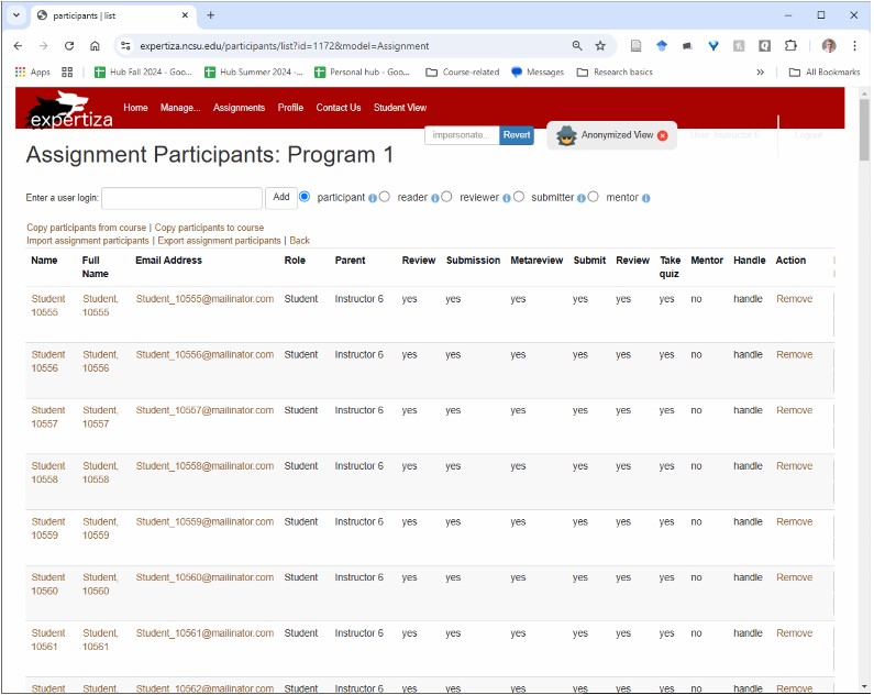
Expertiza is an open-source learning management system built using Ruby on Rails. It provides features for creating tests and assignments, managing courses and teams, and, most notably, offers a powerful platform for peer reviews and group feedback. The Assignment Participants Management UI in Expertiza is a tool used by instructors and administrators to manage participants in assignments. Currently, this interface is cluttered, with dense information and limited filtering options, making it challenging to quickly locate, filter, or modify participant data. The current UI has issues with readability, confusing labels, and lacks efficient bulk action capabilities, which leads to repetitive tasks and hampers productivity.
Project Goals
This project aims to redesign and improve the Assignment Participants Management UI by creating a cleaner, more streamlined, and user-friendly interface. The key objectives include:
- Enhancing readability and usability by restructuring the layout and adding more intuitive spacing.
- Extending functionality with advanced search and filtering options to allow multi-parameter searches, enabling instructors to locate specific participants more efficiently.
- Introducing bulk actions to minimize repetitive tasks and improve productivity.
- Improving visual hierarchy with icons, badges, and role-based indicators to make information more accessible at a glance.
- Ensuring responsiveness so that the interface adapts well across different screen sizes and devices.
Project Description
Objective
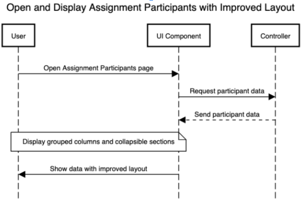
This project focuses on reimplementation of the existing add/edit participants page in Expertiza. This page is important to add participants (students, mentors, etc) to assignments.
Proposed Solution
Current Implementation
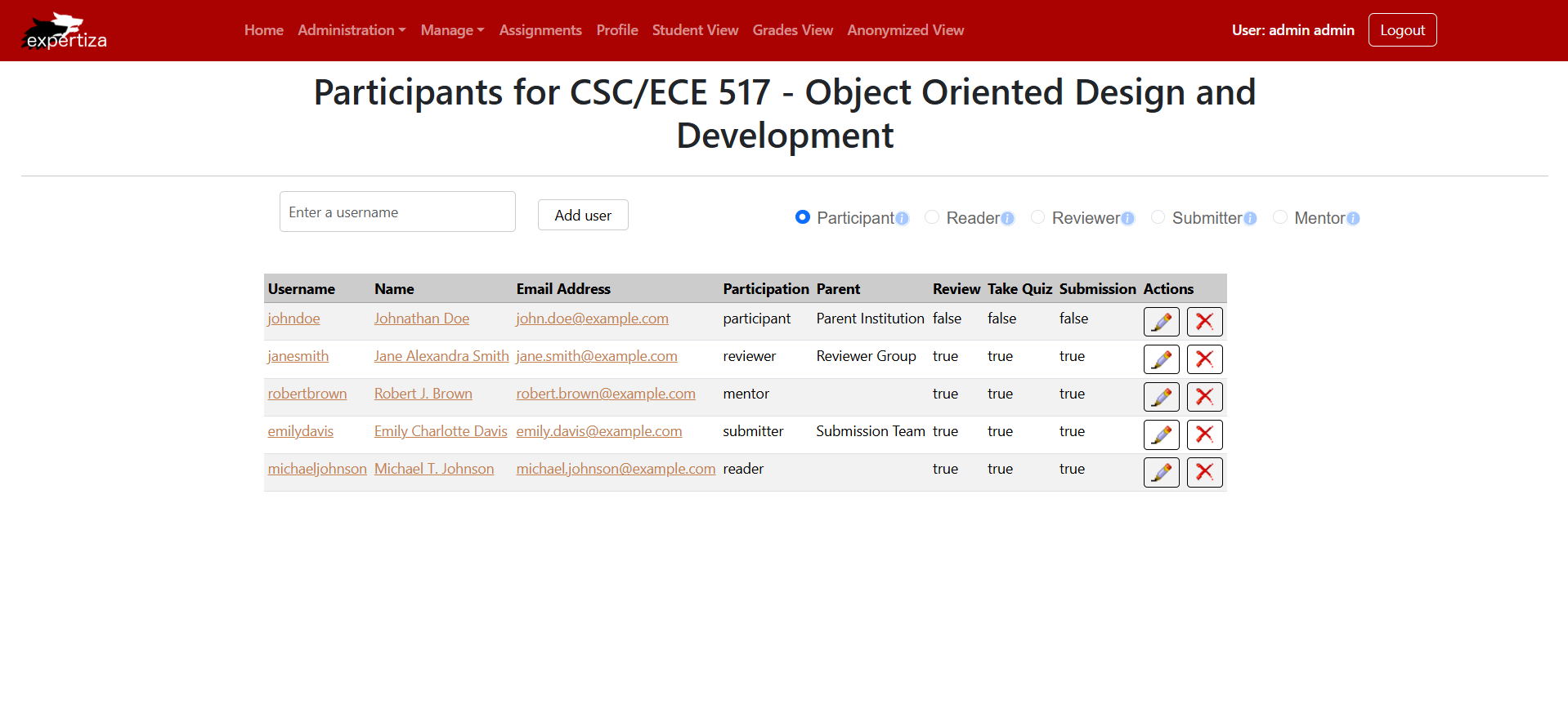
New Implementation
1. Remove the Meta Review column since its not in use anymore.
2. Combine the "Action" and "Participant Role" columns into a single column named "Action." This column should allow users to edit a participant's role directly and delete participants as needed, eliminating the need for a separate "Submit" button after role selection, which currently lacks clarity.
3. Use Icons to depict the actions "Edit" and "Delete".
3. Adjust the information button so that, when hovered over, it provides users with details about each role, enabling them to create participants accurately.
4. The radio buttons next to the roles do not adhere to proper UI design principles; they should be positioned closer to the roles for easier selection.
5. Dynamic column organization: Displaying the columns "Take Quiz", "Review" and "Submit" based on the values present.
6. Adaptive Visibility: Enabling navigation across participant lists exceeding 25 entries.
In this implementation we use dummy data, but the frontend would eventually be wired up to a backend for real-world usage.
Implementation
Main Page Component
This React component, Users, is part of a user management interface for an application, likely related to participant management in a course or event. It fetches user data (simulated with dummy data here) and displays it in a table using @tanstack/react-table, allowing the admin to manage users. Users can be added with specific roles (e.g., participant, reader, reviewer, etc.) via a form. The component dynamically adjusts the table columns to show or hide certain fields (like quiz status or review permissions) based on the diversity of values in the dataset. It also supports user deletion, with confirmation modals, and editing, which navigates to an editing page. Alerts notify users of errors or successful actions, leveraging Redux for global state management. Tooltips provide context for roles, and conditional rendering highlights specific statuses, such as all users having taken a quiz. It integrates a responsive UI, adhering to usability principles and functionality for role-based user operations.
Logic for adding a new user:
const handleAddUser = () => {
    if (!userLogin || !role) {
      dispatch(
        alertActions.showAlert({
          variant: "danger",
          message: "Please enter a user login and select a role.",
        })
      );
      return;
    }

    const newUser: User = {
      id: new Date().getTime(),
      name: userLogin,
      email: `${userLogin}@example.com`,
      full_name: userLogin,
      email_on_review: false,
      email_on_submission: false,
      email_on_review_of_review: false,
      parent: { id: 101, name: null },
      institution: { id: 123, name: null },
      role: { id: 1, name: role },
      take_quiz: false,
    };

    setLocalUsers((prevUsers: User[]) => [...prevUsers, newUser]);

    dispatch(
      alertActions.showAlert({
        variant: "success",
        message: `User ${userLogin} added successfully!`,
      })
    );

    setUserLogin("");
    setRole("");
  };
Logic for accessing the EditUser and DeleteUser components:
  const onDelete = (userId: number) => {
    setLocalUsers((prevUsers) => prevUsers.filter((user) => user.id !== userId));
  };
  const onEditHandle = useCallback(
    (row: TRow<IUserResponse>) => {
      if (!row.original) {
        console.error("Row data is undefined");
        return;
      }
      setEditingUser(row.original as User); // Set the editing user data
      setShowEditModal(true); // Show the edit modal
    },
    []
  );

  const onSaveEdit = (updatedUser: User) => {
    // Update the user in the state
    setLocalUsers((prevUsers) =>
      prevUsers.map((user) =>
        user.id === updatedUser.id ? updatedUser : user
      )
    );
    setShowEditModal(false); // Close the modal
    dispatch(
      alertActions.showAlert({
        variant: "success",
        message: `User ${updatedUser.name} updated successfully!`,
      })
    );
  };
  const onDeleteHandle = useCallback(
    (row: TRow<IUserResponse>) =>
      setShowDeleteConfirmation({ visible: true, data: row.original }),
    []
  );
Columns Component
This code defines a function, userColumns, that dynamically generates column definitions for a data table in a React application using the @tanstack/react-table library. The function accepts three arguments: handleEdit, handleDelete (functions to handle edit and delete actions for table rows), and data (an array of user objects). It conditionally includes specific columns (e.g., Take Quiz, Review, Submit) based on whether any user in the data has the corresponding properties enabled. Columns like Username, Name, and Email Address display values as styled links. The table also features an Actions column, which includes buttons for editing and deleting rows, styled with custom icons and triggered by respective callback functions. By encapsulating conditional rendering, interactivity, and styling, this implementation ensures a flexible, user-friendly interface for managing participant data.
Deletion Component
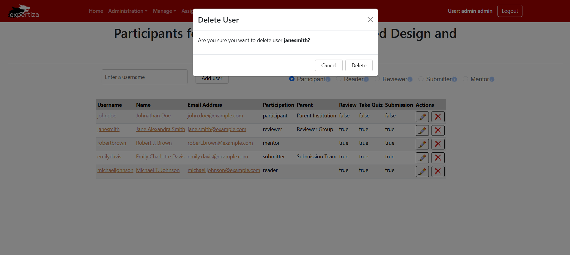
This React component, DeleteUser, displays a confirmation modal when a user attempts to delete a participant. It accepts three props: userData (the user to be deleted), onClose (a function to close the modal), and onDelete (a function to handle the actual deletion). Upon rendering, the modal asks the user to confirm the deletion of the participant. If the user confirms by clicking the "Delete" button, the onDelete function is called with the user’s ID, and the modal is closed. If the user clicks "Cancel," the modal simply closes. The component also contains commented-out code for handling API requests and dispatching success/error alerts using Redux, but these are currently not active. The modal includes a title, body text with the user's name, and action buttons to either cancel or proceed with the deletion.
type DeleteUserProps = {
  userData: IUser;
  onClose: () => void;
  onDelete: (userId: number) => void; // Ensure this is declared
};

const DeleteUser: React.FC<DeleteUserProps> = ({ userData, onClose, onDelete }) => {
  // const { data: deletedUser, error: userError, sendRequest: deleteUser } = useAPI();
  const [show, setShow] = useState<boolean>(true);
  // const dispatch = useDispatch();

  // Delete user
const deleteHandler = () => {
  onDelete(userData.id); // Call the parent-provided delete function
  setShow(false);

  onClose();
};

  const closeHandler = () => {
    setShow(false);
    onClose();
  };
The pop-up appearing prompting the admin to conform the action of deletion.
Editor Component
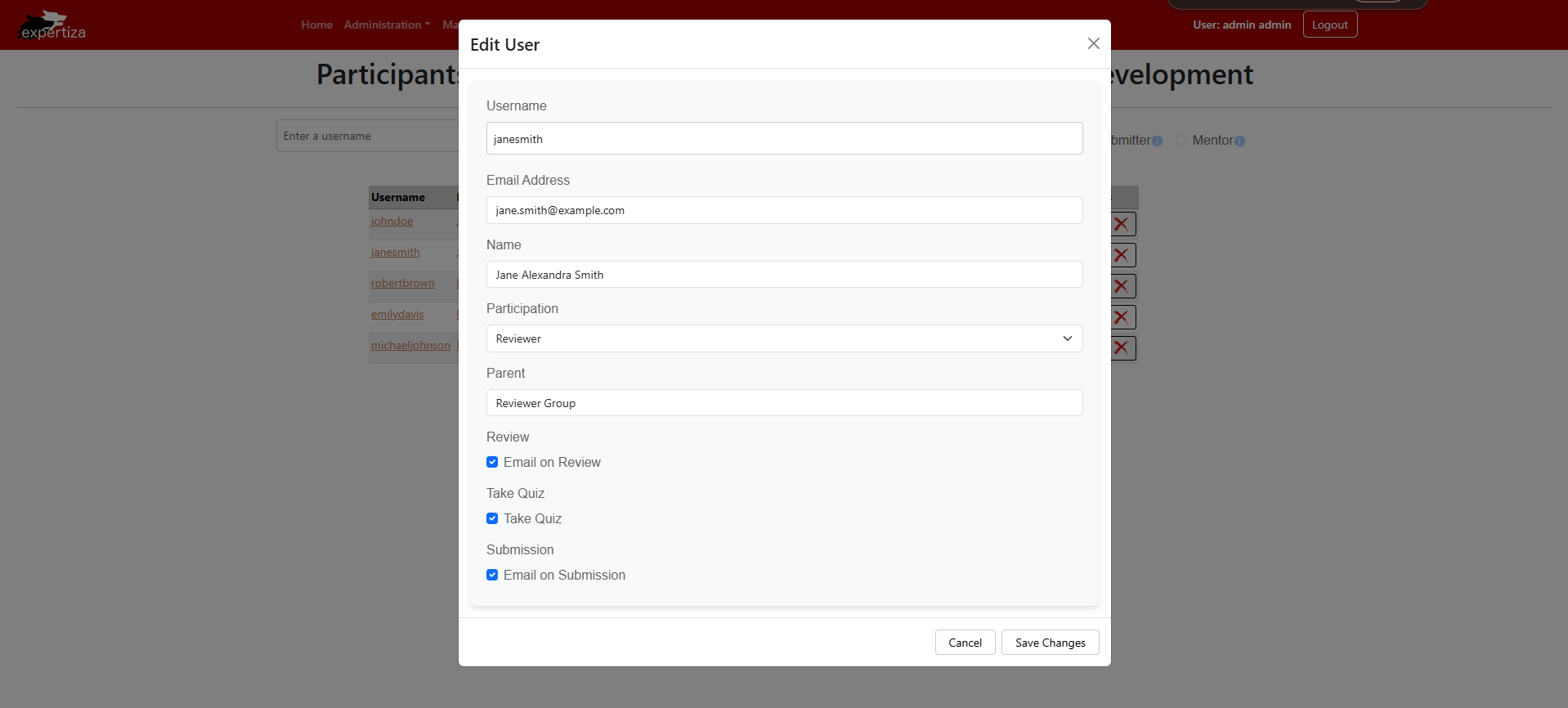
The EditUser component is a form used for either creating a new user or updating an existing one. It accepts a mode prop, which can be "create" or "update," to determine the form's behavior. If in "update" mode, it pre-fills the form with data for the selected user; if in "create" mode, it initializes the form with default values. The form includes fields for the user's name, full name, email, role, institution, and email preferences. The role and institution fields are conditionally disabled based on the mode or user's authentication role. The form uses Formik for form handling, validation via Yup, and displays success alerts after form submission. Upon form submission, it either updates the existing user or adds a new user to the list (stored in a state variable, users). The component also includes a modal for display, and the user can navigate back to the user list page after submitting or canceling the action.
const EditUser: React.FC<IEditor> = ({ mode}) => {
  const [users, setUsers] = useState<User[]>(dummyUsers);
  const [userData, setUserData] = useState<User | null>(null);

  const dispatch = useDispatch();
  const navigate = useNavigate();
  const location = useLocation();

  const auth = useSelector(
    (state: RootState) => state.authentication,
    (prev, next) => prev.isAuthenticated === next.isAuthenticated
  );

  // Pre-fill the data if in update mode
  useEffect(() => {
    if (mode === "update" && location.state?.userId) {
      const user = users.find((user) => user.id === location.state.userId);
      if (user) {
        setUserData(user);
      } else {
        console.error("User not found");
        // Handle case where the user isn't found in the dummy data
      }
    } else if (mode === "create") {
      setUserData(initialValues); // Ensure initial data is set for create mode
    }
  }, [mode, location.state?.userId, users]);

  const onSubmit = (values: User, submitProps: FormikHelpers<User>) => {
    if (mode === "update") {
      // Find and update the user in the dummy data
      setUsers((prevUsers) =>
        prevUsers.map((user) =>
          user.id === values.id ? { ...user, ...values } : user
        )
      );
      dispatch(
        alertActions.showAlert({
          variant: "success",
          message: `User ${values.name} updated successfully!`,
        })
      );
    } else {
      // Add new user to the dummy data
      const newUser = { ...values, id: new Date().getTime() };
      setUsers((prevUsers) => [...prevUsers, newUser]);
      dispatch(
        alertActions.showAlert({
          variant: "success",
          message: `User ${values.name} created successfully!`,
        })
      );
    }

    submitProps.setSubmitting(false);
    navigate("/users");
  };

  const handleClose = () => navigate(location.state?.from ? location.state.from : "/users");
Design Principles
Single Responsibility Principle (SRP)
Each UI component will be designed to handle a specific function:
- User manages user information and reviews
- Review represents a single review
- ReviewManager handles the collection of reviews
Open/Closed Principle (OCP)
The classes are designed to be open for extension but closed for modification. For example, new functionality can be added to the User or ReviewManager classes without modifying their existing code.
Interface Segregation Principle(ISP)
The classes have focused interfaces with methods that are relevant to their specific responsibilities, avoiding unnecessary dependencies.
Dependency Inversion Principle(DIP)
The code shows a tendency towards depending on abstractions rather than concrete implementations, which is evident in the way the Review class is used by both User and ReviewManager
DRY(Don't Repeat Yourself)
The code is modular, with classes representing distinct concepts, which helps reduce repeated logic across the codebase.
Test Plan
Manual UI Testing
Outline step-by-step test cases for manually verifying each UI component:
- User Search: Enter various criteria to check search functionality.
- Role Filter: Select different roles and verify displayed results.
- Bulk Actions: Select multiple users and apply actions to confirm functionality.
Conclusion
The project to improve the Assignment Participants Management UI in Expertiza demonstrates a comprehensive approach to addressing usability and functionality issues in a learning management system. By focusing on key areas such as layout restructuring, enhanced filtering, bulk actions, and responsive design, the project aims to significantly improve the user experience for instructors and administrators. The implementation leverages modern React components and libraries, adhering to important design principles like SOLID and DRY. This approach ensures a modular, maintainable, and extensible codebase. The use of dynamic column generation, conditional rendering, and state management showcases a thoughtful application of React best practices.
Key improvements include:
- A streamlined and more readable interface
- Advanced search and filtering capabilities
- Efficient bulk actions to reduce repetitive tasks
- Improved visual hierarchy with icons and tooltips
- Responsive design for various devices
The inclusion of a manual UI testing plan further demonstrates a commitment to ensuring the quality and reliability of the new interface. By addressing the current UI's limitations and introducing these enhancements, the project is poised to deliver a more efficient, user-friendly, and powerful tool for managing assignment participants in Expertiza. This redesign not only solves immediate usability issues but also lays a foundation for future improvements and scalability in the system.
Team
Mentor
- Chaitanya Srusti <crsrusti@ncsu.edu>
Members
- Kruthi Rajeshwar <krajesh@ncsu.edu>
- Sphurthy Satish <sphurthy@ncsu.edu>
