CSC/ECE 517 Spring 2021 - E2109. Completion/Progress view
Problem Statement
Expertiza allows users to complete peer reviews on fellow students' work. However, not all peer reviews are helpful, and some are more useful than others. Therefore, the application allows for the project's authors to provide feedback on the peer review, this is called "author feedback." The instructors have no easy way to access the author feedback while grading peer reviews, which would be a useful feature to have since this shows how helpful the peer review actually was to the group that received it. Thus, making the author feedback more accessible is the aim of this project. However, a group in 2018 was tasked with this project as well, and most of the functionality appears to have been implemented already, but that is in an older version of Expertiza. Our primary task is then to follow their implementation, refactor any code that may require it, make the suggested improvements that were left in their project feedback and make the feature compatible with the latest beta branch of Expertiza.
Goal
There is an author feedback column to the review report, but the previous team's submission added new code to calculate the average. However, this most likely already exists somewhere else in the system, and so we will identify where that functionality exists and refactor the code to reuse it.
In addition, the review report UI is said to be somewhat crowded in its appearance. However, there is often no author feedback, and so the column for that should be made toggleable.
Use wrapping for the reviewer column.
Design
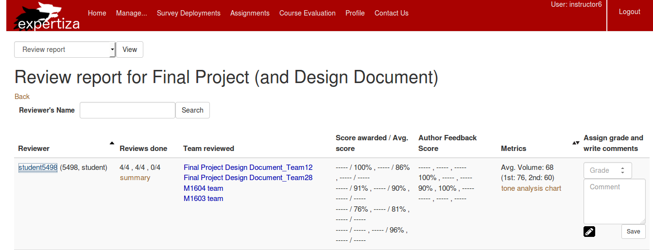
Below is the current implementation of the page we are going to edit.
(Sourced from this link)
The existing user interface is confusing to those unfamiliar with the system, and not very intuitive or user friendly. The relationship between the "Reviews done" and "Score awarded/Avg. score" columns is also unclear. It was not immediately obvious how those entries are related. Originally it was thought that "Reviews done" column was missing an entry for the last team that was reviewed by this student, "M1603 team", but this is not the case. We propose to offer the instructor with two different views. The first would allow the instructor to view the reviews by the round for which the reviews were completed. This way, if the student has gotten better at doing peer reviews over the time, this would be more obvious to the instructor during grading. The second would categorize the reviews based on which team the reviews were for. In the new design, the "Team reviewed" column would not be necessary, that information would exist elsewhere in the entry (either categorized by it, or serving as some form of header for the row entry).
Currently, the entries in the "Score awarded/Avg. score" and "Author Feedback Score" columns contain a lot of missing entries. Instead, it might be better if a button is rendered in their place, that allows a table, bar graph, etc. to display showing this information since visual aids are interpreted more easily.
To a user unfamiliar with the system, the purpose of the "Metrics" column is unclear. Perhaps next to the "Metrics" text there should be a question mark icon that when the user hovers over, it explains what these metrics do and are for. Specifically, the metric "Avg. Volume" is hard to understand and therefore requires some form of an explanation.
Lastly, "Assign grade and write comments" column does not have enough width to properly write a comment to the student. Instead, we would like to replace this with a button called "Grade" that will open a dialog box that contains the Grade drop-down as well as a text field to provide the comment.
Test Plan
to be added
