E1735. UI changes for review and score reports
Introduction
This wiki provides details on the tasks that were undertaken as part of the continuous improvement to the Expertiza project.
Background
Expertiza is a web application where students can submit and peer-review learning objects (articles, code, web sites, etc). The Expertiza project is supported by the National Science Foundation.
The application provides a complete system through which students and instructors collaborate on the learning objects as well as submit, review and grade assignments for the courses.
Overview of Review Functionality
The Expertiza review system encompasses many types of reviews. Assignments can have multiple submission rounds defined with their own due dates and criteria. Each round can have an associated questionnaire whereby peers are encouraged, or required, to review each others' submissions and rate those submissions using the scores 1 through 5 for each question. The scores for each question are averaged to find the rating for the submission for each questionnaire response. The average of all questionnaire responses determine the score for the submission.After the reviews are submitted, the recipient of those reviews can rate the reviewers using a similar questionnaire. On this questionnaire, the author of the submission will rate the reviews based on the reviewers understanding, helpfulness, and respectfulness. This is a review of the reviews, thus it is termed a "metareview."
Both students and instructors using Expertiza have the ability to view the reviews and the scores associated with the reviews for each assignment. These screens will display review summary and detail information in various formats such as lists, graphs, and heatgrids. The instructor will be able to see all review and score information for all teams on the assignment whereas a student will only be able to see the review and score information pertaining to them.
The reviews and associated scores are available on the scores report. To access the score reports in Expertiza follow these instructions:
As a student
- Log into Expertiza.
- Click on the 'Assignments' link on the top navigation bar.
- Find the assignment in the list and click the title of the assignment.
- Click on the 'Your scores' link to see the standard view or click on the 'Alternate View' link to see the heatgrid view.
As an instructor
- Log into Expertiza.
- Hover over the 'Manage' item on the top navigation bar, then select click the 'Assignments' link.
- Find the assignment in the list and click the 'View scores' icon (a star with a magnifying glass) in the 'Actions' column.
- This will bring up the standard view. To see the heatgrid view, click the 'Alternate View' link on the team headings or click the 'view heatgrid' beneath the 'Final Score' when the team is expanded.
Motivation
By participating in the overall refactoring effort as part of the continuous improvement of Expertiza, students get an opportunity to work on a open source software project. This helps them gain exposure on the technologies used in the project as well as much needed experience in collaborating with peers as part of the software development process.
Project Purpose
Requirements Statement
Expertiza displays reviews (i) to the team who was reviewed, and (ii) to the reviewer. A student user can see all the reviews of his/her team’s project. The instructor can see all the reviews of everyone’s project. The instructor also has access to a review report, which shows, for each reviewer, all the reviews that (s)he wrote. Currently, the score report and review report use completely different code. This makes the UI non-orthogonal and also causes DRY problems. So, we would like to have a single way of displaying reviews that would be visible to students (reviews that they did, and reviews that their team received), and instructors (reviews that each time received, sorted by team; and reviews that each student did, sorted by student).
Required Tasks
The tasks involved as part of this requirements change are as follows:
- Compact the review display
- Eliminate the blank lines between items within a single review. Instead vary the background color from line to line to improve readability
- With a single click, there should be a way to hide all the reviews, reveal just the headings (as at present), or expand all the reviews
- At the top of each review, it should say
- Who submitted the review. The instructor should see the user’s name and user-ID.
- A student should see
- “Reviewer #k”, where k is an integer between 1 and n, the number of reviews that have been submitted for this project
- The version number of the review
- The time the review was submitted
- There should be a tabbed view to switch between various review views
- One tab has overall statistics (averages, min, max, as the present “normal” view)
- One tab has the heat map (current “alternate” view)
- One tab has a grid view, with no scores, but text comments in the grid squares, and then a “More” link to display the whole comment (which will require expanding the row of the grid)
- Switching between reviews from Reviewer k and Reviewer j might also be done by clicking on different tabs. Or, it might be more convenient to keep the current score view, which lists the n reviews across the page. Then the student should be able to click on the reviewer number (the instructor would instead click on the reviewer name) and see the review done by that reviewer
- To make it easy to focus on the reviewer’s feedback, there should be a way to hide and/or gray the criteria (“questions”), so the responses stand out more clearly
- There needs to be a way to search all reviews (of a particular project, or by a particular individual) for a given text string. The user should be able to go from one instance of the text string to another by clicking down and up buttons
Problem Statement
In the current state, the score report for instructors and students are built differently though they display the same information using similar UI elements. The application has multiple views into the same information but the way in which those views are accessed, the code which populates them, and the layout of the screens differs unnecessarily between instructors and students and across the views themselves. This leads to redundant code in both the backend and frontend of the application. Furthermore, since the UI is not uniform between instructors and students, instructors may have difficulty assisting students in accessing their score information due to the differences which are present in the UI that leads to confusion.
Following are some of the issues with the current state UI which we seek to rectify.
Scores Report
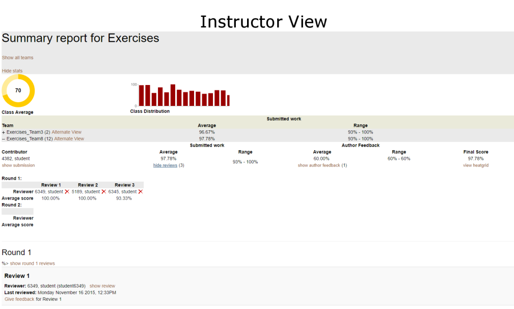
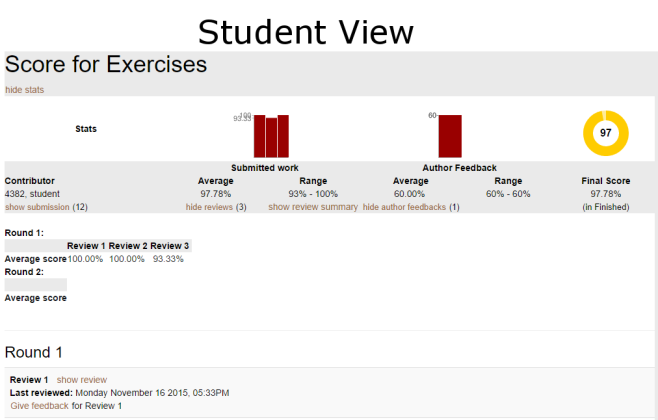
The scores report for students and instructors have very similar layouts despite being created by different controller methods and views. They both display graphs, reviews on team submissions, author feedback, and score metrics. The primary different between them is that the instructor view (shown above) displays information for all teams in a collapsible accordion widget format while the student view (shown below) display the information only for a single team. There are some further discontinuities between the two UIs. For example, the student cannot access the heatgrid view from within the scores report page. This view is only accessible from the assignment page for students. For instructors there are two ways to access the heatgrid view from a single page. The 'Alternate View' link is adjacent to the team name on the heading bar and there is also a link inexplicably placed beneath the 'Final Score' field.
Author Feedback
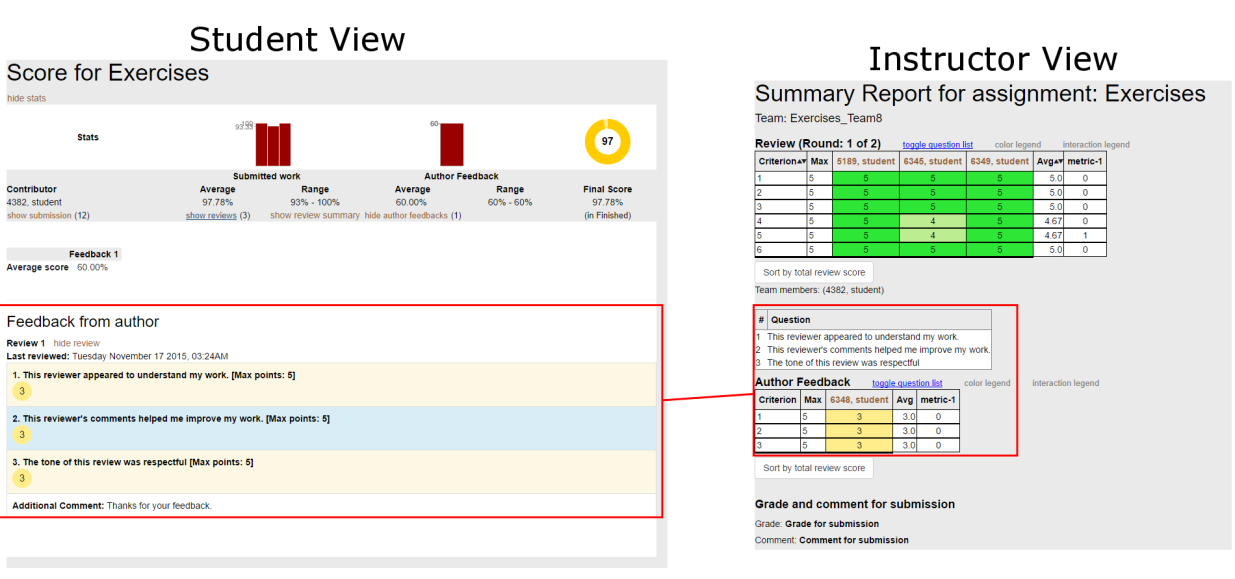
Author feedback takes two different forms when being shown to instructors but only one form for students. Both students and instructors have access to the author feedback format shown on the left in the student view. This format is identical to the format of the review scores and is displayed on the scores report for both instructor and student. The format on the right is shown on the heatgrid view yet it is only available to instructors. The information conveyed by these two formats is nearly identical and not uniformly available to all consumers of this information.
Graphs and Charts
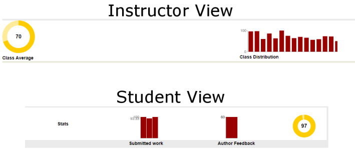
The scores report view has a bar of graphs and charts at the top of the page for both students and instructors. Both views shown below use a donut chart and bar graphs though their method of display is not uniform. The instructor view has titles beneath each item but the student view does not. The 'Submitted work' and 'Author Feedback' titles shown, despite being beneath the bar graphs, are actually headings for the metrics which are displayed beneath the graphs. Also, the graphs contain two labels on the y-axis: the maximum score and the average score. The graphs are so compact that the values on the axis overlap and make them illegible.
Project Design
High Level Design
The project requirements state that we need to create a standard UI for accessing and consuming review and score information. The emphasis will be on smart and purposeful code reuse as well as ease of navigation to access information. To achieve these results we will redesign the scores report to work for both instructors and students alike. There will be a single route, a single controller method, and a single view that is common t users of both role types. In some instances, such as with the graphs and charts, the data will be different enough to warrant separate methods to retrieve the values needed. In most instances, the data is identical and will be accessed identically.
We will create a standard hierarchy which works for both students (who only need to see a single team's scores) and instructors (who need to see all teams' scores). This hierarchy will be rendered within a page in the form of a set of tabbed panes which contain the contents. We will separate the information among four tabs.
- Reviews and scores
- Author Feedback
- Graphs and Charts
- Heatgrid
Putting these components on different tabs will allow us to de-clutter the UI. The instructor scores report UI has multiple ways to expand and collapse sections of information, links are placed in some unusual places, and the page can get so cluttered that it is difficult to distinguish one thing from another. This will be cleaned up by removing some links, removing the author feedback and the charts, and placing the reviews and scores into more discernible sections. The graphs and charts will be on their own tab so they can be larger and easier to read. Since they are not confined to a single bar of a fixed height new graphs and charts can be added. The heatgrid will no longer be coupled with the author feedback and there will be a standard author feedback view which encompasses all information needs. Each of these tabs will be rendered using their own partial.
To prevent the application from pulling data for tabs which the user will not view, AJAX calls will be used to access the data on demand without reloading the page. These calls can also be expanded to request data for individual sections. Routes will be created to controller methods specifically to pull the data for each tab so that calls can be made to them to generate the necessary data structures. These will be accessed when a user expands a group or switches tabs.
Test Plan
In order to test the functionality of our updates, we will focus on reusing the existing test cases which validate the current views for the score report and the reviews report. Since the goal is to make the code which generates these views common, the tests will include generation of pages from a student login and instructor login to verify that the common elements are present. This will also ensure that the underlying code which is used to generate the two views works as expected. For the sections of the views which differ, such as the displaying of reviewer name, we will write independent test that ensure the correct name is listed based on the logged in user type.
Additionally to explicitly testing our updates, we will update the other tests which rely on the contents of the pages in order to invoke various functionality. An example of this will be the addition of the tabbed views. The existing tests will be updated in order to account for the transition to the appropriate tab before selecting links as appropriate.


