CSC/ECE 517 Spring 2024 - E2441 Reimplement grades/view team (Phase 2)
Introduction
Expertiza, a learning management system available as open-source software, utilizes the Ruby on Rails framework as its foundation. Its features encompass the creation of assignments, tests, assignment teams, and courses, among others. Particularly noteworthy is its comprehensive system designed to facilitate peer reviews and feedback within teams and groups. The primary focus of this project lies in developing frontend React Components, specifically targeting User, Institution, and Roles functionalities. The objective is to create a fully operational user interface for these components using React.
Problem Statement
The main objective of this project is to redesign the front end for the grades/view_team page within Expertiza. The current layout suffers from performance issues and outdated design, resulting in decreased usability. Our aim is to improve user experience and interface efficiency by developing a refreshed front end using React JS and TypeScript. The project will concentrate on several key features including displaying team information such as names and assignment details, listing reviews and their comments/feedback for each question while ensuring consistency, indicating review scores with color-coding(Heat map) from green to red.
Design Patterns
In the re-implementation of Expertiza's front end, we have utilized several design patterns to enhance maintainability and promote code reusability:
1. Composite Design Pattern: We employ the Composite Design Pattern by nesting and composing components like Table, Modal, and others to construct our Course component effectively.
2. DRY Principle: Adhering to the DRY Principle, we leverage React's capabilities to reuse existing components such as Table and Modal, thereby minimizing redundancy in our codebase.
3. Provider Pattern: Using React's Context API, we implement the Provider Pattern to seamlessly pass props down the component tree without explicit prop drilling.
4. Observer Pattern: We harness the Observer Pattern using React's Context API alongside hooks like useEffect and useState to efficiently manage component state and side effects.
5. HOC Pattern: The HOC Pattern, or Higher-Order Component pattern, is adopted to facilitate routing for new pages by creating functions that take in a component and return a modified component with routing capabilities.
6. Mediator Pattern: Given the disparity between backend data structures and frontend requirements, we employ the Mediator Pattern to transform data as needed, ensuring compatibility and coherence within our application.
Files Added
We created an assignment folder inside the pages folder which includes the essentials for the implementation of all the changes mentioned in the previous sections.
App.tsx
Added code that sets up a React component (ReviewTable) to manage and display Reviews in Tabular Format. It handles data fetching from data stub, configures a dynamic table, and provides user interactions for viewing scores.
ReviewTable.tsx
Here a component called `ReviewTable` responsible for displaying review data was created. It allows users to toggle between different rounds of reviews and customize the display by filtering reviews based on word count. The component calculates and displays the average peer review score, along with individual question scores and overall averages. Users can also navigate between different rounds of reviews using a selector. Additionally, it provides a link to navigate back to the homepage. Overall, the `ReviewTable` component provides a summary report of peer reviews for a specific assignment, enhancing the user's understanding of the review data.
ReviewTableRow.tsx
This file is responsible for rendering a single row of review data within a table. It receives props containing information about the review data for that row, such as the review scores, question numbers, and average score. The component dynamically applies styling based on the review scores and calculates word counts for comments if enabled by the user. Overall, ReviewTableRow enhances the readability and presentation of individual review data within the larger review table.
RoundSelector.tsx
This React code defines a component called `RoundSelector`, enabling users to switch between different rounds of reviews. It presents buttons for each review round, allowing users to easily navigate and view review data for specific rounds, along with displaying team member names involved in the review process.
Dummy_Data
This code represents dummy data for reviews of a feature, where each feature has several questions with corresponding scores and comments from reviewers. The data is structured as an array of arrays, with each inner array containing review information for a specific round of reviews. Each round includes reviews for different questions about the feature, along with scores and comments from reviewers. This dummy data is used for testing and demonstration purposes in the application.
grades.css
This CSS code provides styling for various elements in a web application, such as tables, buttons, circles, and tooltips. It defines the appearance of table containers, circles used for indicating scores, heatgrid tables for displaying data, and tags for student reports. Additionally, it styles round selectors and provides hover effects for buttons. This CSS is crucial for ensuring a visually appealing and user-friendly interface in the web application.
utils.ts
This JavaScript code provides several utility functions for processing review data in a web application. `getColorClass` calculates a color class based on a score and maximum score, which is useful for visually indicating the performance level. `getWordCount10` and `getWordCount20` count the number of reviews with more than 10 and 20 words, respectively, helping to identify reviews with substantial feedback. `calculateAverages` computes average scores for rows and columns of review data, as well as sorting the data based on row averages. These functions are essential for analyzing and presenting review data effectively in the application.
Notable Code ReImplementation
ReviewTable
we have created component "ReviewTableRow" renders a table row with review data. It includes the question number, review comments, score, and word count. The component also has optional columns for word count that are conditionally rendered based on the showWordCount16 and showWordCount20 props. The styling and data population of the rendered elements are dynamically handled by functions like `getQtrColorClass` and `getWordCount28`. The component is designed to be used in a larger table structure where each row represents a review.
import React from 'react';
import { getColorClass, getWordCount10, getWordCount20 } from './utils'; // Importing utility functions
import { ReviewData } from './App'; // Importing the ReviewData interface from App

// Props interface for ReviewTableRow component
interface ReviewTableRowProps {
  row: ReviewData; // Data for the row
  showWordCount10: boolean; // Flag to show reviews with 10+ words
  showWordCount20: boolean; // Flag to show reviews with 20+ words
}

// Functional component ReviewTableRow
const ReviewTableRow: React.FC<ReviewTableRowProps> = ({ row, showWordCount10, showWordCount20 }) => {
  return (
    <tr className={row.maxScore === 1 ? "no-bg" : ""}>
      {/* Question Number */}
      <td className="py-2 px-4 text-center" data-question={row.questionText}>
        <div className="circle-container">
          {row.maxScore !== 1 ? (
            <span className="circle">{row.maxScore}</span>
          ) : (
            <span className="tick">✓</span>
          )}
                {row.questionNumber}
        </div>
      </td>

      {/* Review Cells */}
      {row.reviews.map((review, idx) => (
        <td
          key={idx}
          className={`py-2 px-4 text-center ${getColorClass(review.score, row.maxScore)}`}
          data-question={review.comment}
        >
          <span style={{ textDecoration: review.comment ? "underline" : "none" }}>{review.score}</span>
        </td>
      ))}

      {/* Row Average */}
      <td className="py-2 px-4 text-center">{row.RowAvg.toFixed(2)}</td>

      {/* Optional columns for word count */}
      {showWordCount10 && <td className="py-2 px-4 text-center">{getWordCount10(row)}</td>}
      {showWordCount20 && <td className="py-2 px-4 text-center">{getWordCount20(row)}</td>}
    </tr>
  );
};

export default ReviewTableRow; // Exporting the ReviewTableRow component as default
RoundSelectorCode
The following design for users shows the tabular format in which the users are displayed. For our new components, we will be replicating this tabular format with the headers depending on the component. Using buttons to represent separate review rounds offers several advantages over simply stacking them one below another:
1. Improved User Experience (UX): Buttons provide a clear visual cue for interactive elements, making it easier for users to understand that they can switch between rounds.
2. Better Organization: Buttons can be laid out horizontally or vertically, depending on space constraints, potentially saving space compared to a long list of rounds.
3. Faster Navigation: With buttons, users can directly jump to the desired review round, improving navigation efficiency, especially for pages with many rounds.
import React, { useState, useEffect } from 'react';
import dummyDataRounds from './Data/heatMapData.json';
import teamData from './Data/dummyData.json';

interface RoundSelectorProps {
  currentRound: number;
  handleRoundChange: (roundIndex: number) => void;
  showAllRounds: () => void;  // Added for showing all rounds
}

const RoundSelector: React.FC<RoundSelectorProps> = ({ currentRound, handleRoundChange, showAllRounds }) => {
  const [teamMembers, setTeamMembers] = useState<string[]>([]);

  useEffect(() => {
    setTeamMembers(teamData.members);
  }, []);

  const active = (clickedButton: HTMLElement) => {
    // Remove 'current' class from all buttons
    const buttons = document.querySelectorAll('.round-button');
    buttons.forEach(btn => {
      btn.classList.remove('current');
    });

    // Check if 'current' class is already applied to any button
    const currentButton = document.querySelector('.round-button.current');

    // If 'current' class is not applied to any button, add it to the clicked button
    if (!currentButton) {
      clickedButton.classList.add('current');
    } else {
      // If 'current' class is applied to a button, remove it from that button and add it to the clicked button
      currentButton.classList.remove('current');
      clickedButton.classList.add('current');
    }
  };


  return (
    <div className="round-selector">
      <div className="flex items-center">
        {dummyDataRounds.map((round, index) => (
          <button
            key={index}
            className={`round-button mr-4 ${currentRound === index ? "current" : ""}`}
            onClick={(e) => {handleRoundChange(index); active(e.currentTarget)}}
          >
            Round {index + 1}
          </button>
        ))}
        <button className="round-button mr-4 show-all-rounds" onClick={(e) => { showAllRounds(); active(e.currentTarget); }}>
          Show All
        </button>
        <span className="ml-4">
          Team members: {teamMembers.map((member, index) => (
            <span key={index}>
              ({member})
              {index !== teamMembers.length - 1 && ' '}
            </span>
          ))}
        </span>
      </div>
    </div>
  );
};

export default RoundSelector;
HelperFunctions
The codes given below shows three functions written in TypeScript or JavaScript:
1. getColorClass takes a score and maxScore as input and returns a string representing a color class based on the score's percentage of the maximum score. It uses a series of if-else statements to assign a color class ('c1', 'c2', 'c3', 'c4', 'c5', or 'cf') based on different score percentage ranges.
2. getWordCount10 takes a ReviewData object as input and returns the count of reviews where the comment has more than 10 words. It filters the reviews array, splits each comment string by spaces, and counts the length of the resulting array
3. getWordCount20 is similar to getWordCount10 but counts reviews with more than 20 words in the comment.
The second image shows the calculateAverages function, which seems to be responsible for calculating various averages and scores displayed in a table or grid.
4. calculateAverages function, is to be responsible for calculating various averages and scores displayed in a table or grid.
import { ReviewData } from './App';

// Function to get color class based on score and maxScore
export const getColorClass = (score: number, maxScore: number) => {
  let scoreColor = score;

  scoreColor = ((maxScore - scoreColor) / maxScore) * 100;
  if (scoreColor >= 80) return 'c1';
  else if (scoreColor >= 60 && scoreColor < 80) return 'c2';
  else if (scoreColor >= 40 && scoreColor < 60) return 'c3';
  else if (scoreColor >= 20 && scoreColor < 40) return 'c4';
  else if (scoreColor >= 0 && scoreColor < 20) return 'c5';
  else return 'cf';
};

// Function to get count of reviews with more than 10 words
export const getWordCount10 = (row: ReviewData) => {
  return row.reviews.filter(
    (review) => review.comment && review.comment.trim().split(' ').length > 10
  ).length;
};

// Function to get count of reviews with more than 20 words
export const getWordCount20 = (row: ReviewData) => {
  return row.reviews.filter(
    (review) => review.comment && review.comment.trim().split(' ').length > 20
  ).length;
};

// Function to calculate averages for rows and columns
export const calculateAverages = (
  currentRoundData: ReviewData[],
  sortOrderRow: 'asc' | 'desc' | 'none'
) => {
  let totalAvg = 0;
  let questionCount = 0;
  let totalMaxScore = 0;
  currentRoundData.forEach((row) => {
    const sum = row.reviews.reduce((acc, val) => acc + val.score, 0);
    row.RowAvg = sum / row.reviews.length;
    totalAvg = row.RowAvg + totalAvg;
    totalMaxScore = totalMaxScore + row.maxScore;
    questionCount++;
  });

  const averagePeerReviewScore =
    questionCount > 0
      ? (((totalAvg / totalMaxScore) * 100) > 0 ? ((totalAvg / totalMaxScore) * 100).toFixed(2) : '0.00')
      : '0.00';

  const columnAverages: number[] = Array.from({ length: currentRoundData[0].reviews.length }, () => 0);

  currentRoundData.forEach((row) => {
    row.reviews.forEach((val, index) => {
      columnAverages[index] += val.score;
    });
  });

  columnAverages.forEach((sum, index) => {
    columnAverages[index] = (sum / totalMaxScore) * 5;
  });

  let sortedData = [...currentRoundData];

  if (sortOrderRow === 'asc') {
    sortedData = currentRoundData.slice().sort((a, b) => a.RowAvg - b.RowAvg);
  } else if (sortOrderRow === 'desc') {
    sortedData = currentRoundData.slice().sort((a, b) => b.RowAvg - a.RowAvg);
  }

  return { averagePeerReviewScore, columnAverages, sortedData };
};
Designs
Following designs are that of the users component which has already been done. This project aims to replicate these designs for the components that we will be creating as mentioned in the previous section.
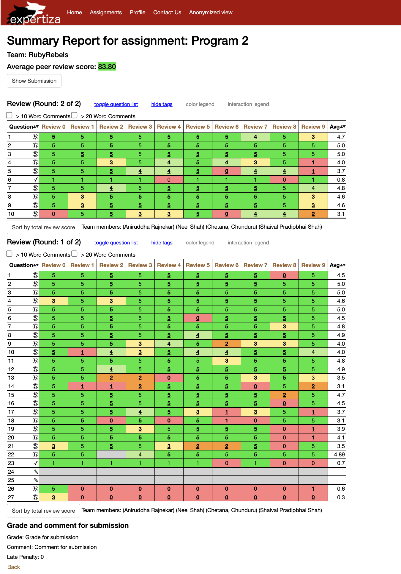
Existing GradesView Page
The user interface design presents users in a tabular format, but it becomes cluttered when displaying the review tables for both round 1 and round 2 stacked together. Additionally, it only shows the average score calculated from both rounds, making it difficult to discern individual round scores. Overall, the current page layout is overloaded with information and challenging to navigate.
Reimplementation Done
The following are the snapshots of the functionality we tried to implement by leveraging the power of ReactJS and Typescript. We've implemented buttons that display review data upon clicking. This view maintains a clean layout, ensuring easy navigation, and allows for separate visibility of the average score for each round. All previously existing functionalities remain unchanged.
Displaying Assignments
Our aim was to display relevant information while listing out the reviews on this page.
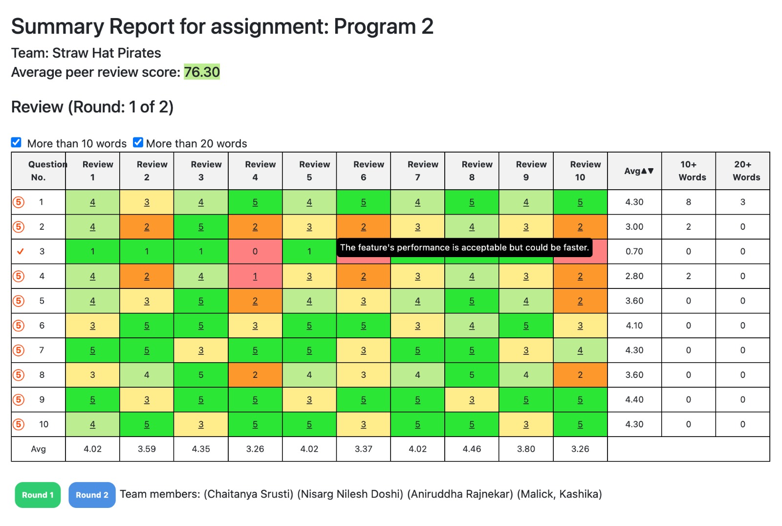
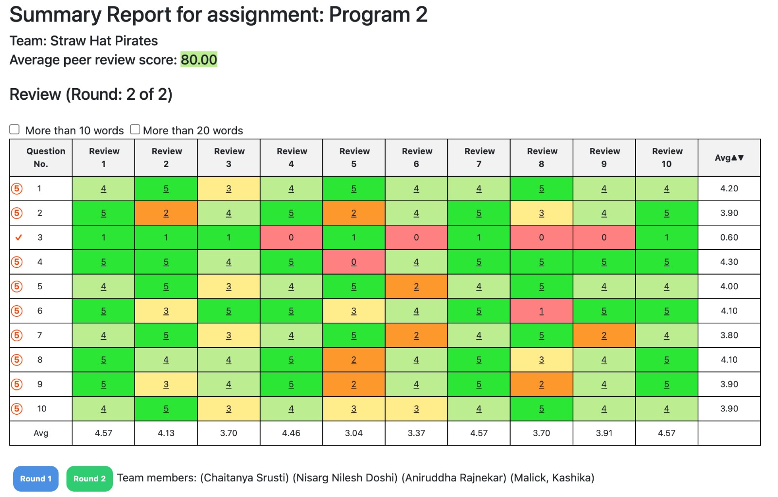
These design patterns play a pivotal role in ensuring the scalability, maintainability, and extensibility of our front-end implementation for Expertiza.
Dummy Data
The purpose of the dummy data is test the functionality of our frontend. For this purpose we have chosen JSON data as a template for test data, the future team working on the backend can delete this file if the data can be successfully retrieved from the database.
JSON Files
JSON files can be found here Link
1. This dummy JSON is used to show the team name, team members, grades and the comments they got for the submission
{
  "team": "Straw Hat Pirates",
  "members": ["Chaitanya Srusti", "Nisarg Nilesh Doshi", "Aniruddha Rajnekar", "Malick, Kashika"],
  "grade": "Grade for submission",
  "comment": "Comment for submission",
  "late_penalty": 0
}
2. This dummy JSON shows the question number, the actual question, the review scores and the review text for this feature.
[
  [
    {
      "reviewNumber": "1",
      "reviews": [
        {"question": "What is the main purpose of this feature?", "score": 5, "comment": "Great work on this aspect!"},
        {"question": "How user-friendly is this feature?", "score": 2, "comment": "The interface was intuitive and easy to navigate." },
        {"question": "Does this feature meet the project requirements?",  "score": 1},
        {"question": "How would you rate the performance of this feature?", "score": 4, "comment": "Performance could be improved, especially for larger datasets." }
      ]
    },
    // Add more reviews as needed
  ],
  [
    {
      "reviewNumber": "1",
      "reviews": [
        {"question": "What is the main purpose of this feature?", "score": 1},
        {"question": "How user-friendly is this feature?", "score": 1, "comment": "Certain design elements make the feature a joy to use." },
        {"question": "Does this feature meet the project requirements?",  "score": 3},
        {"question": "How would you rate the performance of this feature?", "score": 4, "comment": "The feature's design is inviting and approachable." }
      ]
    },
     // Add more reviews as needed
  ]
   // Add more Questions as needed
]
Phase 2 Proposed Changes
Following are the changes we have been assigned to do after completion of project 3:
1. Integrate a submission button at the top of the grades view page to streamline the user experience and facilitate easy access to the submitted link.
Proposed Solution:- To enhance user experience and simplify access to submission functionality, we propose integrating a submission button prominently positioned at the top of the grades view page. By incorporating a submission button at the top of the grades view page, users can effortlessly access the submitted link, enhancing navigation efficiency. This strategic integration optimizes user experience by reducing the need for extensive scrolling and searching, thereby streamlining the submission process.This strategic placement ensures streamlined navigation for users, allowing them to swiftly view the submitted link without unnecessary scrolling or searching. By adhering to the Single Responsibility Principle (SRP) of the SOLID principles, we ensure that each component, including the submission button, has a clear and distinct responsibility. For instance, should the submission process or interface requirements evolve, modifications to the submission button can be implemented independently without disrupting other components, thereby enhancing the system's overall adaptability and robustness within the object-oriented design and development framework.
2. Show Meaningful title for the checkbox that shows comments more than 10 or 20 words.
Proposed Solution:- To enhance usability and provide clear guidance to users, we propose assigning descriptive titles to checkboxes that display comments exceeding either 10 or 20 words.This ensures users easily grasp the checkbox's purpose, fostering clearer comprehension and smoother navigation within the interface. By implementing a title such as "Expand Comments" or "View Detailed Comments," users can easily discern the purpose of the checkbox and its associated action. This approach aligns with the Open/Closed Principle (OCP) of the SOLID principles by allowing for extension without modification. By adhering to this principle, we enable the system to be extended without requiring modifications to existing code. Therefore, if the criteria for comment expansion were to change in the future, the checkbox titles could be updated accordingly without the need to alter the underlying codebase. This design strategy enhances maintainability and scalability within the object-oriented design and development framework, allowing for seamless adaptation to evolving requirements while minimizing the risk of introducing errors or disruptions.
3. Show Questions in the table on the click of the toggle button.
Proposed Solution:- To optimize user interaction and improve accessibility, we propose implementing a toggle button that, upon activation, dynamically populates the table with relevant questions.This implementation streamlines user experience, allowing for seamless toggling between different data views within the table interface. Also, This functionality ensures a seamless user experience by providing immediate access to the desired information without cluttering the interface unnecessarily. By adhering to the Open/Closed Principle (OCP).The Open/Closed Principle (OCP) is applied by ensuring that the existing code for displaying the table remains unchanged (closed for modification) while allowing for the extension of functionality to dynamically populate the table with questions (open for extension) upon the click of the toggle button. This approach promotes code maintainability and scalability within the object-oriented design and development paradigm, enhancing the overall robustness of the system.
4. Add Legend at the top of the table.
Proposed solution:-To enhance clarity and improve user comprehension, we propose adding a legend at the top of the table.This addition provides users with quick reference points, promoting clearer interpretation of symbols, colors, or abbreviations utilized within the table, thus improving overall user experience and facilitating smoother navigation of the data. This legend will provide concise explanations or key indicators for the data presented in the table, aiding users in interpreting the information more effectively. By incorporating this feature, users can quickly reference the legend to understand any symbols, colors, or abbreviations used within the table, thus streamlining their workflow and reducing cognitive load. This approach aligns with the Single Responsibility Principle (SRP) of the SOLID principles by ensuring that the legend component has a clear and distinct responsibility within the user interface. Additionally, it facilitates easy maintenance and scalability of the table's design, allowing for seamless updates or modifications as needed in the future.
5. Implement a three buttons on the page to show round1 score, round2 score, round1 and round 2 score combined.
Proposed Solution:-To optimize user experience and provide seamless access to scoring information, we propose implementing three buttons on the page: one for displaying round 1 scores, another for round 2 scores, and a third for combined round 1 and round 2 scores. This design choice simplifies user interaction, allowing for straightforward navigation and providing users with immediate access to the specific scoring data they require, thus improving overall usability and user experience.By adhering to the Interface Segregation Principle (ISP) of the SOLID principles, each button serves a distinct function, ensuring clarity and simplicity for users. The "Round 1 Scores" button provides focused access to round 1 data, while the "Round 2 Scores" button does the same for round 2. The "Combined Scores" button allows users to view both rounds' scores simultaneously, offering a comprehensive overview. This design approach not only enhances user interaction but also promotes maintainability and scalability within the object-oriented paradigm by segregating interface functionalities based on their specific purposes, facilitating future updates or modifications with minimal disruption.
6. Refactor Dummy Data to structure it by review instead of question.
Proposed Solution:-To improve data organization and enhance clarity, we propose refactoring the Dummy Data structure by grouping it according to reviews rather than questions. This approach aligns with the Single Responsibility Principle (SRP) of the SOLID principles, ensuring that each data structure has a clear and distinct purpose. By structuring data around reviews, users can more easily discern the context of each review and its associated information. This refactoring not only enhances readability but also promotes maintainability and scalability within the object-oriented design and development framework, facilitating future updates or modifications to the data structure with minimal disruption.
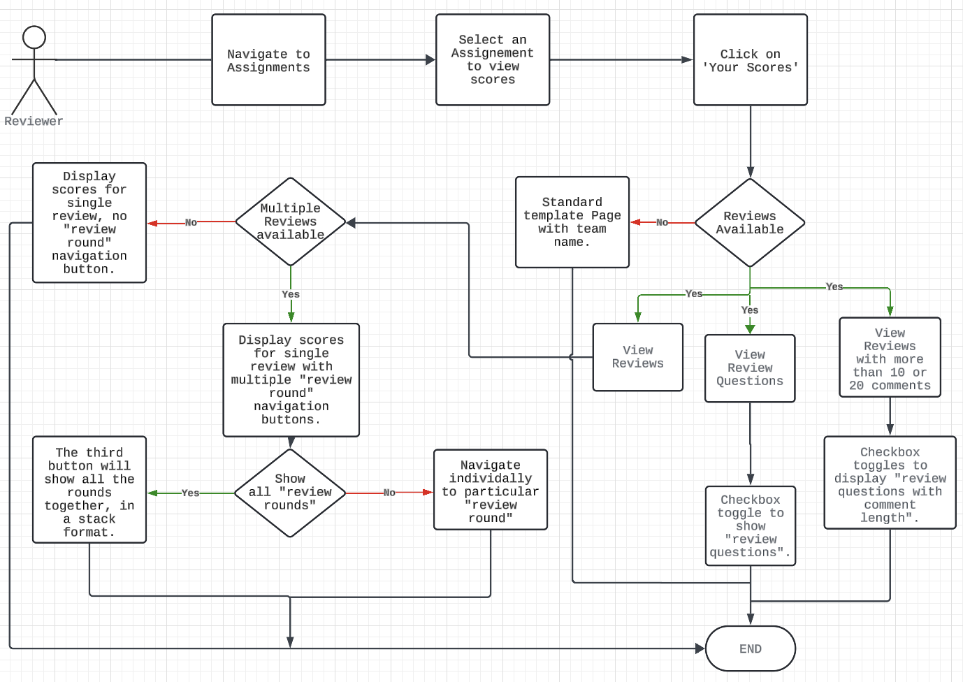
Figure 2: Flow-Chart of the grades/view team page.
Phase 2 Reimplementation Done
The following are the snapshots of the functionality we have implemented by leveraging the power of ReactJS and Typescript. We've made several enhancements to the system:
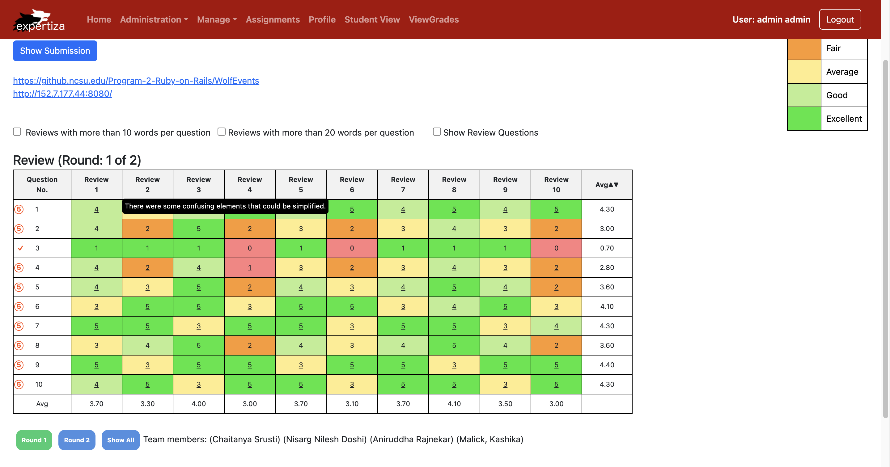
The above image shows:
1. Submission Button Integration: To streamline user experience, a submission button has been integrated at the top of the grades view page, offering convenient access to submit links without the need for scrolling.
2. Meaningful Checkbox Title: We've added descriptive titles to checkboxes that display comments exceeding 10 or 20 words, improving clarity and understanding.
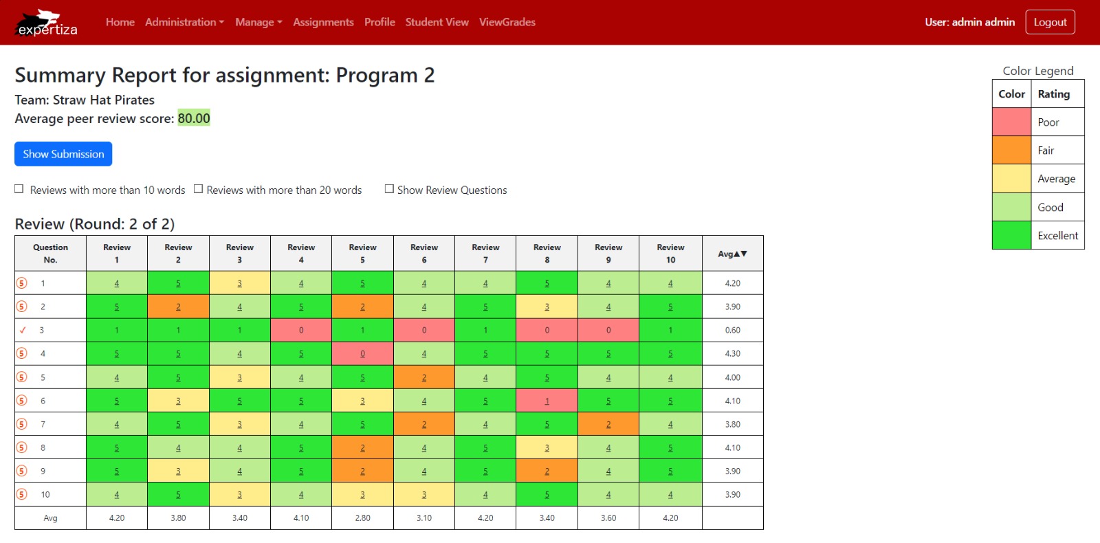
The above image shows:
3. Color Legend: A color legend has been incorporated to provide information about the meaning behind different colors, aiding users in interpreting data more effectively.
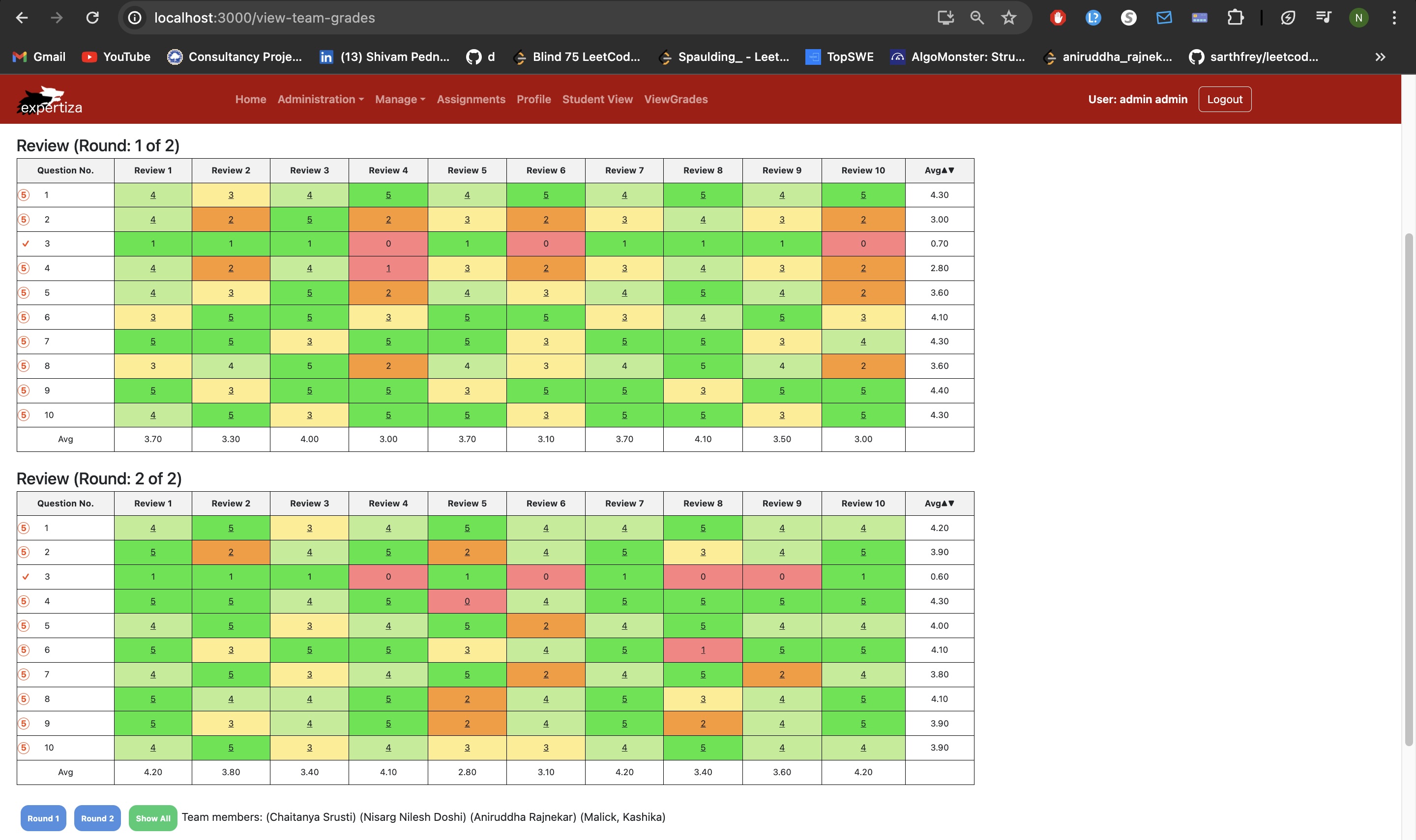
The above image shows:
4. Score Display Buttons: Three new buttons have been implemented on the page to display scores for round 1, round 2, and combined rounds 1 and 2, enhancing accessibility to scoring information.
5. Data Refactoring: Dummy data has been refactored to organize it by review rather than by question, improving data structure and accessibility for users which is shown in Dummy Data Section.
All previously existing functionalities remain unchanged.
Test Plan
Incorporating test cases into your React project is important to ensure this application is robust and functions as expected. Typically, there are several approaches can be taken when organizing test files in your React project directory. One of which is Inline Tests
Inline Tests (Next to Components):
Structure: Place your test files next to the components they are testing, usually within the same directory.
Naming Convention: If your component file is named ComponentName.js, you would name your test file ComponentName.test.js or ComponentName.spec.js.
Why inline tests are important?
1.Inline tests provide immediate feedback during development. Developers can quickly verify that their changes haven't introduced unintended consequences or regressions by running the associated tests directly within their development environment.
2.Placing tests inline with the code they're testing provides clear context for future developers who might be reading or modifying the code. It's easier to understand the intended behavior of the code when the associated tests are right there.
3.Inline tests serve as living documentation for the codebase. They describe the expected behavior of the code in a tangible and executable way, ensuring that the documented behavior stays up-to-date with the actual implementation.
4.When a test fails, having it inline with the code allows developers to quickly locate the problem area and understand the specific conditions that caused the failure. This speeds up the debugging process and facilitates faster resolution of issues. Tests are easy to locate as they are right next to the code they are testing. It simplifies imports in your test files and helps developers quickly identify whether corresponding tests exist for a component.
Following are the test cases that we have written to check our code:-
ReviewTable.test.tsx
import React from 'react';
import { render, fireEvent } from '@testing-library/react';
import { BrowserRouter as Router } from 'react-router-dom';
import ReviewTable from './ReviewTable';

describe('ReviewTable component', () => {
    test('renders without crashing', () => {
        render(
          <Router> {/* Wrap your component with Router */}
            <ReviewTable />
          </Router>
        );
      });

});
Explanation:This test file is designed to validate the behavior of the ReviewTable component using Jest and React Testing Library. It ensures that the component renders without crashing by utilizing the render function provided by React Testing Library. By wrapping the ReviewTable component inside a Router component imported from react-router-dom, it establishes the necessary routing context for components that rely on React Router. This configuration allows the test to accurately simulate the environment in which the component operates. Overall, the test file serves as a quality assurance measure, verifying that the ReviewTable component can render successfully and integrate correctly with React Router.
ReviewTableRow.test.tsx
import React from 'react';
import { render, screen } from '@testing-library/react';
import '@testing-library/jest-dom/extend-expect'; // Import jest-dom for custom assertions
import ReviewTableRow from './ReviewTableRow'; // Import the component to test

// Mocked ReviewData
const mockReviewData = {
  questionText: 'How do you like the product?',
  questionNumber: 'Q1',
  maxScore: 5,
  RowAvg: 4.2,
  reviews: [
    { score: 5, comment: 'Great product!' },
    { score: 4, comment: 'Good product.' },
    { score: 3, comment: 'Average product.' }
  ]
};

describe('ReviewTableRow', () => {
  test('renders question number by default', () => {
    render(<ReviewTableRow row={mockReviewData} showWordCount10={true} showWordCount20={true} showFullQuestion={false} />);
    expect(screen.getByText('Q1')).toBeInTheDocument();
  });

  test('renders full question text when showFullQuestion is true', () => {
    render(<ReviewTableRow row={mockReviewData} showWordCount10={true} showWordCount20={true} showFullQuestion={true} />);
    expect(screen.getByText('How do you like the product?')).toBeInTheDocument();
  });

  test('renders reviews with correct scores and comments', () => {
    render(<ReviewTableRow row={mockReviewData} showWordCount10={true} showWordCount20={true} showFullQuestion={false} />);

    // Find the score within the circle span
    const circleScoreElement = screen.getByRole('cell', { name: '5' });

    // Find the scores within the underlined spans
    const underlinedScoreElements = screen.getAllByRole('cell', { name: /5/ });

    // Assert that the elements are present
    expect(circleScoreElement).toBeInTheDocument();
    expect(underlinedScoreElements.length).toBe(2); // Assuming all scores are underlined
    // Add assertions for comments if needed
  });
});
Explanation:This test file focuses on the ReviewTableRow component, aiming to validate its rendering and behavior under different conditions. It employs Jest and React Testing Library for testing purposes, along with the jest-dom library for custom assertions. The mockReviewData object simulates review data, providing sample information about a question, its number, maximum score, average score, and reviews. The first test, 'renders question number by default', ensures that the component correctly displays the question number when no additional options are specified. The second test, 'renders full question text when showFullQuestion is true', verifies whether the component renders the full question text when the showFullQuestion prop is set to true. Lastly, the 'renders reviews with correct scores and comments' test assesses the rendering of review scores and comments. It locates the elements displaying scores within circles and underlined spans and asserts their presence. Additional assertions for comments can be added if necessary. Overall, these tests comprehensively evaluate the rendering and functionality of the ReviewTableRow component.
RoundSelector.test.tsx
import React from 'react';
import { render, screen, fireEvent } from '@testing-library/react';
import '@testing-library/jest-dom';
import RoundSelector from './RoundSelector';
import dummyDataRounds from './Data/heatMapData.json';

describe('RoundSelector', () => {
  const handleRoundChangeMock = jest.fn();
  const showAllRoundsMock = jest.fn();

  beforeEach(() => {
    render(<RoundSelector currentRound={0} handleRoundChange={handleRoundChangeMock} showAllRounds={showAllRoundsMock} />);
  });

  test('renders without crashing', () => {
    expect(screen.getByText(/Team members:/)).toBeInTheDocument();
  });

  test('renders the correct number of round buttons', () => {
    expect(screen.getAllByRole('button')).toHaveLength(dummyDataRounds.length + 1); // +1 for the 'Show All' button
  });

  test('calls handleRoundChange with correct index when a round button is clicked', () => {
    const roundButtons = screen.getAllByRole('button');
    fireEvent.click(roundButtons[1]); // Click on "Round 2"
    expect(handleRoundChangeMock).toHaveBeenCalledWith(1);
  });

  test('toggles current class correctly when a round button is clicked', () => {
    const firstButton = screen.getAllByRole('button')[0];
    fireEvent.click(firstButton);
    expect(firstButton).toHaveClass('current');
    const secondButton = screen.getAllByRole('button')[1];
    fireEvent.click(secondButton);
    expect(secondButton).toHaveClass('current');
    expect(firstButton).not.toHaveClass('current');
  });

  test('calls showAllRounds and toggles current class when "Show All" button is clicked', () => {
    const showAllButton = screen.getByText('Show All');
    fireEvent.click(showAllButton);
    expect(showAllRoundsMock).toHaveBeenCalled();
    expect(showAllButton).toHaveClass('current');
  });
});
Explanation:This test file is dedicated to testing the RoundSelector component, assessing its rendering and behavior under different scenarios. Utilizing Jest and React Testing Library along with jest-dom for custom assertions, the tests ensure the component's functionality. The beforeEach hook renders the RoundSelector component with mock functions for handling round change and showing all rounds. This setup prepares the component for testing in each individual test case. The first test, 'renders without crashing', confirms that the component displays the expected text ('Team members:') when rendered. The second test, 'renders the correct number of round buttons', verifies whether the component renders the appropriate number of round buttons, considering the length of the dummyDataRounds array plus one for the 'Show All' button. The third test, 'calls handleRoundChange with correct index when a round button is clicked', ensures that clicking on a round button triggers the handleRoundChange function with the correct round index. The fourth test, 'toggles current class correctly when a round button is clicked', examines whether clicking on a round button toggles the 'current' class appropriately, indicating the active round. Lastly, the fifth test, 'calls showAllRounds and toggles current class when "Show All" button is clicked', validates that clicking on the 'Show All' button invokes the showAllRounds function and toggles the 'current' class on the button itself. In summary, these tests comprehensively evaluate the rendering and functionality of the RoundSelector component, ensuring its correctness and responsiveness to user interactions.
ShowSubmission.test.tsx
import React from 'react';
import { render, screen, fireEvent } from '@testing-library/react';
import '@testing-library/jest-dom/extend-expect'; // Import jest-dom for custom assertions
import ShowSubmission from './ShowSubmission'; // Import the component to test

describe('ShowSubmission', () => {
  test('renders button with correct text', () => {
    render(<ShowSubmission />);
    expect(screen.getByRole('button', { name: 'Show Submission' })).toBeInTheDocument();
  });

  test('collapsible content is initially hidden', () => {
    render(<ShowSubmission />);
    const collapsibleContent = screen.queryByTestId('example-collapse-text'); // Update test ID here
    expect(collapsibleContent).toBeNull(); // Check if the collapsible content is initially null
  });


  test('renders links when collapsible content is open', () => {
    render(<ShowSubmission />);
    const button = screen.getByRole('button', { name: 'Show Submission' });
    fireEvent.click(button);
    expect(screen.getByText('https://github.ncsu.edu/Program-2-Ruby-on-Rails/WolfEvents')).toBeInTheDocument();
    expect(screen.getByText('http://152.7.177.44:8080/')).toBeInTheDocument();
  });
});
Explanation:This test file focuses on the ShowSubmission component and evaluates its rendering and behavior under different circumstances. Leveraging Jest and React Testing Library along with jest-dom for custom assertions, the tests ensure the correctness and responsiveness of the component.
The first test, 'renders button with correct text', confirms whether the component renders a button with the expected text ('Show Submission').
The second test, 'collapsible content is initially hidden', checks if the collapsible content is initially hidden when the component is rendered. It queries for the collapsible content using its test ID and expects it to be null.
The third test, 'renders links when collapsible content is open', validates whether the component renders links when the collapsible content is open. It triggers a click on the 'Show Submission' button to reveal the content and then expects specific links to be present in the rendered output.
In summary, these tests comprehensively assess the rendering and behavior of the ShowSubmission component, ensuring that it renders as expected and displays the correct content based on user interactions.

This Screenshot shows that all the test cases we have written have run successfully.
Links
Project Mentor
Kashika Mallick (kmallick@ncsu.edu)
Team Members
Aniruddha Rajnekar (aarajnek@ncsu.edu)
Chaitanya Srusti (crsrusti@ncsu.edu)
Nisarg Doshi (ndoshi2@ncsu.edu)