CSC/ECE 517 Fall 2023 - E2385. Create a Courses User interface in ReactJS
About
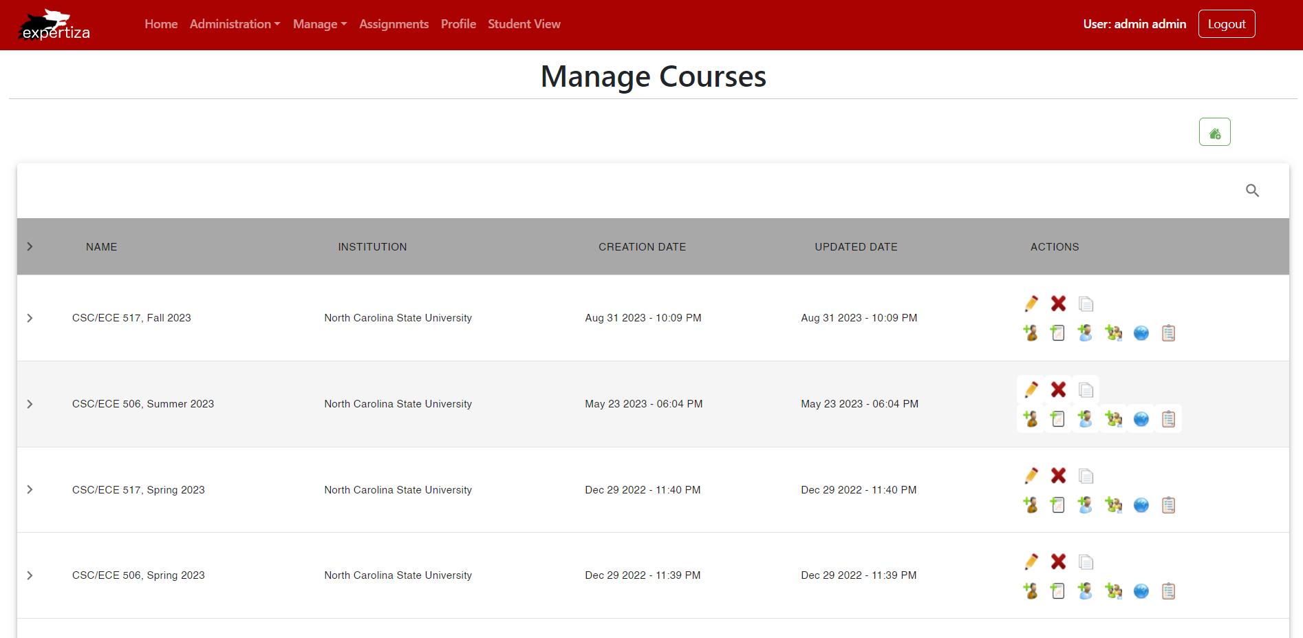
The page will display a comprehensive list of courses, showcasing essential details like course name, institution name, creation and update dates, along with associated actions.
Each course will provide information about assignments and relevant actions. The goal is to design an intuitive and interactive interface for users to easily navigate and manage course-related information.
Design
This is the main page that allows the user to manage course information. All the other pages like manage questionnaires and manage assignments can be accessed from this page. The consolidated accessibility of these features in a singular location eliminates the need for users to navigate through multiple menus or pages, resulting in a more efficient and streamlined process for managing course content. It will display a table with course details such as name, institution, creation date, updated date and actions. There will be a plus icon button above the top right corner of the table to create a course and for each course, there are several buttons such as edit, delete and duplicate.
The Manage Courses page:
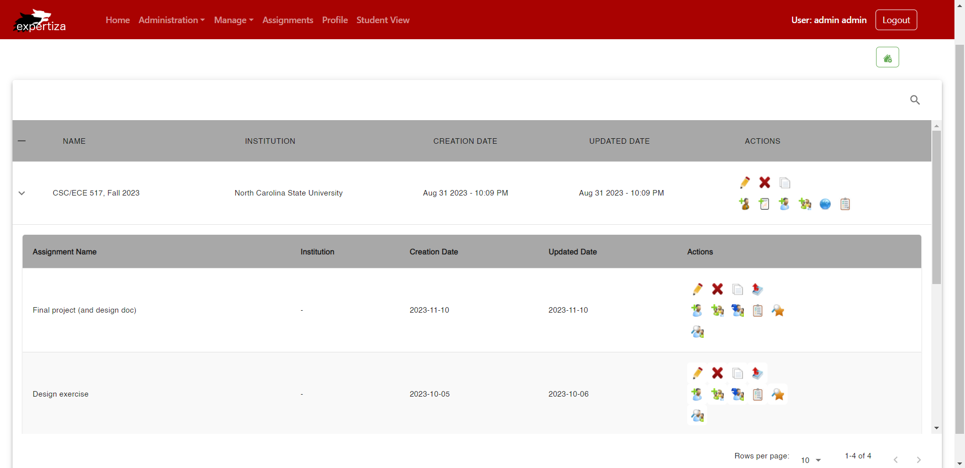
When the user clicks on any course in the table, they will see all the information related to the course including assignment name, institution, creation date, updated date and actions.
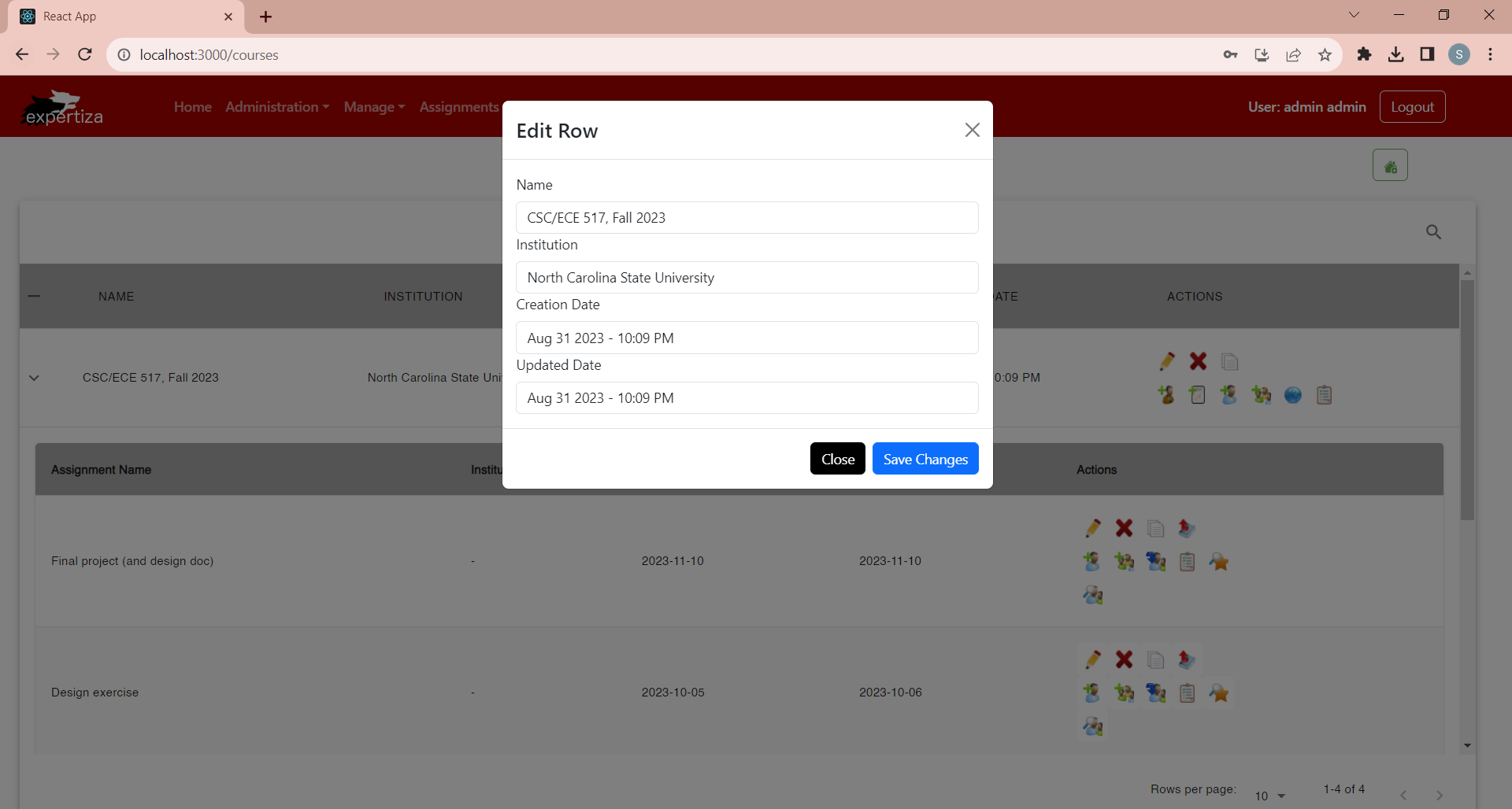
When the user clicks on edit action for a particular row, a modal with existing row information is displayed.
When the user clicks on delete action for a particular row, an alert confirming whether the user wants to move forward with the deletion is displayed.
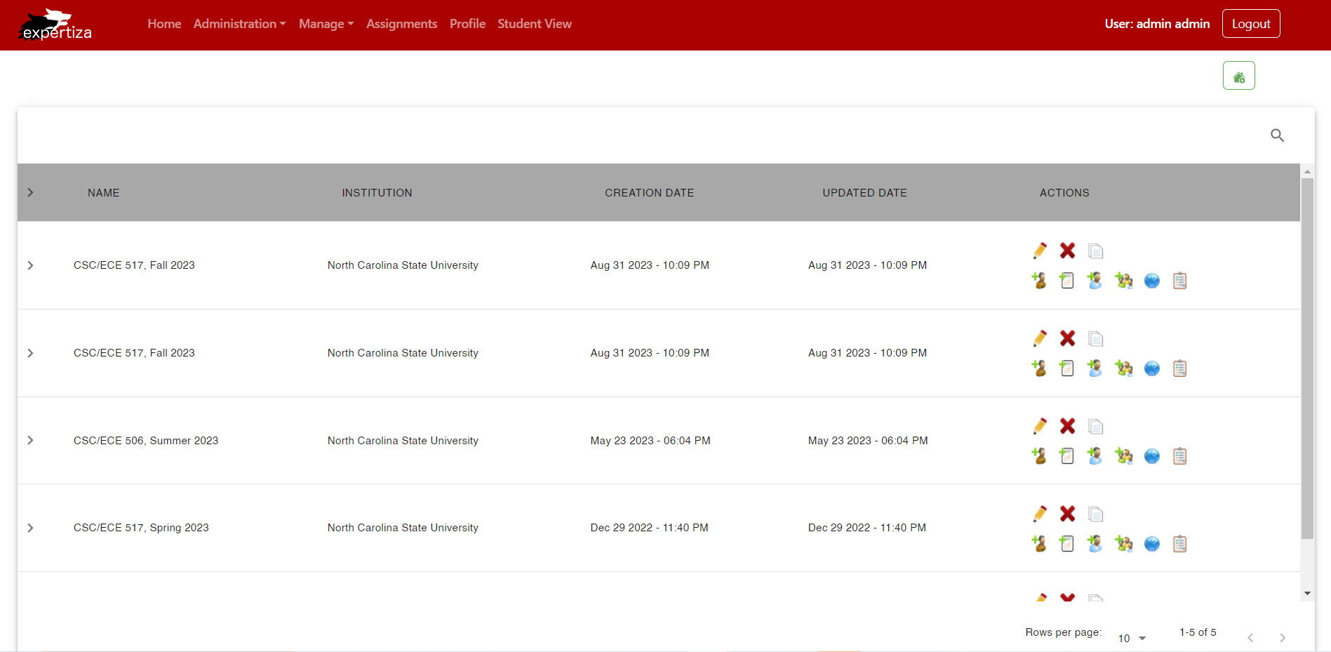
When the user clicks on copy action for a particular row, the information for that row is duplicated and added in the row below the existing row.
Files Modified
- src/App.tsx
- src/pages/Manage/Courses.jsx
- src/pages/Manage/utils/Tooltip.jsx
- src/pages/Manage/utils/Modal.jsx
- src/pages/Manage/utils/data.js
- tsconfig.json
Components
Courses.jsx
It is a React component that defines a course management interface.
State Management:
- The component uses the useState hook to manage various state variables, including tableData, innerrowData, showModal, showInnerModal, editRowData, editInnerRowData, editedData, editedRowIndex, and editedInnerRowIndex.
Navigation:
- The useNavigate hook is utilized for programmatic navigation.
Theme Styling:
- The component uses the Material-UI library and defines a custom theme using the createTheme function.
Modal Handling:
- The component utilizes two custom modal components (EditModal) for editing course data and inner data.
Table Configuration:
- The component configures a Material-UI DataTable (MUIDataTable) to display the course data.
- Custom styling is applied to the DataTable and its cells using the custom theme.
Data Operations:
- There are functions to handle editing, saving edits, and closing the modals.
- Functions for handling input changes in the edit modals (handleInputChange, handleInnerInputChange).
- Functions for copying rows (handleCopy, handleCopy_inner) and deleting rows (handleDelete, handleDelete_inner).
- Functions for handling various actions related to courses and inner data.
Rendering:
- The component renders a container (Container) with a heading, a button for adding a new course, and two instances of the EditModal component.
- The DataTable is rendered inside a centered container, and the theme is applied to it.
Actions:
- The component defines actions for each row in the table, including editing, deleting, copying, and performing other specific actions.
Nested Table:
- The DataTable has an expandable feature to display additional details (inner data) for each course.
Icons:
- Various icons from React-icons and local assets are used for actions and tooltips.
Modal.jsx
The EditModal component is a modal used for editing rows in the course management interface.
Bootstrap Components:
- The component imports various Bootstrap components, including Button, Col, Container, Modal, Row, and Form.
Modal Structure:
- The component renders a Bootstrap Modal component with a title ("Edit Row").
- The modal has a close button in the header.
Form Inputs:
- The modal contains a Form with several Form.Group components.
- Each Form.Group represents a different field (Name, Institution, Creation Date, Updated Date).
- Each field has a corresponding Form.Control input element.
- The defaultValue attribute is set based on the values of the corresponding row data from the props.editRowData.
Input Change Handlers:
- The onChange event of each Form.Control input is connected to a corresponding props.handleInputChange function, passing the event and the index of the field.
Modal Footer:
- The modal has a footer containing two buttons: "Close" and "Save Changes."
- Clicking the "Close" button triggers the props.handleCloseModal function.
- Clicking the "Save Changes" button triggers the props.handleSaveEdit function.
Dynamic Content:
- The content of the modal is dynamically populated with data from the props.editRowData, allowing for the editing of course details.
Integration with Parent Component:
- The modal receives various props from its parent component (showModal, handleCloseModal, handleSaveEdit, handleInputChange, editRowData).
- These props are used to control the modal's visibility, handle actions, and manage the data being edited.
Tooltip.jsx
Imported Libraries:
- The component imports React, the Tooltip component from the Material-UI library (@mui/material/Tooltip), and a Bootstrap Button.
Component Structure:
- The component renders a Tooltip component from Material-UI, wrapping around a Bootstrap Button.
- The Tooltip component displays a tooltip with a title provided via the props.title attribute.
Button Styling:
- The Bootstrap Button is styled with inline CSS to have specific padding, color, background color, and no border.
Event Handling:
- The onClick event of the button is connected to a function (props.handler) that is passed via the props object.
- The function is called with parameters props.rowData and props.index when the button is clicked.
Image Display:
- Inside the button, there's an img element displaying an image sourced from the URL provided in props.src. The image has a fixed width and height.
Dynamic Content:
- The content of the button, including the image and tooltip, is dynamic and depends on the props passed to the component.
Integration with Parent Component:
- The component receives various props (key, title, handler, rowData, index, src, alt) from its parent component.
- These props are used to customize the appearance, behavior, and content of the button with the tooltip.
Design Patterns
Composite Design Pattern:
- The Composite Design Pattern is a structural pattern in software design that allows you to compose objects into tree-like structures to represent part-whole hierarchies. In the context of React, this pattern can be applied when creating complex components by nesting and composing simpler components together.
- In the scenario of building a Course component, you can use the Composite Design Pattern to structure it as a composition of smaller components like Table, Modal, and others. For example, the Course component may consist of a Table component to display course information, a Modal component for additional details, and potentially other components for various functionalities.
- This approach promotes a modular and scalable architecture, making it easier to manage and extend the functionality of your application.
DRY Principle:
- DRY, which stands for "Don't Repeat Yourself," is a software development principle that encourages the reduction of redundancy in code. In the context of React, one of the significant advantages is the ability to create reusable components.
- By adhering to the DRY Principle in React development, you leverage the component-based architecture to create modular, self-contained components. For example, if you have a Table component that displays data, you can reuse it across different parts of your application without duplicating code.
- This not only improves code maintainability but also enhances the consistency of your application, as changes made to a reusable component automatically reflect across all instances where it's used.
Provider Pattern:
- The Provider Pattern in React is closely associated with the Context API. It allows you to share data, such as state or configuration, across the component tree without passing props explicitly at each level.
- By using the Provider Pattern, you can create a central point (a provider) that holds and provides the necessary data to the components in its subtree. This eliminates the need to pass props through each intermediate component manually.
- For instance, if your application has a theme configuration, you can use the Provider Pattern to set the theme at the top level of your component tree, and all components within that tree can access and apply the theme without explicit prop passing.
Observer Pattern:
- In React, the Observer Pattern can be implemented using the Context API along with hooks like useEffect and useState. The Observer Pattern involves a subject (observable) and observers. When the state of the subject changes, all observers are notified and updated accordingly.
- In React, the subject can be represented by the state held in a context provider, and components that consume this context become observers. The useEffect hook allows components to react to changes in the observed state, and useState is used to manage local state within components.
- This pattern is particularly useful for scenarios where multiple components need to react to changes in a shared state, such as updating UI elements when data is fetched or modified.
HOC Pattern:
- The Higher-Order Component (HOC) Pattern is a design pattern in React where a function takes a component and returns a new component with additional features or props. It's a way to reuse component logic.
- For example, you might create an HOC that adds routing capabilities to a component. This HOC can handle the navigation logic and provide routing-related props to the wrapped component. This allows you to reuse the same routing logic across different parts of your application.
- HOCs enhance code modularity and reusability by encapsulating specific functionalities in separate functions, making it easier to manage and extend the capabilities of your components.
Test plan
We will be testing the pages manually.
We will have to ensure that the view of this appears properly, with all the necessary options for each course. We will have to also make sure that the details are displayed in table format as shown in the figure. The search bar, sort page and other options should also be verified accordingly.
1. Verify that the search option appears in the proper position and add a button to search.
2. Check that the search functionality works properly where it can search for words from all the columns.
3. Verify that the table is populated with correct data. We will be displaying hard-coded data to check this functionality.
4. Verify if the checkbox to include other items is working correctly.
5. Verify that the details of a course are displayed when clicking on a row in the table.
6. Verify if the sorting functionality is working for each column.
7. Verify whether the details of the icon are visible when hovering over each icon in the row.
The test results are presented in Demo Link
Important links
Team
Mentor
- Kartiki Bhandakkar
Members
- Shreya Vaidya <svaidya6@ncsu.edu>
- Shonil Bhide <sbhide@ncsu.edu>
- Subhang Boorlagadda <sboorla@ncsu.edu>


