CSC/ECE 517 Spring 2024 - E2444 Implement Frontend for the Review
Overview of Expertiza
Expertiza, constructed using Ruby on Rails, is an open-source learning management system that offers a diverse array of features. These include the ability to generate assignments, tests, assignment teams, courses, reviews for the assignments, etc. Notably, it excels in providing a comprehensive peer review system, fostering thorough feedback within teams and among group members. The central focus of the project revolves around enhancing the frontend components related to the Review. A specific challenge being tackled involves the reimplementation of the current non-Typescript Review Page to incorporate Typescript and React. Consequently, the team's task is to craft the User Interface for these components using React.js and Typescript.
Introduction
The main objective of this project is to reimplement the front end for the Review view page within Expertiza.
Problem Statement
The following tasks were required for the reimplementation :
- Frontend Reimplementation: Reimplement the frontend of the Review page in React.js and Typescript which is currently in Ruby.
- Seeding of Databse File There should be seeding of 1 file to simulate the review given by a user which will reflect in the Review UI page.
- Removal of Unused Elements: Remove any unused elements such as URLs, color legends, etc., to streamline the interface.
- Improve UI: We aim to improve user experience and interface efficiency by developing a refreshed front end using React JS and TypeScript.
Project 4 - DESIGN DOC
Design Patterns
Composite Design Pattern:
By nesting and composing elements like Show-Review, Email etc and others, we can effectively design our Review component by utilising the Composite Design Pattern.
DRY Principle:
We want to reduce redundancy by using React's functionality to reuse pre-existing components like Show-Review and Email, in line with the DRY Principle.
Single Responsibility Principle (SRP)
Provider Pattern:
Our goal is to apply the Provider Pattern to React's Context API so that props can propagate naturally throughout the component hierarchy without requiring explicit prop drilling.
Observer Pattern:
Our goal is to take advantage of the Observer Pattern by using hooks like useEffect and useState along with React's Context API to manage component state and side effects efficiently.
HOC Pattern:
Routing for new pages can be made more efficient by using the Higher-Order Component pattern, or HOC Pattern. This entails creating functions that take an input component and provide a changed component with routing functionality.
Mediator Pattern:
Our goal is to apply the Mediator Pattern in light of the discrepancy between frontend requirements and backend data structures. With this method, we can easily change data as needed to ensure that it is consistent and compatible with the rest of our program.
Open/Closed Principle (OCP)
- Designing components to be open for extension by allowing for customization or configuration through props or context.
- Ensuring that components can be extended or modified without altering their core functionality by adhering to React's composition model.
Use Cases
The following is a simple decision tree that can help summarize the various user stories that we absolutely must account for in our design. The first case is a user who reads the review and is satisfied, and takes no further action except for perhaps sharing their review publicly as a model. The second case is when there's an issue on the fault of the reviewer that the user notices, at which point they can press the email button to email the author of the review. Lastly, the user may be informed by a reviewer or discover on their own that something is wrong with their submission. If this happens, then the user may change the submissions saved in the system by removing unnecessary ones or uploading new files.
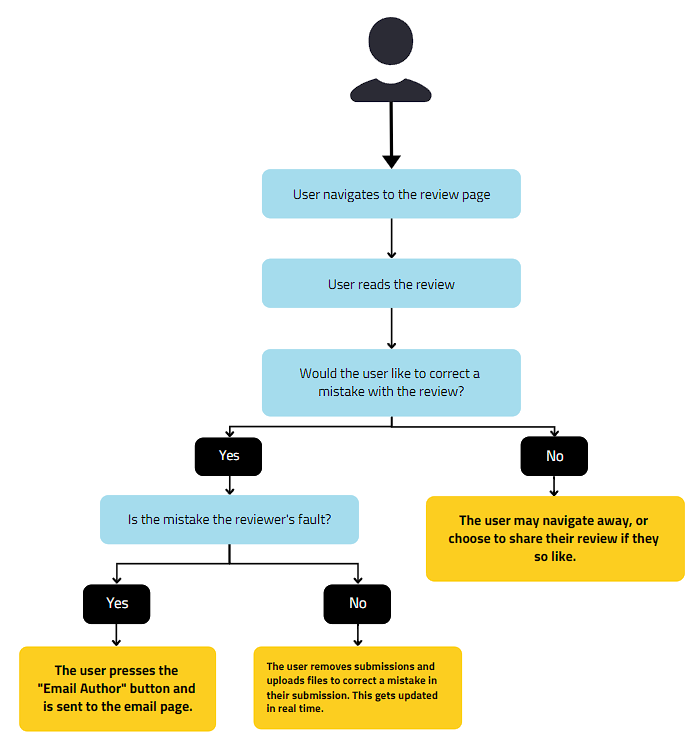
Figure 1: User story decision tree for Expertiza
Existing Review Page
We identified several design issues with the existing review page. Most notably, there are many elements that are uncentered and completely unformatted. Spacing in between each element is inconsistent and some even have bullet points for no reason. It would also be nice if lists of links or files could be shown in a table instead of a list of checkboxes, as it makes actions related to these items more difficult for the user. Finally, some hyperlinks, particularly the toggle visibility ones, could be better implemented as buttons since they do not actually route the user anywhere.
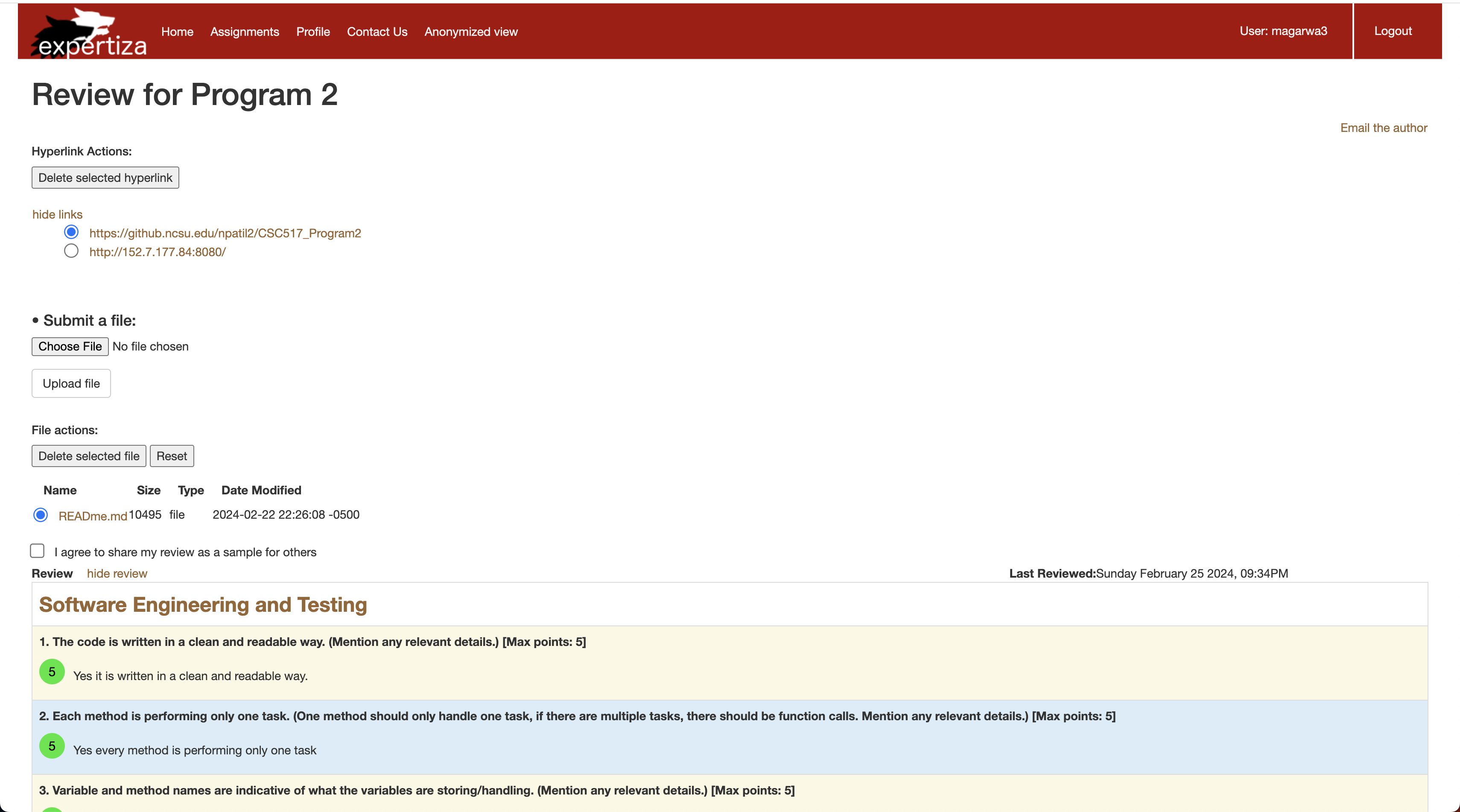
Figure 2: Existing review page within Expertiza
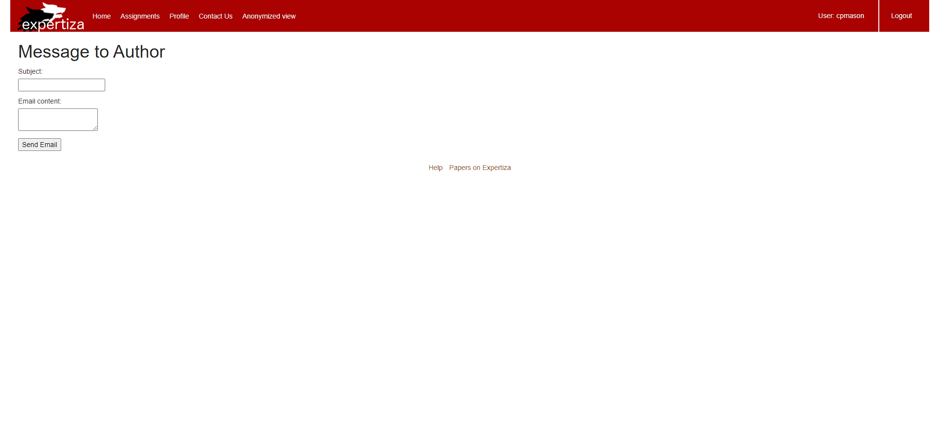
Figure 3: Existing email page within Expertiza
Design
The following is our refactoring of the previous design.
1. Several key elements are now centralized, and the link submission and the file submission areas are placed side-by-side to minimize whitespace while still maintaining readability.
2. Key user actions were made into buttons, particularly visibility toggles, emailing the author, and sharing the review publicly. This was done to better grab the user's attention and to more clearly communicate the result of clicking the link by use of icons.
3. "Email the Author" page was also stylized to incorporate central elements.
4. The previous system of selecting a bullet-point list, and then clicking on a remove button was changed to simply having a trashcan icon next to every submission on the table, that way the user can simply press the icon corresponding to the submission they would like to remove. This action is dangerous, since it could potentially result in the user losing their work. For this reason, we also added a stylized confirmation screen that clearly communicates the exact action the user is about to take in the form of a warning. This is a good thing because it prevents potential future errors down the road. This warning system was also kept for the review sharing system since that could result in the exposing of sensitive information.
5. We thought it would be a good idea to simplify the file-uploading experience for the user. The user sees the name of the file uploaded, the size of the file, and also the type of the file uploaded and does not have to go through a two-step select + upload process like before.
6. In the new design, files are uploaded as they are selected but can be identified and removed quickly from the table. We thought this was an appropriate design choice because we saw no benefit to having to make the user press two buttons to perform what most would consider a single task. There are also minimal consequences for user error since they can immediately delete files that they did not mean to upload.
7. Some changes we decided to keep were the color scheme and score reporting within the review table because we believe it should catch the attention of the user as soon as they navigate to the page. The circles provide good contrast from the other elements, and alongside the color make it quick to identify low scores on criteria that the user may want to give their attention to.
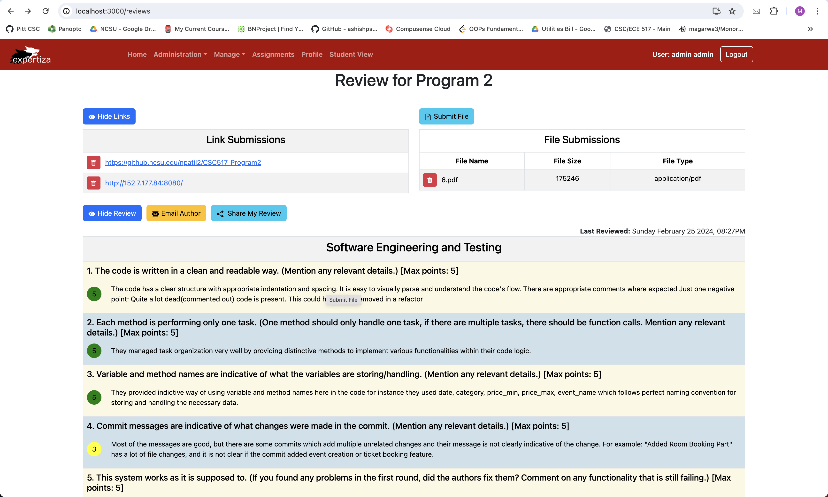
Figure 4: Our new design of the review page
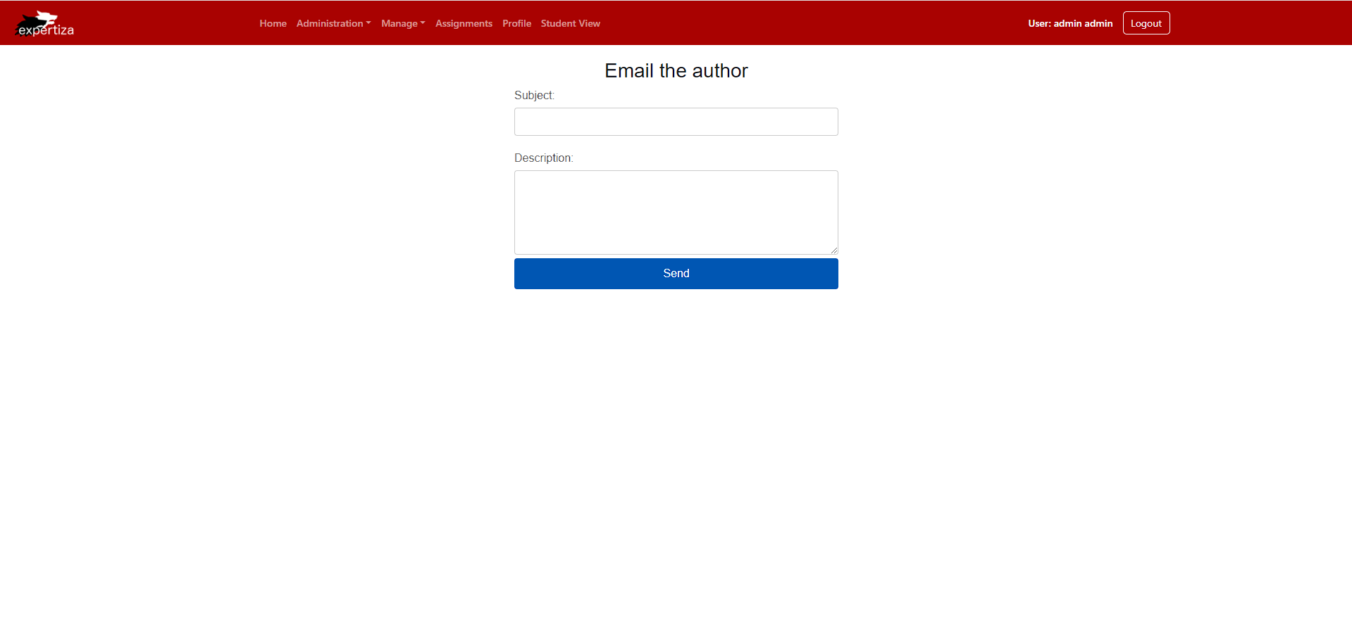
Figure 5: Our new design of the email page
Files Added / Changed
reviews.tsx
This is the main typescript file in which we have implemented all the changes. It contains the functionality as follows:
Enhancing the Design functionality of buttons and links have been integrated into this file.
Additionally, the following is a description of each function
The following displays the code responsible for declaring state variables used to keep track of their respective buttons, particularly showReview and showSubmissions, which keep track of the visibility of the reviews and submissions, respectively. reviewSetId is the review ID used with the demo data structure. This tells the webpage which review to load. reviewItems and feedbackItems store each review criteria for their respective categories. The warning state variables are maintained by the above-mentioned warning functions and shouldn't be altered directly. After variables are declared, the first part of our code declares the warning functions.
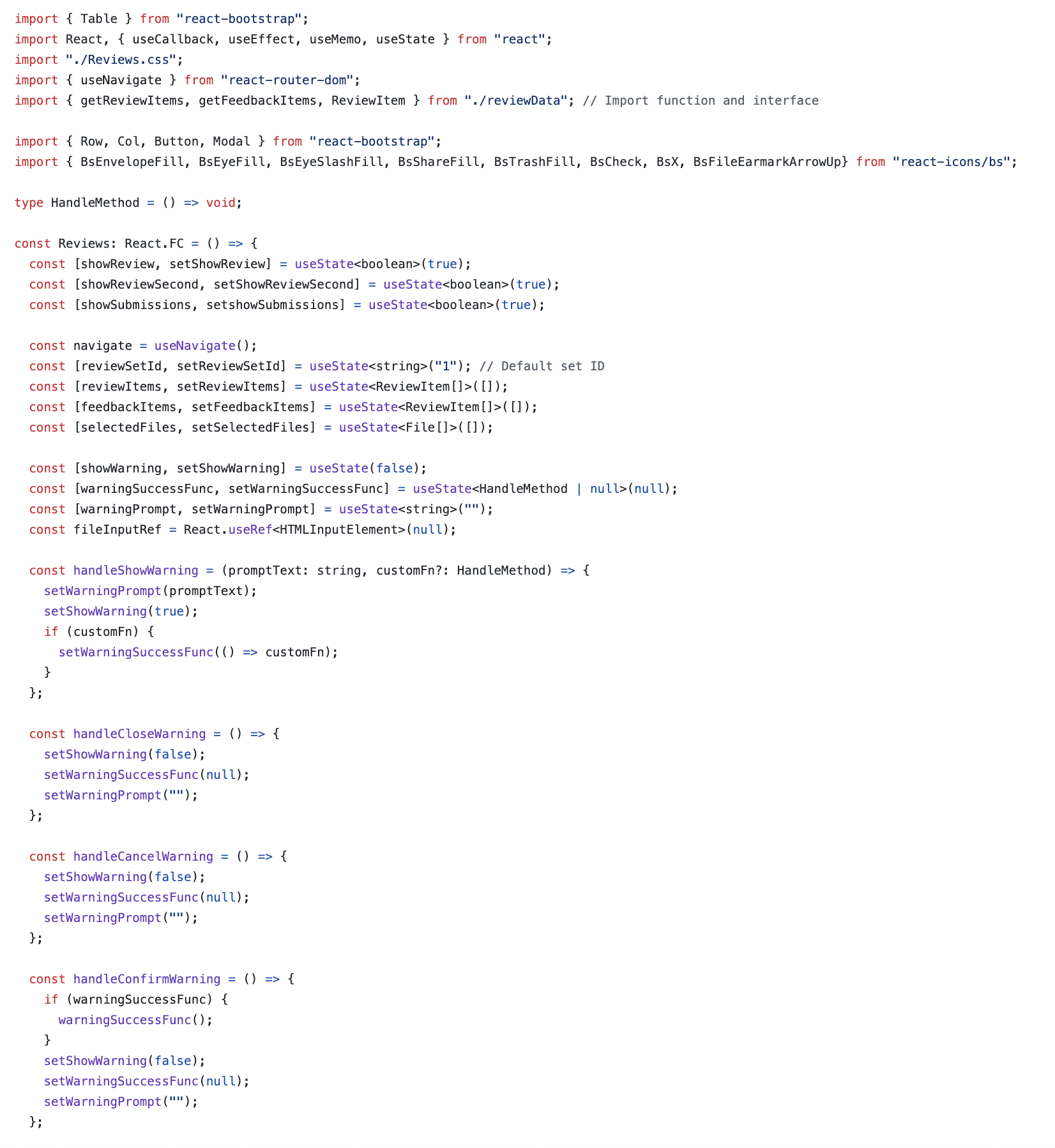
Figure 6: Changes in reviews.tsx
This code segment is where the aforementioned getScoreColor is declared. Additionally, it shows the React Modal framework used to manage the warning dialogue prompt window, which is managed by the warning functions. Lastly, you can see the "side-by-side-container" Row section. This is what holds the two side-by-side "action-container" sections which store the tables for the links and file submissions.
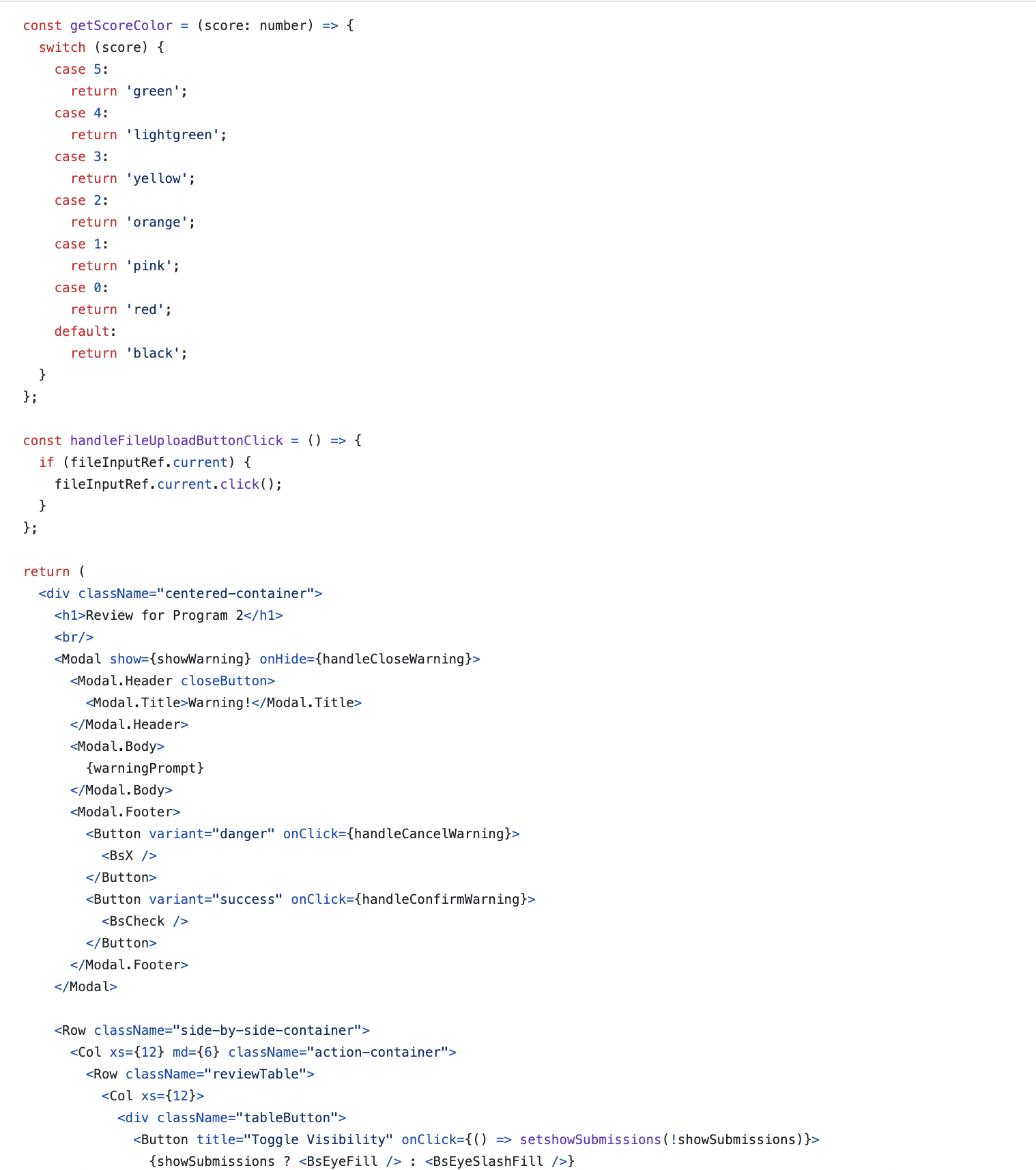
Figure 7: Changes in reviews.tsx
Finally, this image shows how the review table itself is generated. There is a "tableButton" which controls the visibility, and is also used for the sharing/emailing the author buttons. Within the table itself, the modulo operator is used to alternate between the row colors, and the row itself is populated with the score, the colored score circle, the title of the criteria, and a description of the feedback.
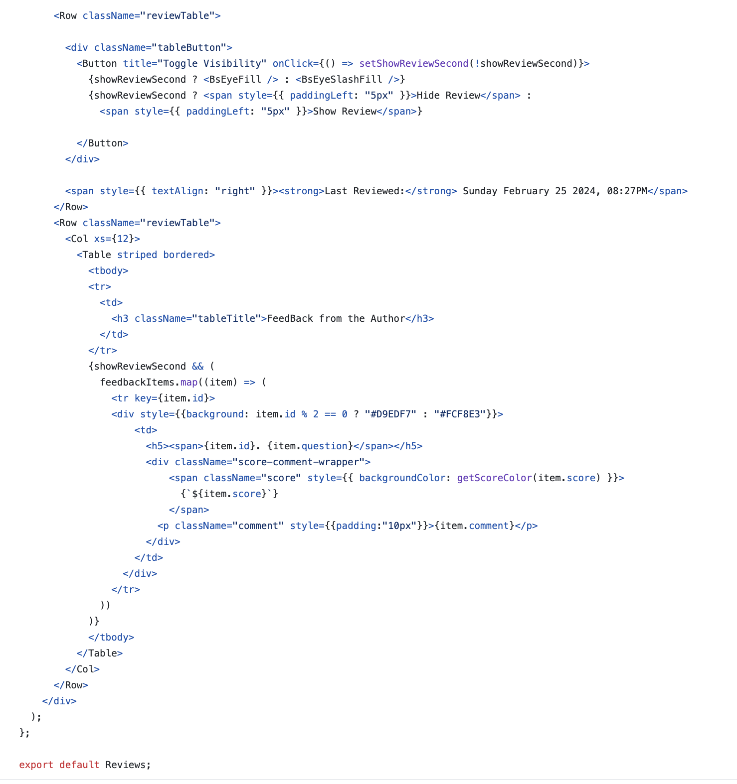
Figure 8: Changes in reviews.tsx
reviewData.ts
This is the transport stream file through which we are reading our reviews in the front-end page. We have seeded the reviews in this page and utilizing the"map" functionality in ReactJS to read the reviews from this file. First in the file, the review data is set to be mapped with a key string, which is the id previously mentioned in reviewSetId. In addition to the review id, each criteria entry is given its own id, which controls what order they are populated in the review table (ascending order by id). Each criteria also has a "question", which is loaded in the sub-header of the row, a "score", which is the score loaded in the score circle, and a "comment", which is the description given below the row sub-header.
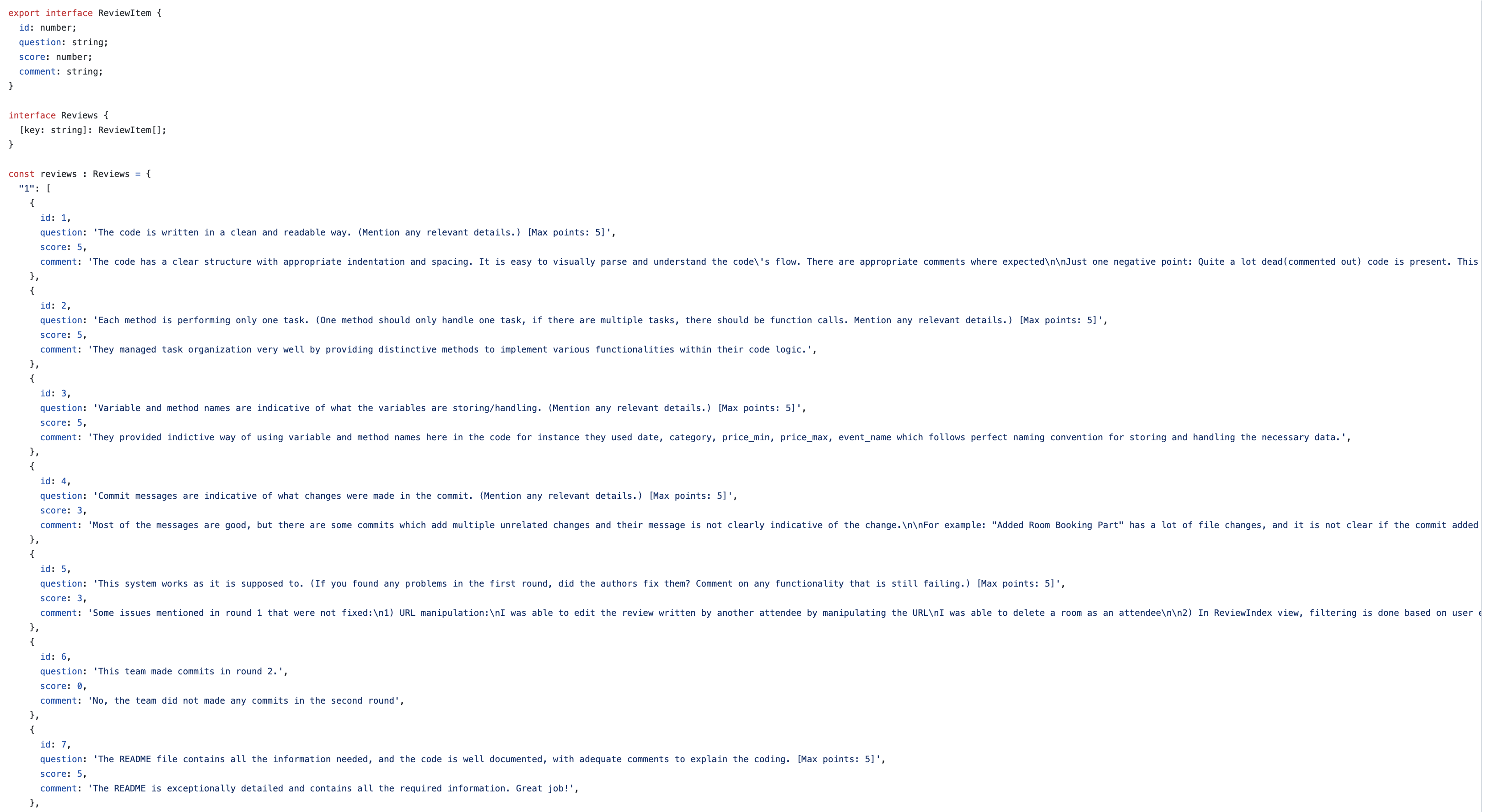
Figure 9: Changes in reviewData.ts
Test Plan
Since the changes revolve around UI implementation, the features need to be manually checked on the web pages.
- Component Rendering: Ensure that all components from the original Ruby frontend are properly re-implemented in React.js and Typescript.
- Styling Consistency: Verify that the new front-end maintains consistent styling with the rest of the application.
- Functionality Testing: Test all interactive elements such as buttons, and input fields to ensure they work as expected.
- Responsive Design: Check the responsiveness of the new front-end on different screen sizes and devices.
- Show "Email Author" Link: Ensure that "Email Author" Link is there in the reimplemented React page so that the Review can be mailed to him/her.
- Seeding the Database Functionality: Ensure that the Reviews are correctly read from a sample Database by seeding it correctly.
- Interface Efficiency: Check if the new frontend enhances interface efficiency by being more intuitive and user-friendly.
The Results of our testing indicate that all of our components work correctly. Particularly, here are the features we have verified the following features:
- The toggle visibility button for the submission table correctly toggles between show and hide, and appropriately makes the table contents visible and invisible.
- The toggle visibility button for the review table correctly toggles between show and hide, and appropriately makes the table contents visible and invisible.
- The email author button correctly navigates the user to the email author page.
- The share review button correctly gives a warning, and will only run the handleShowReview() function if that warning is successfully confirmed.
- The upload file button uploads the selected file and displays it on the file submission table below.
- The trashcan icon next to a link will appropriately delete that link from the list of links, and visually update the table accordingly.
- The trashcan icon next to a file will appropriately delete that file from the list of files, and visually update the table accordingly.
- Our design is user friendly. This is verified by consulting all of the 12 Basic Principles of Graphic Design (https://www.zekagraphic.com/12-principles-of-graphic-design/).
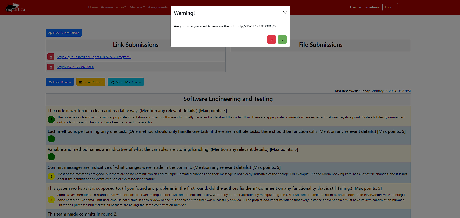
Figure 10: Warning displayed when a user attempts to remove a submitted link
Important Links
- GitHub Repo: https://github.com/gwenmason125/reimplementation-front-end
- Pull Request: https://github.com/expertiza/reimplementation-front-end/pull/51
Demo Video
You can watch this demo video for a detailed demonstration of the changes we made in the UI.
Team
Mentor
- Riya Gori
Members
- Mitesh Agarwal (unityid: magarwa3)
- Shubham Loya (unityid: ssloya)
- Gwen Mason (unityid: cpmason)