CSC/ECE 517 Spring 2024 - E2432. UI for Participants.rb
This wiki page is for the description of changes made under E2432 OSS assignment for Spring 2024, CSC/ECE 517.
Description
The aim of this project was to enhance the user interface (UI) for participants in Expertiza, an online peer review application. Initially, the URL structure was modified to accommodate individual participants associated with specific assignment IDs. Furthermore, the UI underwent significant refinements to align with the underlying data schema, enhancing usability and functionality.
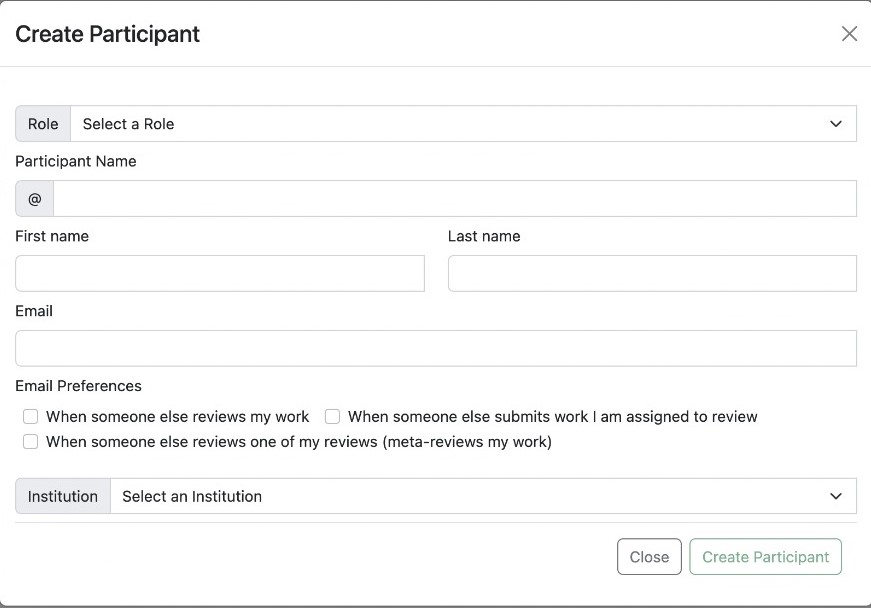
This is the design diagram for the UI implementation:
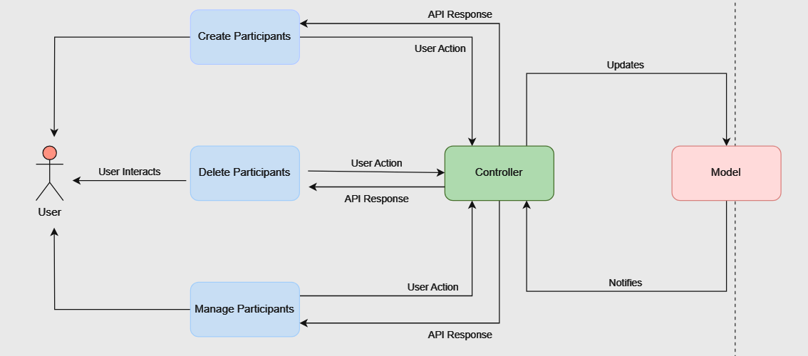
Design
URL Restructuring
Initially, our website's link to access participant information was straightforward /assignments/participants. This link served as a general entry point to view all participants across different assignments. However, as our project progressed, we recognized the need for a more refined system to handle participants associated with specific assignments. To meet this requirement, we revised the link structure to /assignments/{id}/participants, where {id} represents the unique identifier for each assignment. This adjustment enables us to access participant data within a particular assignment directly. By organizing participants in this manner, we enhance the clarity and efficiency of participant management within our application. It serves same for the student tasks as well.
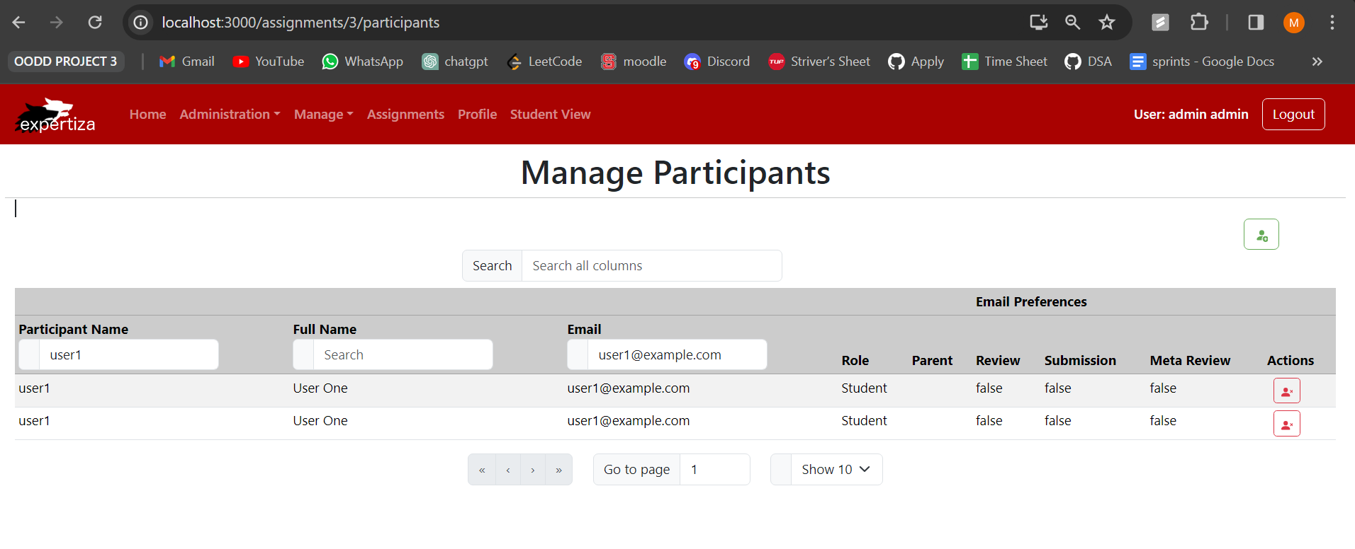
Form Refinement
We noticed a mismatch between the fields in our form and the actual participant model. It turned out that fields like role, email, first name, and last name didn't align with the participant model structure. After examining the participant.rb file, we realized that the participant model was associated with the user model and included an assignment ID.
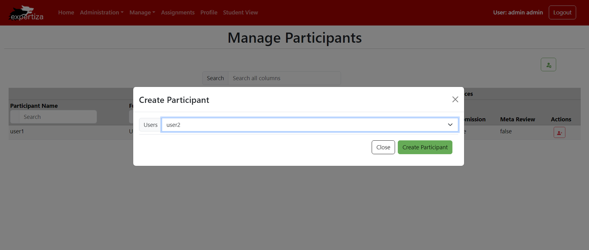
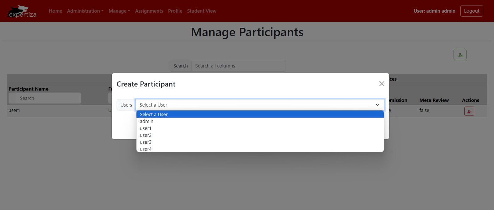
To address the inconsistency, we refined the form by removing unnecessary fields and focusing on essentials. We replaced them with a dropdown menu populated with user options. This menu allows users to select participants for specific tasks and ensures direct association with assignment IDs. This streamlining reduces confusion and aligns participant data seamlessly with the model structure, optimizing the creation process. Users can now efficiently assign participants, enhancing overall system efficiency and accuracy.
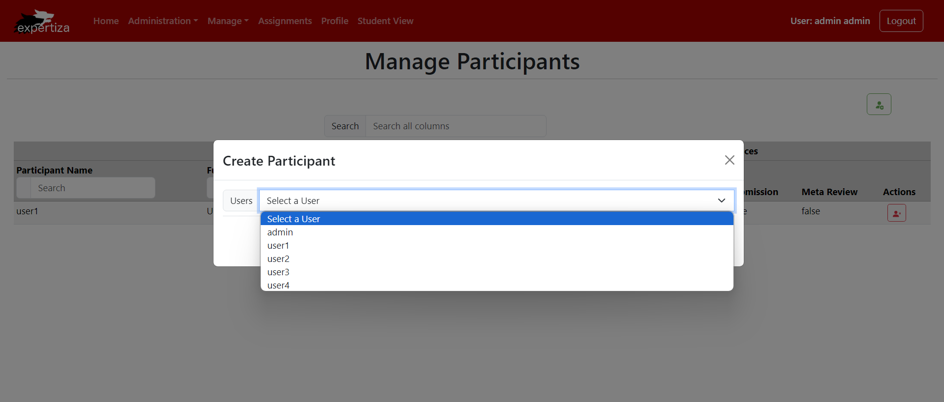
The user dropdown fetches user names from the backend and populates the dropdown menu:
UI Restructuring
We changed how we handle participant creation to better match how modifications are made. Since modifying a participant is essentially like deleting and creating a new one, we removed the edit participant feature from the UI. Instead, we redesigned the UI to focus on a simpler approach to managing participants. This not only makes the system less complex but also makes it easier for users to understand and use. By simplifying the interface, users can navigate and interact with the system more smoothly, resulting in a better overall experience.
Database
For the database, we cloned and set up reimplementation backend by following the instructions given here :Backend Setup Instructions
Components
- interfaces.ts : This file defines TypeScript interfaces for form-related props and fields used in React components, including options for form elements and Formik field props.
- App.tsx : This file defines the main routing structure of the React application, configuring routes and their corresponding components, including authentication, user management, institution management, roles, assignments, participants, courses, and questionnaire sections.
- participantColumns.tsx : This file defines helper functions to create columns for displaying participant data in a table, including features like sorting, filtering, and actions such as editing and deleting participants.
- ParticipantEditor.tsx : This file contains a React component for editing participant information within a modal, including form inputs for name, email, role, institution, and email preferences, with validation and submission handling.
- participantUtil.ts : This file provides utility functions and data transformations for managing participant data, including loading participant information, roles, and institutions, and transforming data for API requests and responses.
- Participant.tsx : This file defines a React component for managing participants, including displaying participant data in a table, with options for editing and deleting participants.
- ParticipantDelete.tsx : This file contains a React component for deleting a participant, presenting a modal to confirm deletion and handling the deletion request via an API call.
Files modified
- src/components/Form/interfaces.ts
- src/App.tsx
- src/pages/Participants/participantUtil.ts
- src/pages/Participants/Participant.tsx
- src/pages/Participants/participantColumns.tsx
- src/pages/Participants/ParticipantEditor.tsx
- src/pages/Participants/ParticipantDelete.tsx
List of changes
1. URL structure updated to /assignments/{id}/participants and /student_tasks/{id}/participants:
Initially, our URL was set as "assignments/participants." However, we updated it to "assignments/{id}/participants" because participants are closely tied to specific assignments. We changed by examining of the participant model, which indicated that participants belong to only users and assignments. As a result, each participant needs to be associated with a unique assignment ID. This adjustment ensures a more accurate representation of participant data within the system.
We refined the participant creation form by removing irrelevant fields like role, email, first name, and last name, aligning it with the participant model and the database schema. Instead, we introduced a user dropdown menu, populated with options retrieved from the backend. This approach ensures direct association between participants and assignment IDs, enhancing efficiency and accuracy in participant assignment
Two interfaces, IParticipantResponse and IParticipantRequest, facilitate communication for user selection. When a user selects a participant from the dropdown, their corresponding details are fetched from the backend. Upon form submission, the system uses the selected user's ID to associate the participant with the chosen assignment. This process simplifies participant management and improves system efficiency.
3. Edit participant functionality removed, as modification now entails deletion and recreation:
We redesigned how participants are created to better align with how modifications are handled. Understanding that editing a participant involves essentially deleting and recreating them, we decided to remove the edit participant feature from the interface. This simplifies the user experience, making it easier for people to navigate and interact with the system seamlessly.
Design Patterns
1. RESTful Design:
RESTful Design is an architectural style that emphasizes client-server communications that are stateless, cacheable, and layered. In the context of web development, it involves structuring URLs in a meaningful and hierarchical manner to reflect the relationships between resources.
By restructuring URLs to include specific identifiers for accessing participant information within assignments, the project adopts RESTful principles, making the application more intuitive and navigable. This method enhances the scalability and maintainability of the web services.
This design choice not only improves clarity for developers and users by making URLs self-descriptive but also facilitates better data management and access patterns within the application, aligning with modern web standards.
2. Strategy Pattern:
The Strategy Pattern involves defining a family of algorithms, encapsulating each one, and making them interchangeable. This pattern lets the algorithm vary independently from clients that use it, promoting flexibility in the application's functionality.
The form refinement in the project, where a dropdown menu is populated with user options based on the context (like the specific assignment), exemplifies the Strategy Pattern. It allows the selection mechanism in forms to adapt dynamically, improving the user interface and experience.
Employing this pattern enables the application to handle varying requirements gracefully, allowing for a modular approach to form configuration and interaction. This adaptability is crucial for applications that require a high degree of customization and flexibility in user input processing.
3. Facade Pattern (Simplified Interface):
The Facade Pattern provides a unified interface to a set of interfaces in a subsystem. It defines a higher-level interface that makes the subsystem easier to use, simplifying complex systems by providing a simple interface.
In the project, simplifying the participant management interface by removing the edit feature and focusing on streamlined participant addition and removal demonstrates the application of a simplified interface, akin to the Facade Pattern. This change reduces complexity for the end-user, making the system more accessible and user-friendly.
This approach enhances the user experience by reducing the cognitive load and making the interaction with the system more intuitive. It reflects a thoughtful consideration of user needs and system design, aiming to make complex processes as straightforward as possible for users.
Testing Details
We tested the pages manually
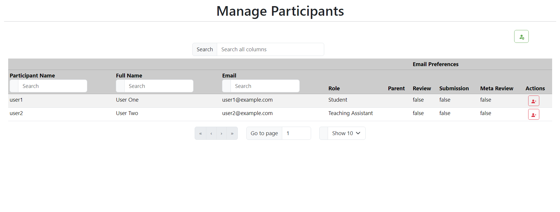
1. Manage Participants
- Verify that the "Manage Participants" page displays correctly with all necessary options (delete, create) for the participants.
- Ensure that participant details are presented in a table format.
2. Add Participant
- Hover over the "Add Participant" icon located at the top right corner to ensure that the "Add Participant" option is visible.
- Click on the "Add Participant" icon and confirm that the create participant popup window appears.
- In the popup window, verify that the user dropdown menu contains all users from the database.
- Test the close button to ensure that the popup window closes without creating a new participant.
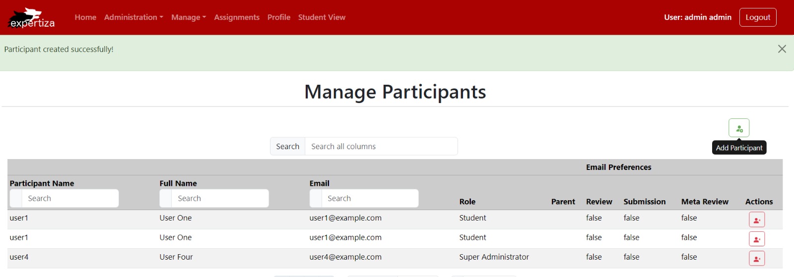
- Verify that the create participant popup window closes after successfully creating a new participant.
- Confirm that the newly created user is populated in the participants table.
Message for successful participant addition:
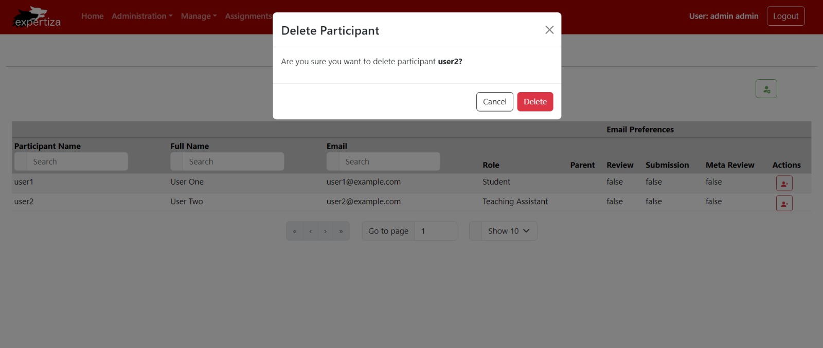
3. Delete Participant
- Hover over the "Delete Participant" icon present in each row of the participant table to ensure its visibility.
- Click on the "Delete Participant" icon to trigger the delete participant popup window.
- Verify that the delete participant popup window prompts confirmation ("Are you sure?").
- Test the cancel button to ensure that it closes the delete participant popup window without performing the deletion.
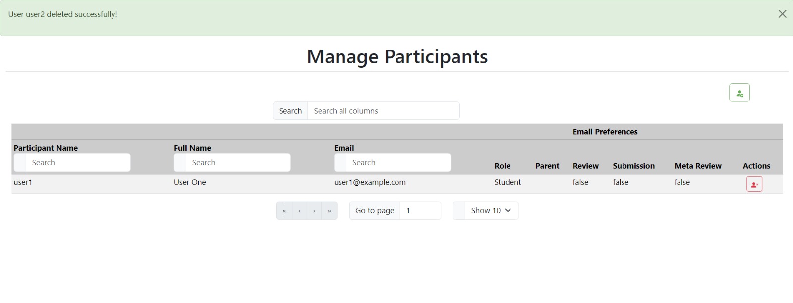
- Click on the delete button within the popup window and confirm that it deletes the participant and closes the popup window.
- Ensure that the deleted user is removed from the participants table upon successful deletion.
Pop Up window for deleting participant:
Message for successful participant deletion:
Relevant Links
GitHub repository: https://github.com/mahathii/reimplementation-front-end
Pull request: https://github.com/expertiza/reimplementation-front-end/pull/39
Team
Mentor
Kalyan Karnati
Student Team
Anish Rao Toorpu (atoorpu@ncsu.edu)
Mahathi Kolishetty (mkolish@ncsu.edu)
Nitya Naga Sai Atluri (natluri@ncsu.edu)
