CSC/ECE 517 Spring 2018- Project E1815: Improvements to review grader
Introduction
This project aims to enhance the review report and summary page, and display more information necessary for grading. The goal is to help the instructors by making the process of grading reviews easier and more accurate.
Problem Statement
Issue 1: Visualization of Metrics in Review Reports
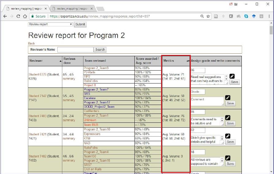
There are some issues with the current review report page with regards to the Metrics column.
- Metrics are displayed as plain text.
- No comparison on how this student compares with other students.
- If more metrics are added, showing multiple lines of text for each metric can make the column cluttered and difficult to read.
Showing a bar chart for the metric rather than just text would improve the user experience. The bar chart can also depict the average for all students for this metric, so the grader can see how this student compares with other students. Also, if several metrics are shown in the column, the bar chart can be made resizable to accommodate multiple bars.
Issue 2: Updating Review Summary view
To view this page you click the summary in the row for any student.
This page summarizes the peer Reviews given to the Author. They are basically separated into three columns i.e reviewee, score and comments.
- The first issue in this view is that there is no header saying what course, assignment, or student this relates to.
- Secondly, The field that lists the team members is wider than the rest of the columns combined. The comments column needs more space it will contain more information
- Finally, For questions answered with check-boxes, comments are not necessary, but still a blank cell is displayed.

Issue 3: Adding color schemes to identify updates to reviews as per submissions
Currently, in review report, each team reviewed is color coded as, red indicating that the review is not yet completed and blue indicating that the review grade is not assigned or updated. So if an instructor sees a name in red, the student should not be given credit for the review. If text is in blue, then the student has not been graded for the review, so the instructor should grade it now. But there is caveat here. If the reviewer has reviewed the work but the author did not resubmit, the reviewer has nothing new to review in the latest round and should not be downgraded for not re-reviewing the work. This issue needs to be addressed.
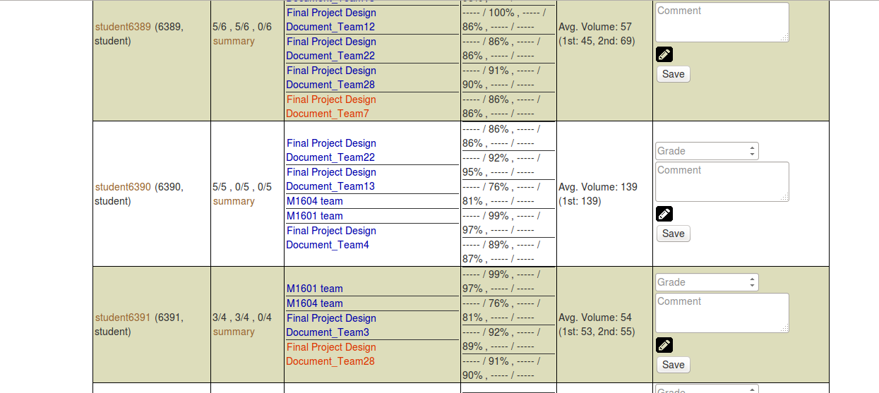
This is what the current color scheme looks like. The text in blue indicates that the student has not been graded, while the text in red indicates the student should not be given credits.
Files Changed
- app/assets/stylesheets/redbox.scss
- app/helpers/review_mapping_helper.rb
- app/views/review_mapping/_review_report.html.erb
- app/views/popup/view_review_scores_popup.html.erb
- config/application.rb
Solutions Implemented
Issue 1: Visualization of Metrics in Review Reports
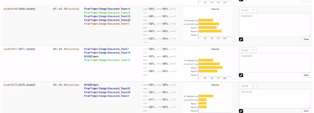
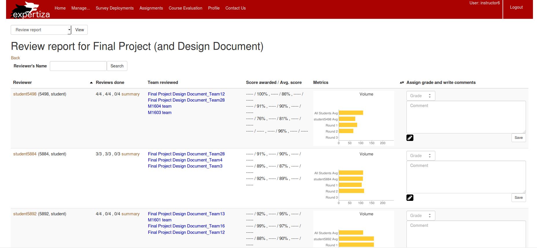
We replaced the text given in the Metrics column with a bar chart, as shown below. The bar chart depicts the overall average of all students for this metric, the average of this student for this metric (based on each round) and the metric values for each round for this student.
Code Changes
- File: app/helpers/review_mapping_helper.rb
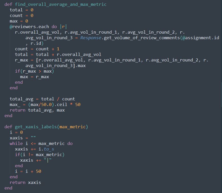
The following methods were added to calculate average for this metric for all students and for calculating maximum value for this metric. The maximum is needed for constructing bar chart. The second method was added to construct the x-axis labels in the format "0|50|100|...|max" for the bar chart.
- File: app/helpers/review_mapping_helper.rb
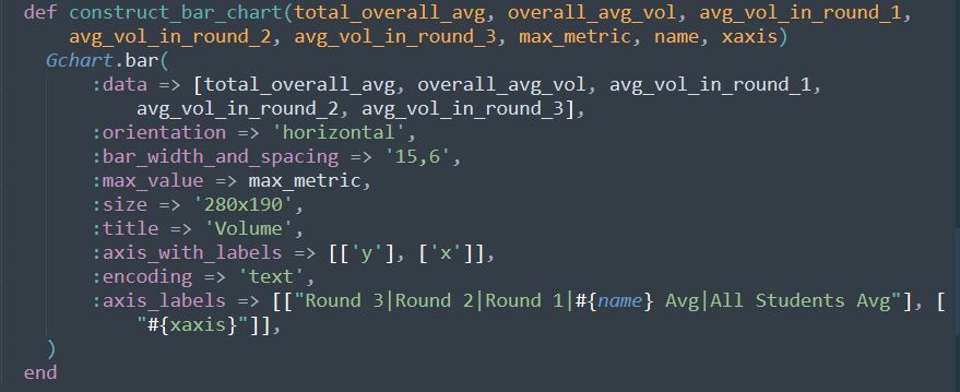
The following method constructs the bar chart.
- File: app/views/review_mapping/_review_report.html.erb
The following code is added to get the average metric, maximum value of metric and x-axis value from controller.

- File: app/views/review_mapping/_review_report.html.erb
The following code includes the bar chart in the review report page.

Screenshots
Issue 2: Updating Review Summary view
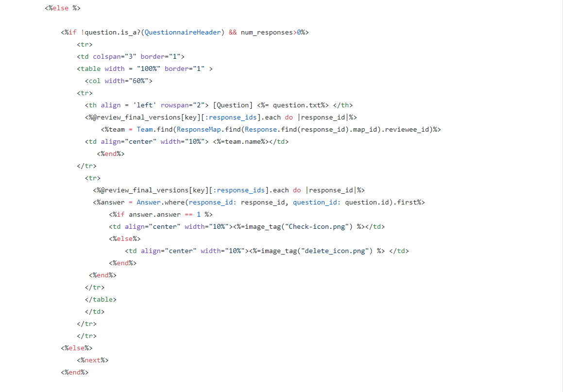
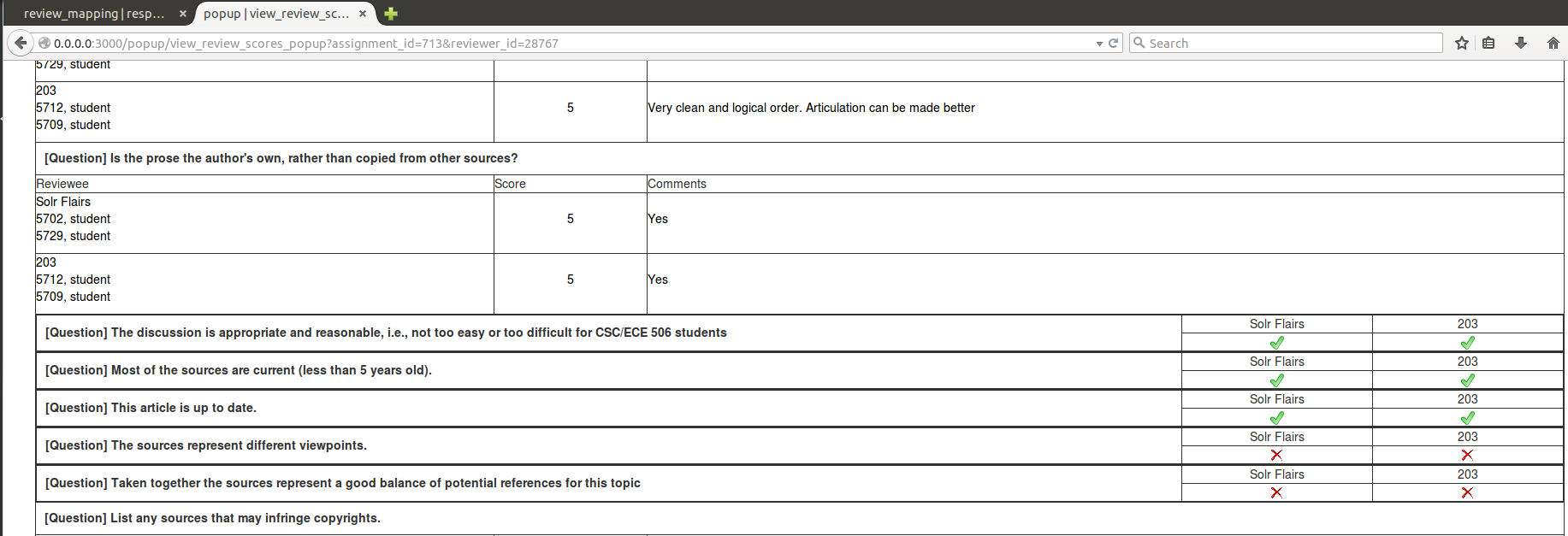
We have spanned the question text to all three columns instead of it being one, also the width of the first column containing the reviewee information is reduced appropriately. Checkbox Questions are displayed more compactly by including Question to the left and automatically adjusting the width of the reviews to right. A green tick is added if the reviewer selected the checkbox and a red cross mark is added if the reviewer did not select the checkbox.
The file modified is app/views/popup/view_review_scores_popup.html.erb
In the code, we identified whether a question is Checkbox question or not and changed the row to include the question on the left and auto adjusting the response from the reviewer's on right.
The page looks as follows
Issue 3
To address the caveat mentioned above, we have used green color to distinguish reviewers who have nothing new to review as the authors have not made any changes. This is what the end result looks like,
For doing this, we are getting the last modified date/time of the wiki links and comparing it with the last review submission deadline. If the last modified date/time of the wiki links is before the last review submission deadline, there is nothing new to review and hence green should be used instead of blue to display the author's name. To ensure this check we have added the is_submission_updated_for_last_round function to the /app/helpers/review_mapping_helper.rb,
   last_round = 0
   assignment_deadlines = DueDate.where(parent_id: response_map.reviewed_object_id)
   number_of_assignemnt_rounds = @assignment.num_review_rounds
   current_time = Time.new
   r = number_of_assignemnt_rounds..1
   due_time = DueDate.new
   (r.first).downto(r.last).each do |round|
     due_time = assignment_deadlines.where(round: round, deadline_type_id: 1).try(:first).try(:due_at)
     if(current_time > due_time)
       last_round = round
       break
     end
   end
   if(last_round > 1)
     previous_round = last_round-1
     prev_due_time=assignment_deadlines.where(round: previous_round, deadline_type_id: 1).try(:first).try(:due_at)
     team = Team.find(response_map.reviewee_id)
     hyperlinks_count = team.hyperlinks.size
     testable_links_count = 0
     if !team.hyperlinks.empty?
       #flag is false when none of the wiki links are updated
       flag = false
       team.hyperlinks.each do |link|
         if ((link.include? "wiki") && !flag)
           testable_links_count = testable_links_count + 1
           last_modified = open(link) do |f|
             if(!(f.last_modified < prev_due_time))
               flag= true
               break
           end
         end
       end
     end
     end
     if(flag == false && hyperlinks_count == testable_links_count)
       return false
     else
       return true
     end
   else
     return true
   end
 end
Test Plan
Issue 1: Visualization of Metrics in Review Reports
1) Log in as an instructor
2) Navigate to review grader by doing this (Manage > Assignments)
3) Click on the “View review report” icon (the one with the spyglass and two people)
4) Check if the visualizations are appearing in the review report.
Issue 2: Updates and Review Summary View
1) Log in as an instructor
2) Navigate to review grader by doing this (Manage > Assignments)
3) Click on the “View review report” icon (the one with the spyglass and two people)
4) In the review report click on the “summary” in the row for any student.
5) Check if the changes are appearing in the page as mentioned in the proposed solution.
Issue 3: Adding Color Schemes to Identify Updates to Review As Per Submission
1) Log in as an instructor
2) Navigate to review grader by doing this (Manage > Assignments)
3) Click on the “View review report” icon (the one with the spyglass and two people)
Screencast
References
Expertiza
Expertiza Github
Expertiza Documentation
