CSC/ECE 517 Fall 2024 - E2493. UI for Assign Reviewers
Introduction
Expertiza is an open-source learning management system developed with Ruby on Rails, designed to enhance interactive and collaborative learning. Unlike traditional LMS platforms, it prioritizes peer reviews and team-based assignments, enabling students to exchange detailed feedback within and across groups. This approach fosters critical thinking and reflective learning by encouraging engagement with diverse perspectives, allowing students to refine their work through constructive input. The platform also supports course and assignment management, giving instructors the flexibility to create real-world projects that go beyond typical assessments. Its grading tools, often featuring rubrics, ensure transparent evaluation while providing personalized feedback. As an open-source system, Expertiza is highly customizable, allowing institutions to tailor its features and integrate seamlessly with other tools. By promoting teamwork and peer interaction, Expertiza equips students with essential collaborative skills for professional environments, making it an indispensable tool in modern education.
Problem Statement
Project Overview
The "Assign Reviewers" UI project is aimed at developing a user interface to assign reviewers to assignments within the Expertiza platform. The new UI will focus on presenting the reviewers and contributors in a structured table layout, with the ability to manage reviewer assignments (e.g., unsubmit, delete). This interface will help streamline the process of assigning reviewers, making it easier for instructors to manage review assignments for contributors.
Functional Requirements
UI Layout
The table will consist of three main columns:
           Topic Selected: Display the title of the assignment or topic.
           Contributor: Show the name of the contributor who submitted the assignment.
           Reviewed By: Display the list of assigned reviewers.
Action buttons for each reviewer will be displayed in the "Reviewed By" column. These will include:
           Unsubmit: Allow the instructor to unassign a reviewer from a particular assignment.
           Delete: Allow the instructor to remove a reviewer from the assignment entirely.
Exclusion of Meta Reviewer Options
The UI will exclude any options related to meta reviewers. This is to keep the focus on core reviewer functionalities.
Interactivity
The "Unsubmit" and "Delete" buttons will trigger actions, which will interact with the backend to update the assignment status. Hover or clickable rows will show tooltips for better clarity on available actions.
Display Logic
Each assignment may have multiple reviewers, which will be displayed in the "Reviewed By" column. If no reviewers are assigned, the UI will indicate that no reviewers are present. The "Reviewed By" column should allow dynamic updates based on the changes made by the instructor.
Excluding Meta Reviewer
Meta reviewer options will be excluded from this UI to focus on the primary reviewer functions.
Technologies
- Frontend: React, TypeScript
- State Management: React's useState and useMemo, Context API for centralized data handling
- Styling: CSS (for responsive and accessible design), AssignReviewerStyle.css
Technical Design
Frontend (React & TypeScript)
Component Structure
Main Table Component: This component will render the table structure, which includes all three columns: Topic Selected, Contributor, and Reviewed By.
Reviewer Row Component: A row within the table for each reviewer, displaying the reviewer's name and action buttons (Unsubmit/Delete).
Action Buttons: Each action button will trigger a specific function for managing reviewer assignments.
State Management
State management in this application uses React's state and Context API (or other suitable solutions) to efficiently handle and centralize data for each row representing assignments and reviewers. This setup enables consistent data sharing across components, reducing redundancy and simplifying data flow. API calls to the backend retrieve data on assignments and reviewers, ensuring the application remains up-to-date with real-time information. By managing state in a centralized way, it allows for dynamic interactions, streamlined updates, and an overall smoother user experience across the interface.
Styling
For styling, use CSS or a CSS-in-JS solution like styled-components to create a visually appealing and functional table layout, along with styled action buttons. Ensure the design is responsive, adapting seamlessly to both desktop and mobile screens, to provide an optimal user experience across devices.
Design Principles
Design Principles for Assign Reviewers UI
1. Single Responsibility Principle (SRP) Each React component in the UI will have a clearly defined responsibility, focusing on a single aspect of functionality or presentation.
Main Table Component: Responsible for rendering the table layout with columns for "Topic Selected," "Contributor," and "Reviewed By." Reviewer Row Component: Focused on displaying reviewer details and managing actions like "Unsubmit" and "Delete." Action Buttons Component: Encapsulates specific functionalities for individual actions (e.g., handling clicks for "Unsubmit" or "Delete"). By adhering to SRP, the components will be easier to understand, maintain, and test.
2. Open/Closed Principle (OCP) The UI and its components will be designed to be open for extension but closed for modification.
The AssignmentsTable component can accommodate additional columns or features (e.g., new reviewer actions) by extending the functionality without altering its core logic. New action buttons or features can be added as independent components, seamlessly integrating into the existing design without modifying other parts of the codebase. This principle ensures future enhancements do not disrupt the stability of the current implementation.
3. DRY Principle (Don’t Repeat Yourself) Code duplication will be minimized by reusing components and centralizing logic.
Reusable Components: Components like ActionButton and ReviewerRow will be created to handle repetitive UI elements and logic. Shared State Management: React’s Context API or a similar state management library will centralize shared data, reducing redundant state handling across components. Utility Functions: Common logic for tasks like API interactions or data formatting will be encapsulated in reusable utility functions. By adhering to the DRY principle, the codebase will remain clean, consistent, and easier to maintain.
4. Separation of Concerns (SoC) The project will separate concerns across different layers to maintain a clear structure:
Frontend Components: Handle the presentation and user interaction logic. State Management: Manages the application state centrally to keep components stateless wherever possible. Backend Interactions: Isolate API call logic into service functions or hooks for better reusability and testability. This separation ensures modularity, making the system easier to debug and extend.
5. Accessibility and Responsiveness The UI will prioritize accessibility and adapt to various devices.
Ensure components use semantic HTML elements for better screen reader support. Implement responsive design principles to provide an optimal experience on both desktop and mobile devices. Use ARIA roles for enhanced accessibility of dynamic components like buttons and tables.
6. Consistency and Scalability A consistent design system will be maintained for styling and interactions:
Use CSS modules, styled-components, or a design system (e.g., Material-UI) for a unified appearance. Keep naming conventions for CSS classes and component props standardized for better readability. This consistency will make it easier to scale the project with additional features or contributors.
User Stories
As an instructor, I want to see a list of contributors and the reviewers assigned to them, so that I can manage the assignment of reviewers. As an instructor, I want to be able to unsubmit a reviewer, so that they are no longer responsible for reviewing a specific assignment. As an instructor, I want to delete a reviewer, so that I can remove them completely from the review process for a particular assignment. As a contributor, I want to see the status of my assignment and who is reviewing it.
Use Case Diagram
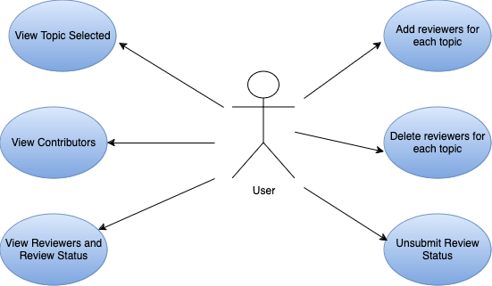
The central user interacts with various use cases, which are represented by blue ovals surrounding the user. These use cases include:
- View Topic Selected: Allows the user to view the chosen topic for review.
- View Contributors: Enables the user to see a list of contributors.
- View Reviewers and Review Status: Lets the user view assigned reviewers and their review status.
- Add Reviewers for Each Topic: Provides functionality to add reviewers for specific topics.
- Delete Reviewers for Each Topic: Allows deletion of assigned reviewers per topic.
- Unsubmit Review Status: Enables the user to unsubmit a review status if needed.
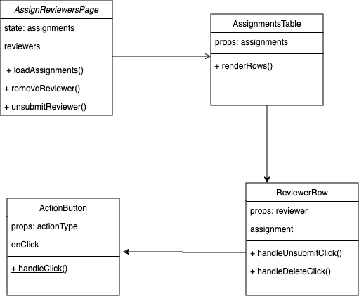
Class Diagram
The Class Diagram for the frontend UI of the "Assign Reviewers" functionality defines the key React components and their responsibilities. At the top level, the AssignReviewersPage component manages the overall state, holding data for both the assignments and the reviewers. It passes this data down to child components, including the AssignmentsTable, which renders the assignments as rows, each represented by a ReviewerRow component. Each reviewer row displays the reviewer's details and includes action buttons for "Unsubmit" and "Delete." The ActionButton component, which is embedded within each row, handles the user interaction by triggering the appropriate method (either unsubmit or delete). The methods within ReviewerRow, such as handleUnsubmitClick and handleDeleteClick, interact with the parent component’s state to update the reviewer status or remove a reviewer. These components work together in a modular way, ensuring that the state is managed effectively while keeping the UI interactive and dynamic. The class diagram represents how data flows from the parent to the child components and how user actions result in state updates, which are reflected in the re-rendered UI.
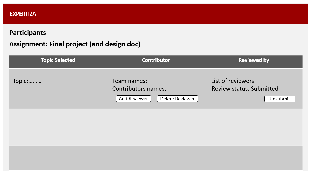
Originally planned view of table
The table is divided into columns labeled "Topic Selected," "Contributor," and "Reviewed by." Each row displays details such as the topic, team names, contributor names, and review statuses. Buttons like "Add Reviewer," "Delete Reviewer," "Unsubmit," and "Delete Review" allow users to manage reviewers and their submissions for the assignment. This layout facilitates easy organization and control of participants' review statuses.
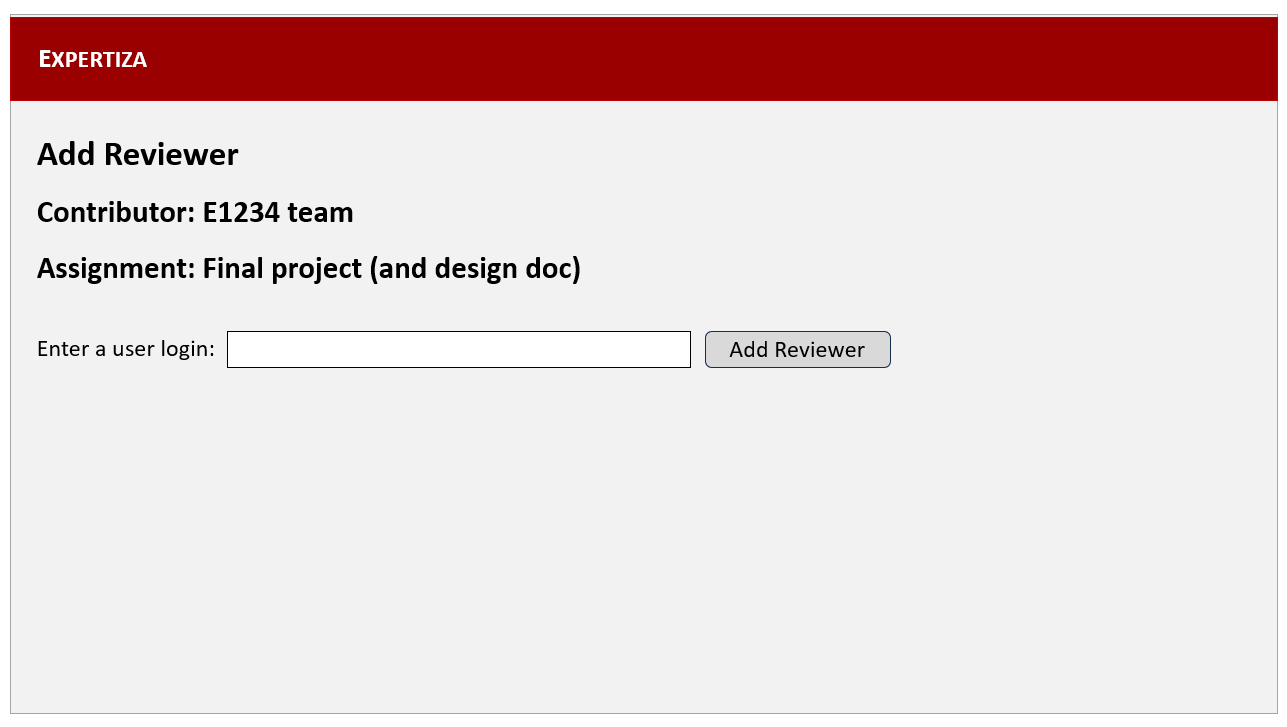
The UI below shows an "Add Reviewer" interface in the Expertiza platform, where a user can assign reviewers to a specific project. The interface displays the contributor's team name (e.g., "E1234 team") and the assignment title ("Final project (and design doc)"). Below, there is an input field labeled "Enter a user login:" where the user can type in the login ID of the reviewer they wish to add. A button labeled "Add Reviewer" is provided to submit the entry and assign the reviewer to the project.
UI Implementation
The UI has been updated to match the rest of the Expertiza APP
Overall view
The enhanced feature in Expertiza is designed to simplify the process of assigning reviewers to project submissions, providing a clear, functional, and user-friendly interface. This improvement addresses the needs of administrators managing peer reviews, offering tools for efficient reviewer assignment, tracking progress, and maintaining transparency in the workflow.
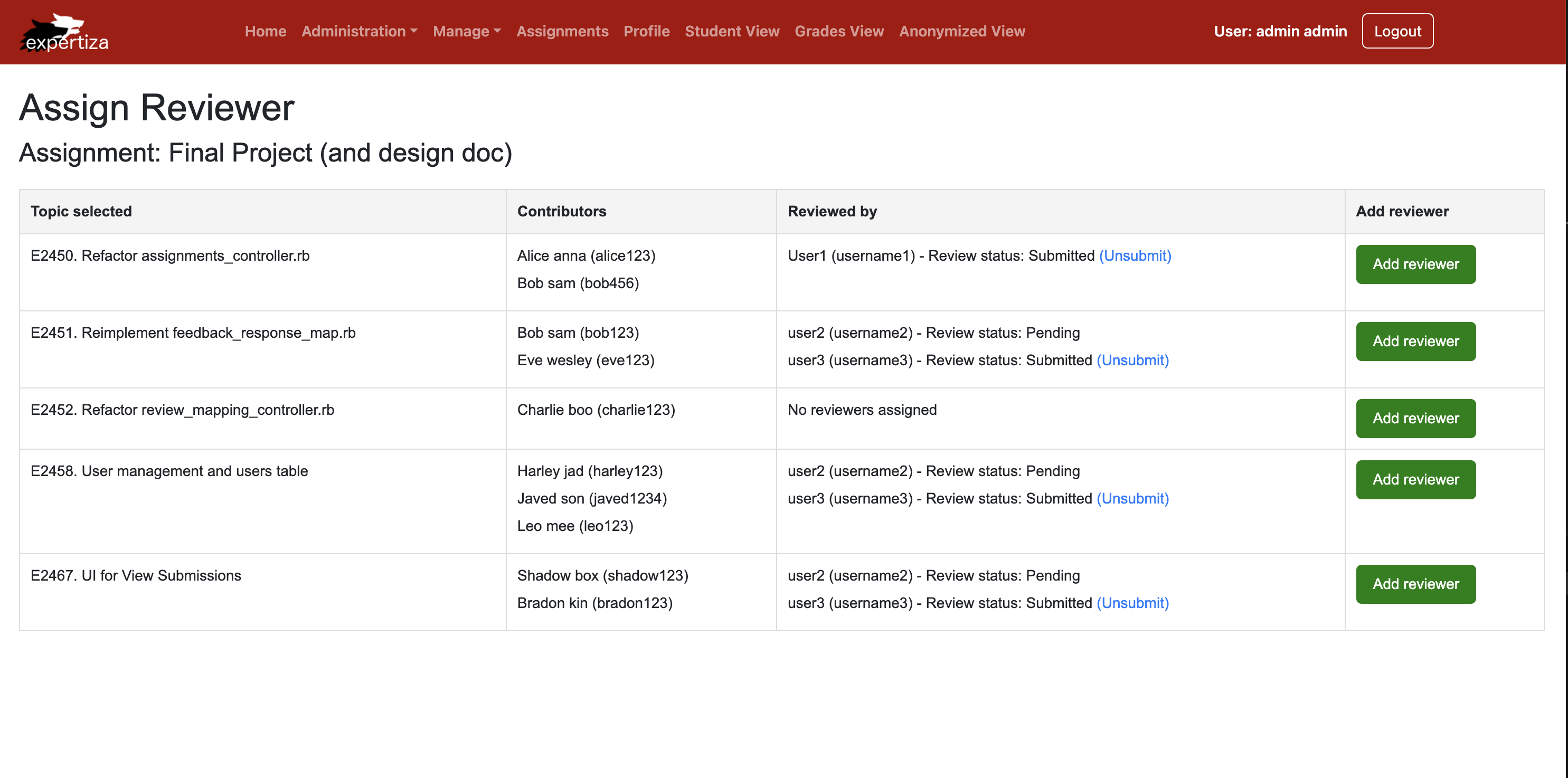
Review Status Tracking
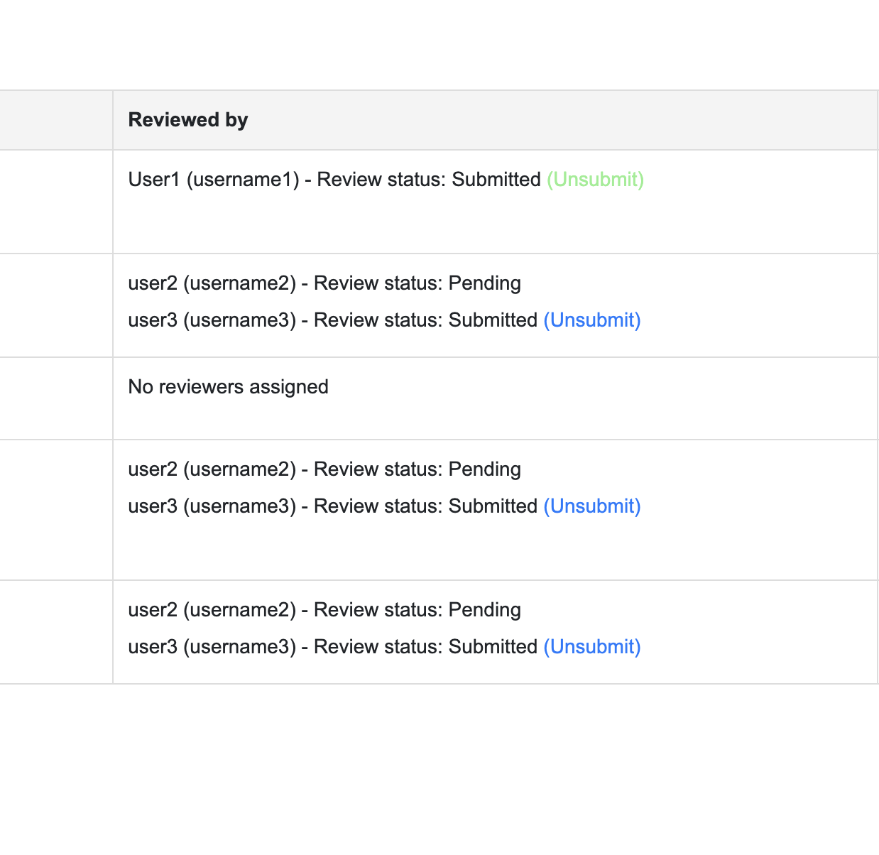
Review Status Tracking
The interface displays the current status of reviews for each project, categorized as either:
   Pending: Reviews that have not yet been completed or submitted.
   Submitted: Reviews that are finalized and available for review by administrators.
It also includes an option to unsubmit reviews, ensuring flexibility and transparency in the peer-review process. When hover over "Unsubmit" link, the color changes to green indicating that it is clickable and interactive.
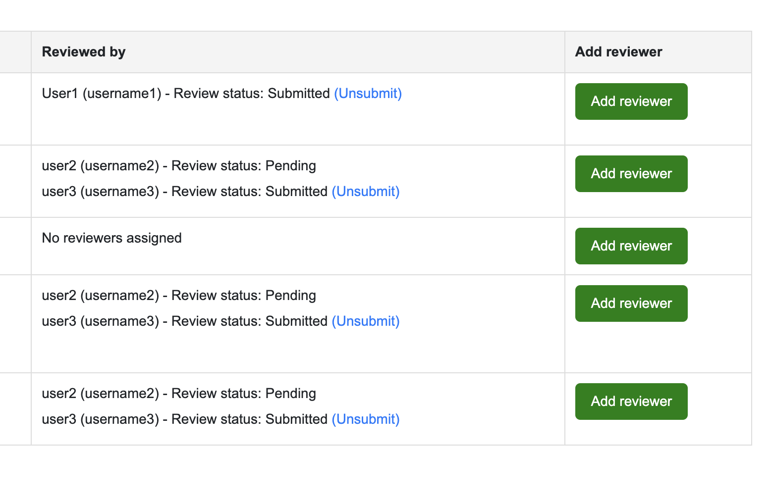
Reviewer Management
Admins can track review statuses and assign new reviewers. It provides a clear interface to manage peer reviews effectively, ensuring smooth collaboration. When hover over "Add reviewer" button, the color changes to blue. Administrators have the capability to:
   Assign new reviewers to projects by entering their details directly into the system.
   Manage existing assignments, including updating or removing reviewers as needed.
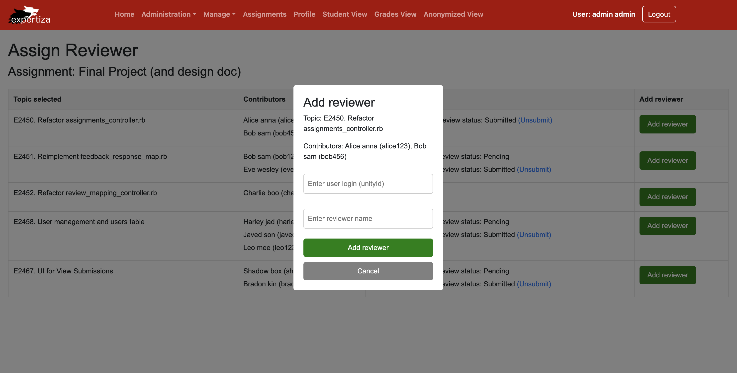
Add Reviewer
Administrators can efficiently assign reviewers to submissions through a clear and user-friendly interface:
Add Reviewer Button: This feature simplifies the process of adding reviewers. Administrators can input the necessary user details and assign them to specific projects or topics.
Code Snippets
Interfaces for Data Representation
Reviewer and IContributor Interfaces
These interfaces are used to define and manage data related to reviewers and contributors. Reviewer Interface: Represents individual reviewers, including details such as name, username, and review status. IContributor Interface: Represents contributors, detailing their identity and role in the project submission process.
RowData Interface
Combines multiple aspects of a topic into a single, structured data model. Components:
 Topic Details: The main subject under review.
 Contributor Information: Names and usernames of contributors involved.
 Reviewer Information: Assigned reviewers along with their current review status.
This unified data model ensures seamless integration of topics, contributors, and reviewers for efficient management.

Core Functions for Reviewer Management
handleAddReviewer Function
Purpose: Adds a new reviewer to a specific topic in the table’s data. Process: Iterates through the table rows to find the row matching the selected topic. Appends a new reviewer object (with a "Pending" status) to the reviewers array for that topic. Closes the modal to confirm the operation visually.
This function ensures the data is updated dynamically while maintaining the integrity of other rows.
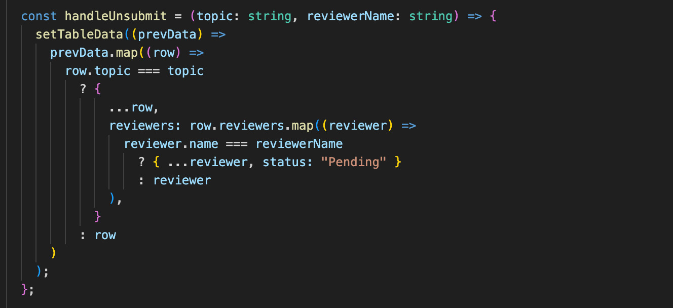
handleUnsubmit Function
Purpose: Updates the review status of a specific reviewer to "Pending" for a selected topic. Process: Identifies the row corresponding to the selected topic. Locates the specific reviewer by their name and updates their review status. Preserves the state of other rows and reviewers.
This ensures flexibility and allows administrators to reset reviews when needed.
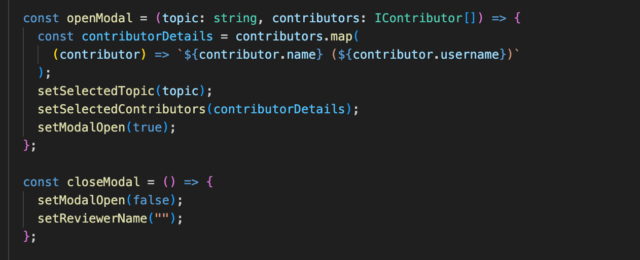
openModal and closeModal Functions
openModal: Prepares and displays the modal for assigning or managing reviewers. Sets the selected topic. Formats contributor details into strings (e.g., name and username) for display. Opens the modal by updating the setModalOpen state to true.
closeModal: Closes the modal and resets any temporary fields (e.g., reviewer name).
Together, these functions create a seamless user experience for modal interactions.

Data Structure for Review Management
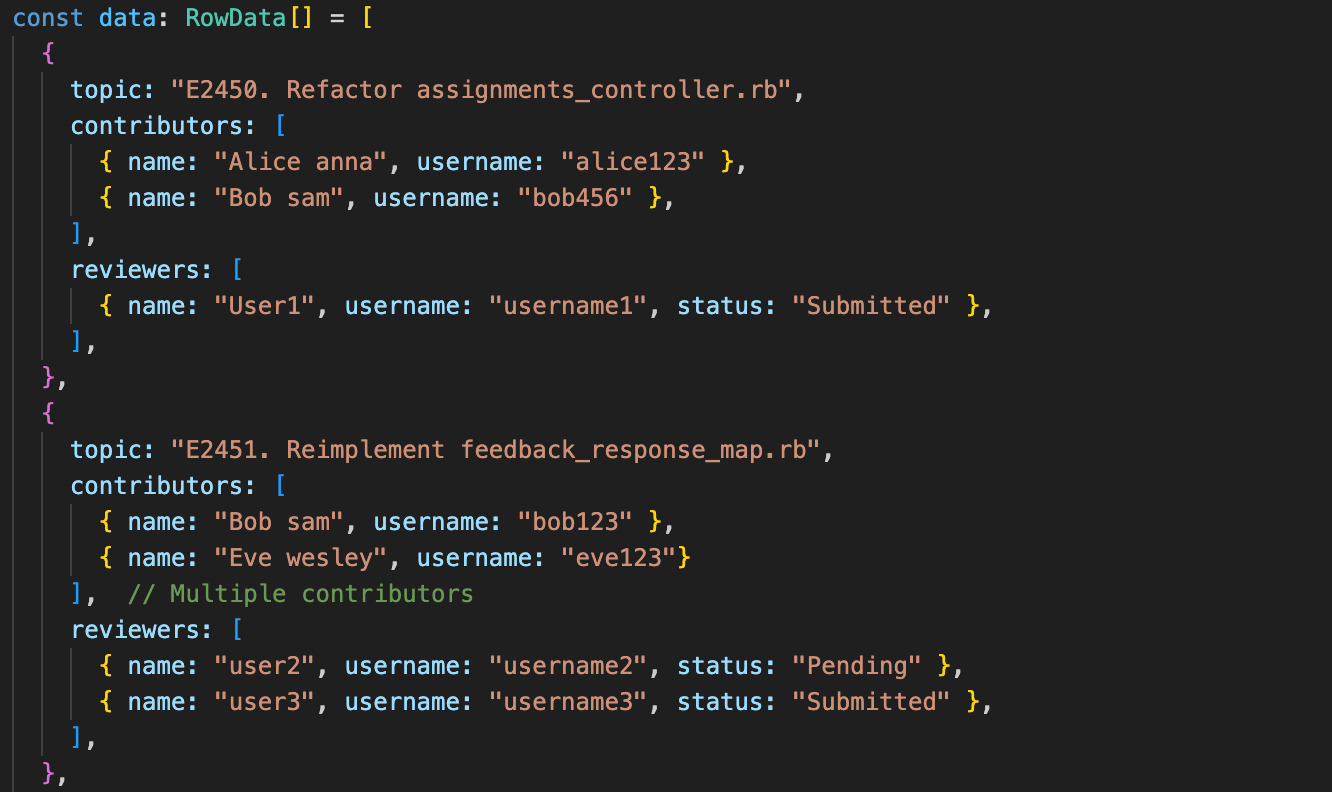
Each topic in the system contains:
Contributor Details: Includes the name and username of contributors. Reviewer Details: Includes the name, username, and current review status of assigned reviewers.
This structured dataset ensures clarity, allowing for organized review tracking and assignment.
CSS Styles for Buttons and Links
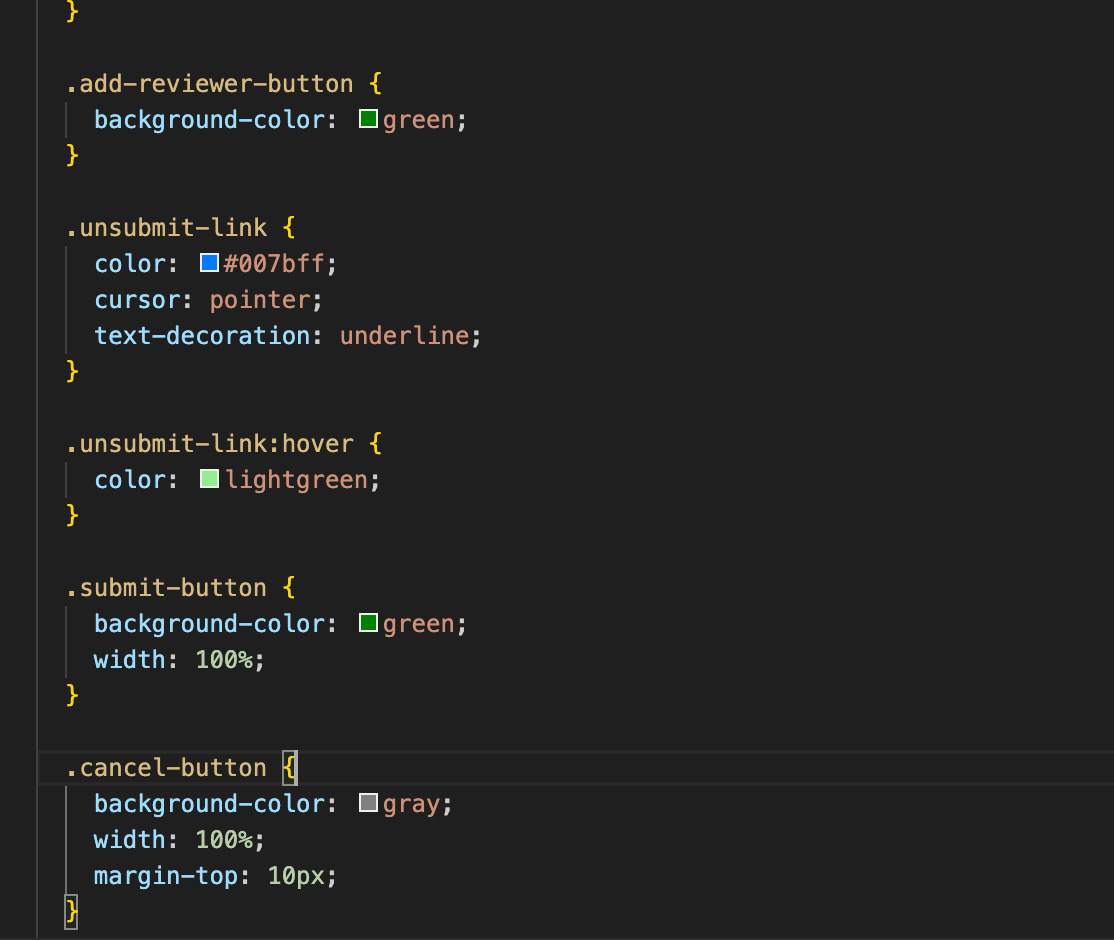
Interactive Elements
Add Reviewer Button: Styled with colors and hover effects for clear visibility and actionability. Unsubmit Link: Changes to light green on hover, indicating interactivity. Submit and Cancel Buttons: Styled for consistent appearance with distinct colors and layout.
Layout and Presentation
Specifies properties such as width, margin, and alignment for a cohesive design. Ensures all buttons and links are easily accessible and visually distinct.
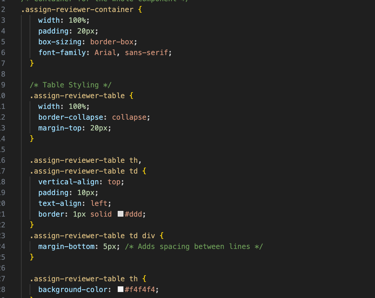
CSS Styles for the Review Assignment Component
Component Styling
Container (.assign-reviewer-container): Provides padding, borders, and background color for a well-structured layout. Table (.assign-reviewer-table): Styled for readability and clarity with defined spacing, borders, and alignment.
Table-Specific Styling
Headers and cells have distinct styles to differentiate them visually. Ensures that elements are spaced appropriately, contributing to an organized presentation.
List of files added/updated
1. Frontend Component Files
- `src/pages/Assignments/AssignReviewer.tsx`: Implements the main UI for assigning reviewers.
- `src/pages/Assignments/AssignReviewerStyle.css`: Defines the CSS styles for the `AssignReviewer` component.
- `src/pages/Assignments/AssignmentEditor.tsx`: Adds navigation for the `AssignReviewer` page.
2. Core Functionalities
Reviewer Management Functions:
- `handleAddReviewer`
- `handleUnsubmit`
- `openModal`
- `closeModal`
Table Structure:
- Dynamic rows for reviewers and contributors.
3. UI Enhancements
- Modal for Adding Reviewers: Provides a user interface for adding reviewers to assignments.
- Interactive Elements: Managing reviewer assignments (e.g., "Add Reviewer," "Unsubmit").
- Table Structure: Displays topics, contributors, and reviewers.
Test plan
Manual Testing
Manual testing ensures the functionality and usability of the "Participants" and "Add Reviewer" pages in the Expertiza platform. It focuses on verifying seamless navigation between pages, accurate rendering of the table layout, and proper functioning of action buttons like "Add Reviewer," "Delete Reviewer," and "Unsubmit." Validation checks will handle empty, invalid, or duplicate inputs effectively, with clear error messages. Testing also ensures that actions like adding, deleting, or updating reviewers dynamically reflect in the interface. Additionally, the plan emphasizes responsiveness across devices and browsers, data consistency, and smooth navigation, ensuring a robust, user-friendly experience for managing reviewers.
Automatic Testing
Initially, testing was excluded from the project’s scope, as the focus was on frontend development. However, ensuring the functionality and user experience of the "Participants" interface is critical. Manual testing procedures will be employed to validate the proper operation of the UI components shown in the screenshot. These procedures include:
- Verifying that the "Add Reviewer" and "Delete Reviewer" buttons function correctly, dynamically updating the interface without errors.
- Testing the "Unsubmit" button to ensure it appropriately changes the review status in real-time.
- Confirming that all table columns—"Topic Selected," "Contributor," and "Reviewed By"—render accurate and consistent data for each assignment.
- Validating that any changes made to reviewers (adding, deleting, or unassigning) are reflected correctly in the UI.
Demo Video
You can watch this demo video for a detailed demonstration of the changes we made in the UI.
Pull Request
Check out the pull request for a detailed changes we made in the UI.
Conclusion
In conclusion, this design document provides a comprehensive plan for developing an improved UI for assigning reviewers in Expertiza. By leveraging React and TypeScript for the frontend, the solution aims to deliver a smooth and intuitive experience, enabling instructors to manage reviewer assignments efficiently. The use of modern technologies ensures high performance, scalability, and maintainable code. This approach also prioritizes data integrity and security, safeguarding the accuracy of assignment data while fostering a user-centric, responsive design that enhances usability across various devices.
Future Scope
- Enhanced Assignment Management: Improve assignment editing capabilities by adding features like due date modification and participant management.
- Comprehensive Questionnaire Support: Create intuitive pages for designing, updating, and interacting with questionnaires.
- Automated Reviewer Assignment: Introduce dynamic reviewer assignment based on expertise, workload, or predefined criteria.
- Account Request Module: Develop a streamlined module for handling and approving account requests efficiently.
- Performance and Accessibility Enhancements: Optimize loading times and ensure a responsive design across all devices for a seamless user experience.
Project Mentor
Anvitha Reddy Gutha (agutha@ncsu.edu)
Team Members
- Vishal Reddy Devireddy (unityid: vdevire2, github: vishalreddy2323)
- Madhumitha Aravelli (unityid: maravel, github: madhumithaaravelli)
- Mona Sree Muppala (unityid: mmuppal, github: Monasree)