CSC/ECE 517 Fall 2024 - E2461. UI for Courses
Expertiza
Expertiza is an open-source learning management system built on the Ruby on Rails framework. It supports a wide range of educational functions, including managing assignments, courses, teams, and tests. One of its standout features is a comprehensive peer review system that enables collaboration and feedback within groups. This project focuses specifically on redesigning the Courses Management UI using React and TypeScript to enhance usability and functionality for administrators. The primary goal is to provide a robust, user-friendly interface for managing courses, instructors, and TAs, building upon and refining previous implementations to ensure a seamless experience.
Design Goals
The Courses page in this project is designed to provide an interactive and intuitive interface for managing course-related information. The main objectives focus on usability, responsiveness, and performance optimization, ensuring that administrators can efficiently manage course details, such as course title, institution name, creation and update dates, and perform essential actions like editing, deleting, adding TAs, and duplicating courses. Detailed goals are as follows:
- Intuitive Course Management: Establish a user-friendly interface that streamlines course management, allowing administrators to navigate and perform actions efficiently. The design prioritizes clarity and ease of use to facilitate straightforward interactions with course-related data.
- Responsive Design: Ensure the interface adapts seamlessly across devices, offering a consistent and optimized user experience on desktops, tablets, and mobile devices. This responsiveness enhances accessibility and usability for administrators on the go.
- Performance Optimization: Refactor code for better efficiency, resulting in faster load times and smoother interactions. By minimizing redundant code and optimizing data handling, the interface delivers a quick and responsive experience.
- Role-Based Display and Interactivity: Implement role-based visibility and functionality, where specific features like the instructor column and TA management are accessible only to authorized users (e.g., admins and superadmins). This targeted accessibility improves security and user experience.
- Enhanced Search Functionality: Include a robust search capability for various columns, such as instructor, creation date, and update date, allowing users to filter and locate courses swiftly. This feature simplifies navigation in large datasets.
- Clear and Consistent User Feedback: Integrate hover effects and tooltips for action icons (e.g., Edit, Delete, Assign TA, Copy Course) to provide visual cues, improving usability and enhancing user interaction feedback.
- Comprehensive Documentation: Maintain clear and detailed inline code comments and external documentation to support ongoing and future development. This ensures that the codebase remains accessible and easy to understand for both current and future developers.
Through these design goals, we aim to deliver a robust and user-centered solution that enhances the functionality and manageability of course information within the Expertiza system. The project leverages ReactJS and TypeScript to achieve these objectives, ensuring a modern, responsive, and optimized interface.
Design
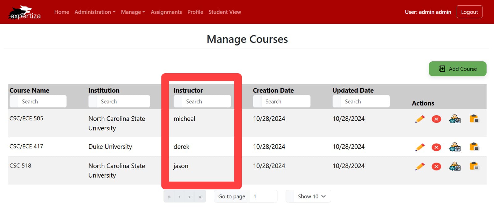
Instructor Column Addition
We have introduced an Instructor column to provide clarity on who is responsible for each course, which was missing in the previous implementation of this project. This addition allows administrators to see instructor information at a glance, enhancing course management. We have also integrated a search capability in the new Instructor column, enabling users to filter courses by instructor name.
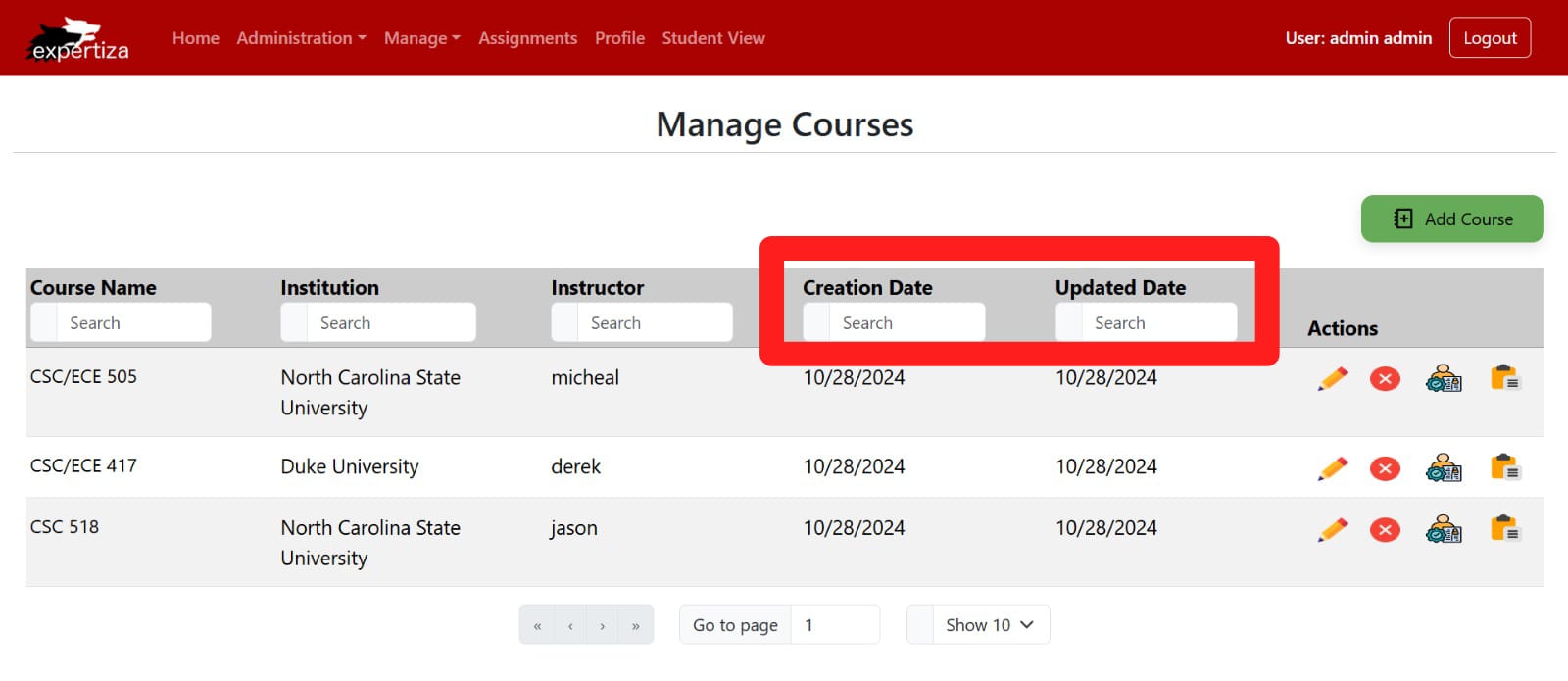
Added Search Functionality
we have added the search fields for the Creation Date and Updated Date columns, allowing users to efficiently locate courses based on when they were created or last updated. This advanced filtering makes course navigation and data retrieval more streamlined.
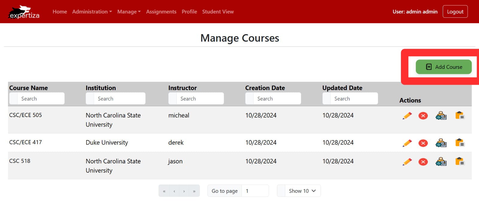
Improved “Add Course” Button
The “Add Course” button now includes descriptive text (“Add Course”) that was previously missing, making the button’s function clearer. The button’s color has been adjusted to a slightly darker shade to improve visibility and draw attention, ensuring that users can easily locate the option to add new courses.
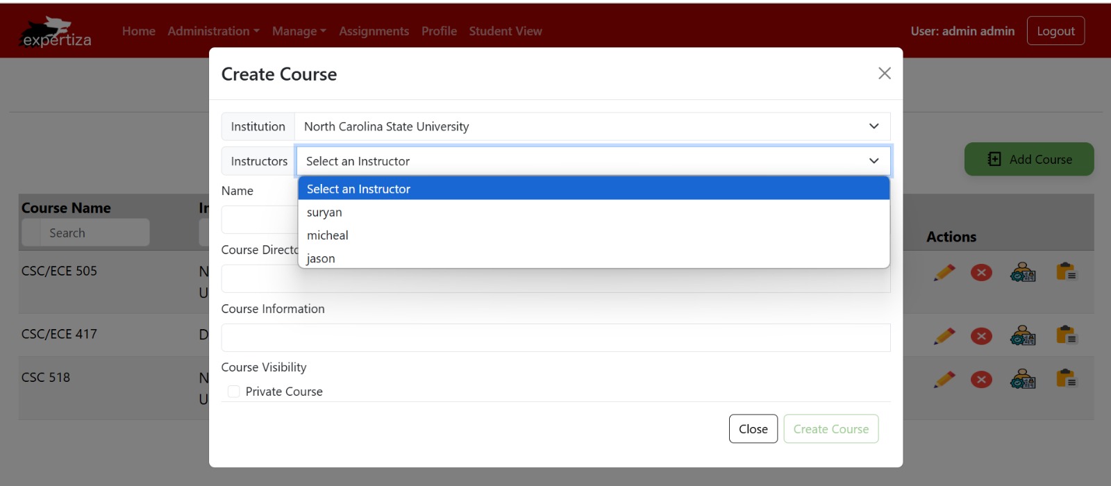
Instructor Selection Dropdown in Create Course Form
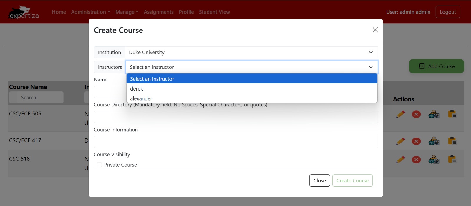
This image shows the Create Course form, where admins can add a new course by selecting details such as the institution, course name, and visibility. The dropdown menu under “Instructors” now lists only valid instructors, streamlining the selection process by excluding irrelevant users. This improvement enhances efficiency, ensuring that admins can quickly and accurately select an instructor for the course. The form also includes fields for Course Directory and Course Information, allowing for a more detailed course setup.
Filtered Instructor Selection in Create Course Form
This image displays the Create Course form, where admins can configure new courses with fields such as Institution, Instructor, and Course Directory. The “Instructors” dropdown now filters and shows only valid instructors relevant to the selected institution, reducing clutter and making the selection process more intuitive. This update enhances the admin experience by allowing quick and precise instructor assignment, while other fields like Course Information and Visibility allow for detailed course customization.
Copy Course Confirmation Modal
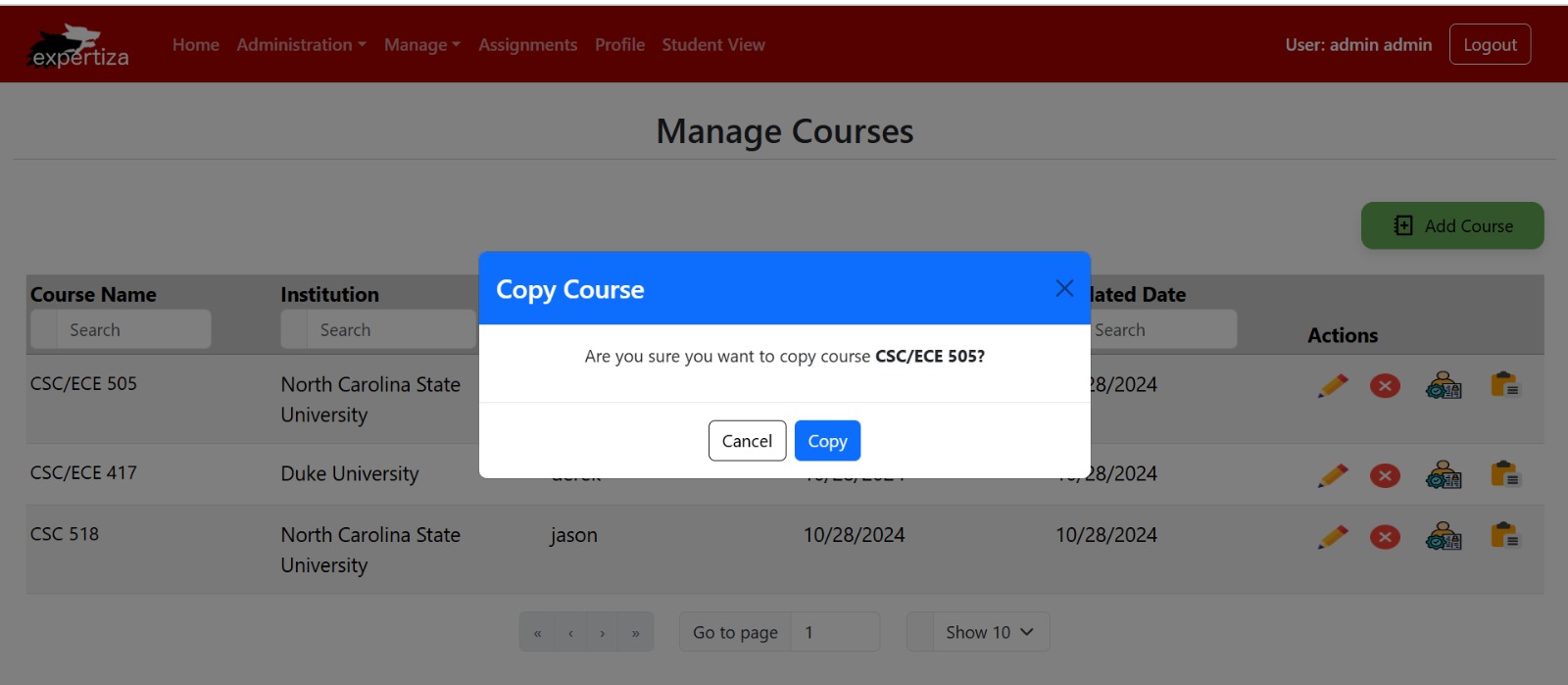
This image displays the Copy Course confirmation modal, which appears when an admin selects the option to duplicate an existing course. The modal prompts the admin with the message, “Are you sure you want to copy course CSC/ECE 505?” and provides two action buttons: Cancel and Copy. Selecting Copy will create a duplicate of the course, retaining all relevant details. This feature streamlines the process of replicating course structures, saving time for admins when setting up similar courses.
Copy Course Loading Animation
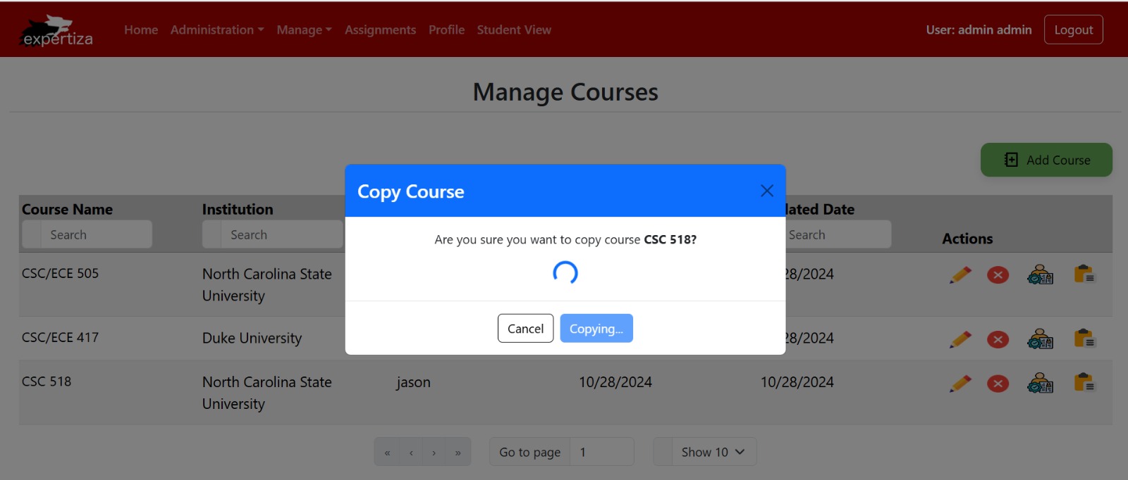
This image shows the Copy Course confirmation modal with a loading animation, which appears when an admin initiates the process to duplicate a course (in this case, “CSC 518”). The message, “Are you sure you want to copy course CSC 518?” is displayed along with an animated loading icon and a Copying… indicator to inform the admin that the duplication process is underway. This front-end feature improves user experience by providing real-time feedback, confirming that the action is in progress, and reducing uncertainty while waiting for the task to complete.
Action Icons in Course Management
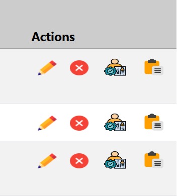
This image highlights the Action Icons available in the Manage Courses section, providing administrators with quick access to essential course management functions. The icons represent the following actions:
1. Edit (Pencil Icon): Allows administrators to edit the course details, such as course information, directory, and visibility settings.
2. Delete (Red Cross Icon): Enables administrators to delete the course from the listing. A confirmation prompt typically appears to prevent accidental deletion.
3. Assign TA (User with Gear Icon): Opens a dialog to manage Teaching Assistants for the course. Admins can add or remove TAs as needed.
4. Copy Course (Clipboard Icon): Facilitates the duplication of an existing course, creating a new course with similar details for efficient course management.
These intuitive icons streamline course management by providing direct, recognizable shortcuts to each action, enhancing the overall usability of the interface.
Edit Course Tooltip Enhancement
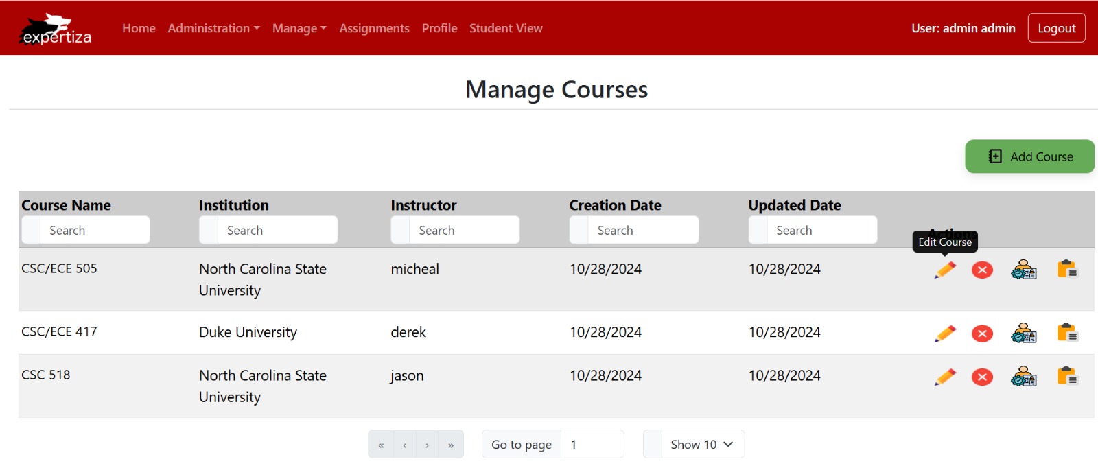
This image demonstrates the newly added tooltip feature for the “Edit Course” action button on the Manage Courses page. When hovering over the pencil icon, which represents the “Edit Course” action, a tooltip appears with the label “Edit Course.” This feature provides users with additional guidance, improving usability and accessibility by clarifying the purpose of the icon, especially for users who may be unfamiliar with icon-based navigation.
Assign TA Tooltip Enhancement
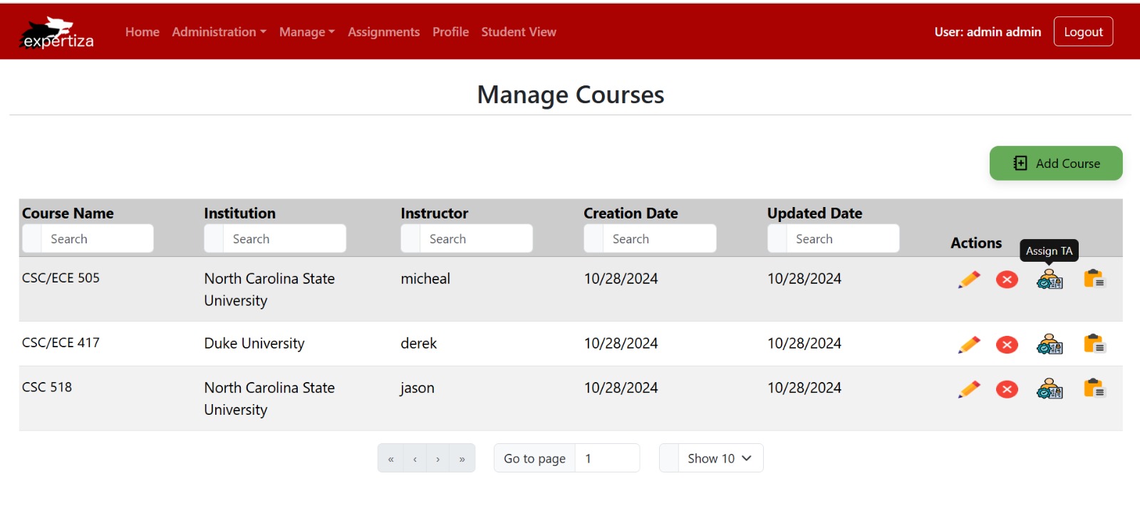
This image highlights the tooltip feature for the “Assign TA” action button on the Manage Courses page. When hovering over the icon representing “Assign TA,” a tooltip with the label “Assign TA” appears. This addition helps users quickly understand the function of the icon, improving navigation and usability by providing clear guidance on how to assign a Teaching Assistant to a course.
Delete Course Tooltip Enhancement
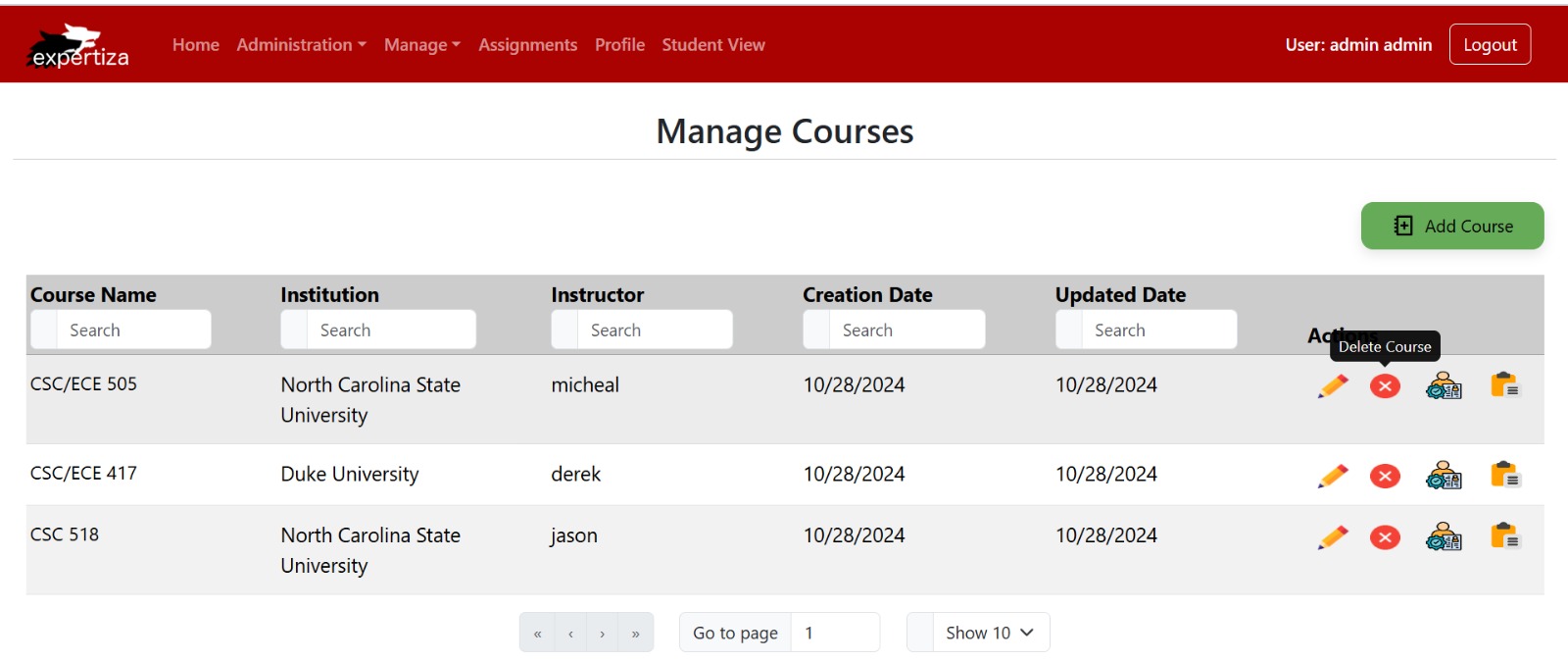
This image illustrates the tooltip feature for the “Delete Course” action button on the Manage Courses page. When hovering over the delete icon (red ‘X’), a tooltip labeled “Delete Course” appears, providing users with a clear visual cue about the function of the icon. This feature enhances usability by ensuring that users understand the action before clicking, reducing the likelihood of accidental deletions.
Copy Course Tooltip Enhancement
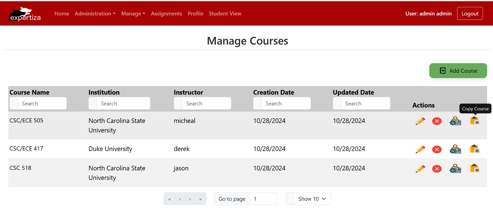
This image highlights the tooltip feature for the “Copy Course” action button on the Manage Courses page. When users hover over the copy icon (clipboard symbol), a tooltip labeled “Copy Course” appears, providing a clear indication of the button’s function. This tooltip ensures that users understand the action associated with the button, enhancing user experience by minimizing potential confusion and improving interface intuitiveness.
Delete Course Confirmation Modal
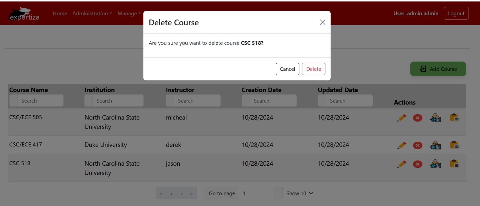
This image shows the Delete Course confirmation modal, which appears when an admin chooses to remove a course. The prompt, “Are you sure you want to delete course CSC/ECE 505?” provides the admin with a final confirmation step to prevent accidental deletions. Two buttons, Cancel and Delete, allow the admin to either proceed with or cancel the action. This feature ensures safe management of course data by requiring explicit confirmation before deletion.
Final UI for Courses
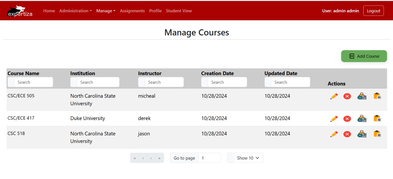
The Manage Courses homepage provides administrators with a comprehensive overview of all courses. Each course listing displays essential details such as Course Name, Institution, Instructor, Creation Date, and Updated Date. Additionally, administrators have access to action icons for editing, deleting, assigning TAs, and duplicating courses, making course management efficient and streamlined. The page also includes search fields for each column, allowing for quick filtering and navigation through the course data. An enhanced Add Course button is available for adding new courses to the list.
Files Modified
Course.tsx is the main component that displays the list of all courses in a paginated table format. This page includes options for admins to edit, delete, copy, and manage TAs for each course. The file also handles data fetching and passes course details to other components as needed. Composite and DRY principles were applied by reusing various components within this file.
CourseColumns.tsx defines the columns and their attributes for the courses table displayed on the main Courses page. Each column is configured with specific actions and properties, such as sorting and filtering options. The file follows the Higher-Order Component (HOC) pattern to apply functionality across columns efficiently.
CourseCopy.tsx is responsible for the “Copy Course” functionality. It displays a confirmation modal to duplicate a selected course and communicates with the backend to create a copy with a unique identifier. The Provider pattern is used to pass course ID data from the main Course component to this modal.
CourseDelete.tsx handles the deletion of a course. It displays a modal for confirmation before permanently deleting the selected course. The file manages the interaction with the backend and triggers a UI update to remove the course from the list upon successful deletion. The Composite pattern is used here to integrate the modal component smoothly.
CourseDetails.tsx displays detailed information about a selected course in a modal format. It provides a read-only view of course attributes such as title, instructor, institution, and visibility. This component enhances the user experience by allowing quick access to detailed course information without navigating away from the main page.
CourseEditor.tsx is a form modal for creating or editing courses. Admins can input course details like the institution, instructor, course name, and visibility settings. The form uses validation and controlled components, applying the HOC pattern for consistent styling and behavior. The Observer pattern with React hooks (useEffect) is used to handle form submission success and update the UI accordingly.
CourseUtil.tsx contains utility functions related to course operations, including data validation, transformation, and backend requests for CRUD operations. These functions are used across different course-related components to maintain DRY principles and ensure consistency in data handling.
interfaces.ts defines TypeScript interfaces for handling course and TA data. New interfaces were created, such as ICourseResponse and ICourseRequest for managing course data, and ITAResponse and ITARequest for handling TA data. These interfaces help enforce type safety across components, supporting the Composite pattern by creating structured types.
Reimplementation
In this project, we have reimplemented few existing methods and functions from the previous version, focusing on enhancing code readability, optimization, and adherence to coding best practices. While the core functionality of these methods remains unchanged, we refactored the code to improve its maintainability and efficiency. This reimplementation allows for a cleaner structure, making the codebase easier to understand, debug, and extend in the future. By following best practices, we ensured that the code is both modular and scalable, paving the way for future development without compromising performance or functionality.
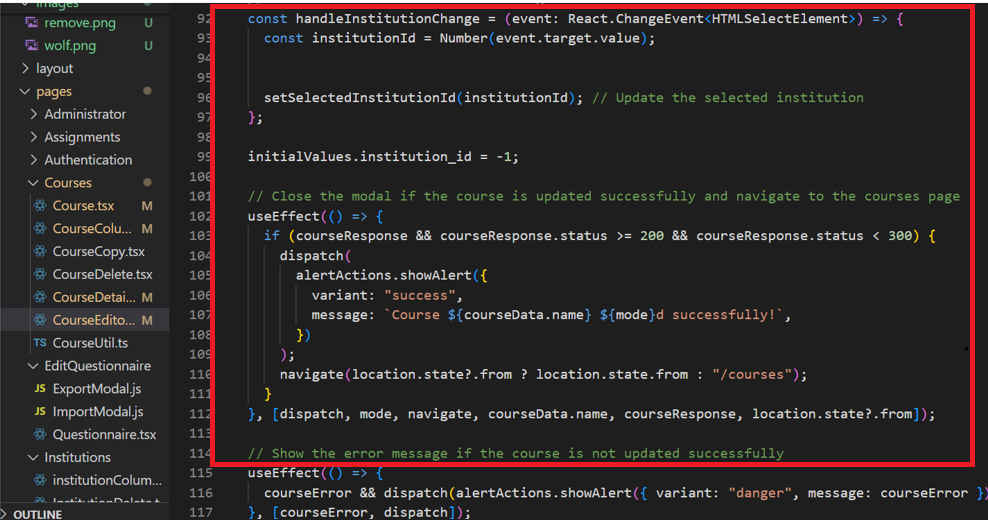
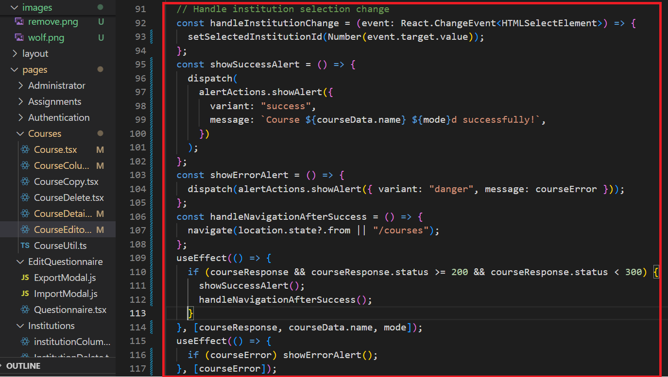
"handleInstitutionChange" method Commit
Fig 5.1: Comparison of original and re-implemented handleInstitutionChange method
The reimplemented code enhances readability and aligns with the Single Responsibility Principle by modularizing alert and navigation logic into dedicated functions. showSuccessAlert, showErrorAlert, and handleNavigationAfterSuccess each handle a single responsibility: success alerts, error alerts, and navigation after updates, respectively. This reduces duplication and keeps the useEffect hooks focused, making the code easier to understand, test, and maintain. Each function now has a clear purpose, making modifications straightforward without impacting other parts of the logic.
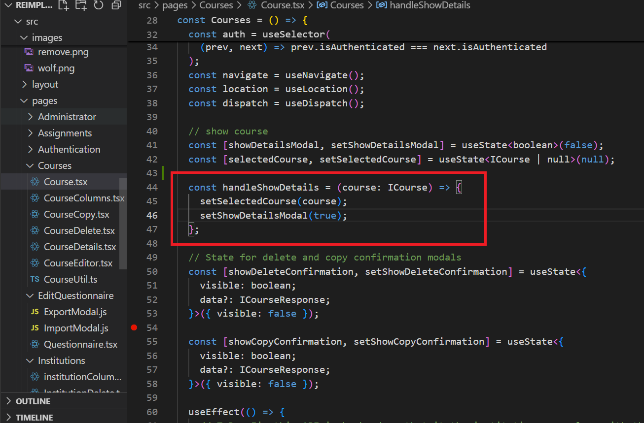
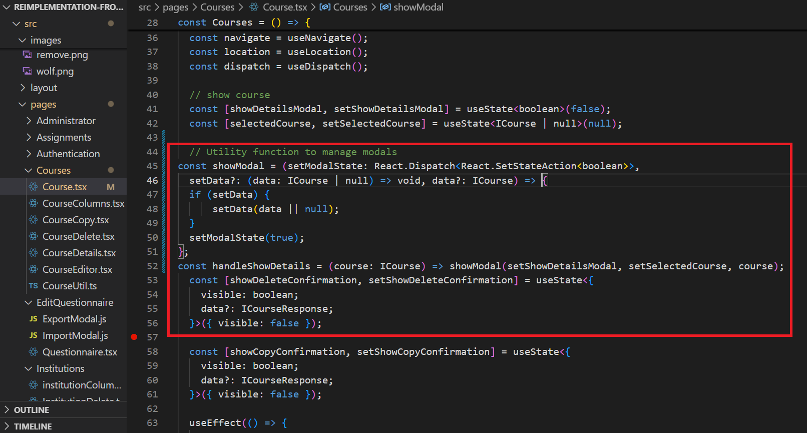
"showModal" method Commit
Fig 5.2: Comparison of original and re-implemented showModal method
In this re-implementation we added the showModal function and reimplemented handleShowDetails to use the reusable showModal utility to handle modal visibility and data setting. This aligns with the Open-Closed Principle by making the function extendable for other modals without modifying its core logic, improving modularity and maintainability.
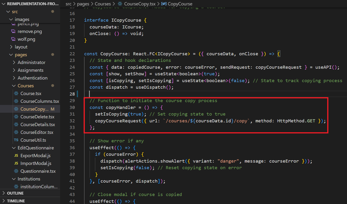
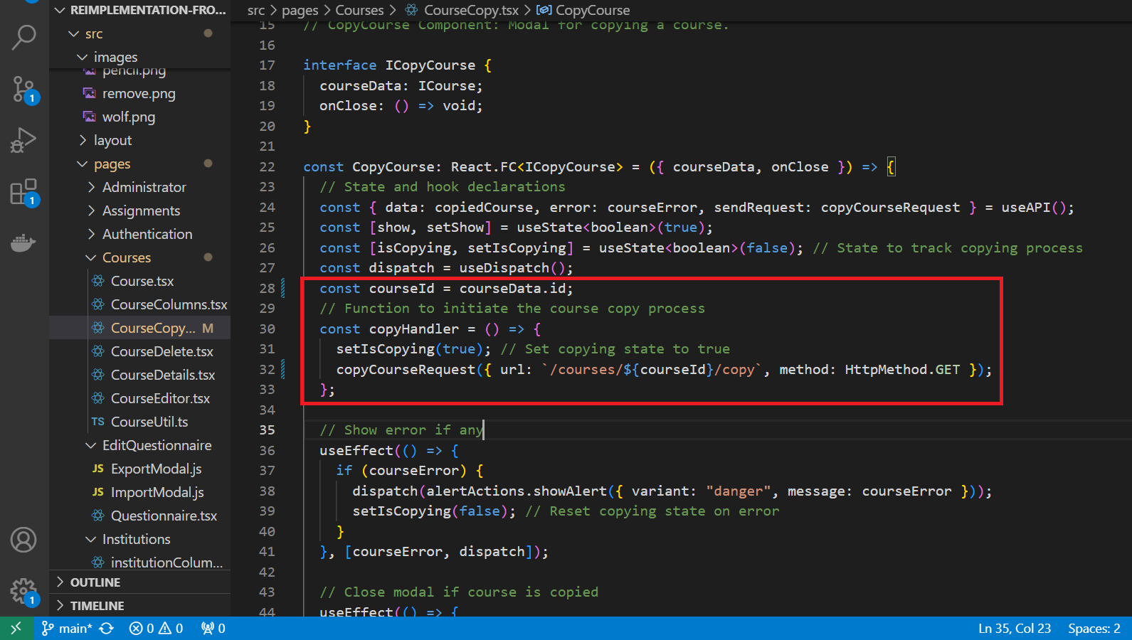
"copyHandler" method Commit
Fig 5.3: Comparison of original and re-implemented copyHandler method
The previous copyHandler function relied on the entire courseData object, even though it only needed courseData.id, resulting in unnecessary dependency on a broader interface. By refactoring to use only courseId, we reduce this coupling, making copyHandler dependent only on the data it actually requires. This re-implementation aligns with the Interface Segregation Principle (ISP) , as it narrows the function's interface to a more focused and relevant dependency (courseId), enhancing modularity and maintainability.
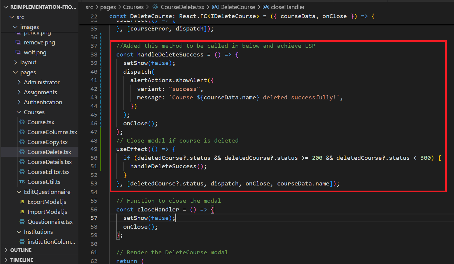
"handleDeleteSuccess" method Commit
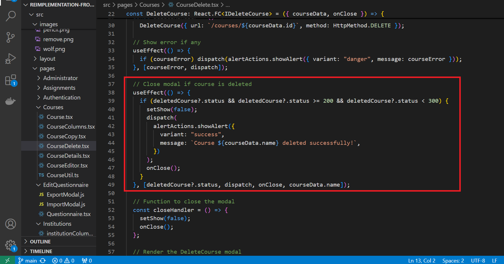
Fig 5.4: Comparison of original and re-implemented handleDeleteSuccess method
In the previous code, the success handling code is directly tied to displaying an alert and closing the modal, limiting flexibility. so we added a new method handleDeleteSuccess which does the success handling logic. we made this component more flexible. Now, if we need to substitute the success behavior (for instance, to log the deletion or trigger another action), we can simply modify or replace handleDeleteSuccess without changing the core logic of the component. This adheres to Liskov Substitution Principle by allowing the component’s success handling to be easily extended or substituted while preserving its functionality.
Design Patterns
Single Responsibility Principle (SRP):
Definition: A class should have only one reason to change, meaning it should have only one responsibility.
Implementation: Each component or class in our project is focused on handling a single responsibility, such as managing course data, rendering specific UI elements for courses, or implementing the search functionality. For example, separate components are created for adding courses, deleting courses, and managing TAs, ensuring modularity and ease of maintenance.
Separation of Concerns (SoC):
Definition: The principle of dividing a program into distinct sections, where each section addresses a separate concern.
Implementation: The codebase has been organized to distinctly separate the management of course data, user interface, and business logic. The backend handles data operations, while the frontend components manage user interactions and rendering. This separation enhances modularity and simplifies future modifications or feature additions.
Composite Pattern:
Definition: A structural design pattern that composes objects into tree structures to represent part-whole hierarchies, allowing individual objects and composites to be treated uniformly.
Implementation: The Composite pattern is applied in the Manage Courses page, where each course row is composed of individual actions (Edit, Delete, Assign TA, Copy). Each action component can function independently, but collectively they create a cohesive course management interface, enabling easy addition or removal of functionalities.
Observer Pattern:
Definition: A behavioral design pattern where an object, known as the subject, maintains a list of its dependents, called observers, and notifies them of any state changes.
Implementation: The Observer pattern is used to implement dynamic feedback on user actions, such as hover effects on action buttons (e.g., Edit, Delete, Copy). Observers detect hover events and adjust the UI to provide visual feedback, enhancing the user experience without altering the core button functionality.
Decorator Pattern:
Definition: A structural design pattern that allows behavior to be added to individual objects dynamically without altering the behavior of other objects in the same class.
Implementation: The Decorator pattern is applied to add tooltip and hover effects to action icons. For example, tooltips are added to action buttons like Edit Course, Delete Course, and Assign TA, providing contextual information to users without modifying the core logic of these buttons.
Template Method Pattern:
Definition: A behavioral design pattern that defines the skeleton of an algorithm in a superclass but lets subclasses override specific steps without changing its structure.
Implementation: The Template Method pattern is used for rendering components based on user roles. The core structure of the Manage Courses page is defined, while specific elements, such as visible columns or actions, are customized based on user permissions (e.g., admin vs. TA), ensuring a consistent yet flexible layout.
Factory Pattern:
Definition: A creational design pattern that provides an interface for creating objects in a superclass but allows subclasses to alter the type of objects that will be created.
Implementation: The Factory pattern is employed to dynamically generate different course-related modals, such as Add Course, Edit Course, and Copy Course. This approach simplifies the process of creating modals and ensures that each modal is generated with the appropriate fields and functionality, promoting code reusability and flexibility.
Through the application of these design patterns, our project ensures a modular, maintainable, and extensible codebase, allowing for a clean separation of concerns and enhanced user experience across the Manage Courses page.
Test Plan
Since the changes revolve around UI implementation, the features need to be manually checked on the webpages.
1. Verify if the search functionality is working for Searching the Creation date and Updated date.
2. Check if only those instructors are seen in the drop-down which are present in the same institution that you have selected from the drop-down when creating a course.
Relevant Links
- Github Repository: https://github.com/yuktasree/reimplementation-front-end/tree/main
- Pull Request: https://github.com/expertiza/reimplementation-front-end/pull/43
Team
Mentor
- Anvitha Reddy Gutha
Members
- Harshvardhan Sangram Patil <hspatil@ncsu.edu>
- Suraj Raghu Kumar <sraghuk@ncsu.edu>
- Yuktasree Muppala <ymuppal2@ncsu.edu>
