CSC/ECE 517 Fall 2024 - E2469. Reimplement grades/view team
Background
Expertiza is an open-source learning management system developed with Ruby on Rails, facilitating assignment creation, team management, and a structured peer review process. Designed for educational settings, Expertiza offers instructors tools to assign topics, manage teams, and allow students to collaborate on various assignment formats, including URLs and wiki pages. Its peer review functionality encourages students to provide feedback, promoting a collaborative learning experience.
Problem Statement
This project focuses on reimplementing the grades/view_team page in Expertiza. The current interface lacks modern design aesthetics and usability standards making it challenging for users to access and understand grading data efficiently. Our objective is to develop a fully functional and visually cohesive front end for the Grades View page. By enhancing visual consistency, simplifying information display, improving responsiveness, giving users freedom to select views, and intuitive layout, this redesign aims to provide an improved user experience.
Reimplementation and Improvements
Enhanced Peer Review and Author Feedback Filtering
I) Existing Design
II) Modified Design
III) Files Changed for this Modification
1. Statistics.tsx
2. Filters.tsx
3. ShowReviews.tsx
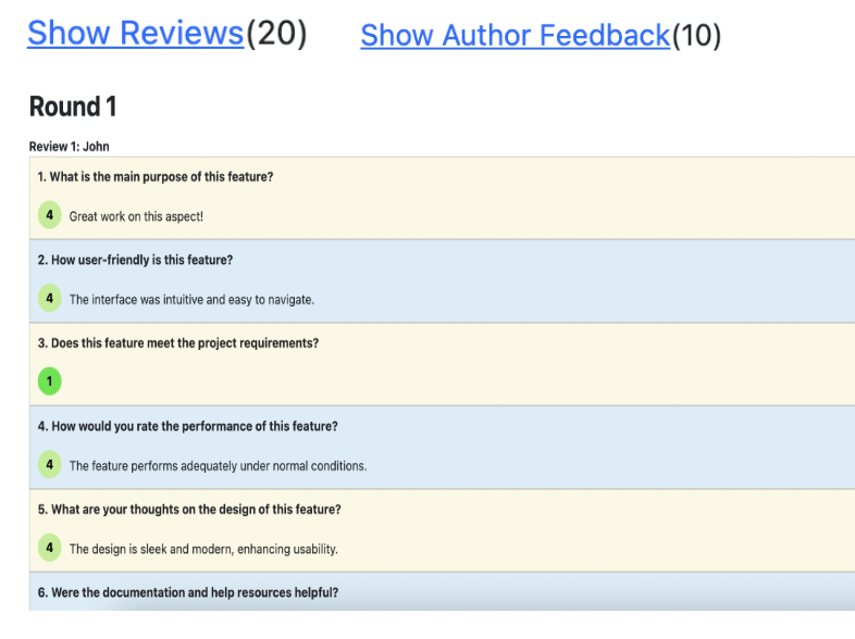
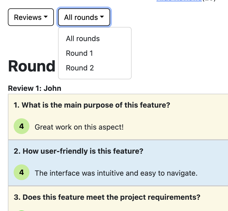
The requirement in the statistic section of the grade page was to make changes to show dropdown selection menu for "Author Feedback" or "Reviews" and further add filtering based on the rounds (Round 1 or Round 2 or All) for "Author Feedback" or "Reviews".
To carry out the changes on first selection menu, we had toggle reviews and toggle feedback event listeners defined in statistics based on which we displayed the data using ShowReviews react componenet. These event listeners were passed to Filters component and which had drop down UI component for "Author Feedback" or "Reviews". Based on the option selected either toggleShowReviews or toggleAuthorFeedback were invoked.
To do make further changes to display data according to rounds, first in the Statistics component of react application we defined the state "roundSelected" and also defined listener function to update round (selectRound). This event listener function was passed to Filter react component which had the UI element for second drop down for rounds selection. Based on the round selected from the dropdown, we invoked selectRound event listener function. When this event listener function is invoked we update the state variable "roundSelected". And then this state variable is passed as props to ShowReviews react component which is responsible for iterating over "Author Feedback" or "Reviews" data and added the logic to show data with rounds based on the prop.
IV) Rationale
The "Show Reviews" and "Show Author Feedback" link displays all the peer reviews from Round 1 and Round 2 and author's feedback from both rounds in a single view. This forces the users to scroll all the rounds' reviews and feedback sequentially which can be overwhelming when users wish to view feedback from a specific round. Also, users don't have the freedom and control to choose to view all rounds' reviews/feedbacks or specific rounds' reviews/feedbacks. Additionally, a single view adds visual clutter and increases cognitive load.
With the 2 dropdowns users have more control over which reviews they would like to view. The first dropdown lets them choose from viewing reviews or author's feedback for the reviews provided, while the second dropdown allows them to select specific rounds (Round 1, Round 2, or both). This gives users the flexibility to focus on specific rounds as needed. Separating the reviews/author feedback based on a round filter reduces clutter, creating a cleaner, more organized layout. Users can now view reviews and feedback in a more structured way, which simplifies navigation and enhances readability and improves satisfaction.
Replaced the disorganized display of scores for submitted work, author feedback, and teammate reviews with a Structured Scorecard table for clearer presentation.
I) Existing Design

II) Modified Design

III) Files Changed for this Modification
The Statistics.tsx file was modified to implement the new tabular format for the grades summary. We removed the earlier code for the UI which showed the scores in a tabular format. However, the existing table was difficult to read without borders around the table. The modified table gets rid of unnecessary statistics like "contributor" and removes the toggles to show reviews and author feedback. This ensures that the section does not repeat links and present information not required
IV) Rationale
The previous display of scores for submitted work, author feedback, and teammate reviews was fragmented and lacked clarity, making it difficult for users to interpret performance metrics at a glance. By introducing a structured scorecard table, we present all relevant data in a clear, organized format, enabling users to easily compare and understand scores across different rounds. This redesign improves usability by offering a more intuitive layout and better visibility of grading information.
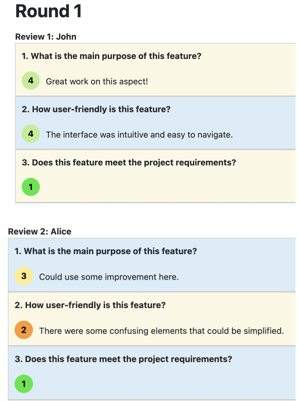
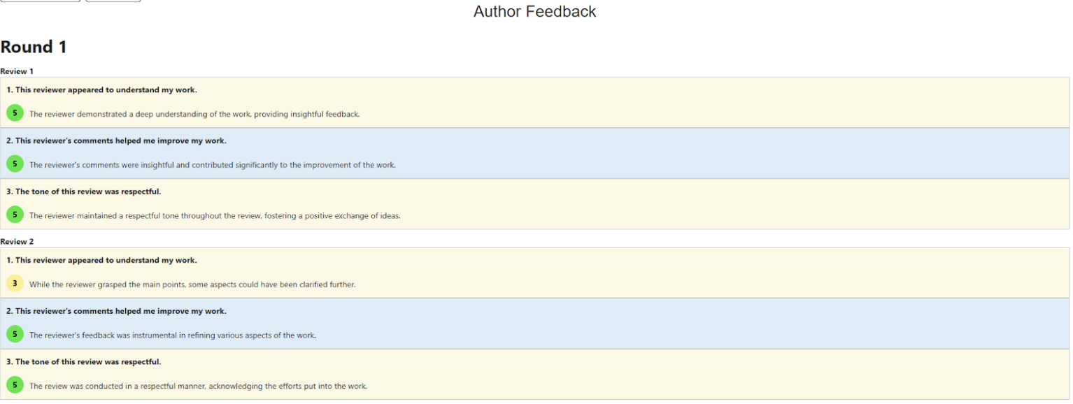
Removed the names of reviewers as they are supposed to remain anonymous.
I) Existing Design
II) Modified Design
III) Rationale
The reason for this change is to shift focus more on quality and content of feedback and reviews rather than identity of reviewers. Anonymity encourages the reviewers to provide constructive criticism as reviewers will review without concern for any issues or repercussions.
Styling of Review Table
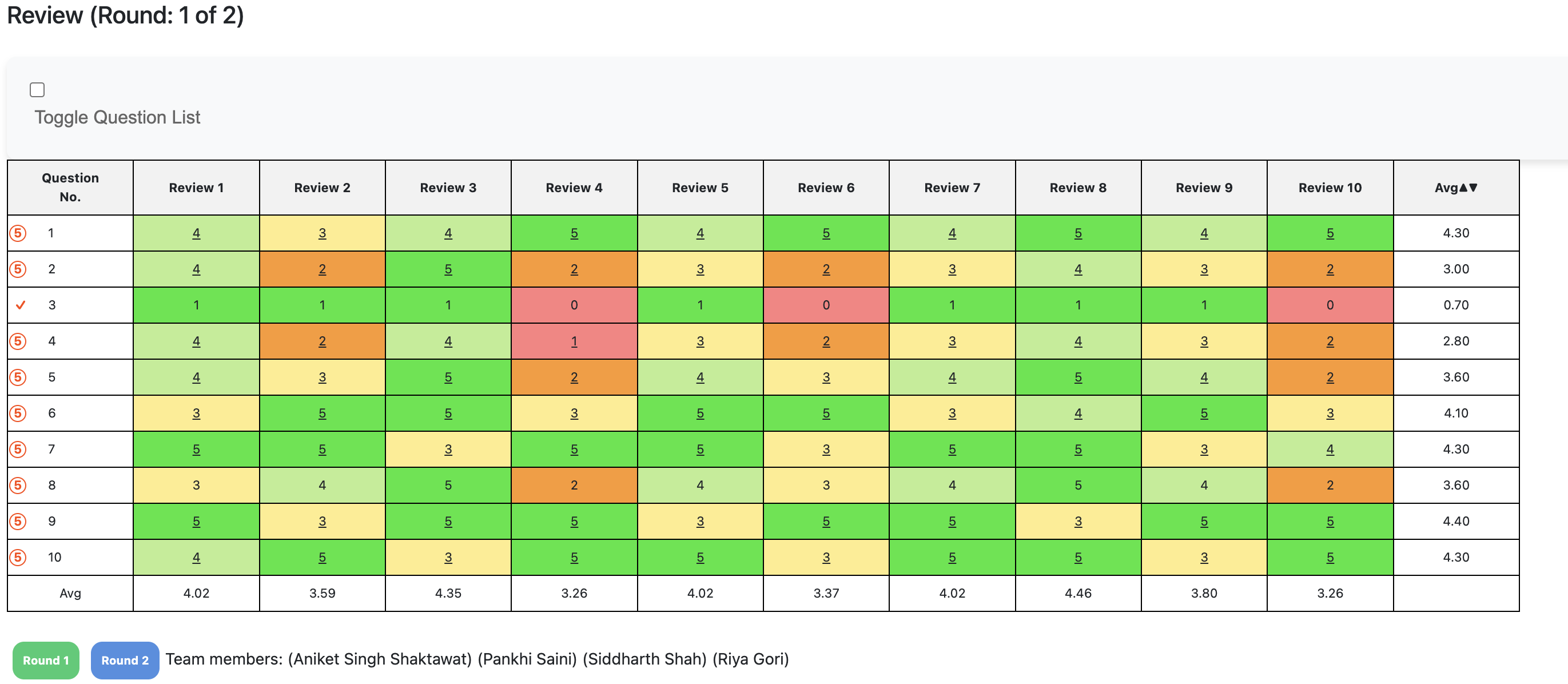
I) Existing Design
II) Modified Design
III) [Files Changed for this Modification]
1. ReviewTable.tsx
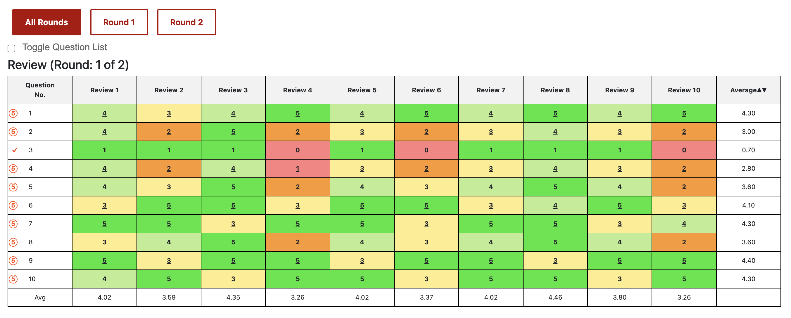
In ReviewTable.tsx, the review table has been refactored to improve modularity and maintainability. This is also in the direction of **Single Responsibility Principle** wherein now we have the method handle entirely the rendering of the table, and the table only. The changes introduce a renderReviewScoreTable function, allowing each review round to render independently. This restructuring supports clearer styling across rounds, with thickened borders and semibold text enhancing readability. The new approach also paves the way for further style or structure adjustments in a streamlined manner.
IV) Rationale
Previously, the table's lack of contrast made distinguishing headers and scores challenging. By making headers semibold and adding thicker borders, the design now enhances visual separation and readability, particularly useful for reviewing detailed feedback. This style refinement ensures users can seamlessly compare scores, fostering an organized review experience across rounds.
Fixed styling Toggle Question List
I) Existing Design

II) Modified Design

III) [Files Changed for this Modification]
1. ReviewTable.tsx
2. grades.scss
In ReviewTable.tsx, updates to the toggle question list enhance user control and interaction. A function refactor introduces improved state handling, allowing users to expand or collapse questions seamlessly within each review round. This modular approach simplifies adjustments and provides flexibility for future additions. Key changes include defining clearer toggling conditions and aligning the user interface elements with intuitive accessibility standards, giving users a cohesive experience across rounds. The styling changes are handled in the grades.scss file where we define a new toggle container class instead of using the existing form class which is inherited from elsewhere in the project and comes with redundant and unnecessary styling.
IV) Rationale
The "Toggle Question List" styling was refined for better alignment and readability, enhancing the clarity of the page’s interactive elements.
Unified Review Rounds Button and Interface Styling Update
I) Existing Design

II) Modified Design

III) [Design pattern/solid/dry][TODO]
IV) [Code Snippet][TODO]
V) Rationale
Addition of “All Rounds’’ Button: The new "All Rounds" button allows users to view reviews from multiple rounds in a single table. This eliminates the need to switch between individual rounds, giving users a comprehensive view of the feedback across all rounds at once.
Color and Style Consistency: The colors and styles of the buttons were updated to match Expertiza’s established color scheme, ensuring a cohesive and professional look across the platform. This consistency aids in navigation, making the interface feel more intuitive and visually appealing.
Expanded Submission Links Display
I) Existing Design
II) Modified Design

III) [Design pattern/solid/dry][TODO]
IV) [Code Snippet][TODO]
V) Rationale
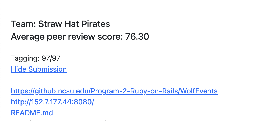
The change enhances usability by directly presenting all relevant submission links to users without requiring additional interaction to show or hide them. This expanded view allows for quicker access to project resources and a more streamlined experience, improving efficiency and clarity in the peer review process on the grades/view_team page.
Testing
We have conducted comprehensive manual testing to verify the functionality, usability, and visual consistency of the reimplemented features.
1. Peer Review and Feedback Filter: Tested the dropdown options to confirm that users can correctly view specific rounds of peer reviews or author feedback as selected.
2. Scorecard Table: Checked that the Scorecard table displays relevant scores in an organized manner and ensured that the scoring data is correctly calculated.
3 Submission Links: Verified that the submission links were directly displayed, without the need to toggle them. Each link was tested individually to ensure it opens the correct resource without errors.
4. Styling Consistency: We compared the new styling of buttons, dropdowns, and tables with the rest of Expertiza's interface to ensure a cohesive look.
5. Anonymity of Reviewers: Verified that reviewers’ names were properly hidden, preserving anonymity throughout the review display
6. All Rounds Button: Tested the "All Rounds" button by viewing multiple rounds of reviews in a single table to confirm that users can easily access and interpret cumulative feedback without toggling between views.
Repository Links
Project Mentor
Kashika Mallick (kmallick@ncsu.edu)
Team Members
Shafa Hassan (shassa22@ncsu.edu)
Archit Gupta (agupta85@ncsu.edu)
Ansh Ganatra (aganatr@ncsu.edu)