CSC/ECE 517 Spring 2024 - E2431. Reimplement grades/view team
Introduction
Expertiza, a learning management system available as open-source software, utilizes the Ruby on Rails framework as its foundation. Its features encompass the creation of assignments, tests, assignment teams, and courses, among others. Particularly noteworthy is its comprehensive system designed to facilitate peer reviews and feedback within teams and groups. The primary focus of this project lies in developing frontend React Components, specifically targeting User, Institution, and Roles functionalities. The objective is to create a fully operational user interface for these components using React.
Problem Statement
The main objective of this project is to redesign the front end for the grades/view_team page within Expertiza. The current layout suffers from performance issues and outdated design, resulting in decreased usability. Our aim is to improve user experience and interface efficiency by developing a refreshed front end using React JS and TypeScript. The project will concentrate on several key features including displaying team information such as names and assignment details, listing reviews and their comments/feedback for each question while ensuring consistency, indicating review scores with color-coding(Heat map) from green to red.
Design Patterns
In the re-implementation of Expertiza's front end, we have utilized several design patterns to enhance maintainability and promote code reusability:
1. Composite Design Pattern: We employ the Composite Design Pattern by nesting and composing components like Table, Modal, and others to construct our Course component effectively.
2. DRY Principle: Adhering to the DRY Principle, we leverage React's capabilities to reuse existing components such as Table and Modal, thereby minimizing redundancy in our codebase.
3. Provider Pattern: Using React's Context API, we implement the Provider Pattern to seamlessly pass props down the component tree without explicit prop drilling.
4. Observer Pattern: We harness the Observer Pattern using React's Context API alongside hooks like useEffect and useState to efficiently manage component state and side effects.
5. HOC Pattern: The HOC Pattern, or Higher-Order Component pattern, is adopted to facilitate routing for new pages by creating functions that take in a component and return a modified component with routing capabilities.
6. Mediator Pattern: Given the disparity between backend data structures and frontend requirements, we employ the Mediator Pattern to transform data as needed, ensuring compatibility and coherence within our application.
Files Added
We created an assignment folder inside the pages folder which includes the essentials for the implementation of all the changes mentioned in the previous sections.
| # | Change | Rationale |
|---|---|---|
| 1 | App.tsx | Added code that sets up a React component (ReviewTable) to manage and display Reviews in Tabular Format. It handles data fetching from data stub, configures a dynamic table, and provides user interactions for viewing scores and. |
| 2 | ReviewTable.tsx | Here a component called `ReviewTable` responsible for displaying review data was created. It allows users to toggle between different rounds of reviews and customize the display by filtering reviews based on word count. The component calculates and displays the average peer review score, along with individual question scores and overall averages. Users can also navigate between different rounds of reviews using a selector. Additionally, it provides a link to navigate back to the homepage. Overall, the `ReviewTable` component provides a summary report of peer reviews for a specific assignment, enhancing the user's understanding of the review data. |
| 3 | ReviewTableRow.tsx | This file is responsible for rendering a single row of review data within a table. It receives props containing information about the review data for that row, such as the review scores, question numbers, and average score. The component dynamically applies styling based on the review scores and calculates word counts for comments if enabled by the user. Overall, ReviewTableRow enhances the readability and presentation of individual review data within the larger review table. |
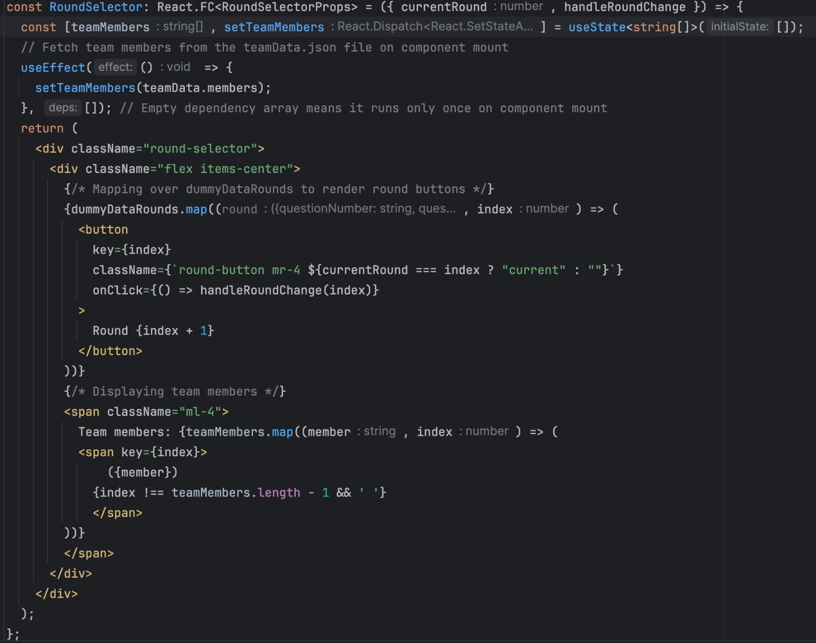
| 4 | RoundSelector.tsx | This React code defines a component called `RoundSelector`, enabling users to switch between different rounds of reviews. It presents buttons for each review round, allowing users to easily navigate and view review data for specific rounds, along with displaying team member names involved in the review process. |
| 5 | Dummy_Data | This code represents dummy data for reviews of a feature, where each feature has several questions with corresponding scores and comments from reviewers. The data is structured as an array of arrays, with each inner array containing review information for a specific round of reviews. Each round includes reviews for different questions about the feature, along with scores and comments from reviewers. This dummy data is used for testing and demonstration purposes in the application. |
| 6 | grades.css | This CSS code provides styling for various elements in a web application, such as tables, buttons, circles, and tooltips. It defines the appearance of table containers, circles used for indicating scores, heatgrid tables for displaying data, and tags for student reports. Additionally, it styles round selectors and provides hover effects for buttons. This CSS is crucial for ensuring a visually appealing and user-friendly interface in the web application. |
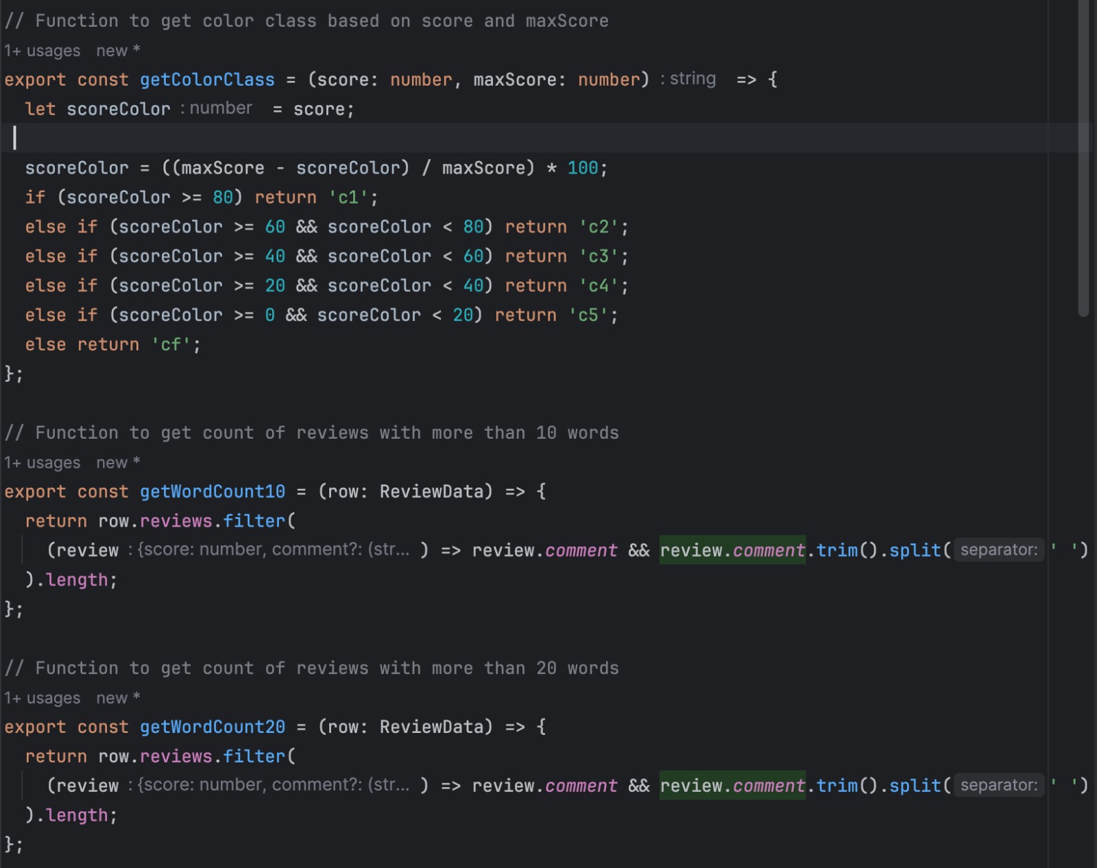
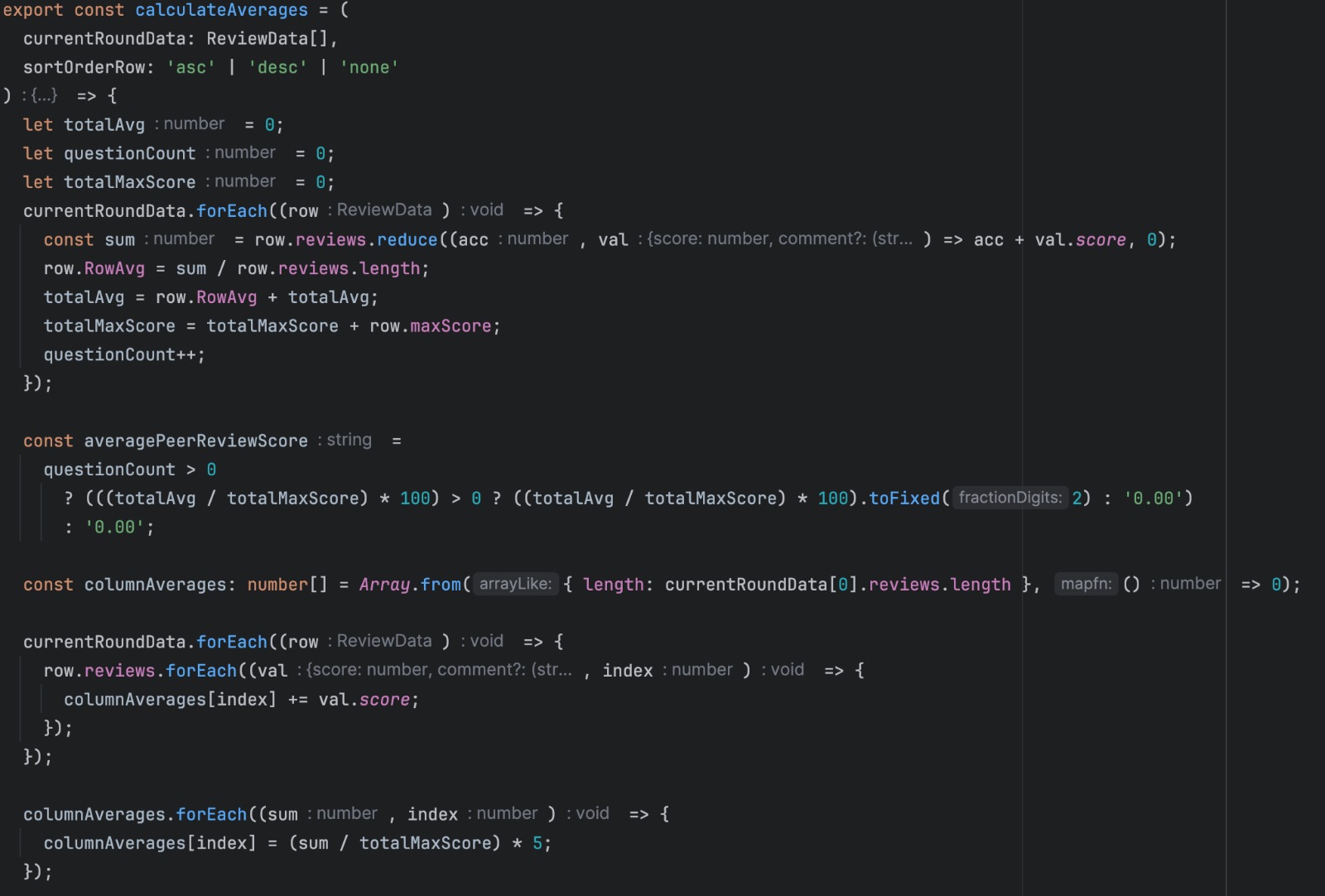
| 7 | utils.ts | This JavaScript code provides several utility functions for processing review data in a web application. `getColorClass` calculates a color class based on a score and maximum score, which is useful for visually indicating the performance level. `getWordCount10` and `getWordCount20` count the number of reviews with more than 10 and 20 words, respectively, helping to identify reviews with substantial feedback. `calculateAverages` computes average scores for rows and columns of review data, as well as sorting the data based on row averages. These functions are essential for analyzing and presenting review data effectively in the application. |
Notable Code ReImplementation
The following design for users shows the tabular format in which the users are displayed. For our new components, we will be replicating this tabular format with the headers depending on the component.
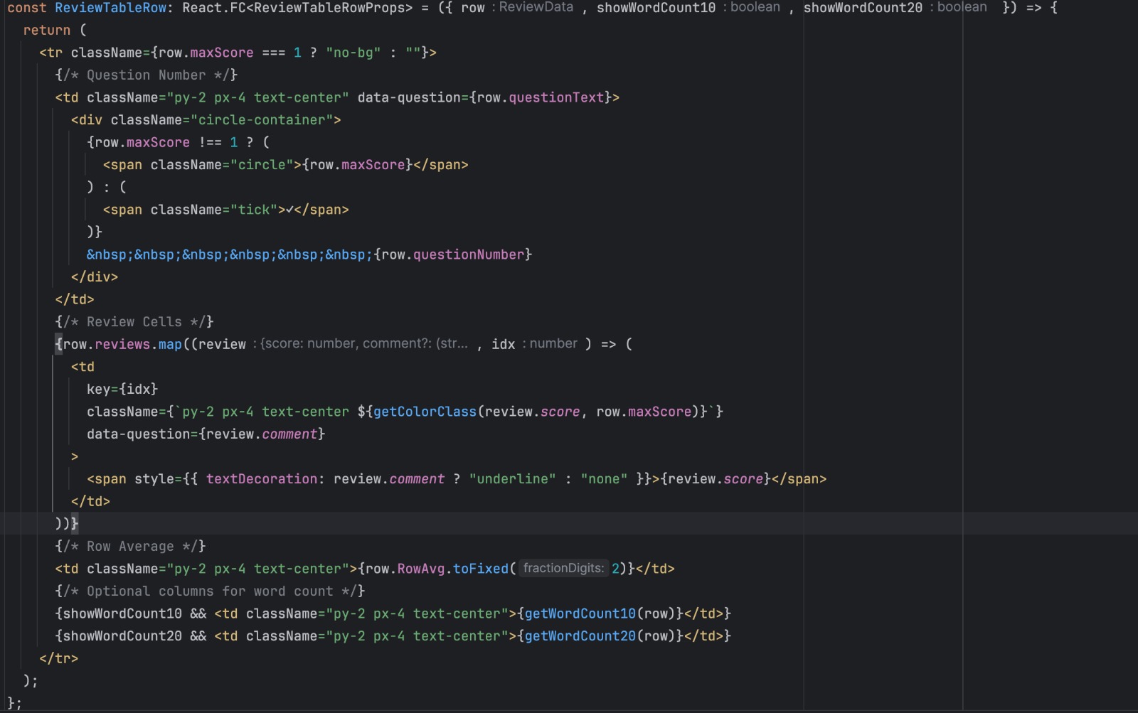
The following design for users shows the tabular format in which the users are displayed. For our new components, we will be replicating this tabular format with the headers depending on the component.
The `getColorClass` function defines the criteria for determining the color displayed in each cell based on the review value. The `getWordCount10` and `getWordCount20` functions determine the count of reviews with more than 10 and 20 words in the feedback, respectively. The `calculateAverage` function handles the logic for calculating the average score displayed in the table.
Designs
Following designs are that of the users component which has already been done. This project aims to replicate these designs for the components that we will be creating as mentioned in the previous section.
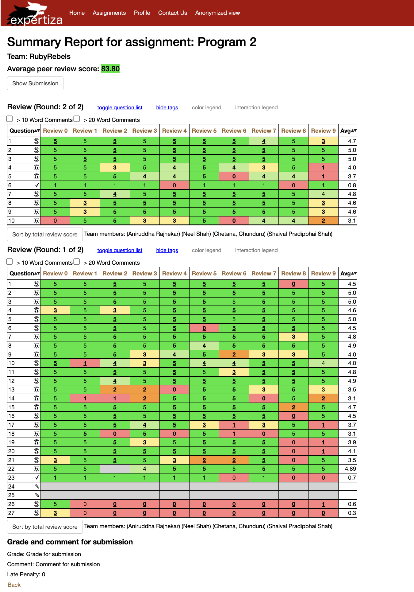
Existing GradesView Page
The following design for users shows the tabular format in which the users are displayed. For our new components, we will be replicating this tabular format with the headers depending on the component.
Reimplementation Done
The following are the snapshots of the functionality we tried to implement by leveraging the power of ReactJS and Typescript.
Displaying Assignments
Our aim was to display relevant information while listing out the reviews on this page.
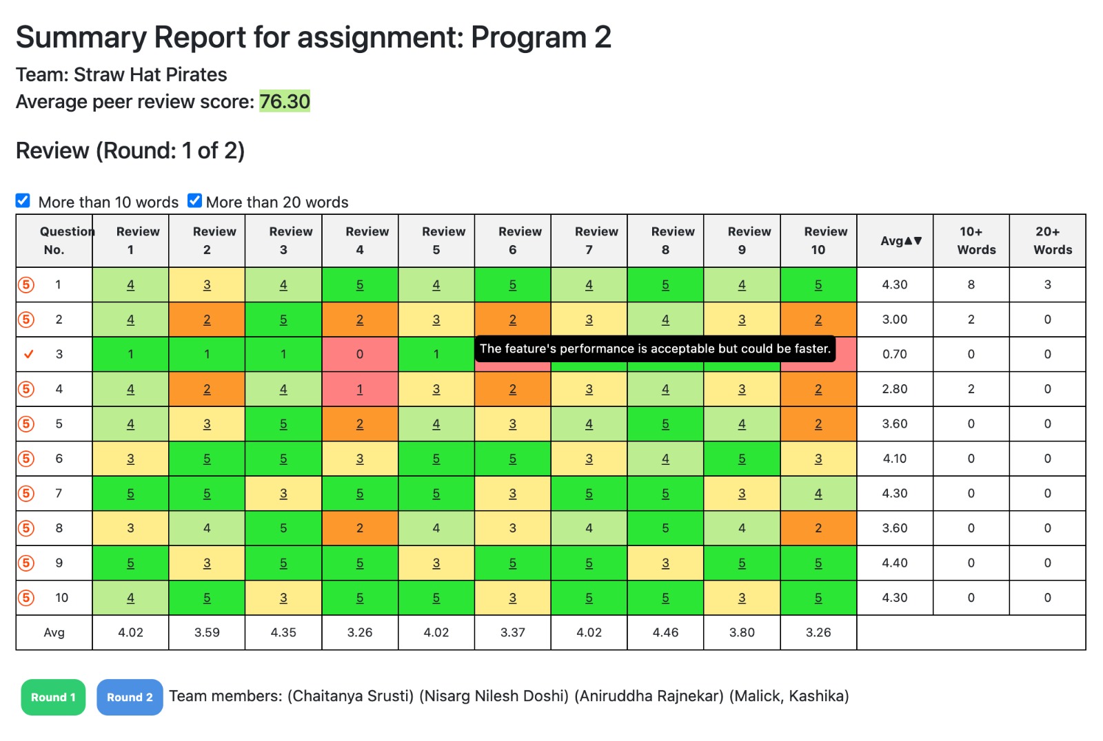
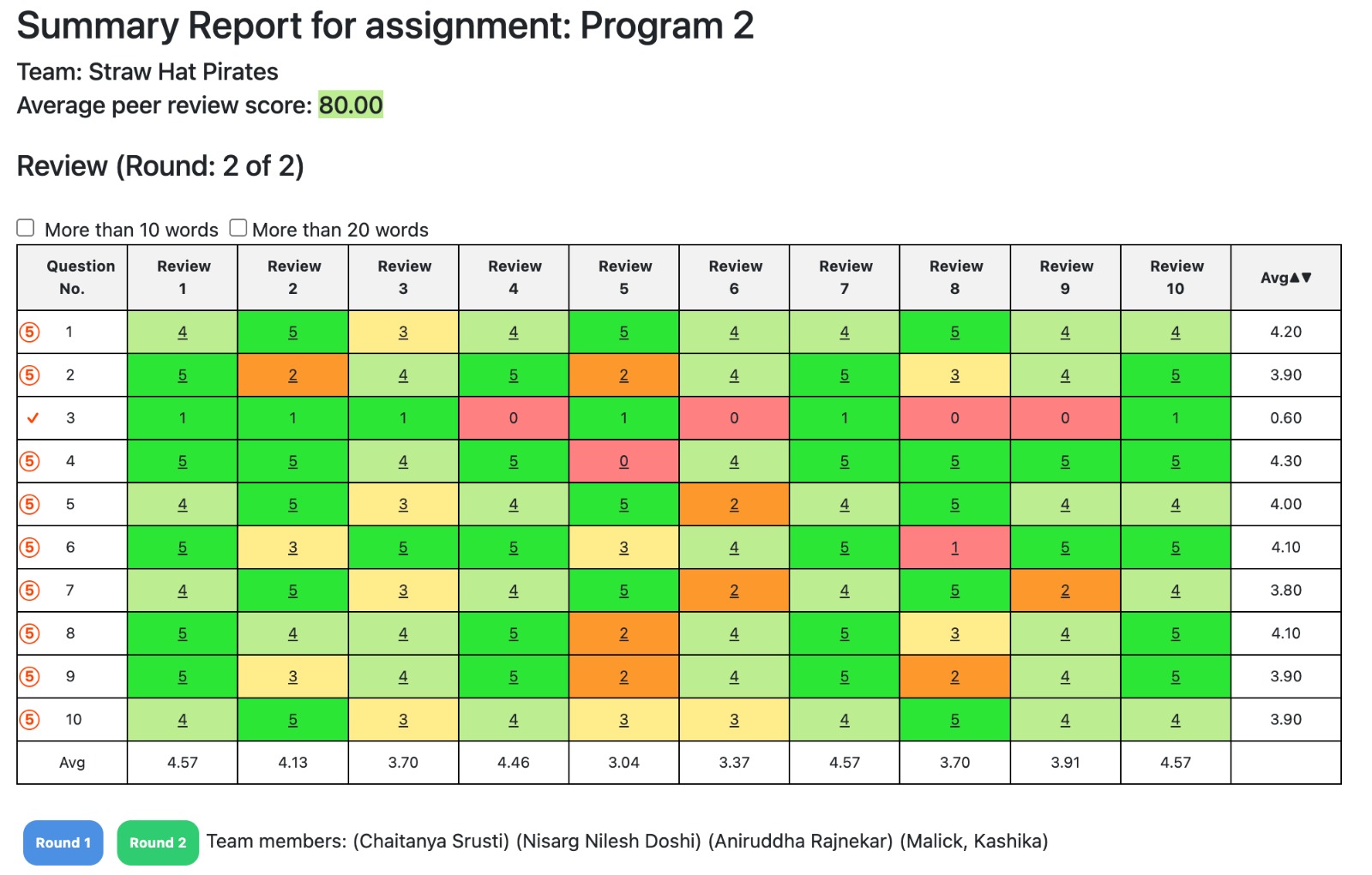
These design patterns play a pivotal role in ensuring the scalability, maintainability, and extensibility of our front-end implementation for Expertiza.
Dummy Data
The purpose of the dummy data is test the functionality of our frontend. For this purpose we have chosen JSON data as a template for test data, the future team working on the backend can delete this file if the data can be successfully retrieved from the database.
JSON Files
JSON files can be found here [Link]
{
  "team": "Straw Hat Pirates",
  "members": ["Chaitanya Srusti", "Nisarg Nilesh Doshi", "Aniruddha Rajnekar", "Malick, Kashika"],
  "grade": "Grade for submission",
  "comment": "Comment for submission",
  "late_penalty": 0
}
[
  [
    {
      "questionNumber": "1",
      "questionText": "Does this feature meet the project requirements?",
      "reviews": [
        { "score": 0},
        { "score": 1},
        { "score": 1},
        { "score": 0},
        { "score": 1},
        { "score": 0},
        { "score": 1},
        { "score": 1},
        { "score": 1},
        { "score": 0}
      ],
      "RowAvg": 0,
      "maxScore": 1
    },
    // Add more question as needed .....
  ],
  [
    {
      "questionNumber": "1",
      "questionText": "What is the main purpose of this feature?",
      "reviews": [
        { "score": 4, "comment": "The design is polished and professional." },
        { "score": 5, "comment": "Certain design elements make the feature a joy to use." },
        { "score": 3, "comment": "Some design aspects could benefit from refinement." },
        { "score": 4, "comment": "The design is user-friendly, with intuitive navigation." },
        { "score": 5, "comment": "Certain design elements enhance user interaction effectively." },
        { "score": 4, "comment": "Some design aspects may require further attention." },
        { "score": 4, "comment": "The design encourages exploration and discovery." },
        { "score": 5, "comment": "The feature's design sets a new standard for user interfaces." },
        { "score": 4, "comment": "Certain design elements are confusing and could be clarified." },
        { "score": 4, "comment": "The design offers an inviting and engaging experience." }
      ],
      "RowAvg": 0,
      "maxScore": 5
    },
    // Add more questions as needed...

  ],
  // Add more rounds as needed...
]
Future Scope
1. Integrate a submission button at the top of the gradesview page to streamline the user experience and facilitate easy access to submission functionality.
2. Develop a tagging table feature for reviews, enhancing organization and categorization capabilities to improve user navigation and analysis of review data.
3. Optimize data structure by transitioning from storing dummy data by question to a more efficient organization by review, enhancing data management and retrieval processes.
4. Incorporate a legend button into the interface to provide users with clear guidance and reference points, enhancing usability and accessibility of information.
5. Enhance usability by implementing review sorting functionality based on the average score, enabling users to quickly identify and prioritize reviews based on performance metrics.
6. Introduce visual aids such as graphs and charts to augment the presentation of review data, facilitating deeper insights and analysis for users through visual representations.
7. Improve clarity and comprehension by displaying a color legend above the review table, providing users with a clear reference for interpreting color-coded indicators within the review interface.
Project Mentor
Kashika Mallick (kmallick@ncsu.edu)
Team Members
Aniruddha Rajnekar (aarajnek@ncsu.edu)
Chaitanya Srusti (crsrusti@ncsu.edu)
Nisarg Doshi (ndoshi2@ncsu.edu)
Links
[Pull Request]