E1859 Visualizations for Instructors
Introduction
Expertiza is an online assignment grading platform. Instructors can create assignments and implement peer reviews for submitted assignments. This project concerns the creation of a system for visualizing student performance on those assignments, primarily as graded in peer reviews. Graphs will be made to show various rubric criteria and the class' performance on the criteria. If the criteria are the same for multiple stages of review, an instructor should be able to compare performance over time or between reviews.
Project Purpose
Our task is to provide an interactive visualization or a table for instructors that shows how their class performed on selected rubric criteria. Such feature would be immensely helpful for instructors as it would assist them to identify what they need to focus more attention on. For example, creating a graph showing the average scores for all or a certain subset of main rubric criteria (questionnaire). If the average score of the class on selected criteria (question) is low means the instructor can emphasize more on the learning materials related to it.
Proposed Changes
The visualizations will be implemented as either a single or stacked bar chart with a bar for each of the selected criteria to be observed. If a single bar, then the height of the bar will be the total class average, but a stacked bar chart may be better to show the percentage of the class that received each score. The changes made to the expertiza project will primarily include HTML/ERB changes to the view files to accommodate the added charts on the page and the necessary javascript to allow responsive design. Brief controller modifications will be made to facilitate database filtering to get the displayed data.
Project Design
Design Flow
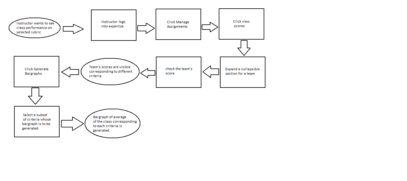
The flowchart representing graphical flow of an instructor visiting view scores under assignments is given below:
Tools and Design Choice
We plan to use the lightweight Google Charts library for displaying the chart data on the page, with standard HTML for all of the options and dropdowns for option selection. Google Charts was chosen because of its high compatibility, full option set, and comparable graphical quality to the rest of expertiza while keeping a small JS footprint, which should help prevent slow page responsiveness.
Visualization
The following graph shows the expected view of the 'view scores' page. The instructor selects a subset of rubric criteria for which he/she wants to know how a class performed. A bar graph of the average score of the class for that subset of criteria would be displayed.
The above graph shows average score of the class for 10 rubric criteria selected by the instructor. The code and live demo can be found on JSFiddle
Files Involved
We plan to work on the files that the previous team were involved with such as controllers of grade and assignment and the view of grade and review_mapping.
Proposed files:
app/controllers/assignments_controller.rb

app/views/grades/view.html.erb

app/views/grades/_teams.html.erb

app/views/grades/_team_title.html.erb

app/views/grades/_team_charts.html.erb

app/view/review_mapping/_review_report.html.erb
Test Plan
The specification of the project does not require us to use automated tests. However, we plan to test the modified ruby code or the new features that will be added to the grades_controller. We will be approaching RSpec testing framework. For the javascript, the tests will be conducted manually.

