CSC/ECE 517 Spring 2018- Project E1816: Visualization for Instructors
Team Members
Daniel Burcal (djburcal@ncsu.edu)
Patrick Poggi (pfpoggi@ncsu.edu)
Ambareesh Pandit (aspandit@ncsu.edu)
Minghao Pan (mpan2@ncsu.edu)
Expertiza
Expertiza is an open source web application based on Ruby on Rails framework, supported by the National Science Foundation. It is a place where students can submit and peer-review learning objects (assignments, codes, write ups, websites, etc). For an instructor, expertiza allows to create and customize new or existing assignments. For students, it allows to create and work on various projects and assignments. It provides a platform to peer review other students' submissions across various document types, including the URLs and wiki pages.
Problem Statement
A previous team has worked on creating this visualization graphic for Instructors, which can be found here. We are tasked with building upon the work they have performed as well as improving the visualization aspect for instructors. Specifically we can narrow the goals of this project as follows:
- The Visualization of the compiled metrics is confusing. We will aim to use a more coherent color scheme from red to green for the graph. We want to allow the instructor to dynamically generate graphs with the data they request. We will separate the table into partials or use a scheme to only show the sections of the table the instructor requests
- There are ways to compile review data together such that it is even easier for the instructor to identify weaknesses and strengths. To that end, we would like to integrate review performance by compiling various feedback data that is collected. This would include the number of reviews performed, the length of the reviews, the summary of the reviews, whether or not the reviewers uploaded a file in their review, the average ratings the reviewers received from authors.
- Another useful feature would be the ability to visualize class performance on a certain rubric criteria. Further, if these criteria are common ones used between projects, it would be very helpful to be able to compare performance between assignments on the common criteria.
Design Process Flow
Below you can see a flowchart representing the graphical flow of an instructor visiting the visualization page we are modifying.
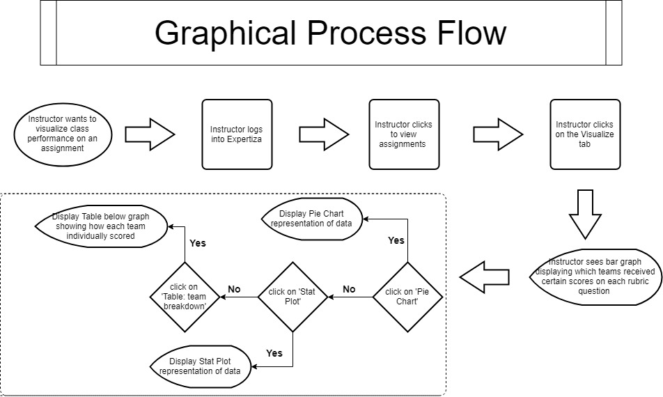
Once the instructor visits the visualization page, they will already see a bar graph displaying how all the teams scored on each rubric criteria. Below this will be buttons or some other method by which to select the data that you want. The whole process flow involves being able to traverse the visualization page in a quick and efficient manner, since oftentimes the instructor will visit the page often. Below we will go into our intended design route for this project.
Design
Here is a mock-up of our intended page:
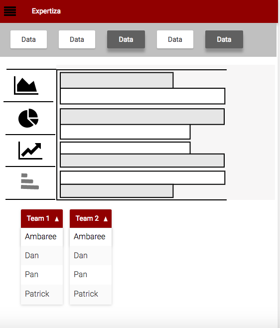
As you can see, we will have menu options by which the instructor can choose which data members to show and likewise the type of graphic visual they would like to produce. This will make it so that the instructors can visualize only the data they want to, and in the form that gives them the most relevant information. We plan on using the flot javascript library to implement the graphic visuals, which will provide an easy and clear visual of the requested data. Under the visual, we will have a way to select between teams and individual students' data to further target the desired visual. The last team which worked on this project used the highcharts javascript library, but we have decided to move to flot due to visual clarity and the ability to easily decide which data to display.
Another mock-up of how the UI could be designed, is that by visiting the visualization page, the instructor will see a graph followed by an array of buttons.
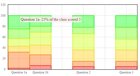
The chart above shows stacked bar charts of a single submission. Each bar represents a question from the submission and the colors represent the percentage of teams that earned a 0(red) through 5(green) on the submission.
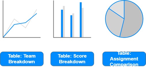
As you can see, we plan on implementing an array of buttons to carry out simple manipulations to data and to display only the data the instructor wants to. We plan on implementing buttons to change the graphic that is displayed, so that if an instructor wishes to see a pie chart or histogram, they can click the button and see the data in a different form. Below those buttons, there will be other ones which will direct the page on what type of table to display and with which information. The reason for these adjustments are that in the last semester's implementation, the table was quite lengthy, and this will make it more manageable by the instructor.
It is possible that if we are able to, we plan on implementing a drop down functionality like in the mock-up further up the page where you can be even more selective about the data you wish to display in the tables or in the graphics.
Modified Files
Generally we plan on modifying the same files as the previous group did. The controllers of grade and assignment are involved. For the view part, we will modify the view of grade and review_mapping. We may also create new view files. app/controllers/grades_controller.rb
app/controllers/assignments_controller.rb
app/views/grades/view.html.erb (partials below)
app/views/grades/_teams.html.erb
app/views/grades/_team_title.html.erb
app/views/grades/_team_charts.html.erb
app/view/review_mapping/_review_report.html.erb
Testing Plan
Since it is based on a previous project, we need to refactor some previous code while making sure the previous test files (assignments_controller_spec.rb and grades_controller_spec.rb) still work. We are going to test new features we add in the future.
It is beyond the scope of the course to test the graphs. We will only test the Ruby code.The tests will most likely use RSpec and the existing factories in Expertiza.
As we will use Javascript to achieve an interactive visualization, we will test the functionality of Javascript codes manually.
Implementation
Visualization
In order to Improve the visualization of the rubric question data, we decided to use the flot javascript library instead of highcharts. In order to accomplish this, we constructed an adapter that took the already generate highchart data by the previous team, and converted it to a representation required by our flot graph. This is done in the highchart_to_flot_adapter method in the app/controllers/grades_controller.rb file.
Color Scheme
For fixing the color scheme, we used the adapter that was made to obtain the correct data, and instead of using their randomly generated colors, in the adapter there was a 6 element array with colors from red to green. This was inputted into the data series as per the correct format flot requires. You can also see the result below, in the picture of the graph provided.
Rubric Representation
To implement this, in the adapter we formed the data series such that different review rounds would be separated and clustered among their own review questions. This allows an easier viewing of different review rounds in order to determine how the class improved. The data passed to the _team_charts.html.erb view file contains all of the questions for all review rounds associated with the assignment. In addition to implementing the flot graphical representation, we also created a tooltip which allows the instructor to see the percentage of people who scored a certain value on any rubric questions of any round.
Here is a picture of what the completed flot graph looks like:

Code
The ruby code printed below is the adapter that was made to convert the highchart series data into the form required by our flot plot in the method highchart_to_flot_adapter.
def highchart_to_flot_adapter(min, max, highchart_series_data)
    flot_series_data = []
    flot_categories = []
    highchart_data = []
    flot_data = []
    j = 0
    k = 0
    rounds = 0
    highchart_series_index = 0
    review_round = highchart_series_data.to_a.reverse[0][:stack]
    flot_colors = ["#FF0000", "#FF6600", "#FFCC00", "#CCFF00", "#66FF00", "#00FF00"] # These are the six colors from red to green

    # This loop will look at every element of the highchart_series_data and use them to form the flot_series_data
    # and flot_categories. Flot_series_data is of the form [{data: [[0,x], [1,x], [2,x], [3,x], [4,x], ...], color: "#......"},...].
    # It is an array of hashes of the size of the number of different scores, which for us is 6: 0, 1, 2, 3, 4, 5. The first
    # value in each of those arrays within the hash indicates the specific question, while the x indicates the percentage
    # of people which scored a certain score on that question. Flot_categories is a hash of the form [[0,""], [1,""], [2,""]],
    # where the first value in each of the inner arrays indicates the question number and the quotes indicate the name
    # of that question.
    highchart_series_data.to_a.reverse.each do |element|
      highchart_data = element[:data]
      stack = element[:stack]
      round = stack.scan(/[0-9]/)
      # This tells flot_categories and flot_series_data that it is a new round
      unless stack.eql?(review_round)
        rounds += 1
        review_round = stack
        k = 0
      end
      # Every sixth element tells flot_categories to create as many ticks as there were questions in that round
      if highchart_series_index % 6 == 1
        for i in 0..highchart_data.size-1
          flot_categories.push([k + (rounds*highchart_data.size), "Rubric \##{k} Round \##{round[0]}"])
          k += 1
        end
      end
      # Pushes the data into flot_series_data in the correct form specified above
      for i in 0..highchart_data.size-1
        if rounds > 0
          flot_series_data[j][:data].push([i + (rounds*highchart_data.size), highchart_data[i]])
        end
        if rounds.zero?
          flot_data.push([i, highchart_data[i]])
        end
      end
      flot_series_data.push(data: flot_data, color: flot_colors[j]) if rounds.zero?

      j += 1
      if j > max
        j = 0
      end
      flot_data = []
      highchart_data = []
      highchart_series_index += 1
    end

    # This loop calculates the percentages and stores them in the correct data series
    num_reviewees = 0
    for i in 0..flot_series_data[0][:data].size-1
      for j in 0..flot_series_data.size - 1
        num_reviewees += flot_series_data[j][:data][i][1]
      end
      for j in 0..flot_series_data.size - 1
        unless num_reviewees.zero?
          flot_series_data[j][:data][i][1] /= num_reviewees.to_f
          flot_series_data[j][:data][i][1] *= 100.0
        end
      end
      num_reviewees = 0
    end
    [flot_series_data, flot_categories]
  end
Also, javascript code was added in order to produce the stacked bar chart as shown on the webpage.
<div id="flot_scores_on_rubric_questions" style="width:1000px;height:300px;"> </div>

<script type="text/javascript">
  $(function () {
    $.plot($("#flot_scores_on_rubric_questions"), <%= @flot_series_data.to_json.html_safe %>, {
      xaxis: {
        ticks: <%= @flot_categories.to_json.html_safe %>
      },
        yaxis: {
            tickFormatter: function(val, axis) { return val < axis.max ? val.toFixed(2) : "Percentage of teams";}
        },
      grid: {
        hoverable: true,
        clickable: true
      },
      series: {
        stack: true,
        lines: {
          show: false,
          fill: true,
          steps: 0
        },
        bars: {
          show: true,
          align: 'center',
          barWidth: 1
        }
      }
    });

    $("<div id='flot_team_scores_tooltip'></div>").css({
      position: "absolute",
      display: "none",
      border: "1px solid #fdd",
      padding: "2px",
      "background-color": "#fee",
      opacity: 0.80
    }).appendTo("body");

    $("#flot_scores_on_rubric_questions").bind("plothover", function (event, pos, item) {

      if (item) {
        var x = item.datapoint[0],
        y = item.datapoint[1];

        $("#flot_team_scores_tooltip").html(item.series.xaxis.ticks[x].label + ": " + item.series.data[x][1].toFixed(2) + "% of the class scored " + item.seriesIndex)
        .css({top: item.pageY+5, left: item.pageX+5})
        .fadeIn(200);
      } else {
        $("#flot_team_scores_tooltip").hide();
      }
    });
Class Performance
The Class Performance visualization allows the instructor to view a histogram of 0 to 5 scores for a particular assignment. Furthermore, the visualization allows the user to switch between the preliminary round and the final round as well as view a combined view. As with the rubric criteria visualization, hovering over a bar in the class performance visualization brings up a tooltip indicating the score and frequency of teams that earned that score.

Code
The ruby code added is below. These are additional methods in the grades controller that collects and adds the raw score counts for each team to the @scores instance variable
  def add_scores_by_round
    scores_by_team_round = get_raw_scores_by_team_round(@questions)
    @scores[:teams].each_value do |value|
      team_id = value[:team][:id]
      value[:scores][:scores_by_round] = scores_by_team_round[:teams][team_id]
    end
  end

  def get_raw_scores_by_team_round(questions)
    scores = {}

    scores[:teams] = {}
    if !questions.nil? && !questions.empty?
      @assignment.teams.collect {|team| team.id}.each do |team_id|
        first_round_sym = (@assignment.num_review_rounds == 1) ? :review : :review1
        scores[:teams][team_id] = get_team_raw_scores_by_round(team_id,questions[first_round_sym][0].questionnaire.id) if !questions[first_round_sym].nil? && !questions[first_round_sym].empty?
      end
    end
    scores
  end

  def get_team_raw_scores_by_round(team_id, questionnaire_id)
    scores = {}
    maps = ResponseMap.where(reviewee_id: team_id, type: "ReviewResponseMap")
    assessments_by_team_id = {}
    res_round = {}
    maps.each do |m|
      responses = m.response.each{|r| r.response_id} # response_id is the actual response here
      assessments_by_team_id[team_id] = [] if assessments_by_team_id[team_id].nil?
      responses.each{|res| assessments_by_team_id[team_id] << res.id if res.is_submitted} if !responses.nil? && !responses.empty?
      responses.each{|res| res_round[res.id] = res.round if res.is_submitted} if !responses.nil? && !responses.empty?
    end

    qData = ScoreView.find_by_sql ["SELECT q1_id,s_response_id, question_weight,s_score FROM score_views WHERE type in('Criterion', 'Scale') AND q1_id = ? AND s_response_id in (?)", questionnaire_id, assessments_by_team_id[team_id]]
    scores[team_id] = {}
    (1..@assignment.num_review_rounds).each{|idx| scores[team_id].merge!("#{idx}": [0, 0, 0, 0, 0, 0])} # [num0s,num1s,num2s,num3s,num4s,num5s]
    qData.each do |qd|
      if !qd.s_score.nil? && !res_round[qd.s_response_id].nil? # if res_round[qd.s_response_id].nil?, then not submitted
        scores[team_id][res_round[qd.s_response_id].to_s.to_sym][qd.s_score] = scores[team_id][res_round[qd.s_response_id].to_s.to_sym][qd.s_score] + 1
      end
    end

    scores[team_id]
  end
Additionally, there was JavaScript code added to the _team_charts.html.erb file. This code took the incoming @scores object and converted it to a format that the Flot libraries could understand. The JavaScript code also added the radio buttons to switch between the individual rounds and all rounds as well as the tooltip for the class performance visualizaton portion of this assignment.
        function compileData() {
            var allData = <%= @scores.to_json.html_safe %>;
            var frequencyDataByTeam = collectFrequencyDataByTeam(allData);
            var aggregate = calculateAggregateFrequencies(frequencyDataByTeam);
            var data = convertAggregateFrequencyArraysToFlotData(aggregate);

            return data;
        }

        function collectFrequencyDataByTeam(allData) {
            var frequencyData = [];
            for(var teamIdx in allData.teams) {
                var team = allData.teams[teamIdx].team;
                var scoresByRound = allData.teams[teamIdx].scores.scores_by_round;
                frequencyData.push({
                    team: {
                        id: team.id,
                        name: team.name
                    },
                    scoresByRound: scoresByRound
                });
            }
            return frequencyData;
        }

        function calculateAggregateFrequencies(frequencyData) {
            var aggregate = aggregateByRound(frequencyData);

            aggregate.all = aggregateAllRounds(aggregate);

            return aggregate;
        }

        function aggregateAllRounds(aggregate) {
            var all = [0,0,0,0,0,0];
            for(var round in aggregate) {
                for(var idx = 0;idx < aggregate[round].length;idx++) {
                    all[idx] += aggregate[round][idx];
                }
            }
            return all;
        }

        function aggregateByRound(frequencyData) {
            var aggregate = {};

            for(var teamDataKey in frequencyData) {
                var teamData = frequencyData[teamDataKey];
                for(var round in teamData.scoresByRound) {
                    var scores = teamData.scoresByRound[round];
                    if(aggregate[round] == null) {
                        aggregate[round] = [0, 0, 0, 0, 0, 0];
                    }
                    for(var idx = 0;idx < scores.length;idx++) {
                        aggregate[round][idx] += scores[idx];
                    }
                }
            }

            return aggregate;
        }

        function convertAggregateFrequencyArraysToFlotData(aggregate) {
            var data = {};
            for(var round in aggregate) {
                data[round] = [];
                for(var idx = 0;idx < aggregate[round].length;idx++) {
                    data[round].push([idx, aggregate[round][idx]]);
                }
            }

            return data;
        }

        $("#class-performance-plot").width($("#class-performance-plot").parent().innerWidth()*0.8);
        $("#class-performance-plot").height($("#team-chart").innerHeight());

        $("#radioBtns").width($("#radioBtns").parent().innerWidth()*0.2);
        $("#radioBtns").height($("#team-chart").innerHeight());

        var cpdata = compileData();

        var classPerformance = $.plot($("#class-performance-plot"),[cpdata.all],
            {
                grid: {
                    hoverable: true,
                    clickable: false
                },series: {
                lines: {
                    show: false,
                    fill: true,
                    steps: 0
                },
                bars: {
                    show: true,
                    align: 'center',
                    barWidth: 1
                }
            }
            });


        $("<div id='class-performance-plot-tooltip'></div>").css({
            position: "absolute",
            display: "none",
            border: "1px solid #fdd",
            padding: "2px",
            "background-color": "#fee",
            opacity: 0.80
        }).appendTo("body");

        $("#class-performance-plot").bind("plothover", function (event, pos, item) {

            if (item) {
                var x = item.datapoint[0],
                    y = item.datapoint[1];

                $("#class-performance-plot-tooltip").html("Score: " + x + "; Frequency: " + y)
                    .css({top: item.pageY+5, left: item.pageX+5})
                    .fadeIn(200);
            } else {
                $("#class-performance-plot-tooltip").hide();
            }

        });

        var radioBtn = $('<label><input type="radio" name="assignmentRound" value="all" checked onclick="showAggregation(\'all\')"/>All Rounds</label>')
        radioBtn.appendTo('#radioBtns');

        for (var round = 1; round <= <%= @assignment.num_review_rounds %>; round++) {
            var radioBtn = $('<label><input type="radio" name="assignmentRound" onclick="showAggregation(\''+round+'\')"/>Round '+round+'</label>');
            radioBtn.attr("value",round);
            radioBtn.appendTo('#radioBtns');

        }

        window.showAggregation = function(round) {
            classPerformance.setData([cpdata[round]]);
            classPerformance.setupGrid();
            classPerformance.draw();
        }
Review Performance
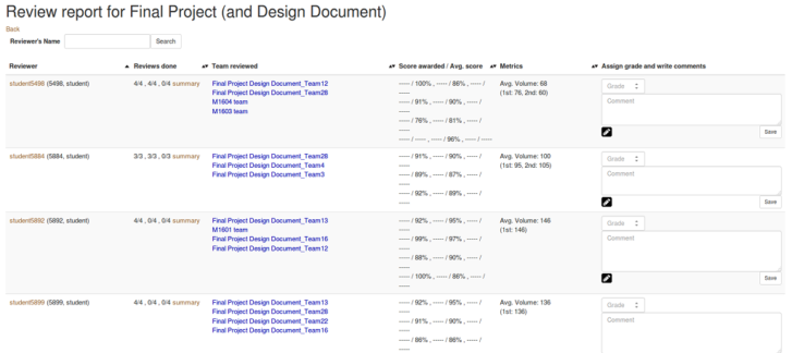
There some obsolete codes in review_mapping_helper.rb about Dr. Kidd's course. Those codes were intended to calculate author feedbacks of reviews and there are also some related codes in _review_report.html.erb. However, in the view part, those codes are commented and those do not work. In fact, Dr. Kidd's course is 806, which is not on Expertiza now. So those obsolete codes are removed. Since in the testing files there are no corresponding codes for those parts, the previous tests still work. The new review table allows the instructor to sort the result by more options, like the number of reviews completed, the average volume and the average score. The page is given as below.
Testing Done
Rubric Representation
In terms of ensuring correct operation of the system under the changes made, our goal was to ensure the previous tests worked, as not much was entirely changed about the view controller method. In ensuring the previous tests worked, we could then be sure the private methods within the grades_controller.rb file were working properly.
Class Performance
The tests verify that the correct frequency of raw scores is received from the database. A test is performed for rubric criteria that vary by round and one is created for an assignment where the rubric does not vary.
Review Performance
Some obsolete codes in the review_mapping_controller.rb are deleted and the previous test still works.
Future Work
One consideration to improve upon the work we have done, is to make it so that the visualization graph that shows participant performance on every rubric question in each round can handle assignments which vary the number of rubric questions between rounds. Currently the set-up does not support such a feature.
With regards to the class performance, an enhancement of showing the breakdown of weighted scores 0-100% could be shown instead of displaying the frequency of raw 0-5 scores.
The remaining challenge is to integrate the author feedback to the review report page. It is hard because of multiple reasons. Some reviews have 3 rounds. The feedback of each round has multiple questions. Some are scored questions but some are not. In fact, even the author feedback report does not include the specific score.
References
Here is our project repo
Here is our created Pull Request
Here is our video Visualization for Instructors Walkthrough
