CSC/ECE 517 Spring 2018- Project E1816: Visualization for Instructors
Team Members
Daniel Burcal (djburcal@ncsu.edu)
Patrick Poggi (pfpoggi@ncsu.edu)
Ambareesh Pandit (aspandit@ncsu.edu)
Minghao Pan (mpan2@ncsu.edu)
Expertiza
Expertiza is an open source web application based on Ruby on Rails framework, supported by the National Science Foundation. It is a place where students can submit and peer-review learning objects (assignments, codes, write ups, websites, etc). For an instructor, expertiza allows to create and customize new or existing assignments. For students, it allows to create and work on various projects and assignments. It provides a platform to peer review other students' submissions across various document types, including the URLs and wiki pages.
Problem Statement
A previous team has worked on creating this visualization graphic for Instructors, which can be found here. We are tasked with building upon the work they have performed as well as improving the visualization aspect for instructors. Specifically we can narrow the goals of this project as follows:
- The Visualization of the compiled metrics is confusing. We will aim to use a more coherent color scheme from red to green for the graph. We want to allow the instructor to dynamically generate graphs with the data they request. We will separate the table into partials or use a scheme to only show the sections of the table the instructor requests
- There are ways to compile review data together such that it is even easier for the instructor to identify weaknesses and strengths. To that end, we would like to integrate review performance by compiling various feedback data that is collected. This would include the number of reviews performed, the length of the reviews, the summary of the reviews, whether or not the reviewers uploaded a file in their review, the average ratings the reviewers received from authors.
- Another useful feature would be the ability to visualize class performance on a certain rubric criteria. Further, if these criteria are common ones used between projects, it would be very helpful to be able to compare performance between assignments on the common criteria.
Design Process Flow
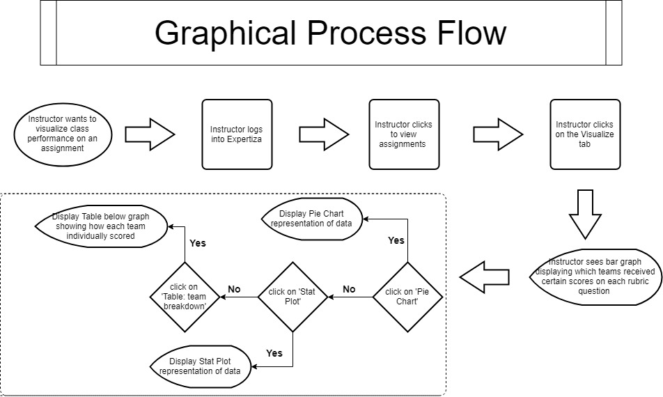
Below you can see a flowchart representing the graphical flow of an instructor visiting the visualization page we are modifying.

Once the instructor visits the visualization page, they will already see a bar graph displaying how all the teams scored on each rubric criteria. Below this will be buttons or some other method by which to select the data that you want. The whole process flow involves being able to traverse the visualization page in a quick and efficient manner, since oftentimes the instructor will visit the page often. Below we will go into our intended design route for this project.
Design
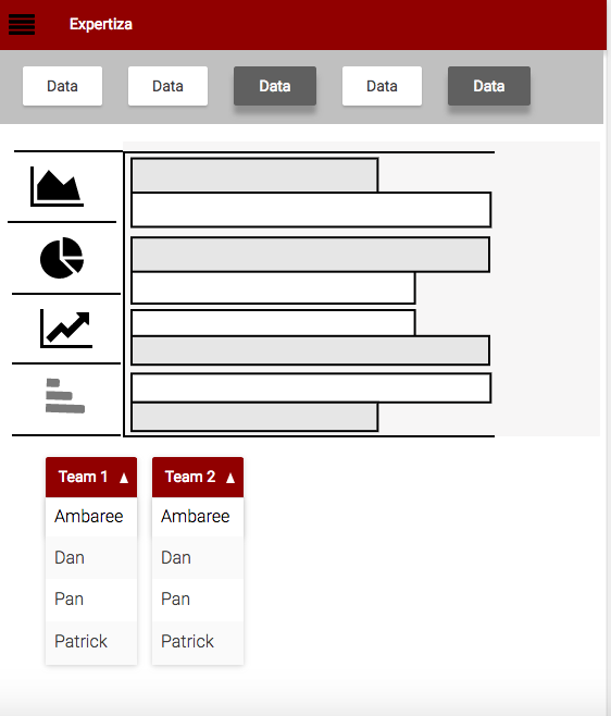
Here is a mock-up of our intended page:

As you can see, we will have menu options by which the instructor can choose which data members to show and likewise the type of graphic visual they would like to produce. This will make it so that the instructors can visualize only the data they want to, and in the form that gives them the most relevant information. We plan on using the flot javascript library to implement the graphic visuals, which will provide an easy and clear visual of the requested data. Under the visual, we will have a way to select between teams and individual students' data to further target the desired visual. The last team which worked on this project used the highcharts javascript library, but we have decided to move to flot due to visual clarity and the ability to easily decide which data to display.
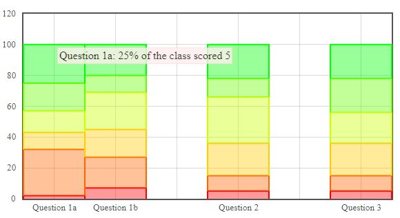
Another mock-up of how the UI could be designed, is that by visiting the visualization page, the instructor will see a graph followed by an array of buttons.

The chart above shows stacked bar charts of a single submission. Each bar represents a question from the submission and the colors represent the percentage of teams that earned a 0(red) through 5(green) on the submission.

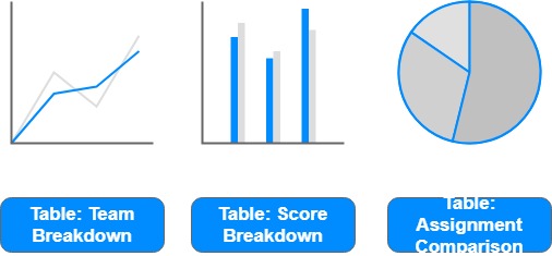
As you can see, we plan on implementing an array of buttons to carry out simple manipulations to data and to display only the data the instructor wants to. We plan on implementing buttons to change the graphic that is displayed, so that if an instructor wishes to see a pie chart or histogram, they can click the button and see the data in a different form. Below those buttons, there will be other ones which will direct the page on what type of table to display and with which information. The reason for these adjustments are that in the last semester's implementation, the table was quite lengthy, and this will make it more manageable by the instructor.
It is possible that if we are able to, we plan on implementing a drop down functionality like in the mock-up further up the page where you can be even more selective about the data you wish to display in the tables or in the graphics.
Modified Files
Generally we plan on modifying the same files as the previous group did. The controllers of grade and assignment are involved. For the view part, we will modify the view of grade and review_mapping. We may also create new view files. app/controllers/grades_controller.rb
app/controllers/assignments_controller.rb
app/views/grades/view.html.erb (partials below)
app/views/grades/_teams.html.erb
app/views/grades/_team_title.html.erb
app/views/grades/_team_charts.html.erb
app/view/review_mapping/_review_report.html.erb
Testing Plan
Since it is based on a previous project, we need to refactor some previous code while making sure the previous test files (assignments_controller_spec.rb and grades_controller_spec.rb) still work. We are going to test new features we add in the future.
It is beyond the scope of the course to test the graphs. We will only test the Ruby code.The tests will most likely use RSpec and the existing factories in Expertiza.
As we will use Javascript to achieve an interactive visualization, we will test the functionality of Javascript codes manually.
Implementation
Visualization
In order to Improve the visualization of the rubric question data, we decided to use the flot javascript library instead of highcharts. In order to accomplish this, we constructed an adapter that took the already generate highchart data by the previous team, and converted it to a representation required by our flot graph. This is done in the highchart_to_flot_adapter method in the app/controllers/grades_controller.rb file.
Color Scheme
References
Here is our project repo
Here is our created Pull Request