CSC/ECE 517 Spring 2018 E1815: Improvements to review grader
Improvements to Review Grader
Abstract
In this design doc, since it's clearer to explain how we are going to improve the UI design by proposing each idea with the corresponding design's current image, we aren't going to separate problems from goals because you, as a reader, will need to scroll up and down to match problems to their corresponding goals.
Introduction
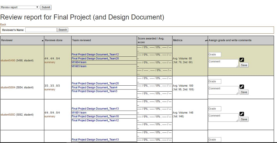
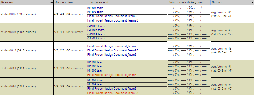
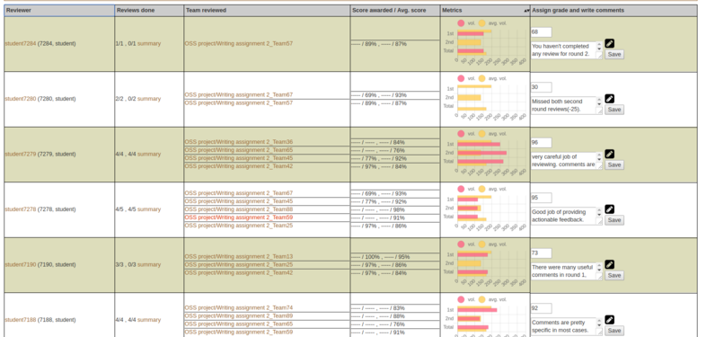
Expertiza is a web application that is widely used by 2 types of users: students and instructors. When a user is logged-in as an instructor, and would like to see a review report on an assignment to review a grader, he/she could reach the page via Manage > Assignments and clicking on the “View review report” icon. The page would look somewhat like this:
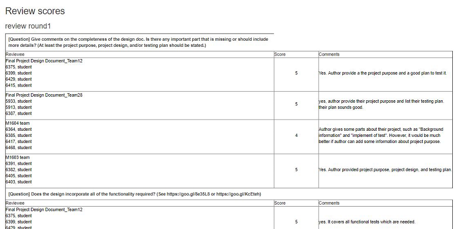
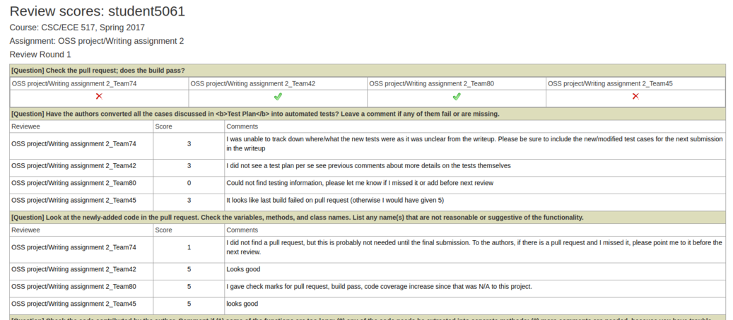
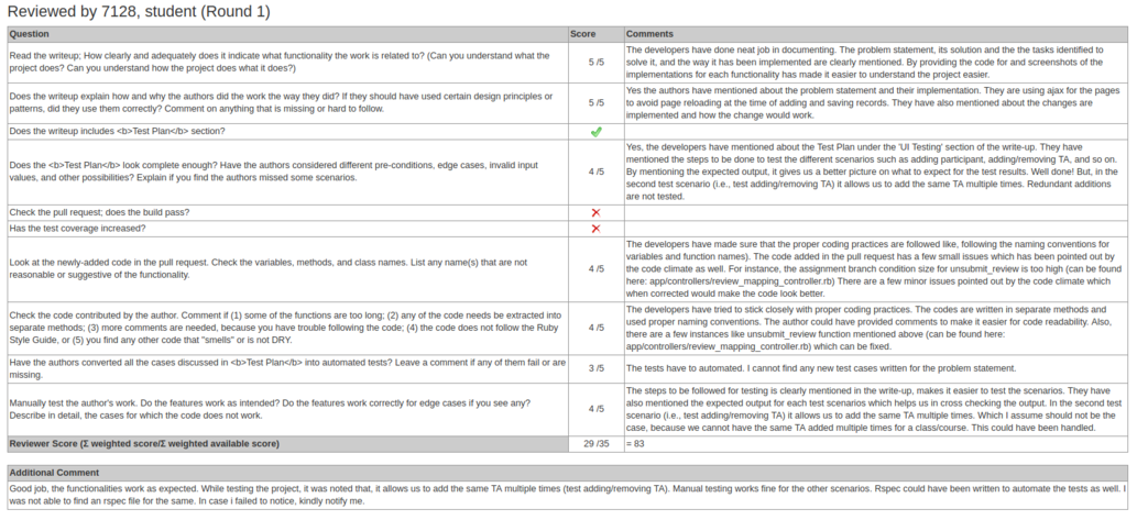
To get a summary review report performed by a particular student, an instructor can get to the page from the review report by clicking “summary” in the row for that student. The page would look like this one:
Problem Statement
This project is focused primarily on making various improvements to the Review Report and Review Summary pages, described in detail in the previous section. Each of these pages, while functional, suffer from many UI issues which make the pages more difficult to use for instructors. That is, information which would be useful to instructors is missing in several cases. In others, large amounts of unnecessary information is present, cluttering the site. Additionally, both pages suffer from structural and design issues which, again, waste instructor time.
Finally, the Review Report page sometimes mis-categorizes students who have not updated their reviews of others, even though the project under review has not changed! This could cause students to be deducted points unfairly. By adding a new way of highlighting this special case to instructors, review grades can be assigned more fairly.
File Changes
- app/helpers/review_mapping_helper.rb for Add metrics charts
- app/views/popup/view_review_scores_popup.html.erb
- app/views/review_mapping/_review_report.html.erb
- app/assets/stylesheets/table_sorter.scss
- app/helpers/review_mapping_helper.rb
- app/views/popup/team_users_pop_up.html.haml
- config/application.rb
Review Report Page
Add metrics charts
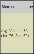
Presently, this page contains a 'metrics' column, presently displaying the average review volume for a given user in text form. This method of displaying data can be difficult to interpret, and even more difficult to compare at a glance, or to notice trends. Additionally, plans for expanding the metrics column to include more data would worsen this issue if it remained in its current state.
Solution
Files
- app/helpers/review_mapping_helper.rb
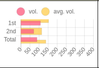
This project will replace the text in this column with easy to read bar or line graphs, which will be color-coded or otherwise made very simple and easy to read. These graphs will display the data clearly and concisely, mitigating these issues. This concise display will allow for easier comparison of data, easier interpretation of data, and will allow for more metrics to be added without simply overcrowding the page with text.
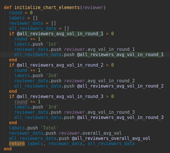
First of all, we calculate the average volume in each round and the overall average volume of all rounds.

Next, we organize all the data and their corresponding label array for the chart drawing method later.
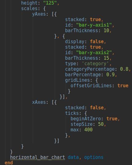
Finally, we apply an extension called chartjs-ror to help us draw horizontal bar charts. Most of the codes in this method relate to the configuration setting of the chart.
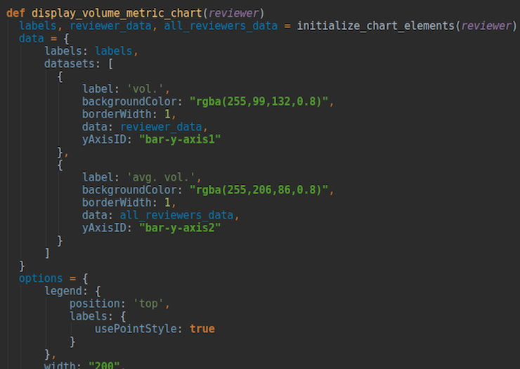
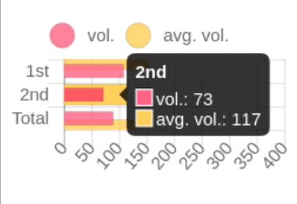
The result of our improvement doesn't have its value explicitly showed because we want to save more space and let the chart be simpler to read. Yet, you can let your mouse points the bar, then the value will show up as seen in the figures below.
Update alternating background color if sorted
In order to make the large table which dominates this page easier to read, each row has an alternating background color (between white and a yellow-green). Although this helps tremendously with readability, the alternating background colors do not update when the table is sorted. That is, if any of the sort functions are used, the background colors move with the associated rows, effectively shuffling the colors of each row. This, in fact, harms the readability of the page, and creates false groupings of visually similar rows.
Review Report sorted by metrics:
Solution
Files
- app/views/review_mapping/_review_report.html.erb
- app/assets/stylesheets/table_sorter.scss
Fixing the alternating background color involved removing the existing backgrounding mechanism in _review_report.html.erb and applying the "zebra" widget to the existing java tablesorter table.
Defining the colors for odd and even rows was just a style fix in the table_sorter.scss file.
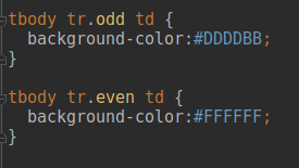
Both of these changes yields a table that updates the backgrounds of each element appropriately, even when the table is sorted.
Add new color to Team reviewed
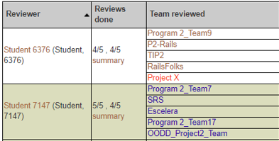
On this page, the names of teams reviewed are color-coded, to make it easier for instructors to see common issues. For example, if a student has not completed a review for a team in every round, the team name is colored red. If a student has completed a review for a team either in every round or not, and has not received a grade, the team name is colored blue. A brown-colored team name indicates that the review grade has been assigned. However, the current color coding scheme assigns a blue color to a team name as long as there is A review. Thus, there is no distinction between the cases when a team's work has been reviewed in the previous round, but the team has not resubmitted their work in the following round, and if the team has resubmitted a work in a round, but there is no review in that round. That is, students may be marked explicitly as having done no work when they have nothing to review in the latest round. Thus, the plan is to add new colors to refactor the case of assigning blue color to team names.
Solution
Files
- app/views/review_mapping/_review_report.html.erb
- app/helpers/review_mapping_helper.rb
- config/application.rb
- app/assets/stylesheets/redbox.scss
Once again, if a student originally completed a review during the first round, but did not update it, AND the project under review has not been changed since the initial review, the reviewer should not be penalized. Reviewers who meet these criteria will be given a green color, otherwise, purple color.
To make new colors assignment work, firstly, we needed to define both new colors in app/assets/stylesheets/redbox.scss:
#green a{
	color: #00aa00;
}
#green{
	height:auto;
}

#purple a{
  color: #FF00FF;
}

#purple{
  height:auto;
}
The actual implementation of refining new logic of color assignment and its supporting methods was added to app/helpers/review_mapping_helper.rb. For this project we had to extend the logic of Response.exists?(map_id: response_map.id) condition:
- assign 'blue' to team reviewed only if the review grade is not assigned, and there is a review for each round;
- assign 'purple' if a team submitted their work within a round, but a student did not review it within that round, or if the team submitted a link in the previous round, and the link was updated within the following round;
- assign 'green' if there is no work to review within a round, or if the team submitted a link in the previous round, and the link was NOT updated within the following round;
Right now the method supports only wiki links, and can return their last-modified date. In the future, it can be extended to support github links.
if Response.exists?(map_id: response_map.id)
      if !response_map.try(:reviewer).try(:review_grade).nil?
        'brown'
      elsif response_for_each_round?(response_map)
        'blue'
      else
        color = []
        (1..@assignment.num_review_rounds).each do |round|
          if submitted_within_round?(round, response_map, assignment_created, assignment_due_dates)
            color.push 'purple'
          else
            link = submitted_hyperlink(round, response_map, assignment_created, assignment_due_dates)
            if link.nil? or (link !~ /https*:\/\/wiki(.*)/) # can be extended for github links in future
              color.push 'green'
            else
              link_updated_at = get_link_updated_at(link)
              color.push link_updated_since_last?(round, assignment_due_dates, link_updated_at) ? 'purple' : 'green'
            end
          end
        end
        color[-1]
      end
    else
      'red'
    end
The rest of new methods definitions, such as:
- response_for_each_round?
- submitted_within_round?
- submitted_hyperlink
- get_link_updated_at
- link_updated_since_last?
can be found in app/helpers/review_mapping_helper.rb.
To support the mechanism of getting last-modified header, we had to add "require 'net/https'" to config/application.rb.
The following screen-shot represents a case when a team submitted their work within a round, but a student did not review it within that round:
This screen-shot represents a case when a team submitted a link in the last round, and the link was NOT updated within the next round. Thus, to avoid penalizing a student for no submitted review, the team name is assigned green color:
To reflect new color assignments, we updated the legend from app/views/review_mapping/_review_report.html.erb:
<p> **In "Team reviewed" column, text in <i style="color:red">red</i> indicates that the review is not yet completed;
    text in <i style="color:blue">blue</i> indicates that the review grade is not assigned or updated;
    text in <i style="color: #986633">brown</i> indicates that the review grade has been assigned;
    text in <i style="color:green">green</i> indicates that there is no work to review;
    text in <i style="color:purple">purple</i> indicates that there is no review for a team's work</p>
This is the updated legend:
Review Summary page
Header
- collapse (fix whitespace where possible)
- add reviewers name to easily tell who's review you are looking at, as well as course and assignment this relates to
- fix round capitalization and add space between word round and the round number
Solution
- Most changes were front end, made to the view_review_scores_popup
Questions should span the entire row
- Add colspan attribute which would allow the question to span the entire column which would then allow the name column to be smaller and the comment column to be larger.
Solution
- As mentioned, adding the colspan=3 attribute allowed the question to span the entire column. This was a purely client-side change.
Checkbox questions
- Replace individual team members name with just the team name
- Delete the comments column since comments aren't allowed in these types of questions
- Questions should be in a column that spans the width of the table.
- The team names that the reviewer reviewed should be in the following row separated into columns.
- The index in the table will have a check if the question was answered with a check and an X if answered otherwise. Each team will be represented as a column with its answer, check or X image, underneath.
Solution
Files
- app/views/popup/view_review_scores_popup.html.erb
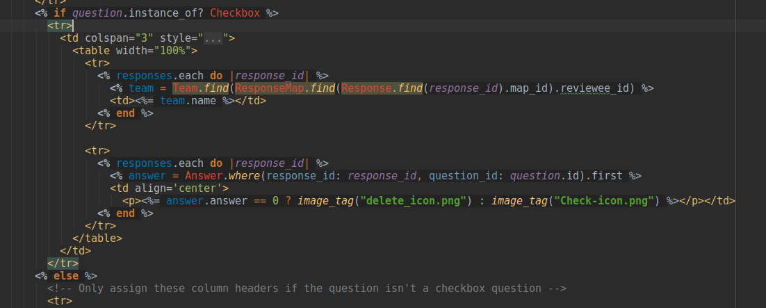
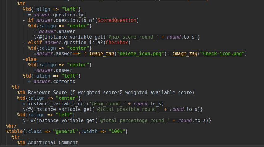
Fixing this involved mostly html changes. Representing the team names instead of individual names was simply using the team attribute instead of the individual's name. Having questions span the entire table involved adding colspan attributes where necessary. Deleting the comments column for as well as representing each team and their answers in columns involved nesting a table into the existing table based on the question type. Representing the checkbox questions as pictures of a check and an X was as easy as showing an image based on the type of questions.
All of the above changes resulted in a checkbox section that looks like this:
Additional comments spanning
- Additional comments should span across all of the columns to save vertical space
Solution
- Several front-end changes result in a cleaner Additional Comments section which saves additional space by adding the Reviewer to a new column
CSS / Style improvements to review scores
- Add addition colors for reviews that didn't do a second(third,forth,etc) round review. In other words if the review hasn't changed from the previous round, color that review(er) a different color so instructors don't have to open the review and see that it hasn't changed.
Test Plan
This project would be manually tested since it's all about UI improvement. To show that it's fully tested, we will record the manual tests for each goal we plan to achieve and of course, it will include audio and video. The video would be posted on Youtube so that it's easy for everyone to watch.
Optional additional improvements
User Report Page
Another piece of low hanging fruit that we decided to tackle was the User report page, which shows the response for an individual review instead of the summary of all of the reviews done. You get to this page by clicking on a team name in the "Team Reviewed" column of the Review Report table(shown above). The edits made on this page where reflective of the edits made on the summary page to enure consistent styles between the two different types of reviewing reviews.
Solution
Files
* app/views/popup/team_users_pop_up.html.haml
The fixes to this page involved adding colspan's and adjusting what is displayed in score column based on whether the question is a checkbox question or not.
The changes to the code above leads to a following table:
