CSC/ECE 517 Spring 2018 E1815: Improvements to review grader
Improvements to Review Grader
Abstract
In this design doc, since it's clearer to explain how we are going to improve the UI design by proposing each idea with the corresponding design's current image, we aren't going to separate problems from goals because you, as a reader, will need to scroll up and down to match problems to their corresponding goals.
Introduction
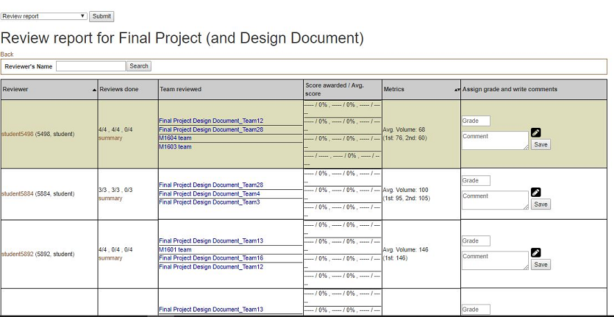
Expertiza is a web application that is widely used by 2 types of users: students and instructors. When a user is logged-in as an instructor, and would like to see a review report on an assignment to review a grader, he/she could reach the page via Manage > Assignments and clicking on the “View review report” icon. The page would look somewhat like this:
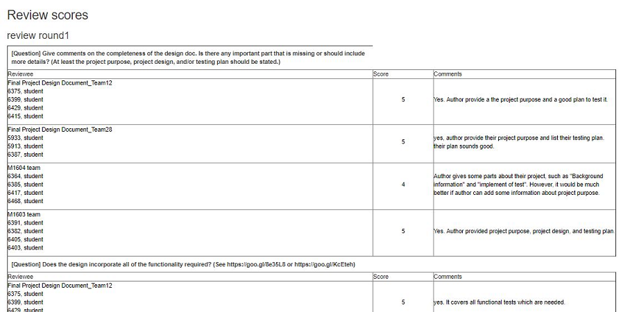
To get a summary review report performed by a particular student, an instructor can get to the page from the review report by clicking “summary” in the row for that student. The page would look like this one:
Problem Statement
This project is focused primarily on making various improvements to the Review Report and Review Summary pages, described in detail in the previous section. Each of these pages, while functional, suffer from many UI issues which make the pages more difficult to use for instructors. That is, information which would be useful to instructors is missing in several cases. In others, large amounts of unnecessary information is present, cluttering the site. Additionally, both pages suffer from structural and design issues which, again, waste instructor time.
Finally, the Review Report page sometimes mis-categorizes students who have not updated their reviews of others, even though the project under review has not changed! This could cause students to be deducted points unfairly. By adding a new way of highlighting this special case to instructors, review grades can be assigned more fairly.
Review Report Page
Add metrics charts
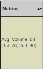
Presently, this page contains a 'metrics' column, presently displaying the average review volume for a given user in text form. This method of displaying data can be difficult to interpret, and even more difficult to compare at a glance, or to notice trends. Additionally, plans for expanding the metrics column to include more data would worsen this issue if it remained in its current state.
This project will replace the text in this column with easy to read bar or line graphs, which will be color-coded or otherwise made very simple and easy to read. These graphs will display the data clearly and concisely, mitigating these issues. This concise display will allow for easier comparison of data, easier interpretation of data, and will allow for more metrics to be added without simply overcrowding the page with text.
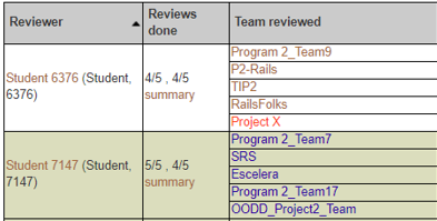
Update alternating background color if sorted
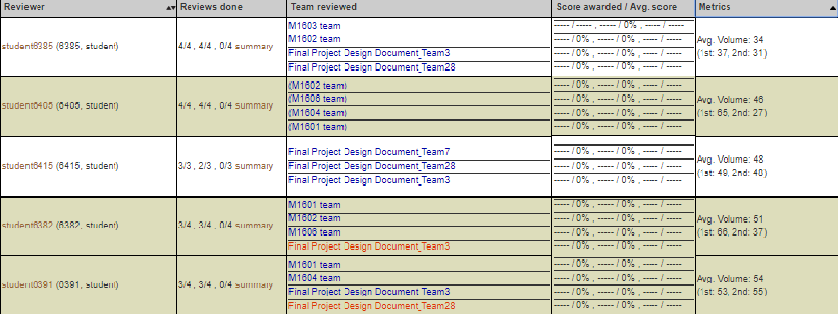
In order to make the large table which dominates this page easier to read, each row has an alternating background color (between white and a yellow-green). Although this helps tremendously with readability, the alternating background colors do not update when the table is sorted. That is, if any of the sort functions are used, the background colors move with the associated rows, effectively shuffling the colors of each row. This, in fact, harms the readability of the page, and creates false groupings of visually similar rows.
Review Report sorted by metrics:
This project will attempt to maintain the alternating background colors, even if the content of the table has been re-organized due to sorting.
Add new color to reviewers
On this page, the names of student peer reviewers are often color-coded, to make it easier for instructors to see common issues. For example, reviewers who have not submitted a review may be colored red, and reviewers who have not received a grade may be colored blue. However, as mentioned earlier, the current color coding scheme will assign a red color to students who have not updated their review of others projects, even when that project has not changed. That is, students may be marked explicitly as having done no work, when there was no work to do!
As part of this project, we will add a new color-code for students in this case. Once again, if a student originally completed a review during the first round, but did not update it, AND the project under review has not been changed since the initial review, the reviewer should not be penalized. Reviewers who meet these criteria will be given a new color, potentially green.
Review Summary page
Header
- collapse (fix whitespace where possible)
- add reviewers name to easily tell who's review you are looking at, as well as course and assignment this relates to
Questions should span the entire row
- Add colspan attribute which would allow the question to span the entire column which would then allow the name column to be smaller and the comment column to be larger.
Checkbox questions
- Replace individual team members name with just the team name
- Delete the comments column since comments aren't allowed in these types of questions
- Questions should be in the leftmost column and the team names that the reviewer reviewed should be in the following columns. The index in the table will have a check if the question was answered with a check and an X if answered otherwise.
Additional comments spanning
- Additional comments should span across all of the columns to save vertical space
CSS / Style improvements to review scores
- Add addition colors for reviews that didn't do a second(third,forth,etc) round review. In other words if the review hasn't changed from the previous round, color that review(er) a different color so instructors don't have to open the review and see that it hasn't changed.
File Changes Plan
- app/helpers/review_mapping_helper.rb for Add metrics charts
Test Plan
This project would be manually tested since it's all about UI improvement. To show that it's fully tested, we will record the manual tests for each goal we plan to achieve and of course, it will include audio and video. The video would be posted on Youtube so that it's easy for everyone to watch.
Optional additional improvements
Review Report page - sort by other metrics
Ideally, this page would have an option to allow instructors to sort by any metric. Presently, only one metric is shown, but adding more has been planned for the future. This may require the addition of a dropdown to allow the selection of what metric to sort by. However this is implemented, it may not add too much complexity to the page.
Review Summary page - Interpret HTML
Presently, users may enter HTML code to style their comments and reviews. However, this is currently not displayed properly. For example, HTML tags will themselves be displayed. The addition of a gem or potentially configuration changes will be needed to ensure this HTML will be properly displayed. Any implementation of this task should follow the DRY principle - that is, the implementation should be able to be re-used in all other pages where user-entered HTMl should be displayed
