CSC/ECE 517 Spring 2018- Project E1816: Visualization for Instructors
Team Members
Daniel Burcal (djburcal@ncsu.edu)
Patrick Poggi (pfpoggi@ncsu.edu)
Ambareesh Pandit (aspandit@ncsu.edu)
Minghao Pan (mpan2@ncsu.edu)
Problem Statement
A previous team has worked on creating this visualization graphic for Instructors, which can be found here. We are tasked with building upon the work they have performed as well as improving the visualization aspect for instructors. Specifically we can narrow the goals of this project as follows:
- The Visualization of the compiled metrics is confusing. We will aim to use a more coherent color scheme from red to green for the graph. We want to allow the instructor to dynamically generate graphs with the data they request. We will separate the table into partials or use a scheme to only show the sections of the table the instructor requests
- There are ways to compile review data together such that it is even easier for the instructor to identify weaknesses and strengths. To that end, we would like to integrate review performance by compiling various feedback data that is collected. This would include the number of reviews performed, the length of the reviews, the summary of the reviews, whether or not the reviewers uploaded a file in their review, the average ratings the reviewers received from authors.
- Another useful feature would be the ability to visualize class performance on a certain rubric criteria. Further, if these criteria are common ones used between projects, it would be very helpful to be able to compare performance between assignments on the common criteria.
Preliminary Design
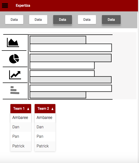
A mock-up of our potential implementation of the graphic visual may be seen below.
As you can see, we will have menu options by which the instructor can choose which data members to show and likewise the type of graphic visual they would like to produce. This will make it so that the instructors can visualize only the data they want to, and in the form that gives them the most relevant information. We plan on using the highcharts javascript library to implement the graphic visuals, which will provide an easy and clear visual of the requested data. Under the visual, we will have a way to select between teams and individual students' data to further target the desired visual.
As denoted in the problem statement, we will also address the table of review data. Currently it is overwhelming and we would like to simplify it by maintaining the ability to inspect the data. We will devise a method to sort the table contents and to only display what is requested.
References
Here is our project repo
Here is our created Pull Request
