CSC/ECE 517 Spring 2018 E1815: Improvements to review grader
Improvements to Review Grader
Introduction
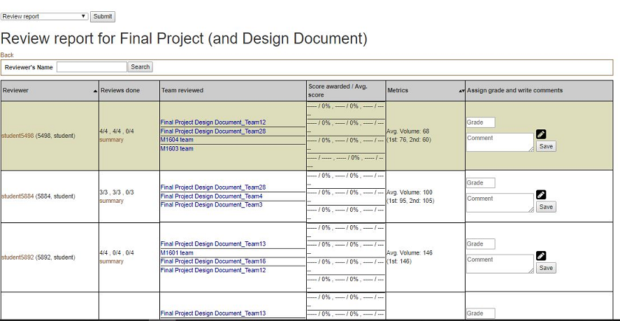
Expertiza is a web application that is widely used by 2 types of users: students and instructors. When a user is logged-in as an instructor, and would like to see a review report on an assignment to review a grader, he/she could reach the page via Manage > Assignments and clicking on the “View review report” icon. The page would look somewhat like this:
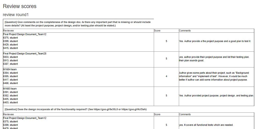
To get a summary review report performed by a particular student, an instructor can get to the page from the review report by clicking “summary” in the row for that student. The page would look like this one:
Problem Statement
Both views, especially the summary report, need some changes in the design to ease the process of reviewer grading.
Some ideas that would improve the look of reports that our team is going to implement are listed below.
Outline of Work for Design Improvements
View Review Report Page
- Add metrics charts
In the metrics column, replace the numbers with bar charts. Specifically, horizontal bar charts that aren’t too wide, so they could potentially add more charts in the future. Color coded is ideal. Should be one bar with the average as a line or something (not clear on details here)
- Update alternating background color if sorted
- Right now, the table on this page has alternating background colors to make it easier to read. Issue is, if you change the sorting, the background colors move with the items. So it may not be alternating any more. Needs to be fixed
- Add new color to reviewers if reviewed content has not changed
- On this page, the names of reviewers are sometimes color coded. Add a new color code (green) for reviewers who reviewed content during the first round but not the second, when nothing has changed since the first round
- (Optional): Sort by metric
Review Summary page
- Header - collapse (fix whitespace where possible)
- Add more information such as the reviewer’s name.
- Checkbox questions
- Replace all team members names with just team name
- Comments aren’t allowed, delete that column
- Columns per team, question on left
- Additional comments spanning
- CSS / Style improvements to review scores
- (Stretch goal) Interpret HTML

