E1859 Visualizations for Instructors
Introduction
Expertiza is an online assignment grading platform. Instructors can create assignments and implement peer reviews for submitted assignments. This project concerns the creation of a system for visualizing student performance on those assignments, primarily as graded in peer reviews. Graphs will be made to show various rubric criteria and the class' performance on the criteria. If the criteria are the same for multiple stages of review, an instructor should be able to compare performance over time or between reviews.
Project Purpose
Our task is to provide an interactive visualization or a table for instructors that shows how their class performed on selected rubric criteria. Such feature would be immensely helpful for instructors as it would assist them to identify what they need to focus more attention on. For example, creating a graph showing the average scores for all or a certain subset of main rubric criteria (questionnaire). If the average score of the class on selected criteria (question) is low means the instructor can emphasize more on the learning materials related to it.
Proposed Changes
The visualizations will be implemented as either a single or stacked bar chart with a bar for each of the selected criteria to be observed. If a single bar, then the height of the bar will be the total class average, but a stacked bar chart may be better to show the percentage of the class that received each score. The changes made to the expertiza project will primarily include HTML/ERB changes to the view files to accommodate the added charts on the page and the necessary javascript to allow responsive design. Brief controller modifications will be made to facilitate database filtering to get the displayed data.
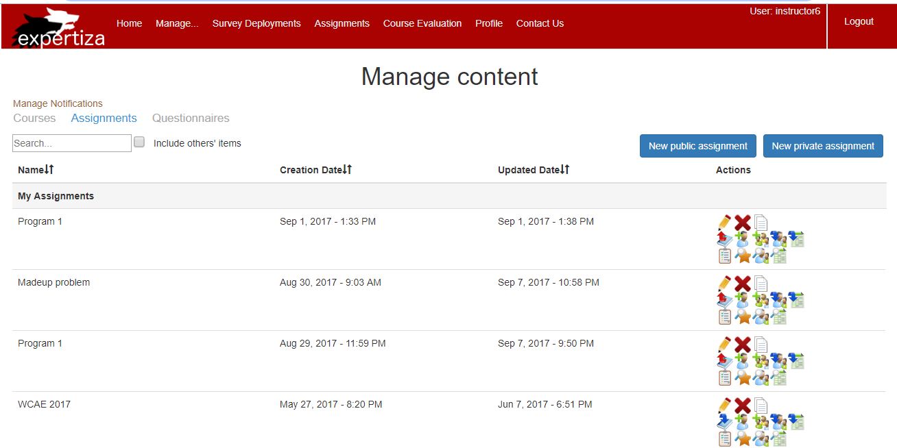
1. On clicking Manage and then on assignments, following page appears.
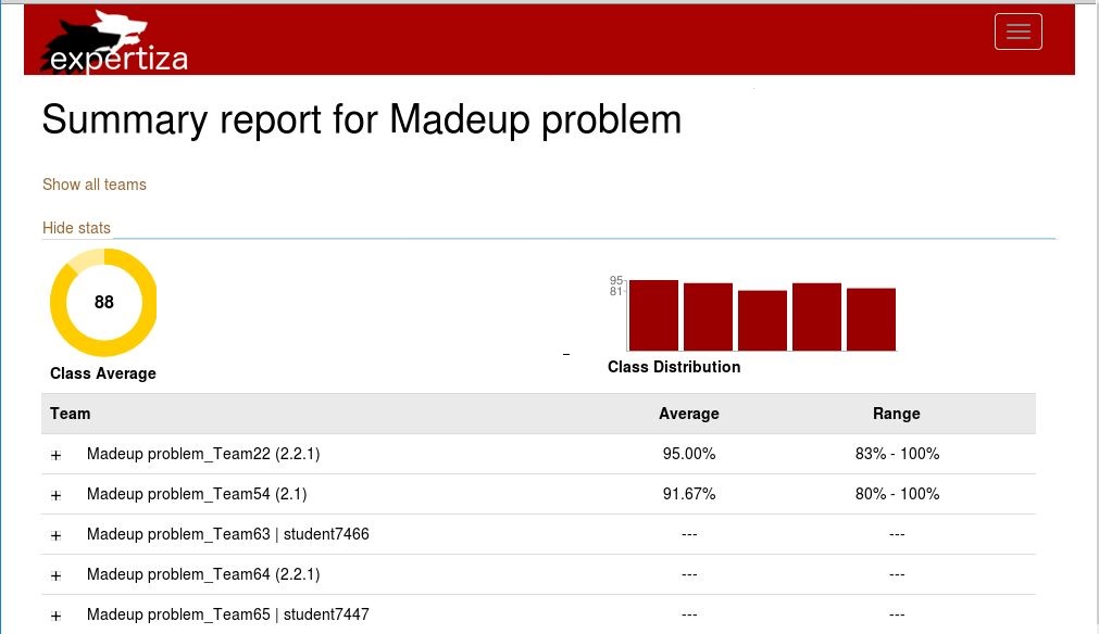
2. Click on 'view score' icon of an assignment. The summary report page of the selected assignment comes up.
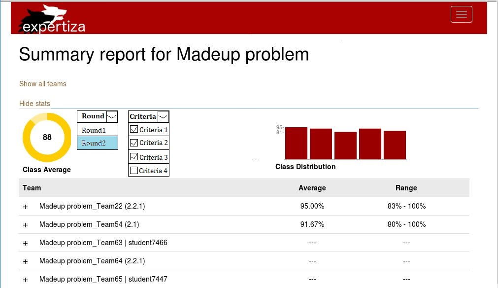
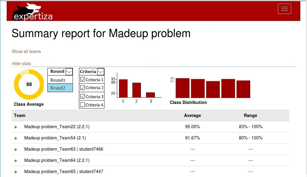
3. Following are mockup screens which we wish to create:
a) Instructor would select the round and rubric criteria of the assignment for which he/she wants to view the class performance.
b) The bar graph of the class performance for those criteria would be displayed.
Project Design
Design Flow
The flowchart representing graphical flow of an instructor visiting view scores under assignments is given below:
Tools and Design Choice
We plan to use the lightweight Google Charts library for displaying the chart data on the page, with standard HTML for all of the options and dropdowns for option selection. Google Charts was chosen because of its high compatibility, full option set, and comparable graphical quality to the rest of expertiza while keeping a small JS footprint, which should help prevent slow page responsiveness.
Visualization
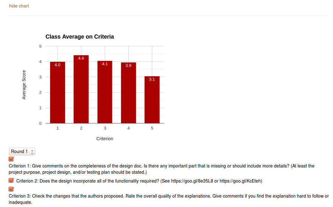
The following graph shows the expected view of the 'view scores' page. The instructor selects a subset of rubric criteria for which he/she wants to know how a class performed. A bar graph of the average score of the class for that subset of criteria would be displayed.
The above graph shows average score of the class for 5 rubric criteria in Round 1 selected by the instructor. A live demo with randomly generated data can be found on JSFiddle
Files Involved
We plan to work on the files that the previous team were involved with such as controllers of grade and assignment and the view of grade and review_mapping. Hopefully there is only slight controller modifications necessary, as the chart can use the existing information collected by controller methods to display the raw details on the existing page.
Proposed files:
app/controllers/assignments_controller.rb

app/views/grades/view.html.erb

app/views/grades/_teams.html.erb

app/views/grades/_team_title.html.erb

app/views/grades/_team_charts.html.erb

app/view/review_mapping/_review_report.html.erb
Code
app/views/grades/_criteria_charts.html.erb
<html>
 <head>
<%= content_tag :div, class: "chartdata_information", data: {chartdata: @chartdata} do %>
   <% end %>
<%= content_tag :div, class: "text_information", data: {text: @text} do %>
   <% end %>
   <%= content_tag :div, class: "minmax_information", data: {minmax: @minmax} do %>
   <% end %>
<script type="text/javascript" src="https://www.gstatic.com/charts/loader.js"></script>
   <script type="text/javascript">
     google.charts.load('current', {packages: ['corechart', 'bar']});
@@ -55,29 +22,35 @@
      //Display Options
     var showLabels = true;
     var barColors = [ // Other colors generated from the expertiza base red
         '#A90201',    // using paletton.com
         '#018701',
         '#016565',
         '#A94D01'
     ];
     function getData(){ //Loads all chart data from the page
       chartData = $('.chartdata_information').data('chartdata');
       chartText = $('.text_information').data('text');
       chartRange = $('.minmax_information').data('minmax');
for (var i = 0; i < chartData.length; i++){ //Set all the criteriaSelected to true
         var criteria = [];
         for (var j = 0; j < chartData[i].length; j++){
           criteria.push(true);
         }
         criteriaSelected.push(criteria);
       }
    }
      function generateData() {	//Generates random data for testing
       var rounds = 3;
       for(var i = 0; i < rounds; i++) {
 var criteriaNum = Math.floor(Math.random() * 5 + 5);  //Random number of criteria
         var round = [];
         var criteria = [];
         for(var j = 0; j < criteriaNum; j++) {
 round.push(Math.floor(Math.random() * 101));  //Random score for each criterion
           criteria.push(true);  //Everything starts out true
         }
         chartData.push(round);
         criteriaSelected.push(criteria);
@@ -89,7 +62,7 @@
       chartOptions = {		//Render options for the chart
         title: 'Class Average on Criteria',
         titleTextStyle: {
 fontName: 'arial',
           fontSize: 18,
           italic: false,
           bold: true
@@ -130,12 +103,12 @@
       chart = new google.visualization.ColumnChart(document.getElementById('chart_div'));
       var checkBox = document.getElementById("labelCheck");
       checkBox.checked = true;
       checkBox.style.display = "inline";
       updateChart(currentRound);
       loadRounds(); }
function updateChart(roundNum) {	//Updates the chart with a new round number and renders
       currentRound = roundNum;
       renderChart();
       loadCriteria();
@@ -150,18 +123,13 @@
      function renderChart() {	//Renders the chart if changes have been made
         var data = loadData();
chartOptions.vAxis.viewWindow.max = 5;
         chartOptions.vAxis.viewWindow.min = 0;
         if (chartRange[currentRound]) { //Set axis ranges if they exist
             if (chartRange[currentRound][1])
                 chartOptions.vAxis.viewWindow.max = chartRange[currentRound][1];
if (chartRange[currentRound][0])
                 chartOptions.vAxis.viewWindow.min = chartRange[currentRound][0];
}
         chart.draw(data, chartOptions);
     }
@@ -177,9 +145,9 @@
          chartOptions.hAxis.ticks = [];
         var rowCount = 1;
for(var i = 0; i < chartData[currentRound].length; i++) { //Add a chart row for each criterion if not null
             if (criteriaSelected[currentRound][i] && chartData[currentRound][i]) {
 data.addRow([rowCount, chartData[currentRound][i], barColors[0], (showLabels) ? chartData[currentRound][i].toFixed(1).toString() : ""]);
                 chartOptions.hAxis.ticks.push({v: rowCount++, f: (i+1).toString()});
             }
         }
@@ -192,7 +160,7 @@
         var data = new google.visualization.DataTable();
         data.addColumn('number', 'Criterion');
         var i;
for(i = 0; i < roundNum; i++) { //Add all columns for the data
             data.addColumn('number', 'Round ' + (i+1).toString());
             data.addColumn({type: 'string', role: 'style'});	//column for specifying the bar color
             data.addColumn({type: 'string', role: 'annotation'});
@@ -208,16 +176,16 @@
             var newRow = [];
             var elementsAdded = false;
             newRow.push(rowCount);
for(var j = 0; j < roundNum; j++) { //If the round has the criterion, add it
                 if (chartData[j][i]) {
                     newRow.push(chartData[j][i]);
                     elementsAdded = true;
                 } else {
                     newRow.push(null);
                 }
 newRow.push(barColors[j % barColors.length]); //Add column color
                 if (chartData[j] && chartData[j][i] && showLabels)
newRow.push(chartData[j][i].toFixed(1).toString()); //Add column annotations
                 else
                     newRow.push("");
             }
@@ -249,15 +217,15 @@
      function loadCriteria() {	//Creates the criteria check boxes
         var form = document.getElementById("chartCriteria");
while (form.firstChild) //Clear out the old check boxes
             form.removeChild(form.firstChild);
if (currentRound == -1) //Don't show criteria for 'all rounds'
             return;
         chartData[currentRound].forEach(function(dat, i) {
             var checkbox = document.createElement('input');
             checkbox.type = "checkbox";
             checkbox.id = "checkboxoption" + i;
checkbox.onclick = function() { //Register callback to toggle the criterion
                 checkboxUpdate(i);
             }
             var label = document.createElement('label')
@@ -285,7 +253,7 @@
   <form id="chartOptions" name="chartOptions">
     <select id="chartRounds" name="rounds"
onChange="updateChart(document.chartOptions.chartRounds.options[document.chartOptions.chartRounds.options.selectedIndex].value)" style = "display: none">
     </select>
<label><input type="checkbox" id = "labelCheck" checked="checked" style="display: none" onclick="showLabels = !showLabels; renderChart();">Show
Labels</label>
   </form>
Test Plan
The specification of the project does not require us to use automated tests. However, we plan to test the modified ruby code or the new features that will be added to the grades_controller. We will be approaching RSpec testing framework. For the javascript, the tests will be conducted manually.
JavaScript Chart
To validate all functionality of the chart when adding new features or fixing old ones, the following criteria were tested manually for expected functionality:
- Chart is displaying correctly
- Bars are showing up where expected
- Bar annotations are showing the expected value
- Criteria labels are for the correct bar and displaying correct values
- Hover text is displaying the correct values
- Null values are not present on the chart
- Correct colors are used for the multi-round view
- Show Labels checkbox works as expected
- Round Criteria is displaying correctly
- Round dropdown menu shows all rounds for the assignment
- Selecting a round changes the criteria checkboxes
- All checkboxes are displayed with appropriate text
- Checkboxes correctly remove or add criterion bars to the chart
RSpec Tests
RSpec tests were added to validate functionality of the helper methods that were added to the grades controller.
