CSC/ECE 517 Fall 2015 E1577 MayYellowRoverJump
Introduction
Expertiza is an open-source education and classroom web-tool founded by the National Science Foundation. Built with Ruby on Rails, it is designed to manage complete courses and students’ work within those courses. Each course can have a collection of instructors and students, though the interaction between instructors and students is minimal. The real emphasis of Expertiza is placed on peer-to-peer interactions, fostering a student-driven learning environment. Courses are comprised of assignments which users complete individually or with a team. Assignments usually encourage or require a team to enforce practicing peer-to-peer interaction.
One of the main tenets of Expertiza is its implicit peer-review system. Assignments inherently have a review stage where, rather than having instructors review a team’s work, other students review a team’s submission for that assignment. When completing a review, a student is presented with essentially a rubric for the assignment, and they fill in each category with the score they deem commensurate with the work of the team. Of course, each category has a comments box for the student to qualify the score they doled out. Each member of the submitting team is notified of the review, and the team can then decide as a whole how to rework their submission based on the feedback in the peer reviews.
There do exist issues, however, with respect to viewing one’s team’s reviews, particularly in the realm of usability. Our team has been tasked with revamping and enhancing the review UI to produce a more focused and uniform user experience for students and instructors alike.
Assignment
Description
The tasks of the assignment are as follows:
- Compact the review display. Eliminate the blank lines between items within a single review. Instead vary the background color from line to line to improve readability.
- Add the following to the top of each review: who submitted the review. The instructor should see the user’s name and user-ID. A student should see “Reviewer #k”, where k is an integer between 1 and n, the number of reviews that have been submitted for this project. the version number of the review, and the time the review was submitted.
- Add functionality to allow the instructor to view different review rounds. Also, provide instructor with a review report page of all reviewers’ reviews to every project.
- Allow different alternate view: group by question.
- Reduce the duplicate code between instructor and student grade reports.
Purpose
Motivations
- Lack of uniformity between student and instructor views
- No defined separation between reviews
- All reviews and review data (comments, question text, etc.) are displayed at once
Discussion
There is no denying that the usability of viewing peer reviews leaves much to be desired. It lacks uniformity across the student and instructor roles, and the view itself has no semblance of order or organization. Viewing a single student’s review is a chore for both instructors and students, as there is no clear separation between reviews. In addition, all reviews are displayed at once, meaning viewing a single review requires scrolling through the page until the desired review is found. Our goal is to take the same data in the current display and present it in a more focused manner that allows a user, in either the instructor or student role, to absorb and process the content in the peer review more efficiently. Accessing, viewing, and understanding a review should be a far more simple task than what it currently is. In addition to the overhaul of the presentation layer, we also strive to drastically increase code reuse in the controller and model layers of the review module, which will in turn create a more uniform experience for both the instructor and student roles.
Scope
The scope of this task is limited to enhancing the usability of viewing peer reviews for both students and instructors. It is within our scope to modify the corresponding views for this functionality, as well as the underlying controllers and models as needed. The modifications to the Ruby classes will either be to accommodate changes to the view or to provide a uniform experience for both the instructor and student. As this is more of a user experience task, e.g, changing the way data is displayed to the user, there will be limited modifications to the base functionality of this module. It is not within our scope to change any element of the actual peer review process, such as selecting a topic to review or completing a review of a topic. As a result, we will not be modifying the results of peer reviews; the same peer review data will be present both before and after our task is completed.
Design
Discussion of Resolution
The goal of this project is to optimize code and UI of review module, to make it more readable and user-friendly. To be more specific, our work focuses on the following specific areas:
- Refactoring grades_controller.rb and review_mapping_controller.rb to optimize code organization, making code easier to read.
- Modifying UI to be more friendly. Instructor can see users' names and user-IDs, student should see review numbers, like “Reviewer #k” where k is the number of reviews submitted to the project/assignment. Besides, the round of reviews (version number) and submitted time of reviews could also be saw by both students and instructor.
- Modifying UI to make it easier for students/instructor to see reviews of different rounds. Tabs is a good choice, besides drop-down menus are a good alternate. Maybe we also need to modify models to make it adaptive to different rounds of reviews.(Currently, review models will only record the latest version of reviews.)
- Providing a new page to display all reviews of one project/assignment as review report. In this page, reviews will be displayed as a format like “Question 1, Reviews 1, Reviews 2 … Reviews n” (reviewer’s name should also be included here). Besides, here we also need to provide different version/round of reviews of different questions. At the top of this page, there should be a matrix to show the summary of questions(as a row) and reviews(as a column).(How can different version be displayed in the matrix? Using different matrix works?)
- Providing a way to hide or gray the questions, making students/instructor more focus on reviews.
- Providing a search reviews through a specific keyword. And when searching, providing a ‘next’ button to navigate to next keyword place.
- Providing a two-dimensional table to show the scores of each question and reviewer’s name who gives the score to the question.
Mock-Ups
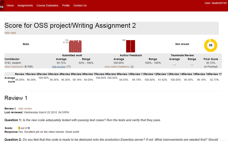
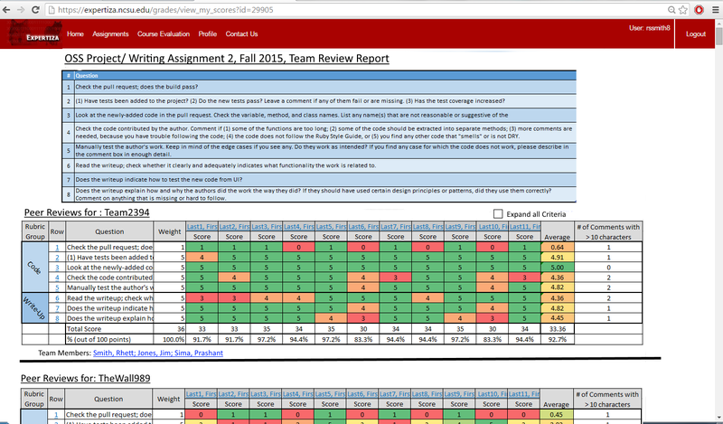
We propose entirely removing the summary statistics at the top of the page. The data in these statistics can be displayed in a more efficient manner.
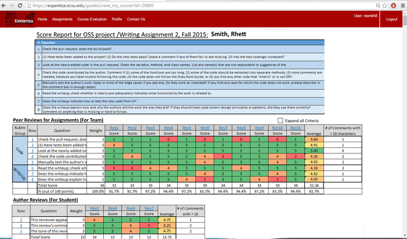
The main UI overhaul will occur in displaying the actual reviews. To combat the length of the current review display, we have chosen to condense all of that data into a single table that can be viewed without the need to endlessly scroll through the page. Each row of the table corresponds to a specific criterion of the review and the scores each reviewer gave with whatever comments they may have offered. The columns dictate which review the score came from. By default, the full criterion text is truncated, while the comments from a review are hidden.
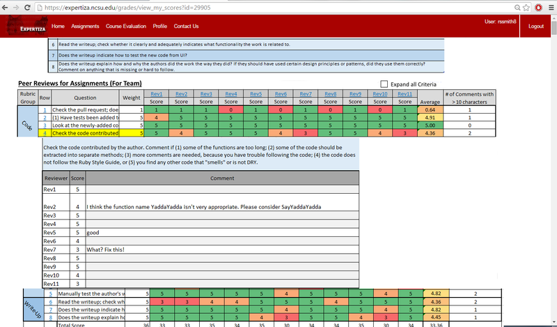
Clicking the row number will display all comments for that particular criterion, i.e., comments from each review. This way a student can compare comments and scores for a single question across all reviews. Clicking the column header for a specific review will display all the comments left by that reviewer. A student can use this functionality to view the entirety of a single review, including scores and comments. The individual scores to each criterion will be colored based on its value relative to the total score for the criterion. In this way, a student can quickly perceive the criterion on which they received poor scores from the reviewer.
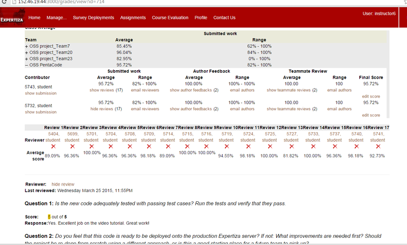
The instructor role will also receive interaction updates using the same underling display structures, but the content differ slightly from that of the student. Instead of reviews in the column headers, student names will take their place. We will be able to reuse the structure in the student's view for this purpose.
Design Patterns
The implementation team expects that the following design patterns be used in the solution:
- FlyWeight Design Pattern: using flyweight design pattern, we can use sharing data/gui to support large numbers of fine-grained objects efficiently. For instance, in expertiza system, students’ review pages and instructor review pages. We can use one page to display in both students’ ‘version’ of review page and instructor’s ‘version’ of review page.
- Strategy Design Pattern: using strategy design pattern, we can display one page into different ‘version’ of page according to different role. For instance, in students’ review page, he will see reviewer’s id, and in instructor’s review page, he will see reviewer’s fullname. In here, student and instructor are different strategy.
- Front Controller Design Pattern: with front controller design pattern, we will display different views based on the URL and currently user’s role.
- Module Design Pattern: by module design pattern, source code can be organized into components that accomplish a particular function or contain everything necessary to accomplish a particular task. In JavaScript files, we use anonymous functions for responsiveness on client side via javascript and jquery.
- Iterator Design Pattern: iterator design pattern is used to iterate through data structures in Ruby actions and when rendering the view. For instance, we need to display all reviewer’s reviews to one round, so we need the collection of all reviewer’s reviews and then iterator to display.
- Facade Design Pattern: facade design pattern provides a unified and higher-level interface to a set of interfaces in a subsystem, which makes the subsystem easier to use. For instance, in students’ review page, grades, commands and feedbacks are from three controller, and they are combined in review controller and display in one review page.
Use Cases
View All Team Scores and Reviews for Specified Assignment, as Instructor View Received Scores and Reviews for Specified Assignment, Grouped by Criteria, as Student (self) View Received Scores and Reviews for Specified Assignment, Grouped by Reviewer, as Student (self)
- View Review Page as Student : General use case, capturing a student viewing his or her own reviews with corresponding user account.
- View Review Page as Instructor : General use case, an instructor associated with the course in which to review's assignment is included, viewing reviews for a student participating in that assignment.
Proposed Tests
- UI Testing: all new functionality must be tested with supported browsers.
- Controller Testing: view person with no reviews, view person with reviews but no scores nor comments, view reviews with scores --,0,1,2,3,4,5. view reviews with comments with length 10,20,30,40,50,60,70,80,90,100,110,120,130,140,150,160,170 characters.
Implementation
Target files: app/models/response.rb, app/views/grades/_reviews.html.erb app/viewsgrades/views.html.erb and app/views/popup/team_users_popup.html.erb
Key tables: questionnaires, questions, responses, response_maps, answers.
Task 1: Compact the review display and colorize the background.
The code for displaying review is implemented in a action call 'display_as_html' in app/models/response.rb. The action basically links html code then return it as a string. To eliminate the blank line between items, some 'BR' tags in the display_as_html need to be delete. To use different color in the background for different review, we plan to insert id for reviews in _reviews.html.erb, then write css for colorization in the app/assets/stylesheets/ folder.
Task 2: Show basic information about each review for both instructor and student.
To extract the data that need to be displayed, the models involve and their relationships to each other need to be analyzed. For students, _reviews.html.erb should be edited. The code to display those data should be insert after 'Review #' and before 'display_as_html' as following:
    <% if controller.action_name != "view_my_scores" %>
        <a name="<%=prefix+"_"+review.map.reviewer.name%>"></a><%= review.display_as_html(prefix) %>
    <% else %>

            <h2>Review <%= count %></h2>
            <!--insert basic information--!><BR/><BR/>
            <%= review.display_as_html(nil,0, nil) %><BR/><BR/>
For instructors, team_users_popup.html.erb should be edited. The information such as reviewers's id, name, review's round number and updated time can be added after the 'else' division:
<%if @scores == nil%>

  <tr> <td align = "center">No review done yet.</td> </tr>
  <br/>
  <tr>
    <th align = "left"> Reviewer score </th>
  </tr>
  <tr>
    <td align = "center">--</td>
  </tr>
  <br/>
<%else%>
Task 3 and 4: Use tab to change reviews according to round, version and questions.
Using the 'round' attribute in the 'response' table to differentiate reviews in distinct rounds, for students the code inside following for-loop located in the _reviews.html.erb wil be rewritten and tab UI in JQuery will be used.
<% for review in rscore[:assessments] %>
.
.
.
<% end %>
For instructors, in the team_users_popup.html.erb file, the code inside 'else' block should be rewritten to adapt tab UI.
<%if @scores == nil%>
.
.
.
<%else%>
.
.
.
<%end%>
We should note that there will be no changes or impact on the database or underlying model classes.
Future Enhancements
- The project team may attempt to implement sorting of the lists and tables in in both the instructor and student review pages.