CSC/ECE 517 Spring 2013/Final E728
Final Project E728
Design Document
Introduction
The E728 project focuses on improving the review section's layout and usefulness. <ref name='assignment'> https://docs.google.com/document/d/11YTjxFXFR13vJ769yFBbqn9qOueK2Ktz0Pd-gyS2W5U/edit</ref> Our plan is to breakdown the assignment and address each goal.
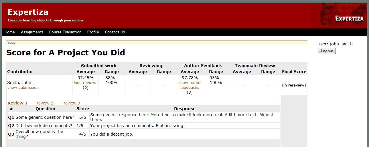
- Tabular Reviews - Use a table with tabs to view the reviews. The tabs will select which review is active. The table will hold the questions on the left, and corresponding reviewer score and comment on the right.
- Submission Type Indicator - A visual clue (can be either text message, color coded, or image icon) will be added to distinguish if a review is an original or updated review.
- Bug Fix - Figure out if a particular bug still exists, if so fix it. The bug happens when a one clicks on a particular review and it does not display the feedback form the review.
- Meta-review Relations - Create a link or add text to indicate which review the meta-review was written about.
- Update View Scores - Improve the view scores page by adding filters.
- Restructure HTML - Move as much code that generates HTML from the models to the views.
Goal Mock-Ups
Tabular Reviews
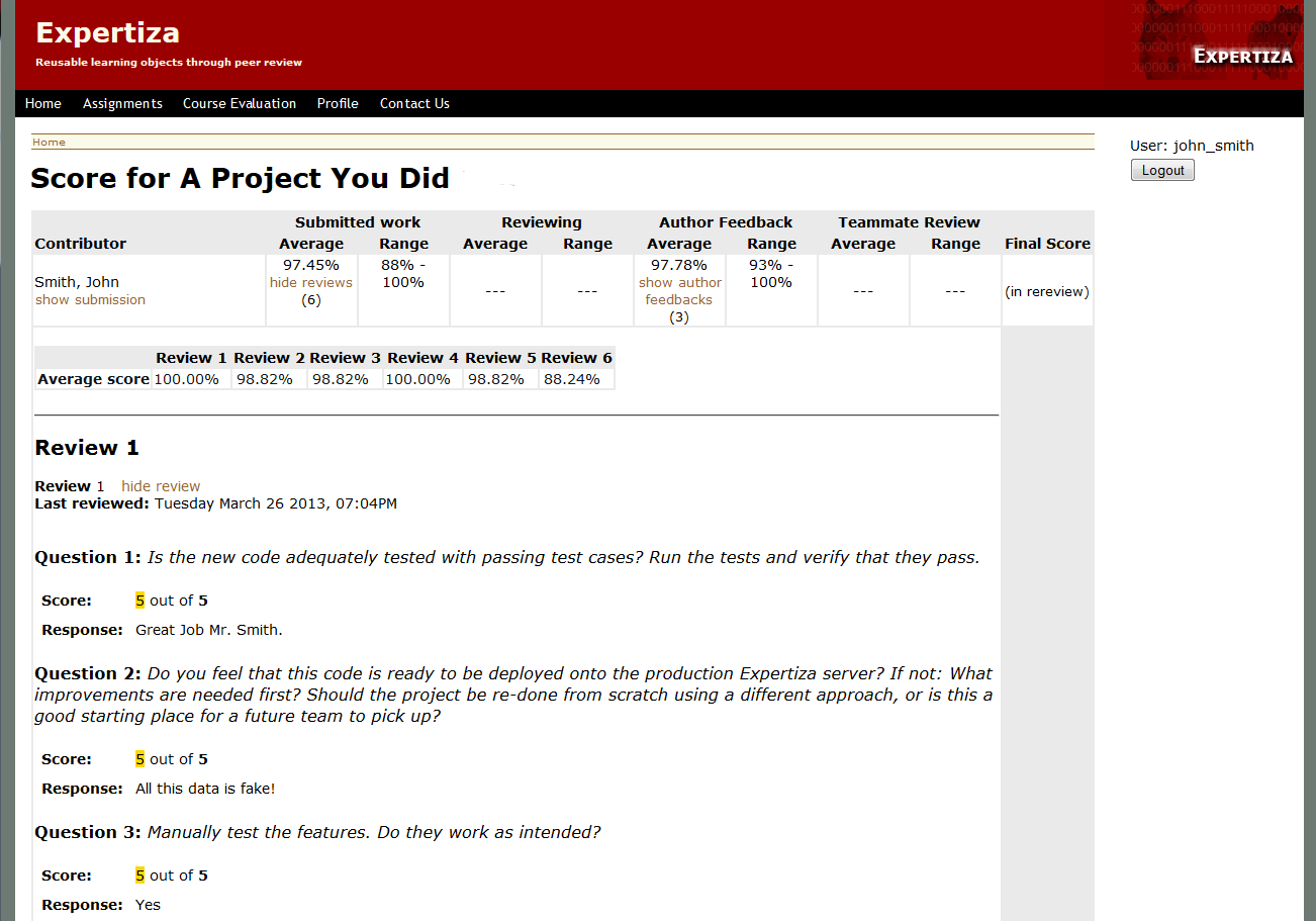
The current review page is shown below. A mock-up of the planned changes is also shown below.
| Before |
|---|

|
| After |
|---|

|
Notice that the reviews have moved from sequential listing to displaying one at a time in a table. The other views can be seen by clicking their respective link which might be styled as a 'tab'.
Submission Indicator
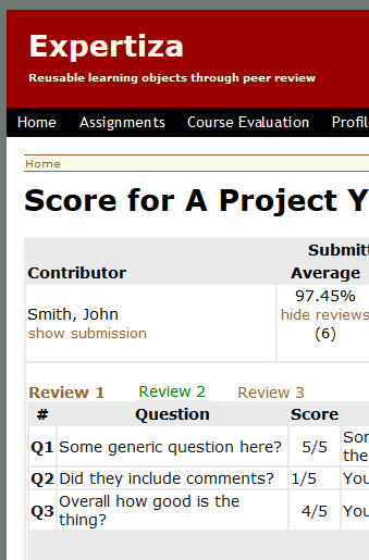
One option is to color code the review links to indicate a updated review. In the mock-up below the updated link is green. A key will be needed to inform users of the distinction.
| Color-coding (mock-up) |
|---|

|
References
<references/>