CSC/ECE 517 Fall 2010/ch1 S10/ms
Introduction to GUI Toolkit
GUI Toolkit is a complete set of elements or control which are used for designing applications in GUI. It is a software usually provided along with the operating system itself and appears as a visible portion of the GUI. Generally, this toolkit creates separate windows, each with one application that makes use of a particular widget. The most common one is an event - driven programming, where for example, if a user presses a button, then it is passed to the corresponding application and the event is handled.
Some common examples of the widget toolkits are -
GTK -
FLTK -
Gt -
FxRuby -
QtRuby -
GUI Toolkit in Ruby
Ruby does not have any real GUI System. The default GUI Toolkit used is Tk. Shoes is the most recent toolkit being used for Ruby. But the most advantageous among all is agreed to be wxRuby2.
Tk
Introduction -
It is generally installed by the Ruby Installer itself and has a complete documented API. It is relatively old, does not care about appearances and is suitable only for simple GUI applications.But it is perfectly functional and is also easily available.
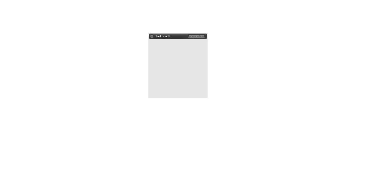
A simple application in Tk looks like this -
require 'tk'
msg = TkRoot.new { title “Hello World!” }
Tk.mainloop
It is mandatory to instruct Ruby that it should "require tk" and "Tk.mainloop",which is the event handler, is needed to start the GUI. All subsequent widgets will be contained in the root if their parent class is not specified.
Getting and Setting Options
To proceed to a more detailed application, let us look at the following code -
require 'tk'
root = TkRoot.new do title "Hello world!" minsize(250,250) end
l1 = TkLabel.new(root) do text 'Hello world!' background 'blue' pack { padx 15; pady 15; } end
Tk.mainloop
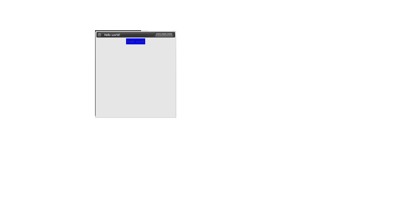
This creates a window of the specified size with the title Hello World and embeds a widget - Label, with the text Hello World and the background in blue. The 'pack' is called the geometry manager and specifies the pixel co-ordinates along with the justification of the text inside. It usually takes hash arguments.
Ruby permits passing options to widgets using code block. The name of the option is used as a method name within the block and arguments to the option are the arguments to the method call. Widgets take a parent as the first argument, followed by hash of options or the code block of options.
TkLabel.new(parent_widget, text => 'Hello, World!').pack(...)
It is also possible to change the setting of options dynamically.
Example -
command proc { ll.configure('text'=>"Bye Bye") }
The 'configure' method will change the text output to "Bye Bye" over writing "Hello World".
The following gives examples for -
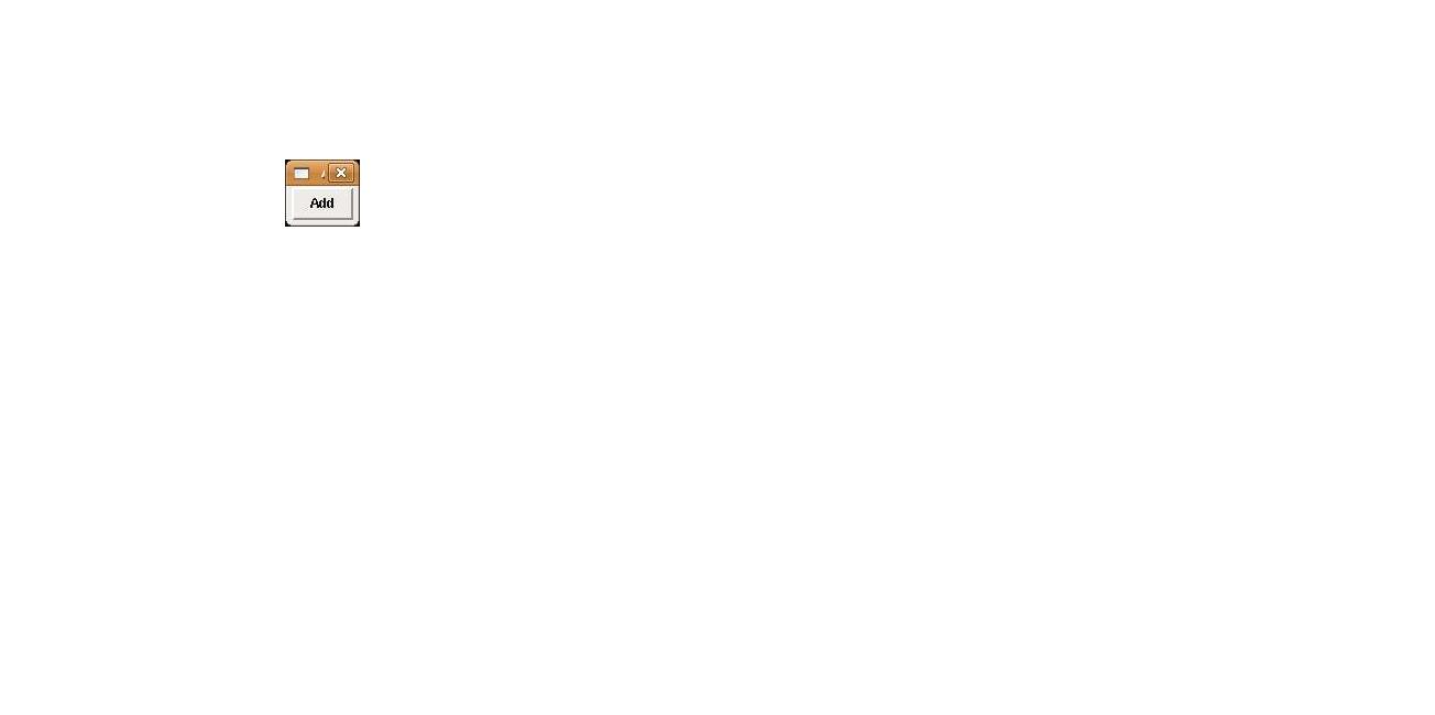
1. To add a Button -
  button = TkButton.new(root) do
  text "Add"
  end
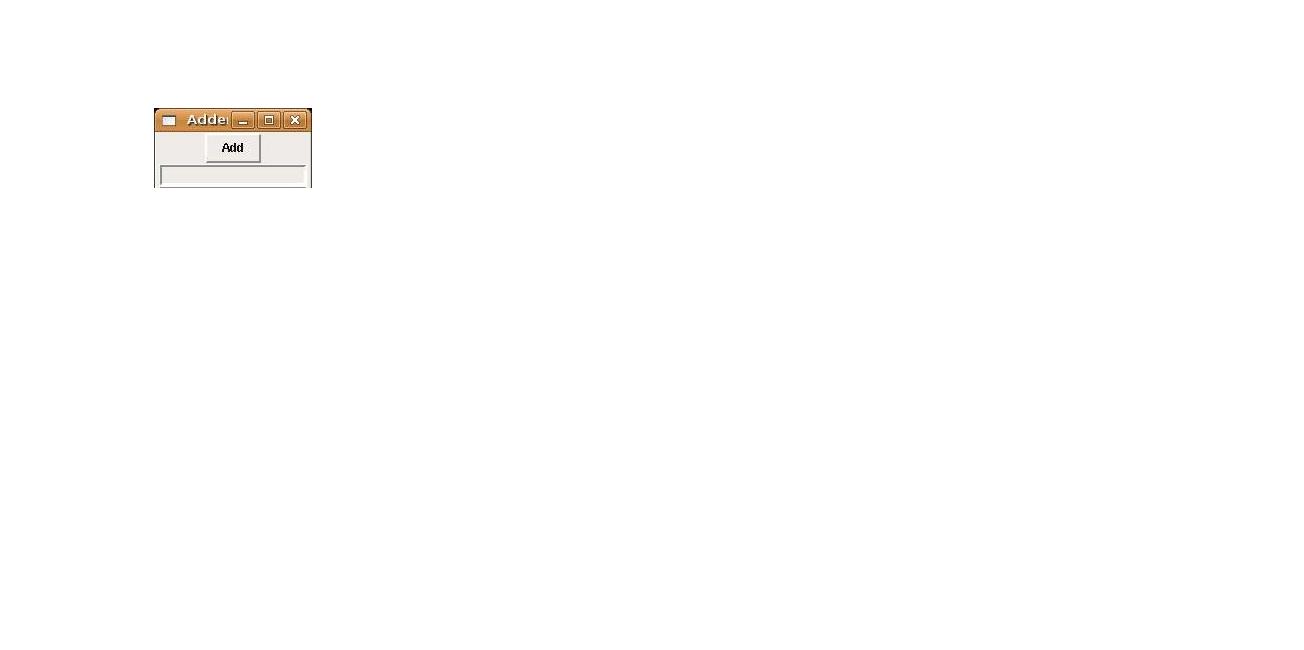
2. To add Text Field -
  entry1 = TkEntry.new(root) do
  pack
  end
All of these applications are included to create a program and they are called by -
- Button press
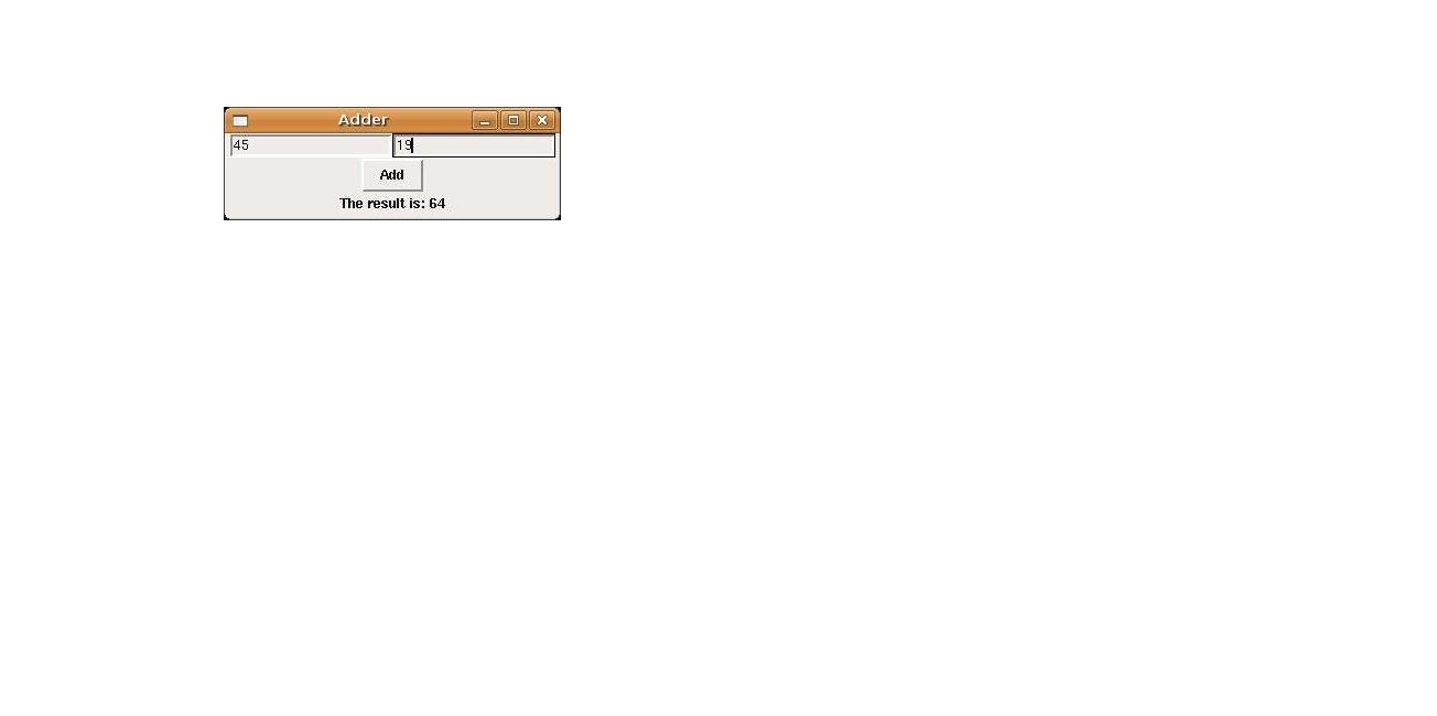
button.pack () { result = entry1.value.to_i + entry2.value.to_i label.text = "The result is: #{result}" }
All widgets such as Button, Label, Entry are prefixed with Tk to create the corresponding classes.
CallBack and Binding Variables
After we create a widget, it is necessary most of the time to get back data from it. This is done by using callback. Getting back data means to get back a '0' or '1' depending on whether the required application does what it is meant to do. Using callback, a proc Object is created which is called as soon as the callback starts.
Example -
TkLabel.new() { text "Hi"
command proc {l appcheck.value; exit }
}
The same thing is acheived by binding variables where a reference is created using TkVariable. This reference is then passed as an argument to the 'variable' option and output is obtained after the check.
appcheck = TkVariable.new
TkCheckButton.new() {
 variable mycheck
 }
This action of getting data can also be acheived dynamically using the cget(arg) method.
require 'tk' l = TkLabel.new {
 text     "Good Morning"
 color    "black"
} l.cget('text') » "Good Morning" l.cget('color') » "black"
Events Binding
The various events such as pressing a button, moving the mouse, entering text into a field, navigating pages can all be bound together using the 'bind' method.
Example -
c1 = TkColor.new (root)do color "green" end
c2 = Tkcolor.new (root) do color "white" end
b1 = TkButton.new(root) { text " Which is your favourite color?" border 4 }
b1.bind ("In") { b1.configure('clor'=>c2) } b1.bind("Out") { b1.configure('color'=>c1)}
'bind' can also take many substrings separated by comma as arguments according to the modifier-modifier type-detail syntax. The modifier may be any button like Shift, Home, Control; the modifier type says which event type it belongs to such as ButtonPress, KeyPress and detail is any number between 1 to 5.
Canvas
The Canvas widget is used to draw any picture you want by mere pressing of a button and the movement of the mouse in whichever direction you want to. Once the button is released, a Post Script, which is nothing but the image drawn, is displayed. It is generally used if you want to draw large size pictures like outline of a house, single line diagram of any instrument or just a random drawing.
Scrolling
This is generally used when a subset or a smaller portion of an image is needed to work with. In that case, we set up scrollbars for the required class. The movement of the scroll bar changes the widget view and vice versa. Hence, they are inter dependent or bidirectional.
More information about Tk as GUI Toolkit and example programs can be found in the book Programming in Ruby.
SHOES
Introduction -
It is not designed for serious, large-scale GUI applications. Shoes applications usually tend to be small, useful and clever programs,which can be used for online or offline purposes.
The basic "Hello World" program is implemented in Shoes as below -
Shoes.app :width => 250, :height => 100 do
  para "Hello World!"
end
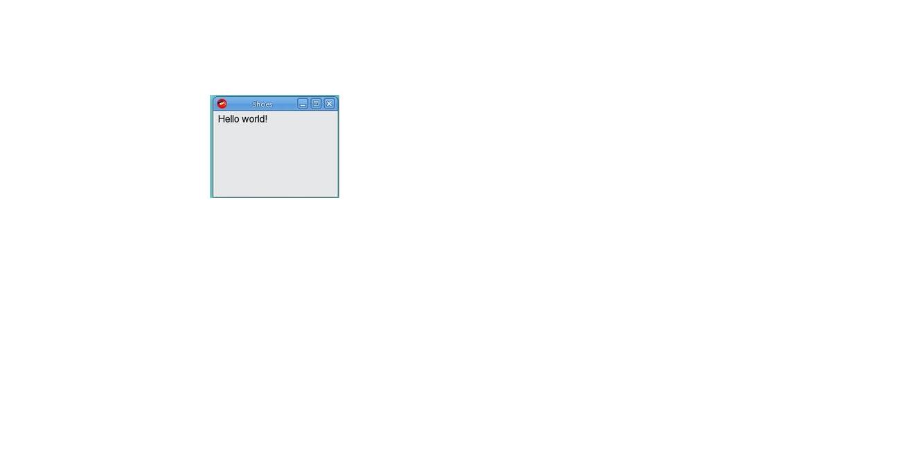
The Shoes.app is the method which encapsulates the entire application and it takes width and height, in pixels, as parameters. Inside this method, any options can be set. Here, 'para' is a text container used to display the text "Hello World". 'para' can also take multiple arguments. Formatting is possible by inserting the format operation even inside the 'para'. It is also possible to include other text containers such as 'title', 'subtitle', 'tagline', 'caption' etc.
Example -
stack do
   title "Title"
   subtitle "Subtitle"
   tagline "Tagline"
end
Formatters -
strong("any")-> any em("number") -> number sup("formatting")-> superscripts "formatting" sub("options")-> subscripts "options"
Stack and Flow
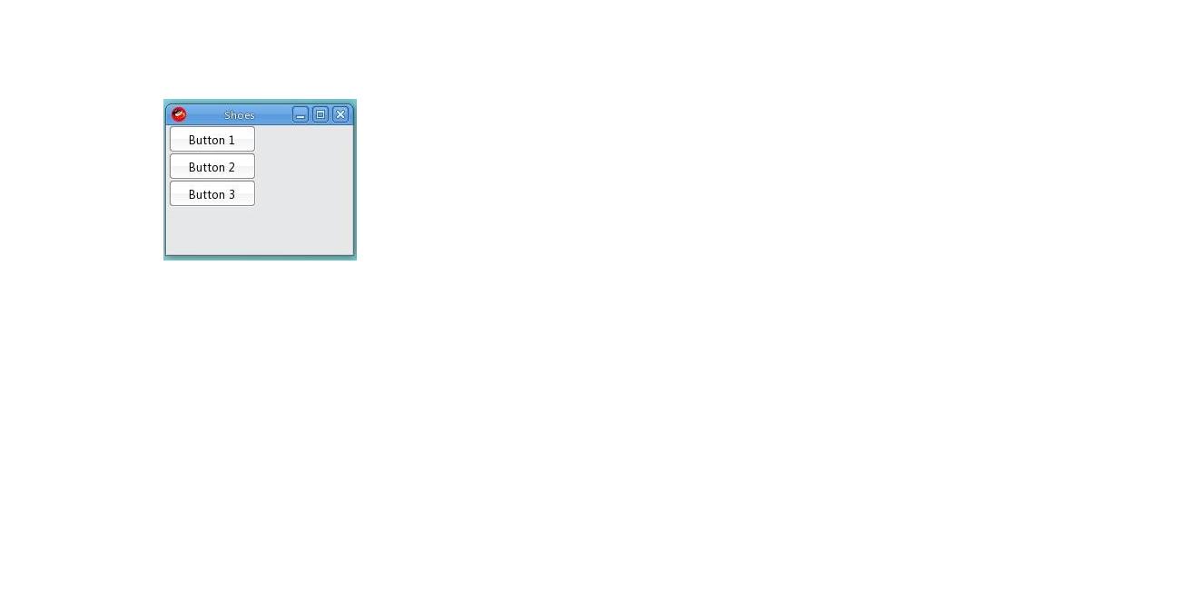
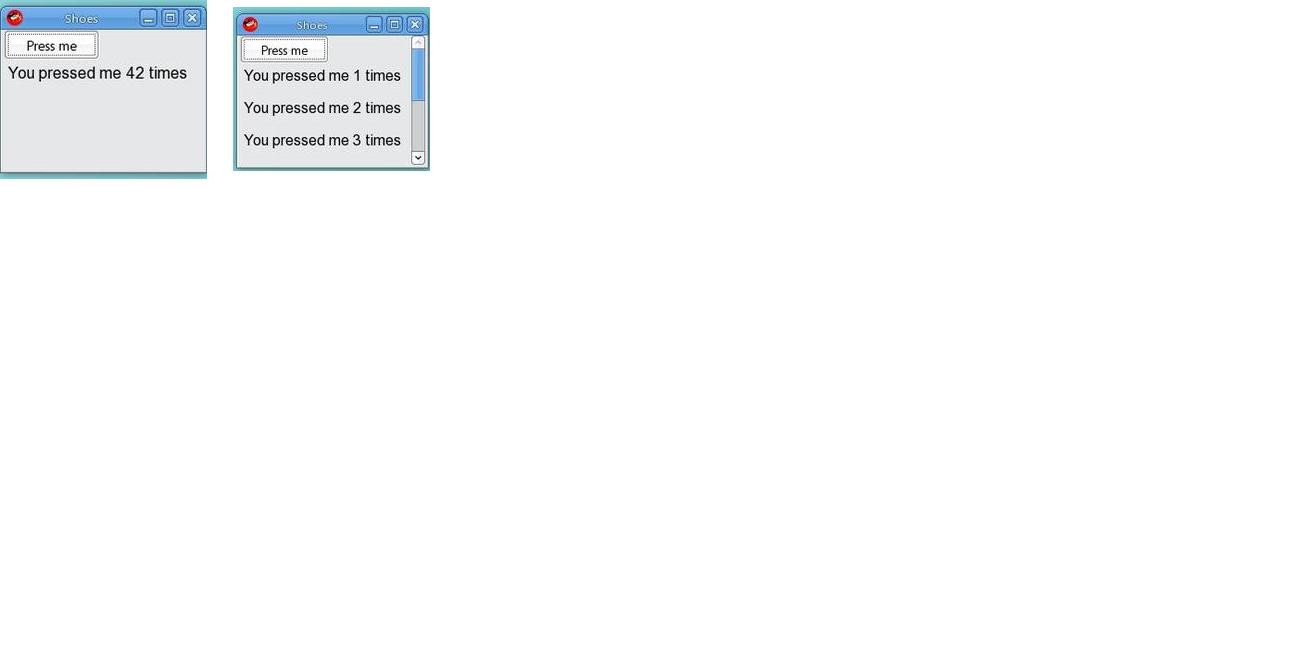
Shoes implement what are called 'stack' and 'flow'. Stack, as the name suggests, is used to arrange the GUI tools vertically on top of each other and flow does the same thing, horizontally. It is possible to assign the width for flow. When the limit exceeds, i.e., during overflow, stack creates a scroll bar to move down but flow does not create one to move across. It is also possible to create a Flow of Stacks and a Stack of Flows. The width and height are then defined in terms of % of the portion each flow/stack will take up horizontally.
Example -
Shoes.app :width => 400, :height => 140 do
 flow :width => 250 do
 button "Button 1"
 button "Button 2"
 button "Button 3"
 end
Replace 'flow' by 'stack' to get the stack of buttons. By default, the arrangement of the tools is 'flow'.
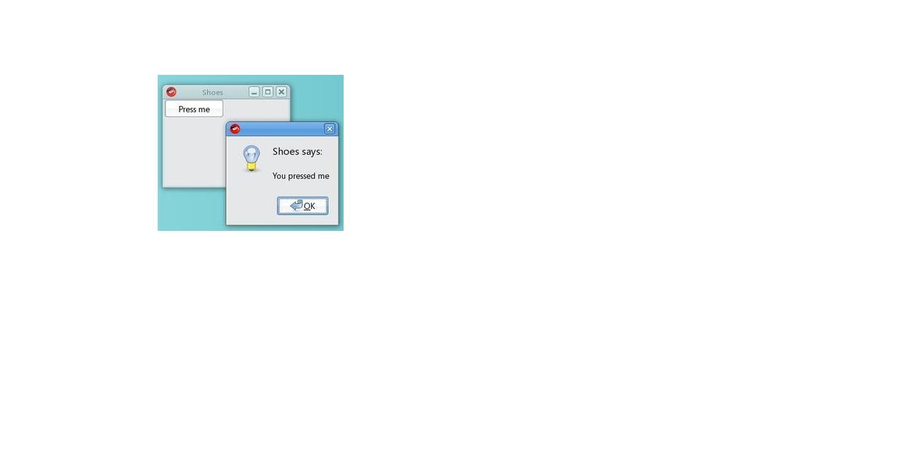
The method 'alert' creates a pop up dialog box with the message and an OK button. Dynamic appending and replacing of text is possible using the 'clear' method and 'append' method respectively.
Example -
stack do @p.append { para "You pressed me #{@times} t imes" } @p.clear { para "You pressed me #{@times} t imes" } end
@p.stack
Images can be displayed, resized, set as background using 'stack' and 'flow'. It is also possible to provide the URL and the corresponding image is placed in the window.
Example -
stack do
image 'lilies.jpg' image 'lilies.jpg', :width => '150%' 'background 'background.jpg # This has to be provided before all other statements. Otherwise, it overwrites them. image 'http://www.maitri.com/images/logo.gif' end
Additional Functions
'edit_line and edit_box' - allows editing a single line or multiple lines respectively in edit boxes. 'ask' - to embed a string in the edit box. 'if confirm (str)' - provides this confirmation question to confirm before executing an operation such as deleting a file. 'ask_color' - asks for the background color. 'ask_load_file' and 'ask_save_file' - provide for selecting filenames to load from and save to. 'click' - a block of code to run when the element is clicked. '@img.click' - assigns a block to the image stored in the variable used to call. 'animate(int)' - run a block at a set interval. Its single parameter defines the interval at which this method will be called in frames/sec. background '#ffa500'..'#aaa' - sets the background gardient. margin => 5 - sets the margin of width 5. border red - sets border to red.
More information and examples about using Soes GUI Toolkit for Ruby can be found at [[1]]
WxRuby2
Introduction -
WxRuby2 has WxWidgets that belong to the C++ toolkit but use a different toolkit for drawings. The advantages of WxWidgets are portable, consistent, serves as a translator/ simplifier between the program nad the native GUI thereby passing messages to the program. WxRuby2 serves as a wrapper for all the WxWidget classes.
The following program displays "Hello World" using WxRuby2 -
require 'wx'
class MyApp < Wx::App
  def on_init
    @frame = Wx::Frame.new( nil, -1, "Application" )
    @frame.show
  end
end

app = MyApp.new
app.main_loop
'wx' module is required to load WxRuby library. The class containing all the WxRuby applications must be inherited from the Wx::App class. The on_init method is used to create any widget. The widget Frame here has three arguments (parent class, unique ID number, text to be displayed). The 'show' method has to be called for the Frame to be displayed.
Creating Menu
Wx::MenuBar object holds the menu and the Wx::Menu objects. Every menu option has a unique ID number assigned to it and its respective callback function is called everytime that option is selected by the user.
Types of ID are -
Wx::ID_ANY -> This ID is used for dummy options when ID is not of significance. Wx::ID_EXIT -> Allows user to perform any operation on the Exit option. Wx::ID_LOWEST -> If any ID is lesser than the LOWEST, it creates no conflict with internal ID. Wx::ID_HIGHEST -> If any ID is higher than the HIGHEST, it creates no conflict with internal ID.
'append' -> It adds a menu item to the menu bar. Usually takes three arguments (ID, text to be displayed, keyboard shortcut, short
description (optional)) . The menu is appended by using two arguments (menu object, name of object)
Example -
Creating a Help Menu - help = Wx::Menu.new help.append( Wx::ID_ABOUT, "&About...\tF1", "Show about dialog" ) menu.append( help, "&Help" )
Adding SubMenu
'append_menu' -> adds a submenu to the menu. 'append_check_item' -> menu item that toggles on and off with a check mark ticked when on. 'append_radio_item' -> same as check item except only one item is checked at a time.
Adding Status Bar
Status Bar is used to display any description of the option over which the mouse moves. The Status Bar Object can be created and assigned using status_bar attribute. Hence, there is no need for any variable and it can be retrieved anytime. It is generally manipulated as a stack where the displayed message is pushed tothe stack and once finished, it is popped out. Top-most is usually displayed and after pop, the original message becomes the top-most.
Example -
status = Wx::StatusBar.new(self) status.push_status_text "Status is shown here"
Arranging Widgets
It can be done either by absolute positioning or by using layout managers called sizers. In the former, size, position and shape of evry widget needs to be defined individually and manually which has the following disadvantages -
1. Resizing becomes impossible 2. Adding Widgets is difficult 3. Difficult to change font size 4. Manual work out of size and shape of widget causing overlapping.
Hence, it is better to use sizers where any changes are automatically taken care of. Sizers are classified as Box and Grid. Use Wx::BoxSizer class for Box. The following functions can be performed on sizers -
'add' -> Appends a sizer/widget i.e. to the right horizontally and to the bottom vertically. 'insert' -> same as 'add' but inserts the sizer anywhere. 'prepend' -> Appendssizer at the beginning i.e. to the left horizontally and top, vertically.
set_sizer must be called to contain the orphaned widgets in a box.
box = Wx::BoxSizer.new( Wx::VERTICAL )
    (1..3).each do|i|
      button = Wx::Button.new(
        nil,
        Wx::ID_ABOUT,
        "Button #{i}"
      )

      box.add( button )
    end

    set_sizer( box )
More information and example programs can be obtained from the tutorial [[2]].
