CSC/ECE 517 Spring 2015 E1522 Visualization: Difference between revisions
| Line 2: | Line 2: | ||
==Project Description== | ==Project Description== | ||
The goal of this project is to present the the data in Expertiza in a more convenient way. Through the use of charts and graphs to enhance certain pages, such as the student's scores page and the instructor's scores page, and allow for the users to get an at-a-glance analysis of the data without having to dive into the tables. | |||
==Purpose== | ==Purpose== | ||
Revision as of 19:18, 3 May 2015
Expertiza - Visualization
Project Description
The goal of this project is to present the the data in Expertiza in a more convenient way. Through the use of charts and graphs to enhance certain pages, such as the student's scores page and the instructor's scores page, and allow for the users to get an at-a-glance analysis of the data without having to dive into the tables.
Purpose
The purpose of this project is to add a visualization element to some of the data collected in expertiza. The aim of this is to provide a more intuitive “at-a-glance” idea of the data, some examples would be: how a student is doing on his/her assignments, or how their work compares to that of their classmates.
Overview of Approach
There are quite a few gems available to visualize data in Ruby on Rails, like Goolgecharts <ref>http://googlecharts.rubyforge.org/</ref> and GoogleVisualr <ref>http://googlevisualr.herokuapp.com/</ref>. These gems makes use of Google Visualization API and wrap it to let users write ruby codes to present nice charts in their web pages instead of using Javascript.
GoogleVisualr
GoogleVisualr is a a wrapper around the Google Chart Tools<ref>https://developers.google.com/chart/</ref> which allows users to create beautiful charts with just Ruby, instead of writing JavaScript if using the Google Chart Tools directly.
Installing
Installing GoogleVisualr is pretty simple. Just include the following gem in the Gemfile.
gem "google_visualr", "~> 2.1.0"
And in the Rails layout, load Google Ajax API in the head tag, at the very top.
<script src='http://www.google.com/jsapi'></script>;
Work Flow
- In your model or controller, write Ruby code to create your chart (e.g. Area Chart, Bar Chart, even Spark Lines etc).
# Add Column Headers
  data_table.new_column('string', 'Year' )
  data_table.new_column('number', 'Sales')
  data_table.new_column('number', 'Expenses')
  # Add Rows and Values
  data_table.add_rows([
    ['2004', 1000, 400],
    ['2005', 1170, 460],
    ['2006', 660, 1120],
    ['2007', 1030, 540]
  ])
- Configure your chart with any of the options as listed in Google Chart Tools' API Docs.
option = { width: 400, height: 240, title: 'Company Performance' }<br/>
@chart = GoogleVisualr::Interactive::AreaChart.new(data_table, option)
- In your view, invoke a chart.to_js(div_id) method and that will magically generate and insert JavaScript into the final HTML output.
<div id='chart'></div>
<%= render_chart @chart, 'chart' %>
Chart Examples
Area Chart<ref>http://googlevisualr.herokuapp.com/examples/interactive/area_chart</ref>
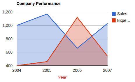
The following code presents the example of area chart.
# http://code.google.com/apis/chart/interactive/docs/gallery/areachart.html#Example
  def area_chart

    data_table = GoogleVisualr::DataTable.new
    data_table.new_column('string', 'Year')
    data_table.new_column('number', 'Sales')
    data_table.new_column('number', 'Expenses')
    data_table.add_rows( [
      ['2004', 1000, 400],
      ['2005', 1170, 460],
      ['2006', 660, 1120],
      ['2007', 1030, 540]
    ])

    opts   = { width: 400, height: 240, title: 'Company Performance', hAxis: {title: 'Year', titleTextStyle: {color: '#FF0000'}} }
    @chart = GoogleVisualr::Interactive::AreaChart.new(data_table, opts)

  end
The resulting chart looks like below.
Bar Chart<ref>http://googlevisualr.herokuapp.com/examples/interactive/bar_chart</ref>
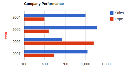
The following code presents the example of area chart.
# http://code.google.com/apis/chart/interactive/docs/gallery/barchart.html#Example
  def bar_chart

    data_table = GoogleVisualr::DataTable.new
    data_table.new_column('string', 'Year')
    data_table.new_column('number', 'Sales')
    data_table.new_column('number', 'Expenses')
    data_table.add_rows(4)
    data_table.set_cell(0, 0, '2004')
    data_table.set_cell(0, 1, 1000)
    data_table.set_cell(0, 2, 400)
    data_table.set_cell(1, 0, '2005')
    data_table.set_cell(1, 1, 1170)
    data_table.set_cell(1, 2, 460)
    data_table.set_cell(2, 0, '2006')
    data_table.set_cell(2, 1, 660)
    data_table.set_cell(2, 2, 1120)
    data_table.set_cell(3, 0, '2007')
    data_table.set_cell(3, 1, 1030)
    data_table.set_cell(3, 2, 540)

    opts   = { :width => 400, :height => 240, :title => 'Company Performance', vAxis: {title: 'Year', titleTextStyle: {color: 'red'}} }
    @chart = GoogleVisualr::Interactive::BarChart.new(data_table, opts)

  end
The resulting chart looks like below.
Bubble Chart<ref>http://googlevisualr.herokuapp.com/examples/interactive/bubble_chart</ref>
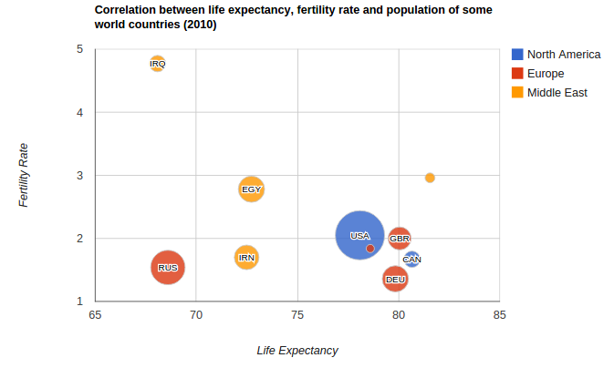
The following code presents the example of area chart.
# http://code.google.com/apis/chart/interactive/docs/gallery/bubblechart.html
  def bubble_chart

    data_table = GoogleVisualr::DataTable.new
    data_table.new_column('string', 'ID')
    data_table.new_column('number', 'Life Expectancy')
    data_table.new_column('number', 'Fertility Rate')
    data_table.new_column('string', 'Region')
    data_table.new_column('number', 'Population')
    data_table.add_rows( [
      ['CAN',    80.66,              1.67,      'North America',  33739900],
      ['DEU',    79.84,              1.36,      'Europe',         81902307],
      ['DNK',    78.6,               1.84,      'Europe',         5523095],
      ['EGY',    72.73,              2.78,      'Middle East',    79716203],
      ['GBR',    80.05,              2,         'Europe',         61801570],
      ['IRN',    72.49,              1.7,       'Middle East',    73137148],
      ['IRQ',    68.09,              4.77,      'Middle East',    31090763],
      ['ISR',    81.55,              2.96,      'Middle East',    7485600],
      ['RUS',    68.6,               1.54,      'Europe',         141850000],
      ['USA',    78.09,              2.05,      'North America',  307007000]
    ])

    opts    = {
      :width => 800, :height => 500,
      :title => 'Correlation between life expectancy, fertility rate and population of some world countries (2010)',
      :hAxis => { :title => 'Life Expectancy' },
      :vAxis => { :title => 'Fertility Rate'  },
      :bubble => { :textStyle => { :fontSize => 11 } }
    }
    @chart = GoogleVisualr::Interactive::BubbleChart.new(data_table, opts)

  end
The resulting chart looks like below.
GoogleCharts
Googlecharts is a ruby gem implements a wrapper for Google Chart API. It is fully tested using RSpec.
Usage
Installing
gem install googlecharts
Example in Ruby on Rails
Controller:
@line_chart = Gchart.line(:data => [1, 2, 3, 4, 5])
View:
<%= image_tag(@line_chart) %>
Basic Usages
require ‘gchart’
Gchart.line(:size => ‘200*200’,
:title => “title”,
:bg => ‘efefef’,
:legend =>
:data => [1, 2, 3, 4, 5])
Detail Usages
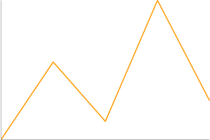
simple line chart:
Gchart.line(:data => [0, 40, 10, 70, 20])
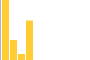
bar chart:
Gchart.bar(:data => [300, 100, 30, 200])
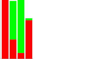
multiple bars chart:
Gchart.bar(:data => [[300, 100, 30, 200], [100, 200, 300, 10]], :bar_colors => ['FF0000', '00FF00'])
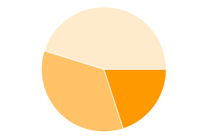
pie chart:
Gchart.pie(:data => [20, 35, 45])
These usages come from http://googlecharts.rubyforge.org/. If you want to see more usages, go and visit this site.
Visualization in Expertiza
This section describes where in Expertiza we can use these visualization to have a better user experience.
The 'Review Score' view of the assignments can be enhanced using these visualization.
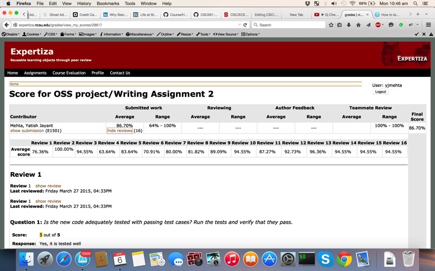
The above scoring which is in tabular form can be converted into graphs. If the assignment is similar to all teams we can add class average of all reviews from different teams.
Graphical Score Dashboard
The scores page will be augmented with bar graphs displaying the distributions of each column, as well as an icon for the average score for that column. This will allow for an easily determining what parts of the assignment need to be worked on at each stage, and provides a visual for the progression of the quality of the work.
Reliability Metric
Based on the uniformity of the review scores, we will compile a reliability metric. This metric encapsulates the level of agreement between the reviews, and should provide a quick at a glance notion of whether reviewers agree on the scoring for the particular assignment, or whether there is a high variance in the scores given.
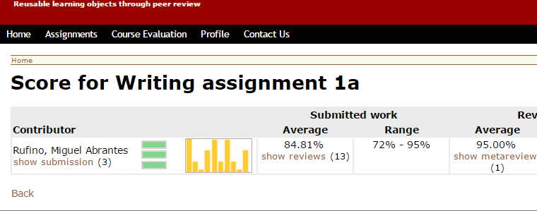
Different Icon colors
The color of the three bars Icon, and the number of filled bars is representative of the reliability of the reviews.
Take the case of the green sample icon in the image above, the reviews mostly all agree. Whereas in the following two images, the icon is yellow and red respectively to signify increasingly worrying levels of disparity in review scores.

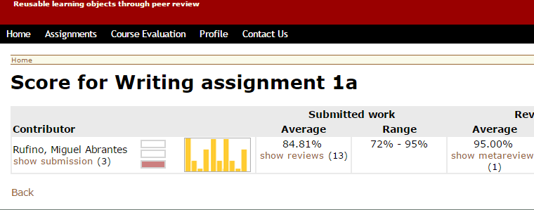
At a Glance Distribution
Next to each student's names a bar graph will be shown displaying the distribution of their review scores. The graph can be clicked to be expanded such that details can be examined
Reference
<references/>
