CSC/ECE 517 Spring 2015 E1526 MPRI: Difference between revisions
| Line 54: | Line 54: | ||
=='''Manage-User page'''== | =='''Manage-User page'''== | ||
[[File:Picture3.png]] | |||
Revision as of 02:51, 1 April 2015
E1526. Responsive web design for Expertiza
Introduction to Expertiza
Expertiza is a large project developed as a combined effort of students and faculty using the Ruby on Rails framework. The main advantage of using Expertiza, in an educational environment, is for the instructor to introduce peer reviewing among the students. Expertiza allows the instructor to create and customize assignments, create a list of topics the students can sign up for, have students work on teams and then review each other's assignments at the end. Expertiza supports submission of almost any document type, including the URLs and wiki pages.
Expertiza is supported by National Science Foundation under Grant No. 0536558. Additional funding from the NCSU Learning in a Technology-Rich Environment (LITRE) program, the NCSU Faculty Center for Teaching and Learning, the NCSU STEM Initiative, and the Center for Advanced Computing and Communication.
Problem Statement
Despite an amazing set of functionality Expertiza offers, there are numerous parts of it that could use a more stylish look and an improved user experience. The goal of this project is to use both Bootstrap and AngularJS to improve the look of the entire Expertiza including the representations of buttons, tables, and other elements. Certain changes in design will also improve the efficiency of the web app when it comes to the amount of time it takes for a page to be loaded.
Explanation of Tasks
Explanation to the task listed in the decription decumentation: Updrading all buttons to Bootstrap (http://angular-ui.github.io/bootstrap/) No explanation needed Creation of new theme which locks menu on the top for easy navigation. Example: https://www.virginamerica.com/ When the page scrolls down, the menu is fixed on the top
Auto hides contents on the dashboard for instructors. Updating action buttons with a responsive layout. Now, when trying to open manage-courses, all records are loaded before rendering them onto the page, which takes too long time to load and is not responsive at all. Better practice is on Virgin American’s website: https://www.virginamerica.com/book/rt/a1/sfo_bos/20150401_20150402 When the website is representing the calendar, the price for each day is not actually loaded. But the skeleton of the page, which is the calendar in this case, can be displayed first.
So in Expertiza, we can create several buttons for course semesters in the page. After clicking on Fall 2014, the courses for Fall 2014 will come out. And if it is still too long and takes a long time load, we can use a ‘show more’ button ,or automatically load more data when the scroll bar reaching the end of the page, to minimize the content we need to load after one single mouse click.
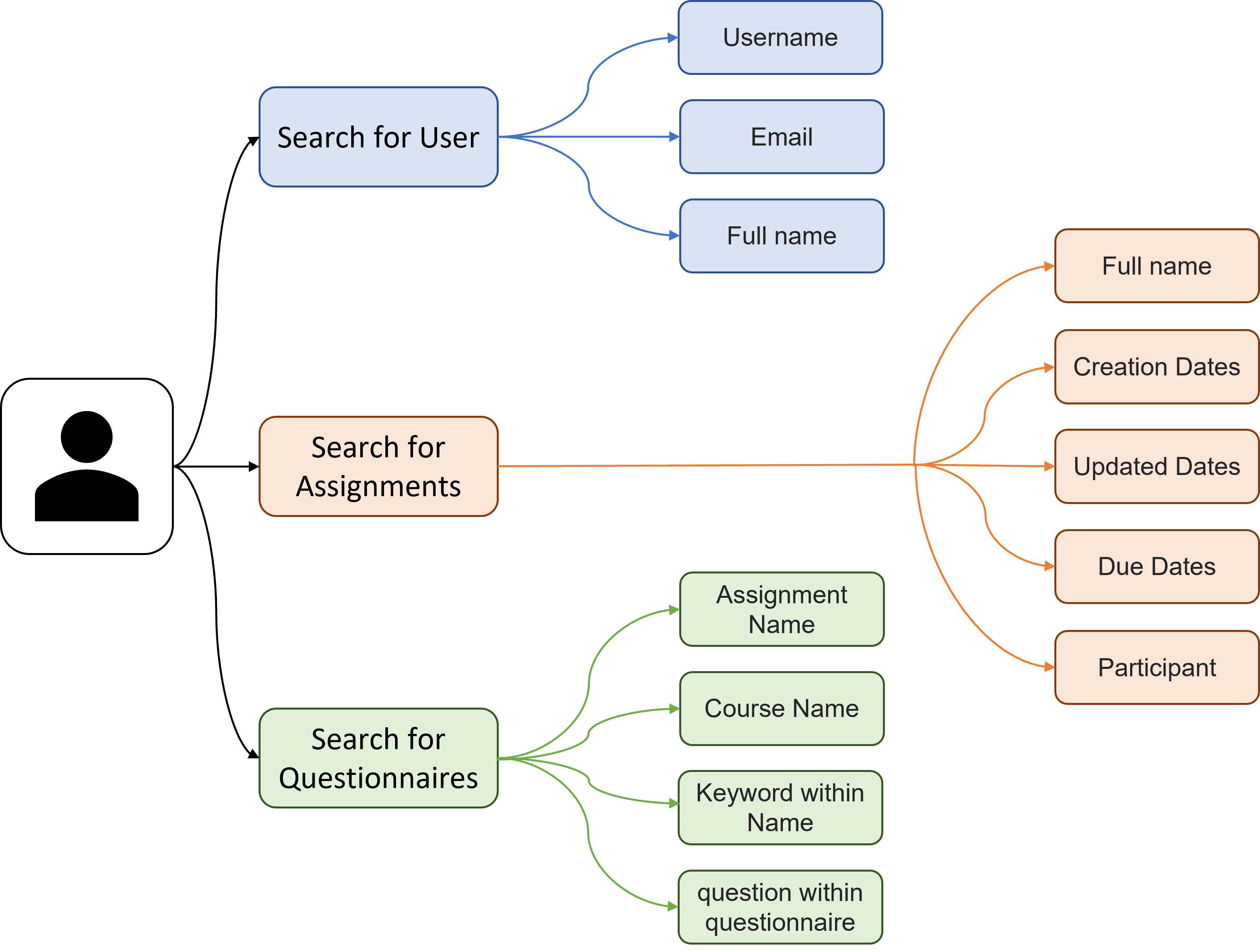
We will need to reduce the number of buttons. For example, the first row are actions for assignments. The second row is for participant...So we can change it to 5 buttons with responsive design, that is, no redirection after clicking on the buttons. Better UI to add users to expertiza, search a user, change it roles. Same as task 3, we will need to make it responsive. Also, when clicking on the letter A-Z, no redirections should happen and only the form content should be replaced rather than the whole page. Upgrading gradesheet (grades_view) and review mapping something which webassign uses. After clicking on ‘Your scores’, all reviews are loaded before rendering the page now. That takes a long time to load and the length of review list is too long.
View student score to be updated to show review on clicks rather than one below another.
Same as task 5
Better score table using bootstrap.
No need to explain


