CSC/ECE 517 Fall 2017/E1792 OSS Visualizations for instructors: Difference between revisions
No edit summary |
|||
| Line 8: | Line 8: | ||
'''Issue 1:''' For links in each cell. We are not sure what will happen if we click the link and which page will open. | '''Issue 1:''' For links in each cell. We are not sure what will happen if we click the link and which page will open. | ||
'''Approach to solve issue 1:''' The issue is about the cell contains link to different pages in expertiza, but there is no way to know which cell is linked to which page. So user don't know the destination page when he/she clicks on some page. So we know that there is link in each cell, so we will show a | '''Approach to solve issue 1:''' The issue is about the cell contains link to different pages in expertiza, but there is no way to know which cell is linked to which page. So user don't know the destination page when he/she clicks on some page. So we know that there is link in each cell, so we will show a hover over text displaying the link of the destination page. | ||
'''Issue 2:''' The scale is blue to green, which does not make sense. And colors will change randomly each time loading the page. It will be better to scale from red to green. | '''Issue 2:''' The scale is blue to green, which does not make sense. And colors will change randomly each time loading the page. It will be better to scale from red to green. | ||
| Line 43: | Line 43: | ||
[[File:Workflow.PNG]]<br><br> | [[File:Workflow.PNG]]<br><br> | ||
'''Issue 6:''' In the 'Review Summary' page for an assignment, currently there is no header indicating the name of the assignment. Also the page has review information for enrolled students. Currently, only student ids are displayed, which make it difficult to make out which student the information corresponds to. Extra white-space around checkboxes. | |||
'''Approach to solve issue 6:''' We will modify the view to show the heading for the assignment. Also, we will include the student name along with their id. We will use a method to truncate extra white-spaces around checkboxes before rendering the view. | |||
'''Issue 7:''' Currently, the reputation scores are not set. They show up as 0.0 for all students. | |||
'''Approach to solve issue 7:''' The method to calculate the reputation scores is not being called. We will call that method in the corresponding controller and deliver the computed reputation score(s) to a view where it can be displayed. Also, once we have this data, we will display the reputation scores of all students for an assignment graphically to enable easy visualization for the instructor. This view can be accessed by a link/button (which we will add) on the ‘review summary’ page. | |||
'''Issue 8:''' Currently, the instructor doesn't come to know which submission has not been updated since the previous review. | |||
'''Approach to solve issue 8:''' For n rounds of submissions, we can take a color (say red) as a background highlighter, and vary (say increase) it's intensity by a percentage of 100/(n-1) on every submission update. And this color code will be mentioned on the corresponding view. This will enable the instructor to quickly make out whether a student has updated/resubmitted the submission. | |||
For example, if a project has 3 rounds of submissions, then n=3. Initially there will be no background color. When a student submits for the first time, the submission link will be shown in black font with no background color. After round 1 reviews, there will be time for second submission, in which the students can resubmit the updated version of their project based on the reviews. If a student resubmits the project, the submission link will now have a red background color of 50% intensity. The submission link for the students who did not resubmit/update their submission would remain as it was earlier, that is, without any background color. After this, there will be another round of reviews. After round 2 reviews, it will be time for third submission (which is the final submission in this case). If a student resubmits the project, the submission link will now have a background color of 100% intensity. The submission link for the students who did not resubmit/update their submission would remain as it was earlier. That is, for students who submitted the project only once and did not resubmit thereafter, there will be no background color of the submission link. For students, who resubmitted the project only once after the first submission, the background color of the submission link will have 50% intensity and for the students who resubmitted the project twice (as was expected) will have 100% intensity. | |||
Pseudocode: | |||
Let n be total rounds of submission for the project | |||
For i from 2 to n | |||
Increase the intensity of background color red (R,0,0) by 100/(n-1) percent | |||
| Line 61: | Line 78: | ||
*2) Click on the button to compute graphs | *2) Click on the button to compute graphs | ||
*3) Compare the bar graphs with separate scores of students in each assignments. | *3) Compare the bar graphs with separate scores of students in each assignments. | ||
'''Issue 6:''' | |||
*1) Login as an instructor. | |||
*2) Go to the 'Review Summary' page for an assignment. | |||
*3) The instructor will now be able to see the name of the assignment as a heading. Also, the name of students will now be displayed beside their student id. | |||
'''Issue 7:''' | |||
*1) Login as instructor. | |||
*2) Go to the 'Review Summary' page for an assignment. | |||
*3) Click on the reputation scores. | |||
*4) The instructor will now be able to see individual reputation scores of the students for that assignment as well as a graphical representation of the reputation scores of all the students enrolled in the exercise. | |||
'''Issue 8:''' | |||
*1) Login as instructor and create an assignment with 3 rounds of submissions. Enroll few students in the assignment. | |||
*2) Impersonate at least three students. | |||
*3) For first student, say 'A', just submit for the first round. | |||
*4) For second student, say 'B', submit the assignment for first round and then resubmit it for second round. | |||
*5) For third student, say 'C', submit the assignment for the first round, second round and third round. | |||
*6) Now, login again as instructor and go to the review submissions page to view submissions of students. You can now see that for 'A', the submission link appears in black font with no background color, for 'B', the submission link appears with a red background color of 50% intensity, and for 'C', the submission link appears with a red background color of 100% intensity. | |||
*7) Also, the color code is mentioned at the end of the page which clearly indicates the usage of background color-code to represent the number of times the project was submitted all together by any student. | |||
Revision as of 06:52, 7 November 2017
Visualisations for instructors
Issue Statement & Approach followed:
Issue 1: For links in each cell. We are not sure what will happen if we click the link and which page will open.
Approach to solve issue 1: The issue is about the cell contains link to different pages in expertiza, but there is no way to know which cell is linked to which page. So user don't know the destination page when he/she clicks on some page. So we know that there is link in each cell, so we will show a hover over text displaying the link of the destination page.
Issue 2: The scale is blue to green, which does not make sense. And colors will change randomly each time loading the page. It will be better to scale from red to green.
Approach to solve issue 2: Here the color coding is blue to green and also it changes randomly. So we will use RBG color coding to make it red to green. We will use percentage to decide color coding. For example if it between 0 - 20% then make it red and so on. This way no matter what scale is being used it will always have appropriate color coding.
Issue 3: Two adjacent bar represents the response in round 1 to round k. It makes sense only if the rubrics in all review rounds are all the same. If the instructor implements the vary-rubric-by-round mechanism, this visualization will not make sense.
Approach to solve issue 3: Here The problem is that the the review responses show in a grid format that shows all the reviews from round 1 to round n. But this is ok when the rubrics is same for all the rounds. But when the rubric is different from round to round this view doesn't make sense. So what we are thinking is creating different grid for each review round. That will solve the problem for when the rubric is different as well as when the rubric is same.
Issue 4: The table is presorted by teams, but you can now also sort alphabetically. The cell view looks way too long, and should be divided into partials.
Approach to solve issue 4: Here we can sort the select query with appropriate column alphabetically, or we can sort the table automatically according to user criteria using dynamic table format. And the long view issue can be solved by using paging.
Issue 5: An interactive visualization or table that shows how a class performed on selected rubric criteria would be immensely helpful. It would show me what I need to focus more attention on.
Approach to solve issue 5 : The issue is about getting the performance of the entire class graded using the 5 rubrics criteria.A proposed solution may be use the below logic of calculating average grade for each student on all assignments in a particular course from the controller assessment360_controller.rb
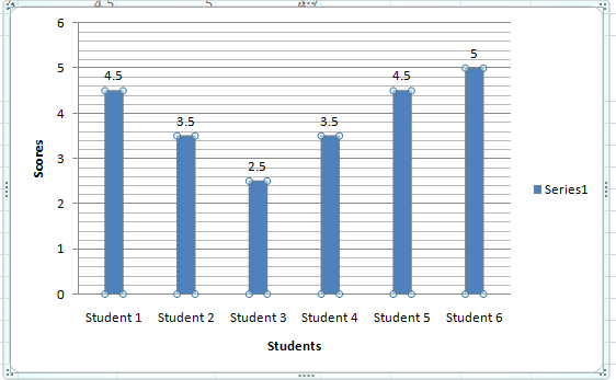
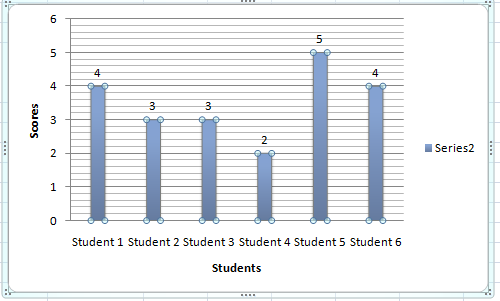
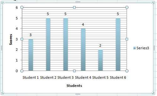
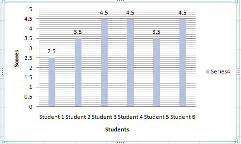
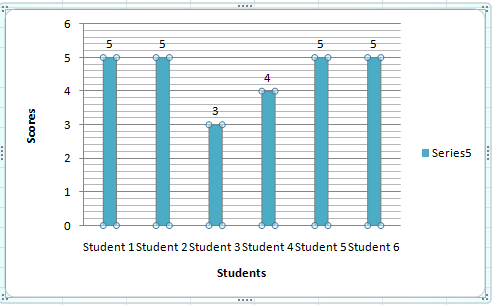
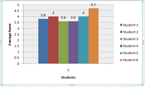
The average grades of each student can be pulled and then used to plot a bar graph as shown below ( This has been created by using a dummy data ) :-
Graph for class performance on Assignment 1 :-
Graph for class performance on Assignment 2 :-
Graph for class performance on Assignment 3 :-
Graph for class performance on Assignment 4 :-
Graph for class performance on Assignment 5 :-
Graph for class performance on Average Class performance :-
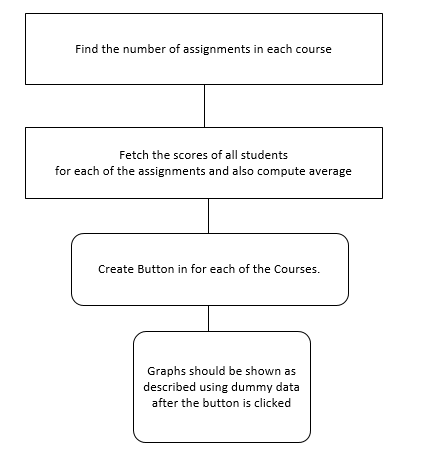
The work flow can be approximately like the below diagram :-
Issue 6: In the 'Review Summary' page for an assignment, currently there is no header indicating the name of the assignment. Also the page has review information for enrolled students. Currently, only student ids are displayed, which make it difficult to make out which student the information corresponds to. Extra white-space around checkboxes.
Approach to solve issue 6: We will modify the view to show the heading for the assignment. Also, we will include the student name along with their id. We will use a method to truncate extra white-spaces around checkboxes before rendering the view.
Issue 7: Currently, the reputation scores are not set. They show up as 0.0 for all students.
Approach to solve issue 7: The method to calculate the reputation scores is not being called. We will call that method in the corresponding controller and deliver the computed reputation score(s) to a view where it can be displayed. Also, once we have this data, we will display the reputation scores of all students for an assignment graphically to enable easy visualization for the instructor. This view can be accessed by a link/button (which we will add) on the ‘review summary’ page.
Issue 8: Currently, the instructor doesn't come to know which submission has not been updated since the previous review.
Approach to solve issue 8: For n rounds of submissions, we can take a color (say red) as a background highlighter, and vary (say increase) it's intensity by a percentage of 100/(n-1) on every submission update. And this color code will be mentioned on the corresponding view. This will enable the instructor to quickly make out whether a student has updated/resubmitted the submission. For example, if a project has 3 rounds of submissions, then n=3. Initially there will be no background color. When a student submits for the first time, the submission link will be shown in black font with no background color. After round 1 reviews, there will be time for second submission, in which the students can resubmit the updated version of their project based on the reviews. If a student resubmits the project, the submission link will now have a red background color of 50% intensity. The submission link for the students who did not resubmit/update their submission would remain as it was earlier, that is, without any background color. After this, there will be another round of reviews. After round 2 reviews, it will be time for third submission (which is the final submission in this case). If a student resubmits the project, the submission link will now have a background color of 100% intensity. The submission link for the students who did not resubmit/update their submission would remain as it was earlier. That is, for students who submitted the project only once and did not resubmit thereafter, there will be no background color of the submission link. For students, who resubmitted the project only once after the first submission, the background color of the submission link will have 50% intensity and for the students who resubmitted the project twice (as was expected) will have 100% intensity.
Pseudocode:
  Let n be total rounds of submission for the project
  For i from 2 to n
   Increase the intensity of background color red (R,0,0) by 100/(n-1) percent
Test Plan:
Issue 1: Check the link matches to the hover over text
Issue 2: Check the color coding when different number is given in different scale.
Issue 3: Enter multiple reviews with different rubric and check different table/grid shows for each review round separately.
Issue 4: Check if the table is sorted with appropriate column alphabetically
Issue 5:
- 1) Login as the instructor
- 2) Click on the button to compute graphs
- 3) Compare the bar graphs with separate scores of students in each assignments.
Issue 6:
- 1) Login as an instructor.
- 2) Go to the 'Review Summary' page for an assignment.
- 3) The instructor will now be able to see the name of the assignment as a heading. Also, the name of students will now be displayed beside their student id.
Issue 7:
- 1) Login as instructor.
- 2) Go to the 'Review Summary' page for an assignment.
- 3) Click on the reputation scores.
- 4) The instructor will now be able to see individual reputation scores of the students for that assignment as well as a graphical representation of the reputation scores of all the students enrolled in the exercise.
Issue 8:
- 1) Login as instructor and create an assignment with 3 rounds of submissions. Enroll few students in the assignment.
- 2) Impersonate at least three students.
- 3) For first student, say 'A', just submit for the first round.
- 4) For second student, say 'B', submit the assignment for first round and then resubmit it for second round.
- 5) For third student, say 'C', submit the assignment for the first round, second round and third round.
- 6) Now, login again as instructor and go to the review submissions page to view submissions of students. You can now see that for 'A', the submission link appears in black font with no background color, for 'B', the submission link appears with a red background color of 50% intensity, and for 'C', the submission link appears with a red background color of 100% intensity.
- 7) Also, the color code is mentioned at the end of the page which clearly indicates the usage of background color-code to represent the number of times the project was submitted all together by any student.


