CSC/ECE 517 Fall 2015 E1577 MayYellowRoverJump: Difference between revisions
No edit summary |
|||
| Line 30: | Line 30: | ||
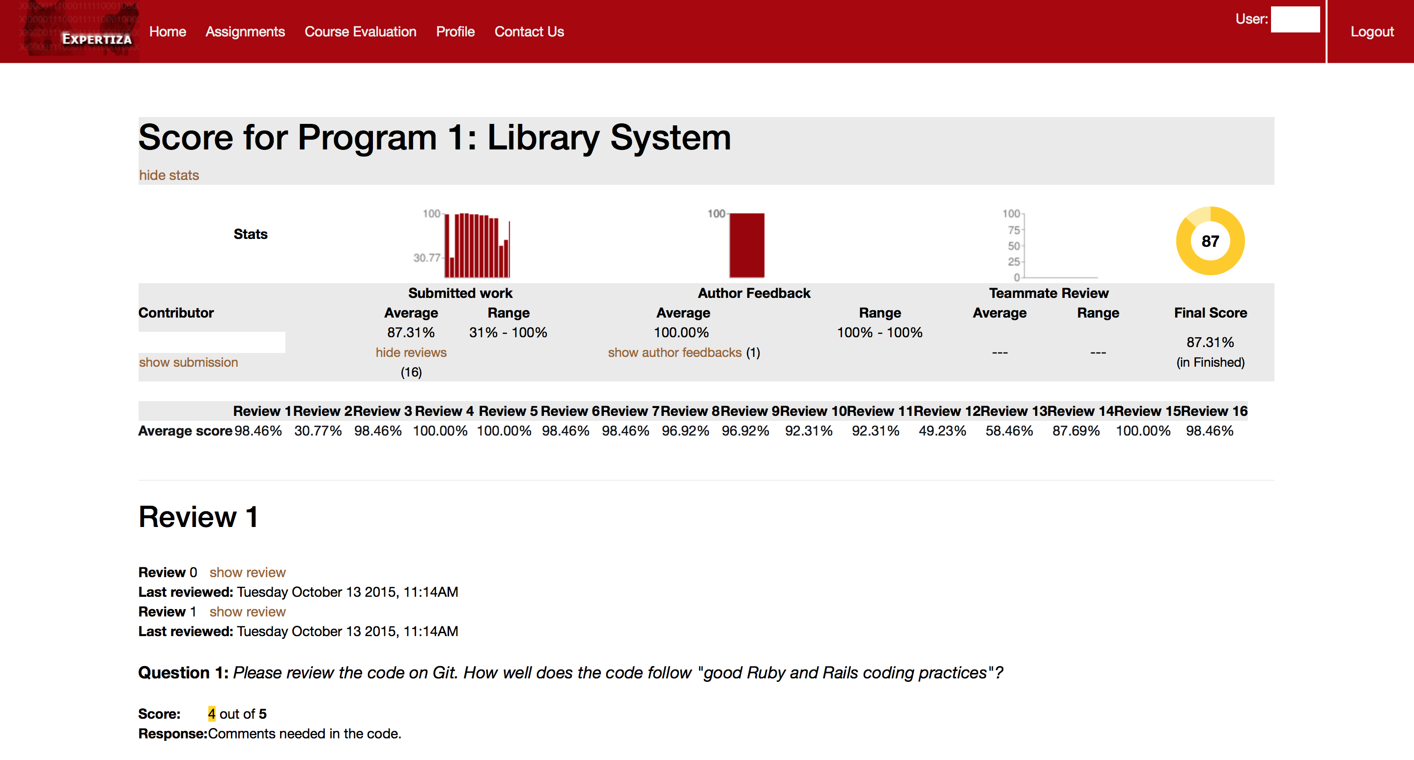
The first instance of major change will occur in the table under the stats section. The table will become interactive, dictating which individual review to show at any given point. To increase readability of the table headers, they will either be spaced out more along the top or rotated to display at an angle. The "Average" in "Average score" will be removed, as it is not indicative of the value held in the table. The percentages will contain links to display that particular review in a table below. Clicking that link will automatically scroll the page down to take the user to the displayed review. | The first instance of major change will occur in the table under the stats section. The table will become interactive, dictating which individual review to show at any given point. To increase readability of the table headers, they will either be spaced out more along the top or rotated to display at an angle. The "Average" in "Average score" will be removed, as it is not indicative of the value held in the table. The percentages will contain links to display that particular review in a table below. Clicking that link will automatically scroll the page down to take the user to the displayed review. | ||
[[File:Mock Up Screenshot 2.png|border]] | |||
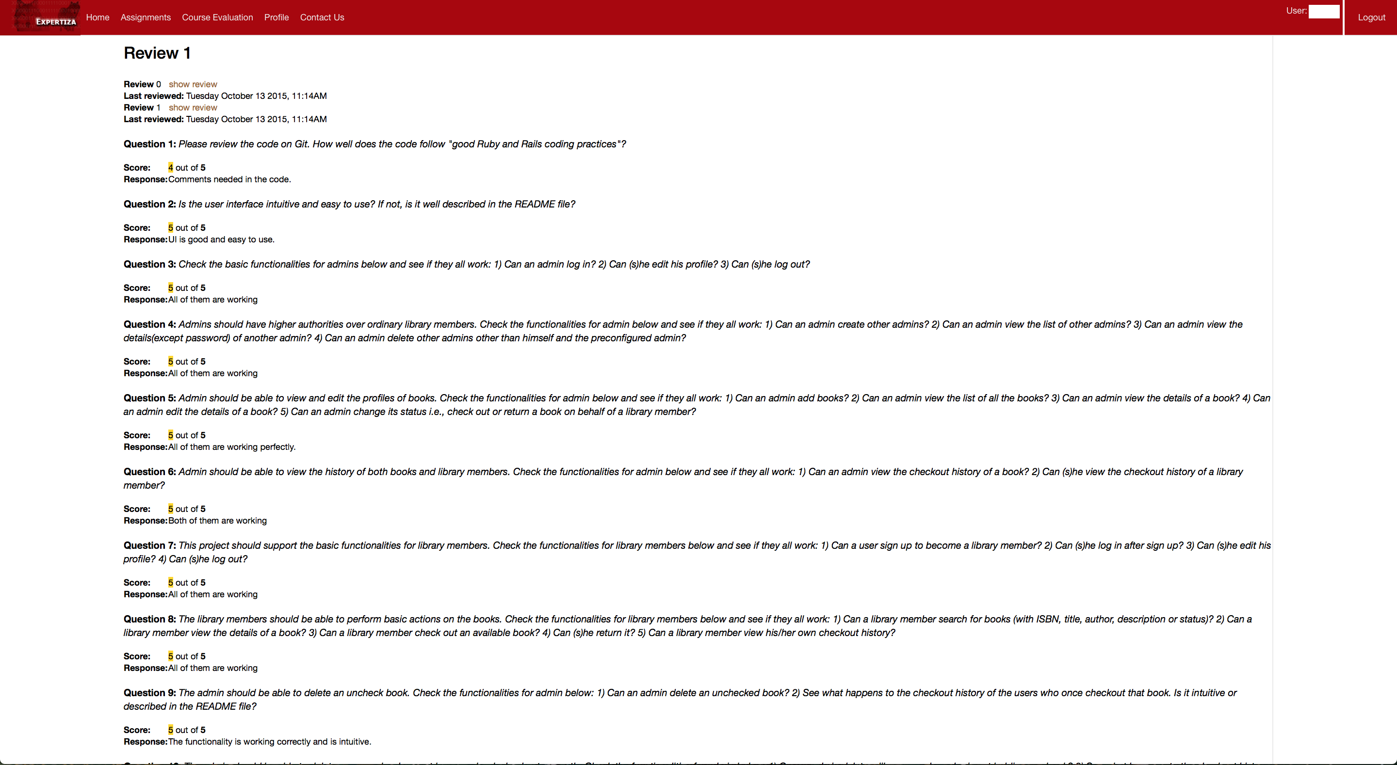
The main UI overhaul will occur in displaying the actual reviews. We intend to pull all of that content and place it in a tabbed table, similar to an Excel spreadsheet. Rather than have the confusing options to show or hide a review from a different round, the table will have multiple tabs, one for each version of the review, which will be labeled with the the particular review phase they belong to. Clicking these tabs, the user can toggle between the review they would like to look at. Each review question will have it's own row in the table, with the following columns: Question Number, Question, Score, Reviewer Comments. These columns will be interactive, i.e., clicking a column header will sort the table based on that column. Under each question number, there will be an option to "View Aggregate Scores," which will compile a table consisting of the selected question from every review. In this manner, a user can swiftly compare the scores they received on a single question from every review. | |||
=== Design Patterns === | === Design Patterns === | ||
Revision as of 14:06, 6 November 2015
Intro
Expertiza is an open-source education and classroom web-tool founded by the National Science Foundation. Built with Ruby on Rails, it is designed to manage complete courses and students’ work within those courses. Each course can have a collection of instructors and students, though the interaction between instructors and students is minimal. The real emphasis of Expertiza is placed on peer-to-peer interactions, fostering a student-driven learning environment. Courses are comprised of assignments which users complete individually or with a team. Assignments usually encourage or require a team to enforce practicing peer-to-peer interaction.
One of the main tenets of Expertiza is its implicit peer-review system. Assignments inherently have a review stage where, rather than having instructors review a team’s work, other students review a team’s submission for that assignment. When completing a review, a student is presented with essentially a rubric for the assignment, and they fill in each category with the score they deem commensurate with the work of the team. Of course, each category has a comments box for the student to qualify the score they doled out. Each member of the submitting team is notified of the review, and the team can then decide as a whole how to rework their submission based on the feedback in the peer reviews.
There do exist issues, however, with respect to viewing one’s team’s reviews, particularly in the realm of usability. Our team has been tasked with revamping and enhancing the review UI to produce a more focused and uniform user experience for students and instructors alike.
Assignment
Description
Lorem ipsum dolor sit amet, consectetur adipiscing elit, sed do eiusmod tempor incididunt ut labore et dolore magna aliqua. Ut enim ad minim veniam, quis nostrud exercitation ullamco laboris nisi ut aliquip ex ea commodo consequat. Duis aute irure dolor in reprehenderit in voluptate velit esse cillum dolore eu fugiat nulla pariatur. Excepteur sint occaecat cupidatat non proident, sunt in culpa qui officia deserunt mollit anim id est laborum
Purpose
There is no denying that the usability of viewing peer reviews leaves much to be desired. It lacks uniformity across varying roles (student and instructor), and the view itself has no semblance of order or organization. Viewing a single student’s review is a chore for both instructor and student, as there is no clear separation between reviews. Our goal is to take the same data in the current display and present it in a more focused manner that allows a user, in either the instructor or student role, to absorb and process the content in the peer review more efficiently. Accessing, viewing, and understanding a review should be a far more simple task than what it currently is. In addition to the overhaul of the presentation layer, we also strive to drastically increase code reuse in the controller and model layers of the review module, which will in turn create a more uniform experience for both the instructor and student roles.
Scope
The scope of this task is limited to enhancing the usability of viewing peer reviews for both students and instructors. It is within our scope to modify the corresponding views for this functionality, as well as the underlying controllers and models as needed. The modifications to the Ruby classes will either be to accommodate changes to the view or to provide a uniform experience for both the instructor and student. As this is more of a user experience task, e.g, changing the way data is displayed to the user, there will be limited modifications to the base functionality of this module. It is not within our scope to change any element of the actual peer review process, such as selecting a topic to review or completing a review of a topic. As a result, we will not be modifying the results of peer reviews; the same peer review data will be present both before and after our task is completed.
Design
Discussion of Resolution
Lorem ipsum dolor sit amet, consectetur adipiscing elit, sed do eiusmod tempor incididunt ut labore et dolore magna aliqua. Ut enim ad minim veniam, quis nostrud exercitation ullamco laboris nisi ut aliquip ex ea commodo consequat. Duis aute irure dolor in reprehenderit in voluptate velit esse cillum dolore eu fugiat nulla pariatur. Excepteur sint occaecat cupidatat non proident, sunt in culpa qui officia deserunt mollit anim id est laborum
Mock-Ups
We’ll outline our proposed changes starting from the top of the review page and working our way down.
We propose minimal, if any, changes to the stats portion at the top of the view. This section already looks refined and provides a nice summary of the reviews submitted for a particular assignment. The only changes that might be incurred would be to the links to “hide reviews” and “show author feedbacks.” It may not make sense for these actions to remain once the presentation of the review content changes.
The first instance of major change will occur in the table under the stats section. The table will become interactive, dictating which individual review to show at any given point. To increase readability of the table headers, they will either be spaced out more along the top or rotated to display at an angle. The "Average" in "Average score" will be removed, as it is not indicative of the value held in the table. The percentages will contain links to display that particular review in a table below. Clicking that link will automatically scroll the page down to take the user to the displayed review.
The main UI overhaul will occur in displaying the actual reviews. We intend to pull all of that content and place it in a tabbed table, similar to an Excel spreadsheet. Rather than have the confusing options to show or hide a review from a different round, the table will have multiple tabs, one for each version of the review, which will be labeled with the the particular review phase they belong to. Clicking these tabs, the user can toggle between the review they would like to look at. Each review question will have it's own row in the table, with the following columns: Question Number, Question, Score, Reviewer Comments. These columns will be interactive, i.e., clicking a column header will sort the table based on that column. Under each question number, there will be an option to "View Aggregate Scores," which will compile a table consisting of the selected question from every review. In this manner, a user can swiftly compare the scores they received on a single question from every review.
Design Patterns
Lorem ipsum dolor sit amet, consectetur adipiscing elit, sed do eiusmod tempor incididunt ut labore et dolore magna aliqua. Ut enim ad minim veniam, quis nostrud exercitation ullamco laboris nisi ut aliquip ex ea commodo consequat. Duis aute irure dolor in reprehenderit in voluptate velit esse cillum dolore eu fugiat nulla pariatur. Excepteur sint occaecat cupidatat non proident, sunt in culpa qui officia deserunt mollit anim id est laborum
Use Cases
Lorem ipsum dolor sit amet, consectetur adipiscing elit, sed do eiusmod tempor incididunt ut labore et dolore magna aliqua. Ut enim ad minim veniam, quis nostrud exercitation ullamco laboris nisi ut aliquip ex ea commodo consequat. Duis aute irure dolor in reprehenderit in voluptate velit esse cillum dolore eu fugiat nulla pariatur. Excepteur sint occaecat cupidatat non proident, sunt in culpa qui officia deserunt mollit anim id est laborum
Proposed Tests
Lorem ipsum dolor sit amet, consectetur adipiscing elit, sed do eiusmod tempor incididunt ut labore et dolore magna aliqua. Ut enim ad minim veniam, quis nostrud exercitation ullamco laboris nisi ut aliquip ex ea commodo consequat. Duis aute irure dolor in reprehenderit in voluptate velit esse cillum dolore eu fugiat nulla pariatur. Excepteur sint occaecat cupidatat non proident, sunt in culpa qui officia deserunt mollit anim id est laborum
Implementation
Target files: app/models/response.rb, app/views/grades/_reviews.html.erb and app/views/popup/team_users_popup.html.erb
Key tables: questionnaires, responses, response_maps
Task 1: Compact the review display and colorize the background.
The code for displaying review is implemented in a action call 'display_as_html' in app/models/response.rb. The action basically links html code then return it as a string.
To eliminate the blank line between items, some
tags in the display_as_html need to be delete.
To use different color in the background for different review, we plan to insert id for reviews in _reviews.html.erb, then write css for colorization in the app/assets/stylesheets/ folder.
Task2: Show basic information about each review for both instructor and student.
To extract the data that need to be displayed, the models involve and their relationships to each other need to be analyzed. For students, _reviews.html.erb should be edited. The code to display those data should be insert after 'Review #' and before 'display_as_html' as following:
    <% if controller.action_name != "view_my_scores" %>
        <a name="<%=prefix+"_"+review.map.reviewer.name%>"></a><%= review.display_as_html(prefix) %>
    <% else %>

            <h2>Review <%= count %></h2>
            <!--insert basic information--!><BR/><BR/>
            <%= review.display_as_html(nil,0, nil) %><BR/><BR/>
Task3: ]
Suggestions for Future Improvements
Lorem ipsum dolor sit amet, consectetur adipiscing elit, sed do eiusmod tempor incididunt ut labore et dolore magna aliqua. Ut enim ad minim veniam, quis nostrud exercitation ullamco laboris nisi ut aliquip ex ea commodo consequat. Duis aute irure dolor in reprehenderit in voluptate velit esse cillum dolore eu fugiat nulla pariatur. Excepteur sint occaecat cupidatat non proident, sunt in culpa qui officia deserunt mollit anim id est laborum

