E1929 Visualizations for Instructors: Difference between revisions
| Line 42: | Line 42: | ||
==== New View Examples ==== | ==== New View Examples ==== | ||
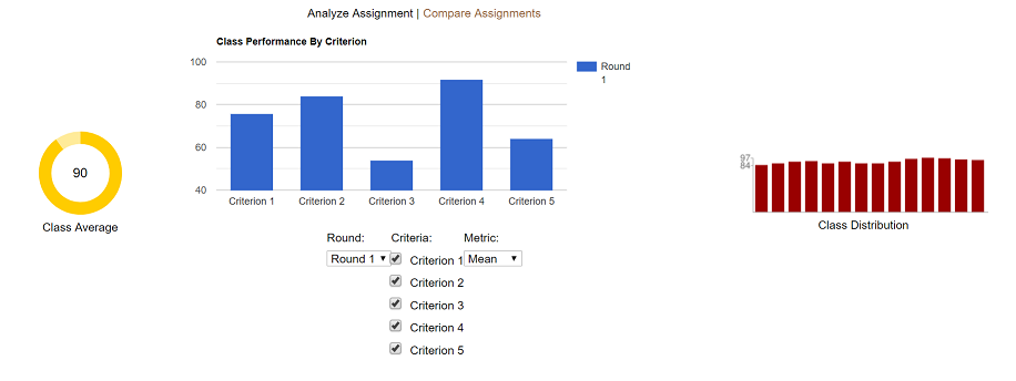
[[File:AnalyzeAssignmentNew.png|frame|centre|Figure 2: New Rubric Statistic Visualization | [[File:AnalyzeAssignmentNew.png|frame|centre|'''Figure 2: New Rubric Statistic Visualization - '''Added in the center of the existing two charts is an interactive chart the instructor can use to see the mean or median scores for whichever criteria they select. This is done on the "Analyze Assignment" tab, which is selected by default when the "View Scores" page is loaded.]] | ||
Added in the center of the existing two charts is an interactive chart the instructor can use to see the mean or median scores for whichever criteria they select. This is done on the "Analyze Assignment" tab, which is selected by default when the "View Scores" page is loaded.]] | |||
Revision as of 02:05, 13 April 2019
Introduction
It is the desire of all instructors to emphasize course material that students have trouble understanding and de-emphasize those aspects of the course material which students readily grasp. One method used by instructors is the creation of questionnaires, or rubrics. A rubric consists of a number of questions, or criterion, that give instructors a glimpse into student understanding of course materials. Use of rubrics and their association with a course assignment allow instructors to fine-tune their lesson plans to their students' understanding.
Creation of assignments, and their associated rubrics, can be a daunting task that can be made easier through the use of online platforms. Expertiza is one such online assignment grading platform. Within Expertiza, instructors create courses and assignments. For each assignment, instructors create one or more peer review rubrics for students to complete. After each round of rubrics, students can submit changes to their assignment based on these rubrics, with each submission and rubric considered a round. Hence, assignments have multiple rounds with each round associated with a rubric.
Instructors use the association between the assignment and the submitted rubric(s) associated with the assignment to understand what subjects need more focus. For example, a low average score on a rubric's particular question, or criterion, can indicate that the class has issues with a particular part of the assignment. Currently, instructors using Expertiza display assignment scores on one pages, but need to visit a completely separate page to display rubric scores. This separation of information hinders the instructor's ability to fully comprehend the associations between the assignment scores and the rubric scores. This, in turn, minimizes the likelihood that instructors will integrate this information to fine-tune their course material.
This project proposes to overcome this weakness in Expertiza by integrating the display of assignment scores and rubric scores onto a single page. This integration will allow instructors to more easily associate low rubric average scores with assignment scores. The ability to visualize assignment scores and rubric scores in a single location will reduce the workload on instructors when the scores. This, in turn, will increase the likelihood that instructors will change their lesson plans to reflect the students' understanding of the course material.
Proposed Changes
To help instructors understand the relationship between assignment scores and rubric scores, this project proposes two types of visualizations. The first type of visualization allows instructors to examine the rubric statistics for a single assignment. The second type of visualization allows instructors to compare the rubric statistics between two different assignments when the criteria for each assignment is the same.
Existing Views
In both cases, the project will add rubric statistics to the assignment grade view. The current assignment grade view consists of a header containing grade statistics followed by a table of the individual grades. In the assignment grade view header, the left side fo the header shows the average assignment grade as a circle, while the right side of the assignment grade view header shows the assignment grade distribution. Figure 1 shows the current header in the grade assignment view page.

The changes proposed by this project integrate rubric statistics to the above assignment grade view. Rubric statistic integration into the assignment grade view allow two types of visualizations. The first visualization allows the instructor to display rubric statistics within a single assignment. The second visualization allows the instructor to display rubric statistics between different assignments in the same course.
Proposed Assignment Grade Visualization
This project proposes the integration of rubric statistic visualization for both single assignments and multiple assignments into the assignment grade view. The integration occurs with a single change to the header of the assignment grade view, and retains the list of student grades. The following HTML mock-up shows the proposed changes to the header. The list of student grades is not changed and therefore not shown.
Interactive Example
https://jwarren3.github.io/expertiza/tabs.html
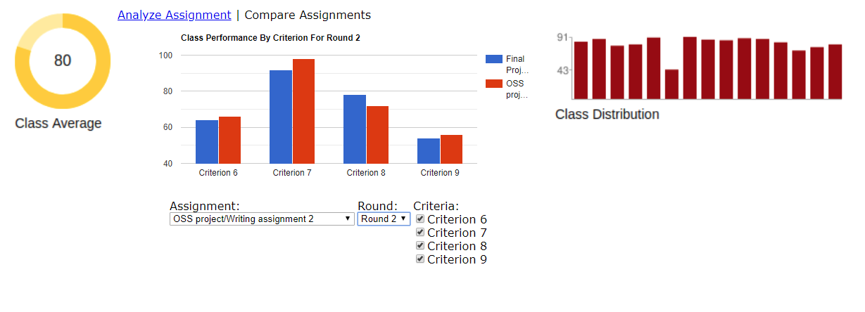
The upper part of the rubric statistic visualization displays a set of tabs that allow the instructor to analyze the rubric within a single assignment or to compare the rubric statistics between multiple assignments. The middle part of the rubric statistic visualization displays the statistics for each selected criteria as a bar graph. The heights of the bars are shown as a percentage of the maximum value for each criteria. The bottom part of the rubric statistic visualization displays a set of options that allow the instructor to filter the statistics shown in the bar graph. The left side (assignment average) and right side (assignment distribution) of the assignment grade view header are not changed.
In the integration of the rubric statistic visualization mock-up within a single assignment, there are two rounds of rubrics for the students to fill out. The rubric in round 1 consisted of five criteria, while the rubric in round 2 consisted of 4 criteria. The round of interest is selected using the drop-down menu on the left side. The criteria shown in the bar graph are selected using radio buttons next to each criterion. Finally, the type of statistic shown is selected using a drop-down menu on the right side of the options. Currently, the statistic is limited to either mean or median. Hovering the mouse over each of the bars in the bar graph shows the numerical value of the chosen statistic.
Visualizing the rubric statistics within a single assignment starts by selecting the left tab titled "Analyze Assignment". The default displays the mean of all criteria from the first round. Changing the round, the type of statistic, and the particular criteria are controlled from the drop-down menus and radio buttons below the bar graph.
Visualizing the rubric statistics between assignments starts by selecting the right tab titled "Compare Assignments". The default displays the comparisons between round one and all criteria of an assignment in the same course. The default assignment is the chronologically earliest assignment. The current assignment is shown in red while the rubric being compared is shown in blue.
New View Examples


Project Design
During the integration of rubric statistics and assignment grade statistics, this project expects to change the grades_controller file, an unspecified number of files in the views/grades subdirectory, assets/javascripts/grading.js, and RSpec files. This project does not expect to change any model files, though models will be changed if model data needs to be reformatted. This project does not expect to change the database.
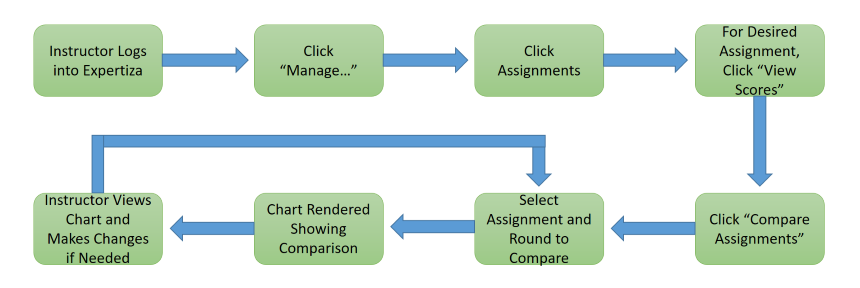
Design Flow


Tools and Design Choices
This project proposes using a third party JavaScript library for rendering the rubric statistics. This project proposes two requirements for the visualization library. The first requirement is to use a visualization library that performs client-side rendering. Using a client-side rendering library will minimize the number of server interactions as the instructor changes which rubric statistics to display. This minimization of server interaction will maximize the response time of Expertiza.
The second requirement for the visualization library is compatibility with current Expertiza graphics. The compatibility requirement implies that the visualization library is one that is already being used in Expertiza or a visualization library that could be used to render the current graphics.
Examples of client-side visualization libraries are given below:
   Highcharts (http://www.highcharts.com/)
   RaphaelJS (http://g.raphaeljs.com/)
   dygraphs (http://dygraphs.com/)
   Protovis (http://vis.stanford.edu/protovis/)
   Grafico (http://grafico.kilianvalkhof.com/)
   ChartKick (https://chartkick.com/)
   VanCharts (http://www.vancharts.com/)
   GoogleCharts (https://developers.google.com/chart/)
Test Plan
The team plans to perform both automated tests using frameworks RSpec and Capybara. In addition, we will perform manual tests of the user interface (UI), using the app.
RSpec Framework Tests
The RSpec Testing Framework, automated testing, will be used to verify the Models of the Expertiza Rails Web application feature set. Since this feature is dealing with Visualizations (charts) that is intimately tied with an Active Record Models, we will seed the Testing Database with known data via RSpec. These changes will be automatically rolled-back once the testing is complete.
Capybara Tests
Another automated testing framework that will be used is Capybara. Capybara is an browser type test to simulate a user clicking through your site. We will use this testing framework to verify that our charting object is present on the page and contains the seeded data that we had loaded.
UI Tests
In addition to the automated tests above we will also perform manual testing of the newly added features to include:
- Chart is displaying correctly
- Bars are showing up where expected
- Bar annotations are showing the expected value
- Criteria labels are for the correct bar and displaying correct values
- Hover text is displaying the correct values
- Null values are not present on the chart
- Correct colors are used for the multi-round view
- Show Labels checkbox works as expected
- Round Criteria is displaying correctly
- Round dropdown menu shows all rounds for the assignment
- Selecting a round changes the criteria checkboxes
- All checkboxes are displayed with appropriate text
- Checkboxes correctly remove or add criterion bars to the chart