CSC/ECE 517 Fall 2017/E1792 OSS Visualizations for instructors: Difference between revisions
| Line 27: | Line 27: | ||
[[File:scr2.PNG]]<br> | [[File:scr2.PNG]]<br> | ||
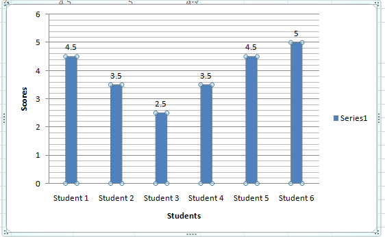
The average grades of each student can be pulled and then used to plot a bar graph as shown below ( This has been created by using a dummy data ) :- | The average grades of each student can be pulled and then used to plot a bar graph as shown below ( This has been created by using a dummy data ) :- | ||
[[File:Dummydata.PNG]] | [[File:Dummydata.PNG]]<br> | ||
Graph for class performance on Assignment 1 :- | |||
[[File:Assignment1.PNG]]<br> | |||
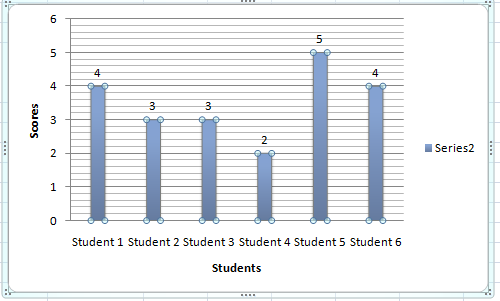
Graph for class performance on Assignment 2 :- | |||
[[File:Assignment2.PNG]]<br> | |||
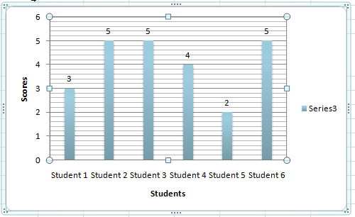
Graph for class performance on Assignment 3 :- | |||
[[File:Assignment3.PNG]]<br> | |||
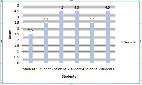
Graph for class performance on Assignment 4 :- | |||
[[File:Assignment4.PNG]]<br> | |||
Graph for class performance on Assignment 5 :- | |||
[[File:Assignment5.PNG]]<br> | |||
Graph for class performance on Average Class performance :- | |||
[[File:Average.PNG]]<br> | |||
The work flow can be approximately like the below diagram :- | |||
[[File:Workflow.PNG]]<br> | |||
Revision as of 04:45, 7 November 2017
Visualisations for instructors
Issue Statement & Approach followed:
Issue 1: For links in each cell. We are not sure what will happen if we click the link and which page will open.
Approach to solve issue 1: The issue is about the cell contains link to different pages in expertiza, but there is no way to know which cell is linked to which page. So user don't know the destination page when he/she clicks on some page. So we know that there is link in each cell, so we will show a hove over text displaying the link of the destination page.
Issue 2: The scale is blue to green, which does not make sense. And colors will change randomly each time loading the page. It will be better to scale from red to green.
Approach to solve issue 2: Here the color coding is blue to green and also it changes randomly. So we will use RBG color coding to make it red to green. We will use percentage to decide color coding. For example if it between 0 - 20% then make it red and so on. This way no matter what scale is being used it will always have appropriate color coding.
Issue 3: Two adjacent bar represents the response in round 1 to round k. It makes sense only if the rubrics in all review rounds are all the same. If the instructor implements the vary-rubric-by-round mechanism, this visualization will not make sense.
Approach to solve issue 3: Here The problem is that the the review responses show in a grid format that shows all the reviews from round 1 to round n. But this is ok when the rubrics is same for all the rounds. But when the rubric is different from round to round this view doesn't make sense. So what we are thinking is creating different grid for each review round. That will solve the problem for when the rubric is different as well as when the rubric is same.
Issue 4: The table is presorted by teams, but you can now also sort alphabetically. The cell view looks way too long, and should be divided into partials.
Approach to solve issue 4: Here we can sort the select query with appropriate column alphabetically, or we can sort the table automatically according to user criteria using dynamic table format. And the long view issue can be solved by using paging.
Issue 5: An interactive visualization or table that shows how a class performed on selected rubric criteria would be immensely helpful. It would show me what I need to focus more attention on.
Approach to solve issue 5 : The issue is about getting the performance of the entire class graded using the 5 rubrics criteria.A proposed solution may be use the below logic of calculating average grade for each student on all assignments in a particular course from the controller assessment360_controller.rb
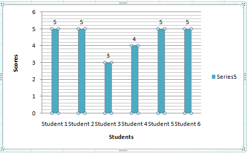
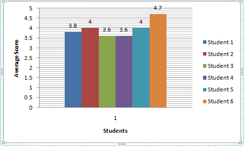
The average grades of each student can be pulled and then used to plot a bar graph as shown below ( This has been created by using a dummy data ) :-
Graph for class performance on Assignment 1 :-
Graph for class performance on Assignment 2 :-
Graph for class performance on Assignment 3 :-
Graph for class performance on Assignment 4 :-
Graph for class performance on Assignment 5 :-
Graph for class performance on Average Class performance :-
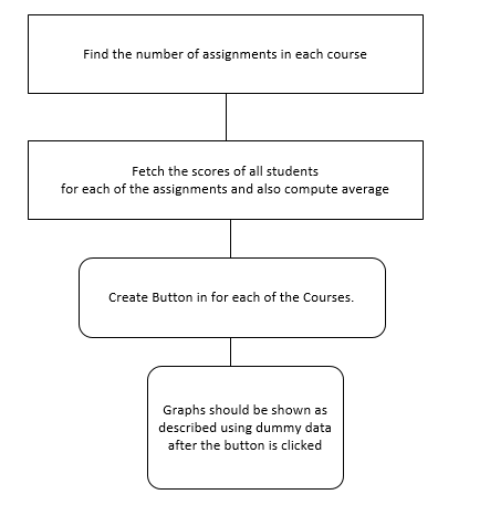
The work flow can be approximately like the below diagram :-
Test Plan:
Issue 1: Check the link matches to the hover over text
Issue 2: Check the color coding when different number is given in different scale.
Issue 3: Enter multiple reviews with different rubric and check different table/grid shows for each review round separately.
Issue 4: Check if the table is sorted with appropriate column alphabetically


