CSC/ECE 517 Spring 2016 E1628 Visualization: Difference between revisions
| Line 57: | Line 57: | ||
= Files Modified = | = Files Modified = | ||
These are the files we will be modifying | |||
* views/grades/_reviews.html.erb | * views/grades/_reviews.html.erb | ||
* views/grades/view_team.html.erb | * views/grades/view_team.html.erb | ||
Revision as of 17:17, 9 April 2016
Purpose
The main goal of the project is to present the data in more convenient way and also improve the existing visualization present in expertiza. We plan to improve /grades/view_my_scores and grades/view_team pages.Presently /grades/view_my_scores has got many unnecessary spaces between the reviews and score is displayed in text.In grades/view_team the data presented is not sorted.We plan to sort the data by avg score and also display high scored reviews on left of the table so it would be easy to analyze at simple glance.
Task Description
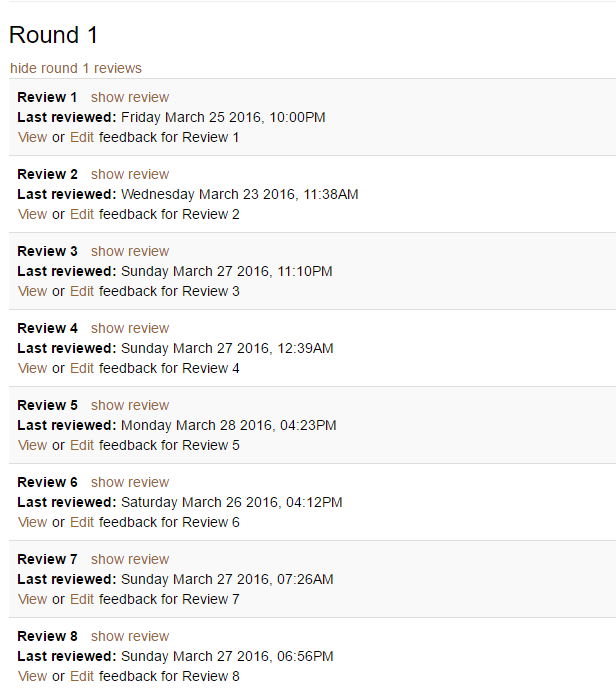
- When a review is shown, use different background colors for adjacent responses or adjacent reviews, instead of so much whitespace.
- In the “alternate view,”
- Clicking on “Avg.” should sort the rows by average score, from highest to lowest. Clicking again should change the sort order to from lowest to highest. Clicking a 3rd time should change it back to highest to lowest, etc.
- Clicking on some other button or icon should sort the columns in terms of total review scores. Clicking once should bring the highest-scored review to the right; clicking again should bring the lowest-scored review to the left, etc.
- Hovering over a box that has a text comment associated with it should show the comment in a “tool tip” format.
- Hovering over a number in the “Question id” column should bring up a “tool tip” that shows the text of the criterion (question).
- The “Question ID” label should be changed to “Criterion”.
Overview of approach
In the view that displays the reviews for the given assignment, each of the reviews are individuals div elements. To make use of existing Bootstrap CSS for displaying individual reviews with different background color, the reviews need to be part of a table. After changing this to a table, the bootstrap's table table-striped class can be added to the table to get alternate grey and white rows. The extra white space tags, horizontal rules, are removed since the table will take care of separating individuals rows.
To achieve task 2.a we intend to use tablesorter jQuery plugin. Tablesorter auto-detects the data types in the table and sort the rows either in ascending or descending order when a column header is clicked.
Install
Add the following line in Gemfile
gem 'jquery-tablesorter'
Usage
In the table add table sorter class as shown below
<table id="myTable" class="tablesorter">
To achieve task 2.c and 2.d we will be including "tooltip" offered by Bootstrap to all the cells in the table with title attribute set to contain comment or criterion based on the data cell. The following attributes should be added to the respective cells in the table to get the tooltip text on hover
data-toggle="tooltip" title="The tooltip text goes here"
To achieve task 2.e we will be renaming "Question Id" table header to "Criterion"
Mock-ups
The UI mock-ups for the tasks of the project are shown below.
Colored background for different review

Sortable AVG column in the alternate view

and

Files Modified
These are the files we will be modifying
- views/grades/_reviews.html.erb
- views/grades/view_team.html.erb