CSC/ECE 517 Fall 2015 E1577 MayYellowRoverJump: Difference between revisions
No edit summary |
|||
| (105 intermediate revisions by 4 users not shown) | |||
| Line 1: | Line 1: | ||
== | == Introduction == | ||
Expertiza is an open-source education and classroom web-tool founded by the National Science Foundation. Built with Ruby on Rails, it is designed to manage complete courses and students’ work within those courses. Each course can have a collection of instructors and students, though the interaction between instructors and students is minimal. The real emphasis of Expertiza is placed on peer-to-peer interactions, fostering a student-driven learning environment. Courses are comprised of assignments which users complete individually or with a team. Assignments usually encourage or require a team to enforce practicing peer-to-peer interaction. | [https://expertiza.ncsu.edu/ Expertiza] is an open-source education and classroom web-tool founded by the [http://www.nsf.gov/ National Science Foundation]. Built with Ruby on Rails, it is designed to manage complete courses and students’ work within those courses. Each course can have a collection of instructors and students, though the interaction between instructors and students is minimal. The real emphasis of Expertiza is placed on peer-to-peer interactions, fostering a student-driven learning environment. Courses are comprised of assignments which users complete individually or with a team. Assignments usually encourage or require a team to enforce practicing peer-to-peer interaction. | ||
One of the main tenets of Expertiza is its implicit peer-review system. Assignments inherently have a review stage where, rather than having instructors review a team’s work, other students review a team’s submission for that assignment. When completing a review, a student is presented with essentially a rubric for the assignment, and they fill in each category with the score they deem commensurate with the work of the team. Of course, each category has a comments box for the student to qualify the score they doled out. Each member of the submitting team is notified of the review, and the team can then decide as a whole how to rework their submission based on the feedback in the peer reviews. | One of the main tenets of Expertiza is its implicit peer-review system. Assignments inherently have a review stage where, rather than having instructors review a team’s work, other students review a team’s submission for that assignment. When completing a review, a student is presented with essentially a rubric for the assignment, and they fill in each category with the score they deem commensurate with the work of the team. Of course, each category has a comments box for the student to qualify the score they doled out. Each member of the submitting team is notified of the review, and the team can then decide as a whole how to rework their submission based on the feedback in the peer reviews. | ||
| Line 9: | Line 9: | ||
=== Description === | === Description === | ||
The tasks of the assignment are as follows: | |||
# Compact the review display. Eliminate the blank lines between items within a single review. Instead vary the background color from line to line to improve readability. | |||
# Add the following to the top of each review: who submitted the review. The instructor should see the user’s name and user-ID. A student should see “Reviewer #k”, where k is an integer between 1 and n, the number of reviews that have been submitted for this project. the version number of the review, and the time the review was submitted. | |||
# Add functionality to allow the instructor to view different review rounds. Also, provide instructor with a review report page of all reviewers’ reviews to every project. | |||
# Allow different alternate view: group by question. | |||
# Reduce the duplicate code between instructor and student grade reports. | |||
=== Purpose === | === Purpose === | ||
There is no denying that the usability of viewing peer reviews leaves much to be desired. It lacks uniformity across | ==== Motivations ==== | ||
* Lack of uniformity between student and instructor views | |||
* No defined separation between reviews | |||
* All reviews and review data (comments, question text, etc.) are displayed at once | |||
==== Discussion ==== | |||
There is no denying that the usability of viewing peer reviews leaves much to be desired. It lacks uniformity across the student and instructor roles, and the view itself has no semblance of order or organization. Viewing a single student’s review is a chore for both instructors and students, as there is no clear separation between reviews. In addition, all reviews are displayed at once, meaning viewing a single review requires scrolling through the page until the desired review is found. Our goal is to take the same data in the current display and present it in a more focused manner that allows a user, in either the instructor or student role, to absorb and process the content in the peer review more efficiently. Accessing, viewing, and understanding a review should be a far more simple task than what it currently is. In addition to the overhaul of the presentation layer, we also strive to drastically increase code reuse in the controller and model layers of the review module, which will in turn create a more uniform experience for both the instructor and student roles. | |||
=== Scope === | === Scope === | ||
| Line 20: | Line 33: | ||
=== Discussion of Resolution === | === Discussion of Resolution === | ||
The goal of this project is to optimize code and UI of review module, to make it more readable and user-friendly. To be more specific, our work | The goal of this project is to optimize code and UI of review module, to make it more readable and user-friendly. To be more specific, our work focuses on the following specific areas: | ||
* [https://en.wikipedia.org/wiki/Code_refactoring Refactoring] grades_controller.rb and review_mapping_controller.rb to optimize code organization, making code easier to read. | |||
* Modifying UI to be more friendly. Instructor can see users' names and user-IDs, student should see review numbers, like “Reviewer #k” where k is the number of reviews submitted to the project/assignment. Besides, the round of reviews (version number) and submitted time of reviews could also be saw by both students and instructor. | |||
* Modifying UI to make it easier for students/instructor to see reviews of different rounds. Tabs is a good choice, besides drop-down menus are a good alternate. Maybe we also need to modify models to make it adaptive to different rounds of reviews.(Currently, review models will only record the latest version of reviews.) | |||
* Providing a new page to display all reviews of one project/assignment as review report. In this page, reviews will be displayed as a format like “Question 1, Reviews 1, Reviews 2 … Reviews n” (reviewer’s name should also be included here). Besides, here we also need to provide different version/round of reviews of different questions. At the top of this page, there should be a matrix to show the summary of questions(as a row) and reviews(as a column).(How can different version be displayed in the matrix? Using different matrix works?) | |||
* Providing a way to hide or gray the questions, making students/instructor more focus on reviews. | |||
* Providing a search reviews through a specific keyword. And when searching, providing a ‘next’ button to navigate to next keyword place. | |||
* Providing a two-dimensional table to show the scores of each question and reviewer’s name who gives the score to the question. | |||
=== Mock-Ups === | |||
[[File:Current Student.PNG|border|center|alt=The current student view.|The current review display for students.]] | |||
'''Image 1. The current review display for students.''' | |||
Image 1, above, illustrates the current design of the Student Review Report. We propose entirely removing the summary statistics at the top of the page. The data in these statistics can be displayed in a more efficient manner. | |||
[[File:Heatgrid_studen_condensed.png|border|center|alt=The proposed condensed student display.|The proposed condensed student display.]] | |||
'''Image 2. The proposed student review report, in default collapsed view.''' | |||
The main UI overhaul will occur in displaying the actual reviews. Image 2 illustrates the design for the student review report. To combat the length of the current review display, we have chosen to collapse all data into a single table that can be viewed without the need to endlessly scroll through the page. Each row of the table corresponds to a specific criterion of the review and the scores each reviewer gave with whatever comments they may have offered. The columns dictate which review the score came from. By default, the full criterion text is truncated, while the comments from a review are hidden. Because all of the comments are not available for all reviews in a single screen display, the rightmost field displays the number of comment fields for each criterion which have 10 or more characters. The purpose of this field is to provide the user a quick and effective manner to spark interest into whether or not the the criterion contains meaningful comments. | |||
The colored background of the cells are based on a color scale relative to the score. These colors are added to the design into order to quickly spark interest to the users, allowing them to pick out the essential information without having to iterate through all the data. | |||
[[File: | [[File:Heatgrid_student_expanded.png|border|center|alt=The proposed expanded student display.|The proposed expanded student display.]] | ||
'''Image 3. The proposed student review report, in expanded view.''' | |||
Clicking the row number will display all comments for that particular criterion, i.e., comments from each review. This way a student can compare comments and scores for a single question across all reviews. Clicking the column header for a specific review will display all the comments left by that reviewer. A student can use this functionality to view the entirety of a single review, including scores and comments. | |||
It is important to note a important data organization difference between the existing design and the proposed design; The existing review report design groups reponses by the reviewer who created them, while the proposed review report design groups responses by the criteria. This new way of grouping responses groups like with like, allow the viewing users to see all scores and comments pertaining to one criterion at once. | |||
[[File: | [[File:Current Instructor.PNG|border|center|alt=The current instructor view.|The current review display for instructors.]] | ||
'''Image 4. Current design of the Instructor's Review Report.''' | |||
The | The instructor role will also receive interaction updates using the same underling display structures, but the content differ slightly from that of the student. The student view will also be made available to the instructor via a link in the 'grades/view' page, allowing to see this updated scores report for a requested participant. | ||
=== Design Patterns === | === Design Patterns === | ||
* ''' | The implementation team used following design patterns in the solution: | ||
* '''[https://en.wikipedia.org/wiki/Module_pattern Module Design Pattern]''': Using the module design pattern, source code can be organized into components that accomplish a particular function. In JavaScript files, we use anonymous functions for responsiveness on client side via JavaScript and JQuery. We also developed a view model module to contain the necessary information needed to render the review content on the page. | |||
* '''[https://en.wikipedia.org/wiki/Facade_pattern Facade Design Pattern]''': The façade design pattern provides a unified, high-level interface to a set of interfaces in a subsystem which is intended to make the subsystem easier to use. We use view-models as facades, which simply the business models such that the report views can be generated without extraneous business data. Additionally, in our implementation, the student role's review page, grades, commands, and feedback are gathered from three different controllers, and they are accessed from within the review controller and displayed in one review page. The client need only interact with the façade, i.e., the review controller. | |||
=== Use Cases === | |||
* ''' | * '''View Received Scores and Reviews for Specified Assignment, Grouped by Criteria''': Accessed from the Student's landing page for a particular assignment. Allows a student to see scores, grouped by criteria, for self's assignment, as well as meta reviews and author reviews. | ||
=== Testing === | |||
Much of the testing was done informally during the development phase in the development database. Because the database was converted from the production environment, the development environment provide many opportunities for parallel testing between the view_my_scores (existing) and view_team (new) views. | |||
Some functional tests were completed with RSpec, but not many and probably not enough. This was because the scope of the project was large and the implementation team ran out of time before the deadline. | |||
One situation where the parallel testing of the development environment provided limited value was with multi-round assignments and multi-round rubrics because the database came from production prior to the functionality being available in production. thus, in order to have sufficient tests, we created assignments new assignments, and new reviews in the development environment. The tests were not exhaustive, and probably not along the lines of TDD. | |||
=== Functional Tests === | |||
* ColorMapping module: The generation of the heatgrid requires mapping review scores to color groups. Testing of the method's functionality requires various fixture collections which vary is size, range, max, min, and number of duplicates and much of the extensive testing was done in the development environment. | |||
* Role Security Testing: In order to DRY the code, and make it maximally orthogonal, the intention is to reuse code where possible. To re-use code across students and participants will require security and role checks to confirm the session user has access to view the requested information. To test this functionality sufficiently will require testing as admin, instructor with access, instructor without access, student, non-participant, participant, team-member, non-team-member, etc. | |||
* Char Comment Count Module: The generation of the "# of comments with chars > x" result will require the execution of a module. this module will be tested with various collections of comments which vary in size, range, length, and content. | |||
* | * Calculate Total Review Score: This module generates the total score of a review, which is then displayed at the bottom of the heat table. | ||
* Calculate Question Average Score: This module generates the average score for all the reviews of a question. | |||
=== | === UI Tests === | ||
UI will be tested manually, but also automatedly with [https://en.wikipedia.org/wiki/Selenium_(software) Selenium]. Compliance and validation will be checked via an online tool. | |||
== Implementation == | == Implementation == | ||
=== New Files === | |||
* '''models/vm_question_response''': A view model which represents a single heatgrid-table, with questions for each row, and reviews for each column. The <code>vm_question_response</code> can be thought of as the controller for the table. It holds all the <code>vm_question_response_ row</code>'s in the table and is responsible for calculating various values, such as the total and average scores for each review. | |||
* '''models/vm_question_response_row''': A view model, which represents a row of a heatgrid-table. It holds the question text, the score cells for that row, and the number of comments with more than 10 characters. It is also responsible for calculating the average score across all reviews for that particular question. | |||
* '''models/vm_question_response_score_cell''': A view model, which represents a cell of the heat-grid table. This class is simply a data holder, which contains a score for displaying, and the related code code to map to a color background. | |||
* view_team.html.erb: view file for new report which is displayed in mock-ups above, and screenshots below. associated with view_team method in the grades controller. | |||
* view_reviewer: html.erb: view file to supplement the new view_team. associated with the view-reviewer method in the grades controller. Uses very similar logic to the existing view scores reports. | |||
* grades.css: css file for the grades controller. for now, only used in the view_team.html.erb file. | |||
=== Modified Files === | |||
* config/routes.rb: for new routes. | |||
* controller/grades_controller.rb: added two new action methods associated with the two new views, listed above. | |||
* models/response_map.rb: added get_assessments_for_rounds(participant,round,rounds) : retrieves assessments for a particular round. | |||
* grades/_participant.html.erb: added href link such that the instructor can view the heat grid for a participant. | |||
* student_task/view.html.erb: added href link such that the student can view his/her heatgrid for a assignment-participant. | |||
=== View Models: What, Why How. === | |||
Three models were added, which aid in organizing the data to generate the view. This view models main purpose is to organize data for views such that the html can be generated without extraneous logic or data. | |||
Advantages: | |||
* simplified loops in views: Without the view models, generating the view model would have been complicated (see the loop in the view_team.html.erb which loops for each row, then loops for each cell in each row.). | |||
* easy-to-understand: Additionally, while the view models may not be the most elegant, they are easy to understand. (We contrast this with the pscores, rscores, and scores hashes used in other score reports, which require a lot of yo-yoing to understand, and whose contents are obscure. | |||
* fast: The view_team view generates quickly compared to the view_my_scores. the main reason for this is that the view models only contain and retrieve what is necessary to populate the view. | |||
=== Javascript, JQuery, CSS tactics in the view_team view === | |||
There are 3 main mechanisms that need to be understood in order to modify the view_team view in future development tasks: | |||
* Inner Loops: In the tbl_heat table: each row of the listofrows list represents a question-row. And each cell in the score_row list represents a cell in that row. | |||
* onclick action of rows: When a user clicks a tr table-row in the tbl_heat, a hidden tr table row underneath expands/collapses, which displays the comment text. This is done by dynamically creating data-targets using the question_ids. <code> data-target="#hid<%= row.question_id.to_s %>" </code> | |||
* dynamic coloring of score cells: the background color of the score cells is generated using a CSS class, which is populated in the view by the color_code string in the vm_question_response cell. | |||
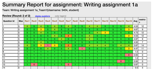
The <code>stylesheet grades.scss</code> is used to create the heat grid effect, allowing users to quickly hone in on bad scores: | |||
[[File:Detailedreview2.png|border|center|alt=uml.|UML]] | |||
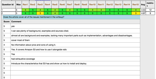
By clicking the question row, full question text and the scores from each review will be displayed: | |||
[[File:Rsz_screenshot_2015-12-04_235548.png|border|center|alt=uml.|UML]] | |||
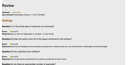
In <code>review_reviewer.html.erb</code>, detailed reviews will be displayed: | |||
[[File:detailedreview.png|border|center|alt=uml.|UML]] | |||
=== Users' Access of Report === | |||
'''see associated video for a visual walk-through here''' | |||
* Instructors: Instructors will access the heat-grid view_team view via the grades/view . A 'heat grid' link appears for each participant. | |||
* Students: Students will access the heat-grid via the student_task/view view, which already lists links available for a participant. | |||
=== UML & ER diagrams === | |||
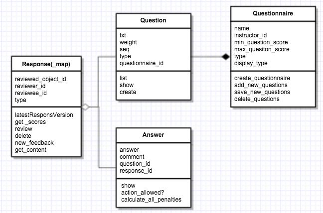
Below is a UML diagram of the main model classes used in our solution. | |||
[[File:FinalProjUml2.png|border|center|alt=uml.|UML]] | |||
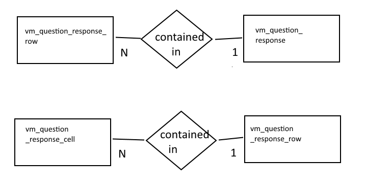
Below is a ER diagram of the added model classes used in our solution. | |||
[[File:Er_vm2.png|border|center|alt=er.|ER]] | |||
== | === Special Testing === | ||
Screenshot of a single round assignment review | |||
[[File:Singleround.PNG|border|center|alt=singleround.|singleround]] | |||
Screenshot of a multiround assignment review | |||
[[File:Multi_no_vary.PNG|border|center|alt=Multi_no_vary.PNG.|Multi_no_vary.PNG]] | |||
Screenshot of a vary-by-rubric review, with reviews for rounds 1 and 3, and blank 2. | |||
[[File:Vary13.PNG|border|center|alt=Vary13.PNG.|Vary13.PNG]] | |||
Screenshot of a vary-by-rubric review, with reviews for rounds 1 and 2, and blank 3. | |||
[[File:Vary12.PNG|border|center|alt=Vary12.PNG.|Vary12.PNG]] | |||
Screenshot of a vary-by-rubric review, with reviews for rounds 2 and 3, and blank 1. | |||
[[Image:Vary23.PNG|border|center|alt=Vary23.PNG.|Vary23.PNG]] | |||
==Future Enhancements== | |||
* The project team may attempt to implement sorting of the lists and tables in in both the instructor and student review pages. | |||
* The project team suggests that an instructor view of the heat grid be created, with lists all peer reviews for all teams stacked vertically on one page. | |||
* The mock-ups above include suggested functionality for expanding all heatgrid rows. This was not implemented due to time limitations. | |||
* Teammate review display have been suppressed such that they will not be displayed. At the end of the project, we realized that teammate reviews are hidden for the current semester, and we don't know how to implement that logic, so we suppressed teammate reviews to be safe. | |||
==References== | ==References== | ||
<references/> | |||
<p>https://expertiza.ncsu.edu/</p> | |||
<p>http://www.nsf.gov/</p> | |||
<p>https://en.wikipedia.org/wiki/Code_refactoring</p> | |||
<p>https://en.wikipedia.org/wiki/Flyweight_pattern</p> | |||
<p>https://en.wikipedia.org/wiki/Strategy_pattern</p> | |||
<p>https://en.wikipedia.org/wiki/Front_Controller_pattern</p> | |||
<p>https://en.wikipedia.org/wiki/Module_pattern</p> | |||
<p>https://en.wikipedia.org/wiki/Iterator_pattern</p> | |||
<p>https://en.wikipedia.org/wiki/Selenium_(software)</p> | |||
Latest revision as of 07:20, 14 December 2015
Introduction
Expertiza is an open-source education and classroom web-tool founded by the National Science Foundation. Built with Ruby on Rails, it is designed to manage complete courses and students’ work within those courses. Each course can have a collection of instructors and students, though the interaction between instructors and students is minimal. The real emphasis of Expertiza is placed on peer-to-peer interactions, fostering a student-driven learning environment. Courses are comprised of assignments which users complete individually or with a team. Assignments usually encourage or require a team to enforce practicing peer-to-peer interaction.
One of the main tenets of Expertiza is its implicit peer-review system. Assignments inherently have a review stage where, rather than having instructors review a team’s work, other students review a team’s submission for that assignment. When completing a review, a student is presented with essentially a rubric for the assignment, and they fill in each category with the score they deem commensurate with the work of the team. Of course, each category has a comments box for the student to qualify the score they doled out. Each member of the submitting team is notified of the review, and the team can then decide as a whole how to rework their submission based on the feedback in the peer reviews.
There do exist issues, however, with respect to viewing one’s team’s reviews, particularly in the realm of usability. Our team has been tasked with revamping and enhancing the review UI to produce a more focused and uniform user experience for students and instructors alike.
Assignment
Description
The tasks of the assignment are as follows:
- Compact the review display. Eliminate the blank lines between items within a single review. Instead vary the background color from line to line to improve readability.
- Add the following to the top of each review: who submitted the review. The instructor should see the user’s name and user-ID. A student should see “Reviewer #k”, where k is an integer between 1 and n, the number of reviews that have been submitted for this project. the version number of the review, and the time the review was submitted.
- Add functionality to allow the instructor to view different review rounds. Also, provide instructor with a review report page of all reviewers’ reviews to every project.
- Allow different alternate view: group by question.
- Reduce the duplicate code between instructor and student grade reports.
Purpose
Motivations
- Lack of uniformity between student and instructor views
- No defined separation between reviews
- All reviews and review data (comments, question text, etc.) are displayed at once
Discussion
There is no denying that the usability of viewing peer reviews leaves much to be desired. It lacks uniformity across the student and instructor roles, and the view itself has no semblance of order or organization. Viewing a single student’s review is a chore for both instructors and students, as there is no clear separation between reviews. In addition, all reviews are displayed at once, meaning viewing a single review requires scrolling through the page until the desired review is found. Our goal is to take the same data in the current display and present it in a more focused manner that allows a user, in either the instructor or student role, to absorb and process the content in the peer review more efficiently. Accessing, viewing, and understanding a review should be a far more simple task than what it currently is. In addition to the overhaul of the presentation layer, we also strive to drastically increase code reuse in the controller and model layers of the review module, which will in turn create a more uniform experience for both the instructor and student roles.
Scope
The scope of this task is limited to enhancing the usability of viewing peer reviews for both students and instructors. It is within our scope to modify the corresponding views for this functionality, as well as the underlying controllers and models as needed. The modifications to the Ruby classes will either be to accommodate changes to the view or to provide a uniform experience for both the instructor and student. As this is more of a user experience task, e.g, changing the way data is displayed to the user, there will be limited modifications to the base functionality of this module. It is not within our scope to change any element of the actual peer review process, such as selecting a topic to review or completing a review of a topic. As a result, we will not be modifying the results of peer reviews; the same peer review data will be present both before and after our task is completed.
Design
Discussion of Resolution
The goal of this project is to optimize code and UI of review module, to make it more readable and user-friendly. To be more specific, our work focuses on the following specific areas:
- Refactoring grades_controller.rb and review_mapping_controller.rb to optimize code organization, making code easier to read.
- Modifying UI to be more friendly. Instructor can see users' names and user-IDs, student should see review numbers, like “Reviewer #k” where k is the number of reviews submitted to the project/assignment. Besides, the round of reviews (version number) and submitted time of reviews could also be saw by both students and instructor.
- Modifying UI to make it easier for students/instructor to see reviews of different rounds. Tabs is a good choice, besides drop-down menus are a good alternate. Maybe we also need to modify models to make it adaptive to different rounds of reviews.(Currently, review models will only record the latest version of reviews.)
- Providing a new page to display all reviews of one project/assignment as review report. In this page, reviews will be displayed as a format like “Question 1, Reviews 1, Reviews 2 … Reviews n” (reviewer’s name should also be included here). Besides, here we also need to provide different version/round of reviews of different questions. At the top of this page, there should be a matrix to show the summary of questions(as a row) and reviews(as a column).(How can different version be displayed in the matrix? Using different matrix works?)
- Providing a way to hide or gray the questions, making students/instructor more focus on reviews.
- Providing a search reviews through a specific keyword. And when searching, providing a ‘next’ button to navigate to next keyword place.
- Providing a two-dimensional table to show the scores of each question and reviewer’s name who gives the score to the question.
Mock-Ups
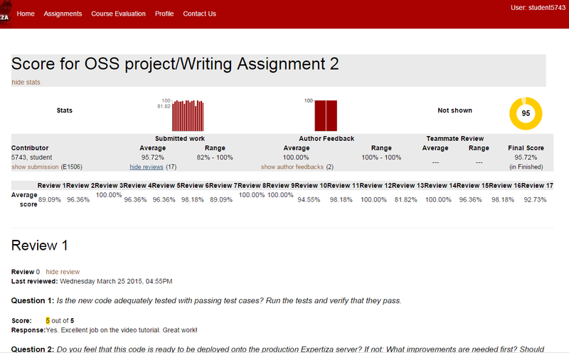
Image 1. The current review display for students.
Image 1, above, illustrates the current design of the Student Review Report. We propose entirely removing the summary statistics at the top of the page. The data in these statistics can be displayed in a more efficient manner.
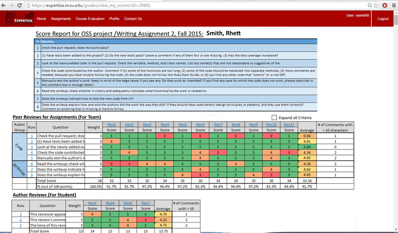
Image 2. The proposed student review report, in default collapsed view.
The main UI overhaul will occur in displaying the actual reviews. Image 2 illustrates the design for the student review report. To combat the length of the current review display, we have chosen to collapse all data into a single table that can be viewed without the need to endlessly scroll through the page. Each row of the table corresponds to a specific criterion of the review and the scores each reviewer gave with whatever comments they may have offered. The columns dictate which review the score came from. By default, the full criterion text is truncated, while the comments from a review are hidden. Because all of the comments are not available for all reviews in a single screen display, the rightmost field displays the number of comment fields for each criterion which have 10 or more characters. The purpose of this field is to provide the user a quick and effective manner to spark interest into whether or not the the criterion contains meaningful comments.
The colored background of the cells are based on a color scale relative to the score. These colors are added to the design into order to quickly spark interest to the users, allowing them to pick out the essential information without having to iterate through all the data.
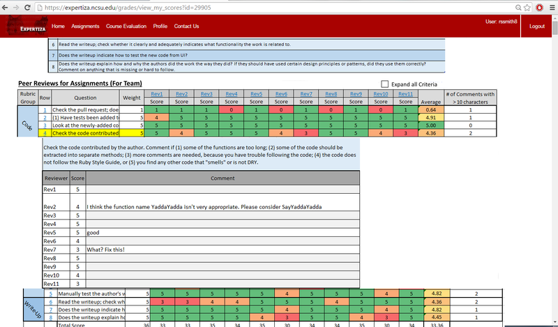
Image 3. The proposed student review report, in expanded view.
Clicking the row number will display all comments for that particular criterion, i.e., comments from each review. This way a student can compare comments and scores for a single question across all reviews. Clicking the column header for a specific review will display all the comments left by that reviewer. A student can use this functionality to view the entirety of a single review, including scores and comments.
It is important to note a important data organization difference between the existing design and the proposed design; The existing review report design groups reponses by the reviewer who created them, while the proposed review report design groups responses by the criteria. This new way of grouping responses groups like with like, allow the viewing users to see all scores and comments pertaining to one criterion at once.
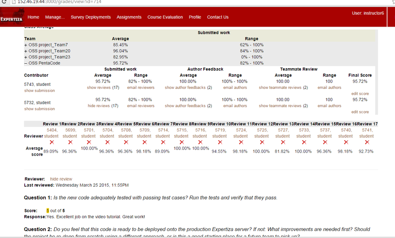
Image 4. Current design of the Instructor's Review Report.
The instructor role will also receive interaction updates using the same underling display structures, but the content differ slightly from that of the student. The student view will also be made available to the instructor via a link in the 'grades/view' page, allowing to see this updated scores report for a requested participant.
Design Patterns
The implementation team used following design patterns in the solution:
- Module Design Pattern: Using the module design pattern, source code can be organized into components that accomplish a particular function. In JavaScript files, we use anonymous functions for responsiveness on client side via JavaScript and JQuery. We also developed a view model module to contain the necessary information needed to render the review content on the page.
- Facade Design Pattern: The façade design pattern provides a unified, high-level interface to a set of interfaces in a subsystem which is intended to make the subsystem easier to use. We use view-models as facades, which simply the business models such that the report views can be generated without extraneous business data. Additionally, in our implementation, the student role's review page, grades, commands, and feedback are gathered from three different controllers, and they are accessed from within the review controller and displayed in one review page. The client need only interact with the façade, i.e., the review controller.
Use Cases
- View Received Scores and Reviews for Specified Assignment, Grouped by Criteria: Accessed from the Student's landing page for a particular assignment. Allows a student to see scores, grouped by criteria, for self's assignment, as well as meta reviews and author reviews.
Testing
Much of the testing was done informally during the development phase in the development database. Because the database was converted from the production environment, the development environment provide many opportunities for parallel testing between the view_my_scores (existing) and view_team (new) views.
Some functional tests were completed with RSpec, but not many and probably not enough. This was because the scope of the project was large and the implementation team ran out of time before the deadline.
One situation where the parallel testing of the development environment provided limited value was with multi-round assignments and multi-round rubrics because the database came from production prior to the functionality being available in production. thus, in order to have sufficient tests, we created assignments new assignments, and new reviews in the development environment. The tests were not exhaustive, and probably not along the lines of TDD.
Functional Tests
- ColorMapping module: The generation of the heatgrid requires mapping review scores to color groups. Testing of the method's functionality requires various fixture collections which vary is size, range, max, min, and number of duplicates and much of the extensive testing was done in the development environment.
- Role Security Testing: In order to DRY the code, and make it maximally orthogonal, the intention is to reuse code where possible. To re-use code across students and participants will require security and role checks to confirm the session user has access to view the requested information. To test this functionality sufficiently will require testing as admin, instructor with access, instructor without access, student, non-participant, participant, team-member, non-team-member, etc.
- Char Comment Count Module: The generation of the "# of comments with chars > x" result will require the execution of a module. this module will be tested with various collections of comments which vary in size, range, length, and content.
- Calculate Total Review Score: This module generates the total score of a review, which is then displayed at the bottom of the heat table.
- Calculate Question Average Score: This module generates the average score for all the reviews of a question.
UI Tests
UI will be tested manually, but also automatedly with Selenium. Compliance and validation will be checked via an online tool.
Implementation
New Files
- models/vm_question_response: A view model which represents a single heatgrid-table, with questions for each row, and reviews for each column. The
vm_question_responsecan be thought of as the controller for the table. It holds all thevm_question_response_ row's in the table and is responsible for calculating various values, such as the total and average scores for each review. - models/vm_question_response_row: A view model, which represents a row of a heatgrid-table. It holds the question text, the score cells for that row, and the number of comments with more than 10 characters. It is also responsible for calculating the average score across all reviews for that particular question.
- models/vm_question_response_score_cell: A view model, which represents a cell of the heat-grid table. This class is simply a data holder, which contains a score for displaying, and the related code code to map to a color background.
- view_team.html.erb: view file for new report which is displayed in mock-ups above, and screenshots below. associated with view_team method in the grades controller.
- view_reviewer: html.erb: view file to supplement the new view_team. associated with the view-reviewer method in the grades controller. Uses very similar logic to the existing view scores reports.
- grades.css: css file for the grades controller. for now, only used in the view_team.html.erb file.
Modified Files
- config/routes.rb: for new routes.
- controller/grades_controller.rb: added two new action methods associated with the two new views, listed above.
- models/response_map.rb: added get_assessments_for_rounds(participant,round,rounds) : retrieves assessments for a particular round.
- grades/_participant.html.erb: added href link such that the instructor can view the heat grid for a participant.
- student_task/view.html.erb: added href link such that the student can view his/her heatgrid for a assignment-participant.
View Models: What, Why How.
Three models were added, which aid in organizing the data to generate the view. This view models main purpose is to organize data for views such that the html can be generated without extraneous logic or data. Advantages:
- simplified loops in views: Without the view models, generating the view model would have been complicated (see the loop in the view_team.html.erb which loops for each row, then loops for each cell in each row.).
- easy-to-understand: Additionally, while the view models may not be the most elegant, they are easy to understand. (We contrast this with the pscores, rscores, and scores hashes used in other score reports, which require a lot of yo-yoing to understand, and whose contents are obscure.
- fast: The view_team view generates quickly compared to the view_my_scores. the main reason for this is that the view models only contain and retrieve what is necessary to populate the view.
Javascript, JQuery, CSS tactics in the view_team view
There are 3 main mechanisms that need to be understood in order to modify the view_team view in future development tasks:
- Inner Loops: In the tbl_heat table: each row of the listofrows list represents a question-row. And each cell in the score_row list represents a cell in that row.
- onclick action of rows: When a user clicks a tr table-row in the tbl_heat, a hidden tr table row underneath expands/collapses, which displays the comment text. This is done by dynamically creating data-targets using the question_ids.
data-target="#hid<%= row.question_id.to_s %>" - dynamic coloring of score cells: the background color of the score cells is generated using a CSS class, which is populated in the view by the color_code string in the vm_question_response cell.
The stylesheet grades.scss is used to create the heat grid effect, allowing users to quickly hone in on bad scores:
By clicking the question row, full question text and the scores from each review will be displayed:
In review_reviewer.html.erb, detailed reviews will be displayed:
Users' Access of Report
see associated video for a visual walk-through here
- Instructors: Instructors will access the heat-grid view_team view via the grades/view . A 'heat grid' link appears for each participant.
- Students: Students will access the heat-grid via the student_task/view view, which already lists links available for a participant.
UML & ER diagrams
Below is a UML diagram of the main model classes used in our solution.
Below is a ER diagram of the added model classes used in our solution.
Special Testing
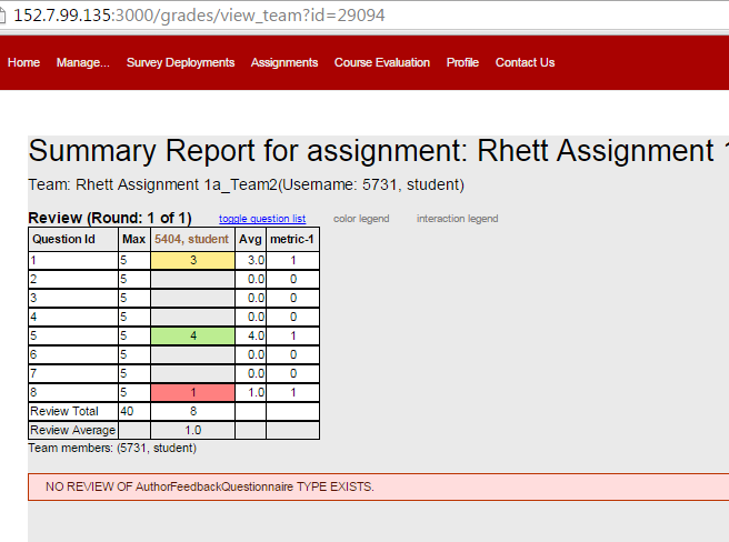
Screenshot of a single round assignment review
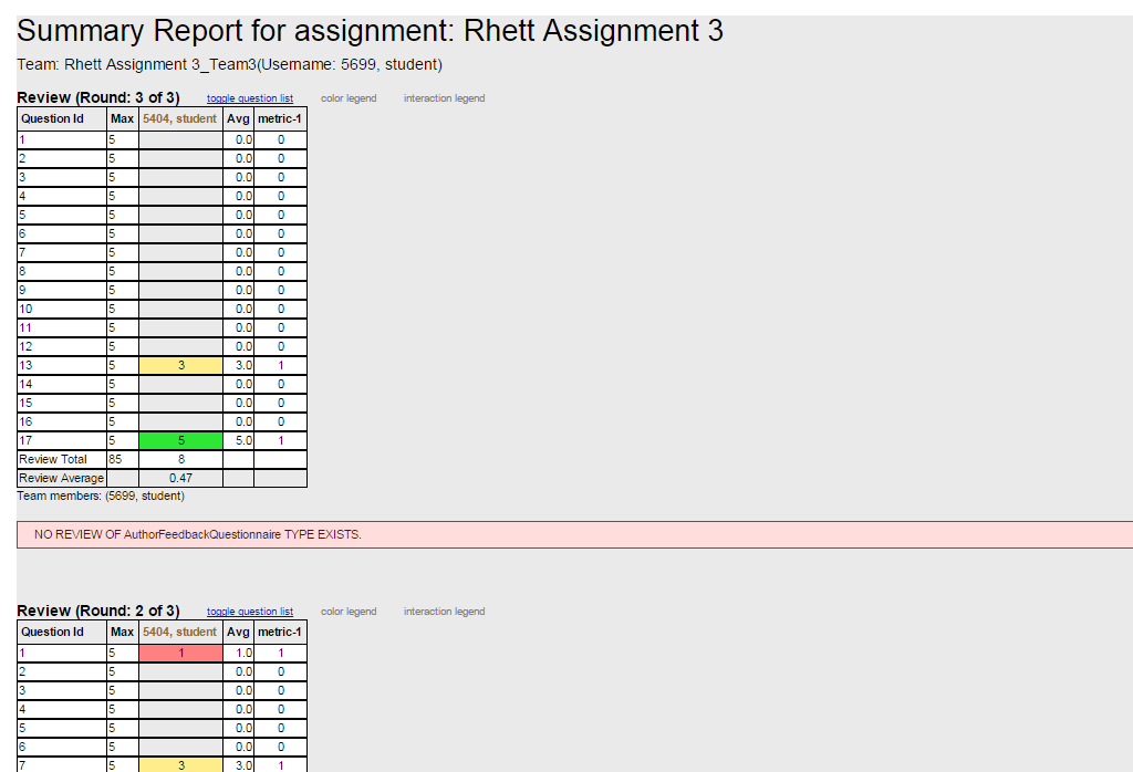
Screenshot of a multiround assignment review
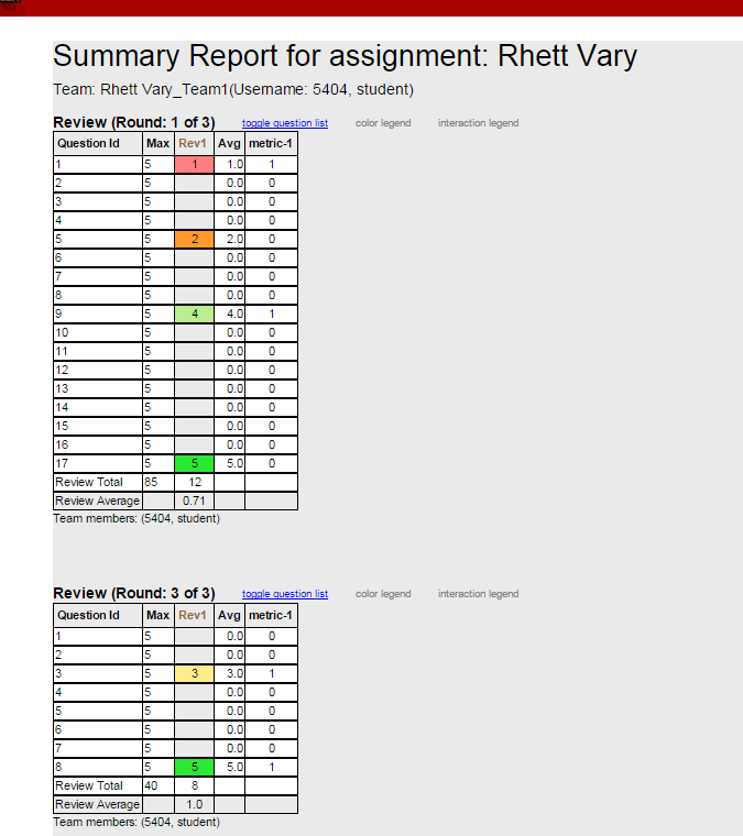
Screenshot of a vary-by-rubric review, with reviews for rounds 1 and 3, and blank 2.
Screenshot of a vary-by-rubric review, with reviews for rounds 1 and 2, and blank 3.
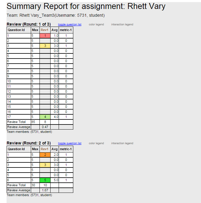
Screenshot of a vary-by-rubric review, with reviews for rounds 2 and 3, and blank 1.
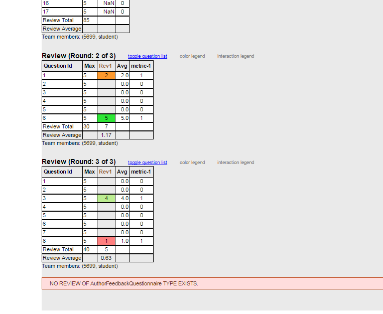
Future Enhancements
- The project team may attempt to implement sorting of the lists and tables in in both the instructor and student review pages.
- The project team suggests that an instructor view of the heat grid be created, with lists all peer reviews for all teams stacked vertically on one page.
- The mock-ups above include suggested functionality for expanding all heatgrid rows. This was not implemented due to time limitations.
- Teammate review display have been suppressed such that they will not be displayed. At the end of the project, we realized that teammate reviews are hidden for the current semester, and we don't know how to implement that logic, so we suppressed teammate reviews to be safe.
References
<references/>
https://en.wikipedia.org/wiki/Code_refactoring
https://en.wikipedia.org/wiki/Flyweight_pattern
https://en.wikipedia.org/wiki/Strategy_pattern
https://en.wikipedia.org/wiki/Front_Controller_pattern
https://en.wikipedia.org/wiki/Module_pattern