CSC/ECE 517 Fall 2013/oss E805 kkn: Difference between revisions
No edit summary |
No edit summary |
||
| (30 intermediate revisions by 2 users not shown) | |||
| Line 30: | Line 30: | ||
===Problem Inference and Motivation=== | ===Problem Inference and Motivation=== | ||
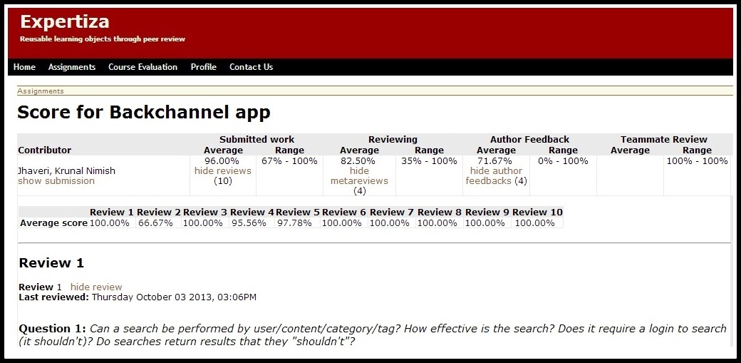
*Currently the view_my_scores html.erb page displays all the scores in a tabular form with reviews,metareviews,author feedback below each other. Everything is merged into one big html page, and thus makes the view rendering a slow process. Also it’s a very bad user interface design. | *Currently the view_my_scores html.erb page displays all the scores in a tabular form with reviews,metareviews,author feedback below each other. Everything is merged into one big html page, and thus makes the view rendering a slow process. Also it’s a very bad user interface design. | ||
[[File: | [[File:untitled2_kj.jpg]] | ||
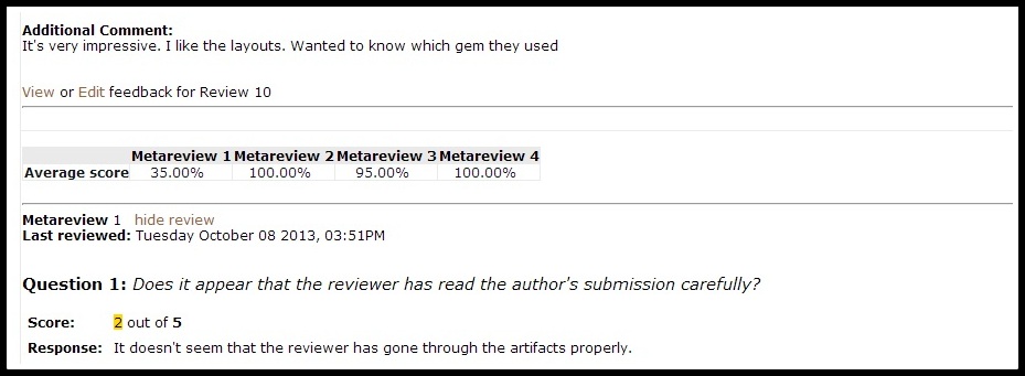
*When a user clicks on show reviews/metareviews,etc the reviews gets rendered below each other which is too taxing for a student to scroll all the way down to read a particular review. | *When a user clicks on show reviews/metareviews,etc the reviews gets rendered below each other which is too taxing for a student to scroll all the way down to read a particular review. | ||
[[File: | [[File:untitled1_kj.jpg]] | ||
*This bad User Interface design along with very slow view rendering process motivated us to design an elegant interface which is user friendly and well as fast. This prompted us to use JQuery tabs. | *This bad User Interface design along with very slow view rendering process motivated us to design an elegant interface which is user friendly and well as fast. This prompted us to use JQuery tabs. | ||
| Line 41: | Line 41: | ||
==Initial User Interface to view scores== | ==Initial User Interface to view scores== | ||
Previously,the view_my_scores html.erb page displayed all the scores in a tabular form with reviews, metareviews, author feedback below each other. Everything is merged into one big html page, and thus makes the view rendering a slow process. Also it’s a very bad user interface | Previously,the view_my_scores html.erb page displayed all the scores in a tabular form with reviews, metareviews, author feedback below each other. Everything is merged into one big html page, and thus makes the view rendering a slow process. Also it’s a very bad user interface design. | ||
design. | |||
When a user clicks on show reviews/metareviews,etc the reviews gets rendered below each other | When a user clicks on show reviews/metareviews,etc the reviews gets rendered below each other | ||
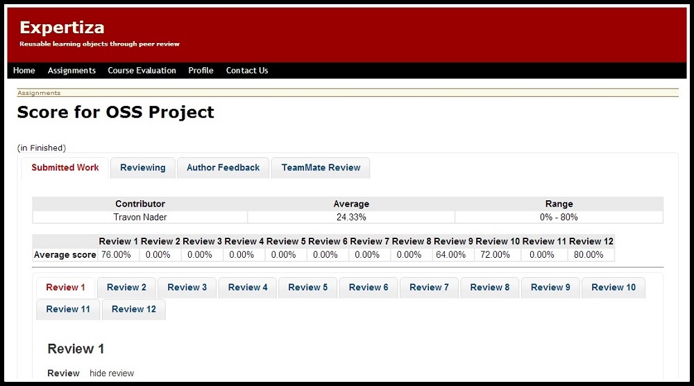
==Modified User Interface to view scores and reviews in tabs== | |||
The new user interface separates the code into various tabs for reporting the scores and also a tab format for displaying reviews. | The new user interface separates the code into various tabs for reporting the scores and also a tab format for displaying reviews. | ||
[[File:Screenshot2.jpg]] | |||
==Code Changes== | ==Code Changes== | ||
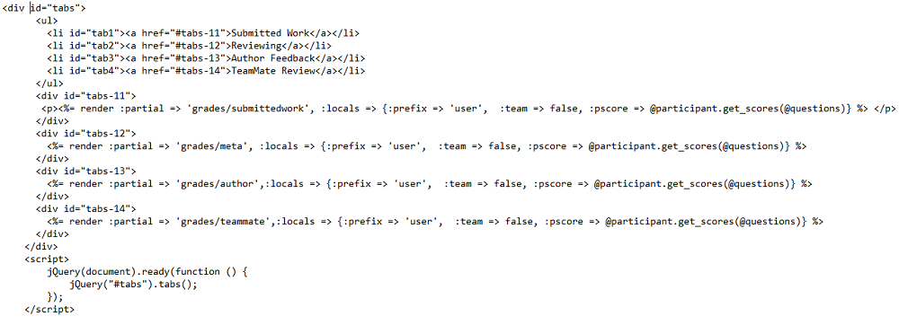
Before modification the code, all the partials for the score rendering were included in the view_my_scores.html.erb.This led to all the partials being rendered at the same time. | |||
[[File:Submit.png]] | |||
We have now refactored the code such that the | We have now refactored the code such that the view_my_scores.html.erb partial includes other partials.Each of these partials corresponds to a tab in the view-my-scores page. | ||
[[File:Newview_my_scores.png]] | |||
As shown in the figure we have separated the code based on the tab that the user clicks. Therefore, we have introduced one more layer of partials which will help facilitate the rendering of the data based on user action. Thus, only the necessary page will be rendered on the click of a tab.The corresponding partial function will have the appropriate call to the controller. This will get the code only to the tab which the user has clicked | |||
[[File:One_new_partial.png]] | |||
==Testing the new User Interface== | ==Testing the new User Interface== | ||
| Line 143: | Line 119: | ||
==References== | ==References== | ||
<references/> | <references/> | ||
==Appendix== | |||
Expertiza VCL image: http://152.46.19.82:3000/ | |||
Forked GitHub Repository: https://github.com/krunaljhaveri/expertiza | |||
Latest revision as of 02:08, 3 November 2013
Introduction
Expertiza<ref name="expertiza>Expertiza Retrieved from http://wikis.lib.ncsu.edu/index.php/Expertiza</ref> is a web application where students can submit and peer-review learning objects (articles, code, web sites, etc). It is used in select courses at NC State and by professors at several other colleges and universities. The Expertiza project is software to create reusable learning objects through peer review. It also supports team projects, and the submission of almost any document type, including URLs and wiki pages. It is an open source project developed on Ruby on Rails platform. More information on Expertiza can be found here. The source code can be forked and cloned for making modifications.
This wiki provides an insight into our contributions to the Open Source Software project Expertiza with main focus on the UI changes for reporting scores. Reporting score functionality is handled by controllers/grades_controller.rb and rendered by views/grades/_view_my_score.html.erb. Improved User Interface using JQuery is our contribution to Expertiza. This new elegant UI uses tabs instead of tables which makes it look elegant and renders faster. Subtle code and design challenges, changes and the motivation to implement this design have been explained further.
Project Description
The view_my_scores html.erb page is being slow-rendered. The page displays all the scores in a tabular form with reviews, metareviews, author feedback below each other. Everything is merged into one big html page, and this makes the view rendering a slow process. Also, the user interface is not aesthetically pleasing. The challenge here is to make appropriate changes to the views so that the rendering time becomes less as well as to improve the over-all look and feel of the score report page.
Classes: grades_controller.rb (241 lines), and probably other classes used by this What it does: This class is responsible for displaying grades to students (via view_my_scores) and instructors (via the view method).
What needs to be done:
- This code is very slow, due to many factors. Two of the most prominent are the fact that separate
db queries are used for each rubric that has been filled out by anyone associated with the assignment; these queries are made sequentially while the HTML page is being written; and the fact that HTML for the whole page is generated, largely by controller methods, before anything is displayed. This project deals with the second of these concerns.
- Move as much html as possible from the controllers into the views. Logic should be handled by
the controllers/models, and the views should simply access those variables set by the controller. HTML should be in html.erb files, not written by controller files.
- Rather than write HTML for displaying all of the reviews on a single page, only the summary
information for each student and team should be written. This should work more like the Review Report that an instructor can view (see review_mapping_controller.rb). This shows each review in a popup when the user clicks on a particular review. You don’t need to use a popup; the review could be populated on the current page when a user clicks on “Show reviews”.
Problem Inference and Motivation
- Currently the view_my_scores html.erb page displays all the scores in a tabular form with reviews,metareviews,author feedback below each other. Everything is merged into one big html page, and thus makes the view rendering a slow process. Also it’s a very bad user interface design.
- When a user clicks on show reviews/metareviews,etc the reviews gets rendered below each other which is too taxing for a student to scroll all the way down to read a particular review.
- This bad User Interface design along with very slow view rendering process motivated us to design an elegant interface which is user friendly and well as fast. This prompted us to use JQuery tabs.
Design
We have implemented partial rendering for the HTML page. The tabs are created using JQuery. The advantage of using JQuery is that it enables a sleeker and cleaner interface on pages without requiring the page to be loaded all at once. The new view page is visually aesthetic as it separates the scoring tabs as well as the review tabs and each review is rendered only when the tab for that review is clicked on. Thereby this approach overcomes the previous issue of the entire page being rendered at once.
Initial User Interface to view scores
Previously,the view_my_scores html.erb page displayed all the scores in a tabular form with reviews, metareviews, author feedback below each other. Everything is merged into one big html page, and thus makes the view rendering a slow process. Also it’s a very bad user interface design. When a user clicks on show reviews/metareviews,etc the reviews gets rendered below each other
Modified User Interface to view scores and reviews in tabs
The new user interface separates the code into various tabs for reporting the scores and also a tab format for displaying reviews.
Code Changes
Before modification the code, all the partials for the score rendering were included in the view_my_scores.html.erb.This led to all the partials being rendered at the same time.

We have now refactored the code such that the view_my_scores.html.erb partial includes other partials.Each of these partials corresponds to a tab in the view-my-scores page.

As shown in the figure we have separated the code based on the tab that the user clicks. Therefore, we have introduced one more layer of partials which will help facilitate the rendering of the data based on user action. Thus, only the necessary page will be rendered on the click of a tab.The corresponding partial function will have the appropriate call to the controller. This will get the code only to the tab which the user has clicked

Testing the new User Interface
Rails makes it super easy to write your tests. It starts by producing skeleton test code while you are creating your models and controllers. By simply running your Rails tests you can ensure your code adheres to the desired functionality even after some major code refactoring. Rails tests can also simulate browser requests and thus you can test your application's response without having to test it through your browser.
Testing with Cucumber
Cucumber<ref name="cucumber">Cucumber Retrieved from https://github.com/cucumber/cucumber-rails</ref> is a high-level testing framework. It is used commonly to perform various integration tests. We used Cucumber to test our new tabbed user interface. Cucumber is used extensively in Expertiza. It constitutes some of the main test cases. All cucumber test scenarios are under Features.
View My Score Test
To test the improved user interface, we had to modify already existing test scenario with the following modifications.
Feature: View scores for an assignment
 In order to view resulting scores
 As a student

@wip
Scenario: View my submitted work scores
 Given I am logged in as a student
   And I move to the "Assignments" page
   And I click the "test_Metareview" link
   And I click the "Your scores" link
   And I have a work review with score of "85"
   And I have a work review with score of "66"
   And I have a work review with score of "99"
 When I click the "show reviews" link
 Then I should see the three reviews for my submitted work with corresponding scores

@wip
Scenario: View my author feedback scores
 Given I am logged in as a student
   And I move to the "Assignments" page
   And I click the "test_Metareview" link
   And I click the "Your scores" link
   And I have a feedback review with score of "93"
 When I click the "show author feedbacks" link
 Then I should see the author feedback review with corresponding score

@wip
Scenario: View my teammate review scores
 Given I am logged in as a student
   And I move to the "Assignments" page
   And I click the "test_Metareview" link
   And I click the "Your scores" link
   And I have a teammate review with score of "100"
   And I have a teammate review with score of "100"
 When I click the "show teammate reviews" link
 Then I should see the two teammate reviews with corresponding scores
Future Work
In the current implementation of the model separate DB queries are made sequentially while the HTML page is being written. This increases the loading time of the page. Hence to make views faster, models and methods should be re-factored too.
- Merge this project with e804 which deals with an efficient way to query DB models to return scores,without UI changes. This will make the review rendering process fast.
- View_my_Score method in the controller saves the questionnaire in a hashmap. It needs re-factoring to make it optimal.
- Total score tab needs to be displayed either to the right or left or remaining tabs.
References
<references/>
Appendix
Expertiza VCL image: http://152.46.19.82:3000/ Forked GitHub Repository: https://github.com/krunaljhaveri/expertiza


