CSC/ECE 517 Fall 2017/E1789 Semester Project: Difference between revisions
| (26 intermediate revisions by the same user not shown) | |||
| Line 1: | Line 1: | ||
='''Improvements to review grader''' | <span style="font-size:180%">'''Improvements to review grader'''</span> | ||
='''1. Overview'''= | |||
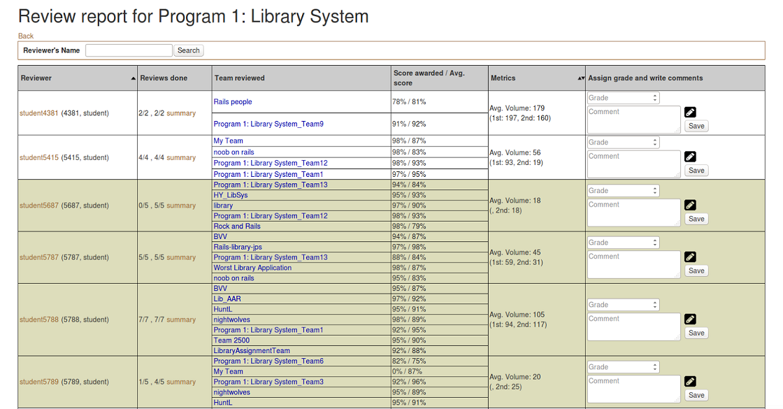
In expertiza, review report page and summary page give the information for instructors to view the overall review result. Also, they are the place where instructors grade the reviews. Review report page can be accessed via Manager -> Assignment, then click the '''“View review report”''' button (the one which has a spyglass and two people). The '''summary''' can be accessed through Review Page by clicking “summary” button of a particular student. | In expertiza, review report page and summary page give the information for instructors to view the overall review result. Also, they are the place where instructors grade the reviews. Review report page can be accessed via Manager -> Assignment, then click the '''“View review report”''' button (the one which has a spyglass and two people). The '''summary''' can be accessed through Review Page by clicking “summary” button of a particular student. | ||
| Line 10: | Line 11: | ||
[[File:u2.png]] | [[File:u2.png]] | ||
<br style="clear: left"/> | <br style="clear: left"/> | ||
'''For now, there are several defects need to be fixed to optimize the grade procedure:''' | '''For now, there are several defects need to be fixed to optimize the grade procedure:''' | ||
| Line 21: | Line 23: | ||
*Check updates of submissions for reviewers to help them decide if they need to review aga. | *Check updates of submissions for reviewers to help them decide if they need to review aga. | ||
='''2. Visualize Metrics column'''= | |||
=='''2.1. Summary of problems'''== | |||
Metrics column, which is in “Review Report Form”, displays statistic data of words used in particular student’s reviews. This helps graders to value how the student compares with the average student. For now, it displays numerical data in the literal way which is not intuitive. It would be better to have a bar or column chart showing this. Ultimately, we may be showing several metrics in this column, so the bars or charts should be resizable. | Metrics column, which is in “Review Report Form”, displays statistic data of words used in particular student’s reviews. This helps graders to value how the student compares with the average student. For now, it displays numerical data in the literal way which is not intuitive. It would be better to have a bar or column chart showing this. Ultimately, we may be showing several metrics in this column, so the bars or charts should be resizable. | ||
| Line 29: | Line 33: | ||
=='''2.2. Chart design in the metrics'''== | |||
| Line 39: | Line 43: | ||
We compare the 1st round and the 2nd round review with their average separately, then compare the overall (Total) with the average. In this way, it will be pretty clear for the grader to checkout how the student performs in the reviews. | We compare the 1st round and the 2nd round review with their average separately, then compare the overall (Total) with the average. In this way, it will be pretty clear for the grader to checkout how the student performs in the reviews. | ||
='''3. Reorganize "Review Report Form"'''= | |||
=='''3.1. Summary of problems'''== | |||
| Line 56: | Line 62: | ||
*For checkbox questions, comments are not possible, but still a blank cell is displayed. | *For checkbox questions, comments are not possible, but still a blank cell is displayed. | ||
*Checkbox questions could be displayed more compactly, better in a visually appealing manner like the review is shown to the author. | *Checkbox questions could be displayed more compactly, better in a visually appealing manner like the review is shown to the author. | ||
=='''3.2. Header in summary page'''== | =='''3.2. Header in summary page'''== | ||
| Line 65: | Line 70: | ||
For example, the header will show as '''“CSC 517 OSS PROJECT : Student 666”''' | For example, the header will show as '''“CSC 517 OSS PROJECT : Student 666”''' | ||
=='''3.3. Form design in summary page'''== | |||
We totally redesign the form in order to arrange the space more properly. The form looks as below: | We totally redesign the form in order to arrange the space more properly. The form looks as below: | ||
| Line 72: | Line 77: | ||
Firstly, we lay the | Firstly, we lay the reviewees on the top with its student details, then we just repeat reviewees’ team name in each question. Meantime, we fix the top row when we scroll down the page, so that we could always refer the student details whenever we like. In this way, we solve the problem 2 mentioned above. Now the reviewees don’t take up too much space and it looks more concise. | ||
Secondly, for questions that require score and comment, we show the score at the beginning, then the text follows. This is consistent with the way that review is shown to the author. | |||
Thirdly, for the checkbox, it becomes clearer. The result will show as ✔ or ✘ which replaces the previous manner of using 0 or 1. We also removes the previous comment column which is not needed for checkbox. | |||
Finally, we redesign the style of the form with keeping the style consistent with other places in Expertiza. | |||
='''4. Check updates for reviewer'''= | |||
=='''4.1. Summary of problems'''== | |||
[[File:u10.png]] | [[File:u10.png]] | ||
In the review report, each team that has been reviewed is color-code. Text in <span style="color:red">red</span> indicates that the review is not yet completed; text in <span style="color:#0000FF">blue</span> indicates that the review grade is not assigned or updated. So if an instructor sees a name in <span style="color:red">red</span>, the student should not be given credit for the review. If text is in <span style="color:#0000FF">blue</span>, the instructor should grade it now. But another common case is after the reviewer has reviewed the work, the author didn’t update it. So the reviewer doesn't need to re-review the work. These reviews should be coded with another color (perhaps <span style="color:green">green</span>). Therefore, it should be checked whether the author has submitted new files or links since the previous review, even the content pointed to by pre-existing links. | |||
=='''4.2. Add checking mechanism'''== | |||
To learn whether submission has been updated since the previous review, we need to get the latest updated time then compare it with the latest review time. In expertiza, one submission contains two types of content -- link and file. Both two types should be considered. For file, we just need to look at the last modification time. For link, you need to consider more: the link string itself, and the content that the link points to. | To learn whether submission has been updated since the previous review, we need to get the latest updated time then compare it with the latest review time. In expertiza, one submission contains two types of content -- link and file. Both two types should be considered. For file, we just need to look at the last modification time. For link, you need to consider more: the link string itself, and the content that the link points to. | ||
==='''4.2.1. Check update of file and link string'''=== | |||
In expertiza, there is a SubmissionRecord class that stores the records of each submission. Thus, for the file and the link string, we could simply get the update time from the records. | In expertiza, there is a SubmissionRecord class that stores the records of each submission. Thus, for the file and the link string, we could simply get the update time from the records. | ||
==='''4.2.2. Check update of link-to content'''=== | |||
For link-to content, situation becomes much more complicated. The types of the links are various, and how to get update times from them is what we need to focus on. | For link-to content, situation becomes much more complicated. The types of the links are various, and how to get update times from them is what we need to focus on. | ||
| Line 100: | Line 107: | ||
In other cases, we can’t get Last-Modified header from the URL. Like the GitHub Enterprise, generally it requires you to login to access the resources. Even you have logged in, the Last-Modified time is not equal to the latest commit time which is what we want. In these cases, we need to call APIs of the link-to website. As the GitHub and Google Doc should be the most common websites, we will handle these two special types of links. | In other cases, we can’t get Last-Modified header from the URL. Like the GitHub Enterprise, generally it requires you to login to access the resources. Even you have logged in, the Last-Modified time is not equal to the latest commit time which is what we want. In these cases, we need to call APIs of the link-to website. As the GitHub and Google Doc should be the most common websites, we will handle these two special types of links. | ||
=='''4.3. Mark not updated review'''== | |||
After we got the status of submission(updated or not), we could simply mark the not updated reviews <span style="color:green">green</span> to indicate that it doesn't need to be re-reviewed. | |||
='''5. Test Plan'''= | |||
Since the main task is about UI design, most of tests executed manually. For the checking updates function, several test code is needed. | |||
Test case 1: Manually open Review Report Page, see if the chart is displayed properly in the Metrics column, including the numerical data and the appearance, ensuring that they are corresponding to the data which should be shown. Also check if the size is resizable. | |||
Test case 2: Manually open Summary Page, see if the chart is displayed as it is designed, including the numerical data and the appearance, check if the checkbox and those save button can respond correctly. | |||
Test case 3: Write unit tests to ensure the last update time gotten from SubmissionRecord is right and can be correctly shown. | |||
Test case 4: Write unit tests to ensure the last update time gotten from link-to website is correct. | |||
Test case 5: Manually open Review Report Page, see if the color of ‘submissions’ words are green if they are not updated. | |||
Latest revision as of 21:54, 15 November 2017
Improvements to review grader
1. Overview
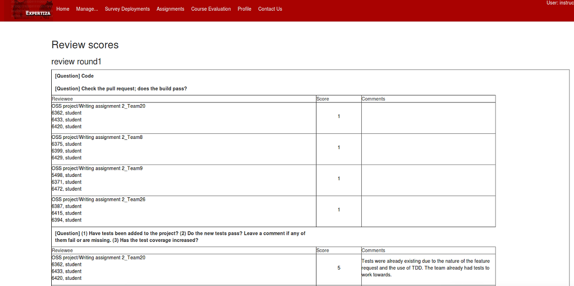
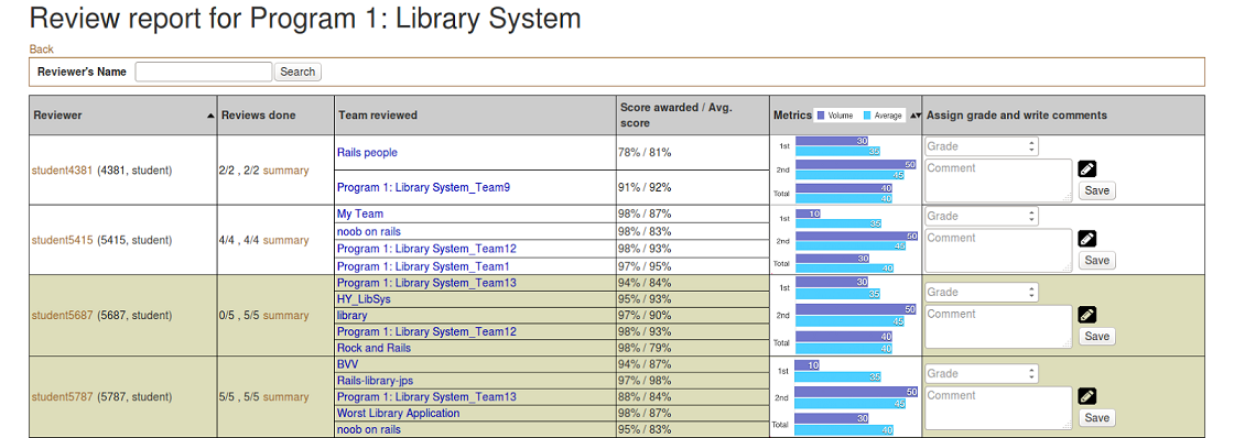
In expertiza, review report page and summary page give the information for instructors to view the overall review result. Also, they are the place where instructors grade the reviews. Review report page can be accessed via Manager -> Assignment, then click the “View review report” button (the one which has a spyglass and two people). The summary can be accessed through Review Page by clicking “summary” button of a particular student.
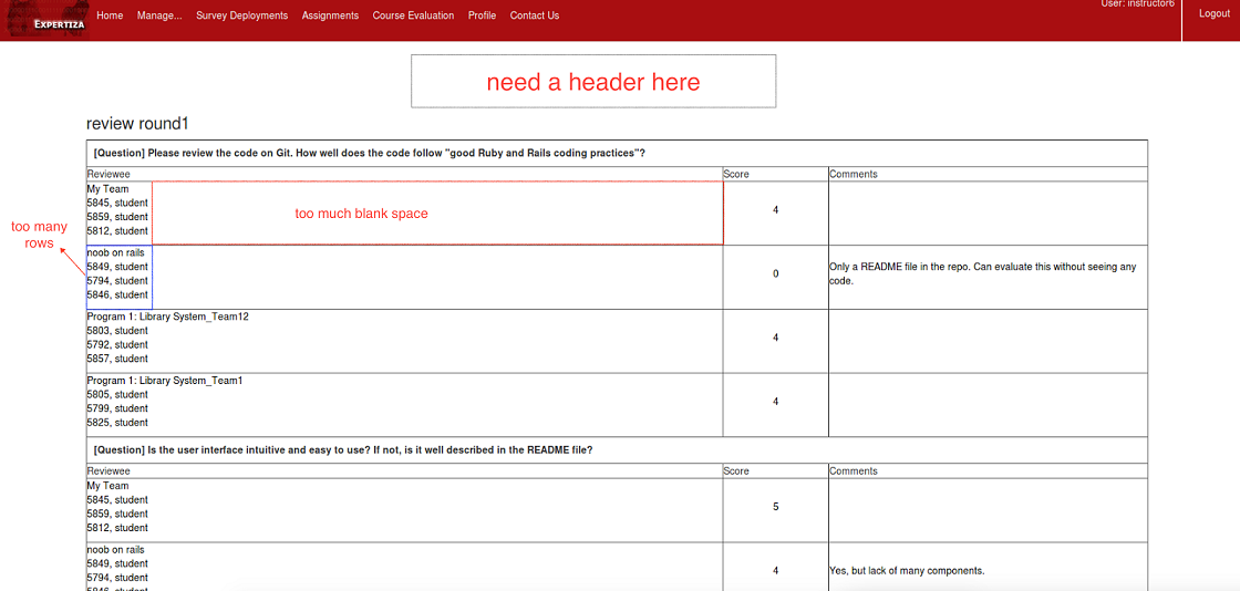
The appearances of the two pages are shown below:
For now, there are several defects need to be fixed to optimize the grade procedure:
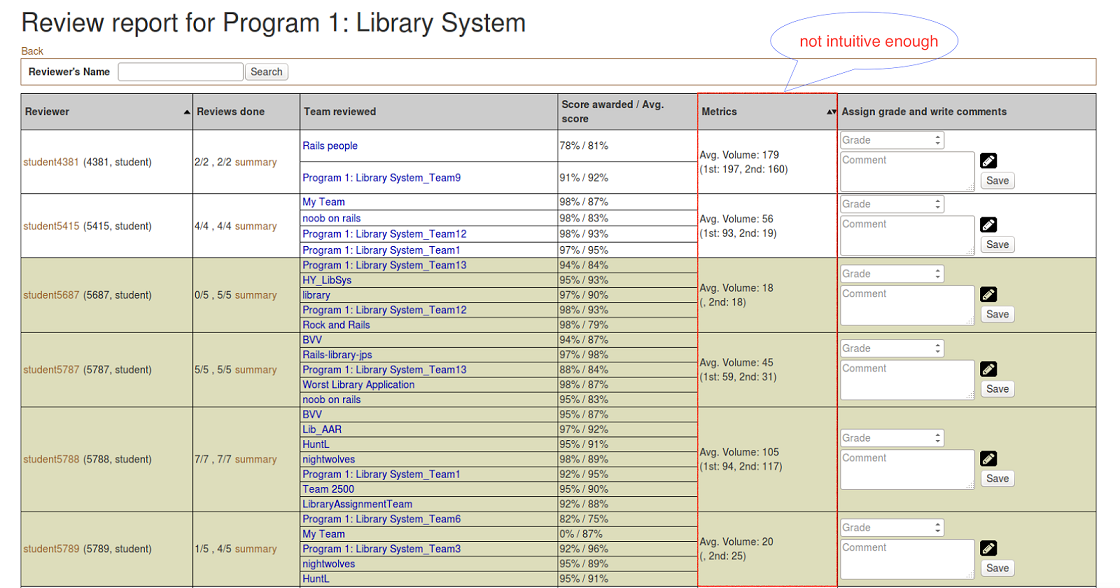
- Metrics column is not intuitive enough.
- The layout of “Review Report Form” in “Summary Page” is unreasonable.
- Reviewers don’t need to re-review the submissions which are not updated, so there should be a checking mechanism.
Therefore, our tasks are:
- Visualize Metrics column.
- Reasonably reorganize the “Review Report Form” in “Summary Page”.
- Check updates of submissions for reviewers to help them decide if they need to review aga.
2. Visualize Metrics column
2.1. Summary of problems
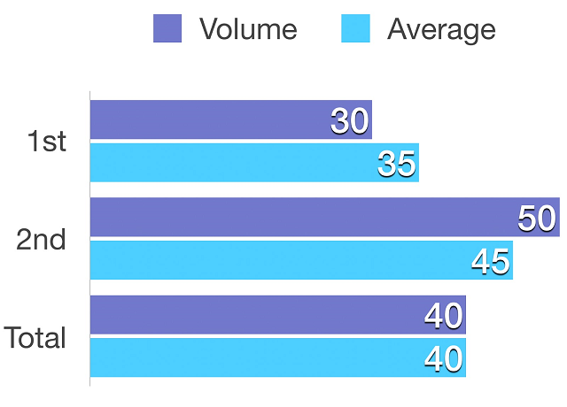
Metrics column, which is in “Review Report Form”, displays statistic data of words used in particular student’s reviews. This helps graders to value how the student compares with the average student. For now, it displays numerical data in the literal way which is not intuitive. It would be better to have a bar or column chart showing this. Ultimately, we may be showing several metrics in this column, so the bars or charts should be resizable.
2.2. Chart design in the metrics
We compare the 1st round and the 2nd round review with their average separately, then compare the overall (Total) with the average. In this way, it will be pretty clear for the grader to checkout how the student performs in the reviews.
3. Reorganize "Review Report Form"
3.1. Summary of problems
- There is no header saying what course, assignment, or student this relates to.
- The team name and student names are listed on separate rows. With the large amounts of whitespace, this makes the table too sparse vertically. It also takes up too much space as the other columns usually contain more information.
- Text is too close to the cell boundaries.
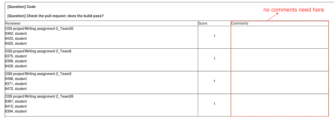
- For checkbox questions, comments are not possible, but still a blank cell is displayed.
- Checkbox questions could be displayed more compactly, better in a visually appealing manner like the review is shown to the author.
3.2. Header in summary page
It will be more reasonable if there is a header in the page. The information of the header will include course name, project name and student number as below:

For example, the header will show as “CSC 517 OSS PROJECT : Student 666”
3.3. Form design in summary page
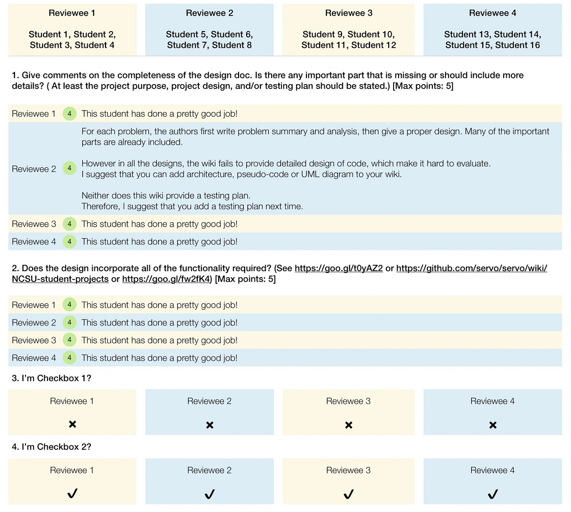
We totally redesign the form in order to arrange the space more properly. The form looks as below:
Firstly, we lay the reviewees on the top with its student details, then we just repeat reviewees’ team name in each question. Meantime, we fix the top row when we scroll down the page, so that we could always refer the student details whenever we like. In this way, we solve the problem 2 mentioned above. Now the reviewees don’t take up too much space and it looks more concise.
Secondly, for questions that require score and comment, we show the score at the beginning, then the text follows. This is consistent with the way that review is shown to the author.
Thirdly, for the checkbox, it becomes clearer. The result will show as ✔ or ✘ which replaces the previous manner of using 0 or 1. We also removes the previous comment column which is not needed for checkbox.
Finally, we redesign the style of the form with keeping the style consistent with other places in Expertiza.
4. Check updates for reviewer
4.1. Summary of problems
In the review report, each team that has been reviewed is color-code. Text in red indicates that the review is not yet completed; text in blue indicates that the review grade is not assigned or updated. So if an instructor sees a name in red, the student should not be given credit for the review. If text is in blue, the instructor should grade it now. But another common case is after the reviewer has reviewed the work, the author didn’t update it. So the reviewer doesn't need to re-review the work. These reviews should be coded with another color (perhaps green). Therefore, it should be checked whether the author has submitted new files or links since the previous review, even the content pointed to by pre-existing links.
4.2. Add checking mechanism
To learn whether submission has been updated since the previous review, we need to get the latest updated time then compare it with the latest review time. In expertiza, one submission contains two types of content -- link and file. Both two types should be considered. For file, we just need to look at the last modification time. For link, you need to consider more: the link string itself, and the content that the link points to.
4.2.1. Check update of file and link string
In expertiza, there is a SubmissionRecord class that stores the records of each submission. Thus, for the file and the link string, we could simply get the update time from the records.
4.2.2. Check update of link-to content
For link-to content, situation becomes much more complicated. The types of the links are various, and how to get update times from them is what we need to focus on.
Actually, Many HTTP responses return a Last-Modified header. It contains the date and time at which the origin server believes the resource was last modified. Sometimes we could use this time as our latest update time.
In other cases, we can’t get Last-Modified header from the URL. Like the GitHub Enterprise, generally it requires you to login to access the resources. Even you have logged in, the Last-Modified time is not equal to the latest commit time which is what we want. In these cases, we need to call APIs of the link-to website. As the GitHub and Google Doc should be the most common websites, we will handle these two special types of links.
4.3. Mark not updated review
After we got the status of submission(updated or not), we could simply mark the not updated reviews green to indicate that it doesn't need to be re-reviewed.
5. Test Plan
Since the main task is about UI design, most of tests executed manually. For the checking updates function, several test code is needed.
Test case 1: Manually open Review Report Page, see if the chart is displayed properly in the Metrics column, including the numerical data and the appearance, ensuring that they are corresponding to the data which should be shown. Also check if the size is resizable.
Test case 2: Manually open Summary Page, see if the chart is displayed as it is designed, including the numerical data and the appearance, check if the checkbox and those save button can respond correctly.
Test case 3: Write unit tests to ensure the last update time gotten from SubmissionRecord is right and can be correctly shown.
Test case 4: Write unit tests to ensure the last update time gotten from link-to website is correct.
Test case 5: Manually open Review Report Page, see if the color of ‘submissions’ words are green if they are not updated.
