CSC/ECE 517 Fall 2015 E1583 Fix the CSS used for Menu Item: Difference between revisions
| Line 48: | Line 48: | ||
The files listed below need to be changed to make proposed changes.<br/> | The files listed below need to be changed to make proposed changes.<br/> | ||
1. | 1. expertiza/config/vendor/assets/components/bootstrap/less/navbar.less<br/> | ||
2. | 2. expertiza/app/assets/stylesheets/navbar.scss <br/> | ||
3. | 3. expertiza/app/views/shared/_navigation.html.erb <br/> | ||
4. | 4. expertiza/app/assets/stylesheets/layout.scss<br/><br/> | ||
== Plan of Work == | == Plan of Work == | ||
Revision as of 04:19, 9 November 2015
Purpose
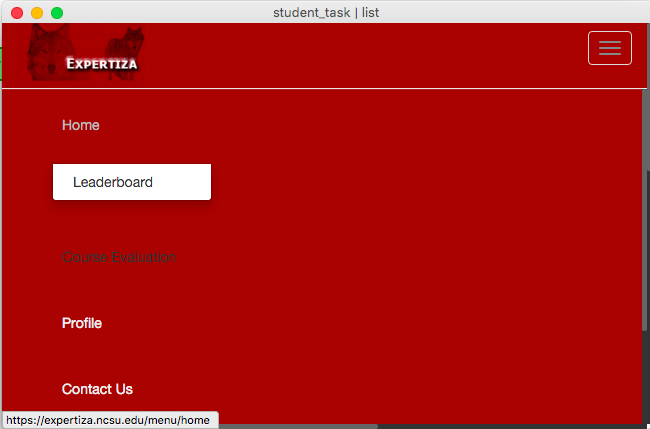
This project aims to fix the problem of the Expertiza Menu layout for smaller devices such as mobiles and tablets. There are many problems currently existing for devices with smaller screen size such as,
1. The Menu layout takes almost whole screen space, which is not suitable from user experience point of view.
2. The submenu items cannot be selected smoothly.
3. User can neither see the content nor scroll it down properly when the menu is open, as it stays behind the menu.
The above mentioned issues can be seen in the screenshot below.
Planned Changes
The aforementioned issues will be addressed as explained below:
1. Reduce the height of the Menu items. As seen in the screenshot above, there is a lot of space between two menu items. Reducing the space in between will reduce the total screen space consumed by the Menu.
2. Show submenu items on the right side of respective menu item, so that they don't overlap with other menu items (Right now, they are shown below the main menu item).
3. Show the Menu selection button on the left side instead of right side.
4. Start the content below the Menu when Menu is in expanded mode.
Below is the screenshot of the proposed CSS changes which will be reflected as below.
Note: This is for reduced screen sizes, and not for normal desktop size. Normal desktop layout will remain the same.
As seen in the screenshot,
1. Menu item height is reduced and now it is not taking all the screen space.
2. Submenu items are displayed on the right side of the main menu item.
3. Content is displayed below the Menu, and it is not behind the Menu. It can be easily scrolled down/viewed even with Menu open.
4. Menu button is on the left side instead of right.
Testing
We are using the browser extension "Responsive Web Design Tester". This extension allows to test a web page for variety of devices with different screen sizes, such as (but not limited to), iPad, iPadMini, iPhone, Nexus, HTC-One etc.
With the help of this tool, we will be easily able to test that our changes are working fine for different screen sizes.
Responsive Web Design Tool - Settings
Responsive Web Design Tool - Devices list
Implementation
The files listed below need to be changed to make proposed changes.
1. expertiza/config/vendor/assets/components/bootstrap/less/navbar.less
2. expertiza/app/assets/stylesheets/navbar.scss
3. expertiza/app/views/shared/_navigation.html.erb
4. expertiza/app/assets/stylesheets/layout.scss
Plan of Work
Below are the deadlines we have set for ourselves.
1. Reducing Height of Menu items and pushing submenu to right side of main Menu item. - 15th December, 2015
2. Pushing the content below the menu - 22nd December, 2015
3. Changing position of menu button to left side, and changing transition from left to right. - 29th December, 2015


