CSC/ECE 517 Fall 2015 E1583 Fix the CSS used for Menu Item: Difference between revisions
| (35 intermediate revisions by 4 users not shown) | |||
| Line 3: | Line 3: | ||
This project aims to fix the problem of the Expertiza Menu layout for smaller devices such as mobiles and tablets. There are many problems currently existing for devices with smaller screen size such as,<br/> | This project aims to fix the problem of the Expertiza Menu layout for smaller devices such as mobiles and tablets. There are many problems currently existing for devices with smaller screen size such as,<br/> | ||
* The Menu layout takes almost whole screen space, which is not suitable from user experience point of view. <br/> | |||
* The submenu items cannot be selected smoothly. <br/> | |||
* User can neither see the content nor scroll it down properly when the menu is open, as it stays behind the menu.<br/><br/> | |||
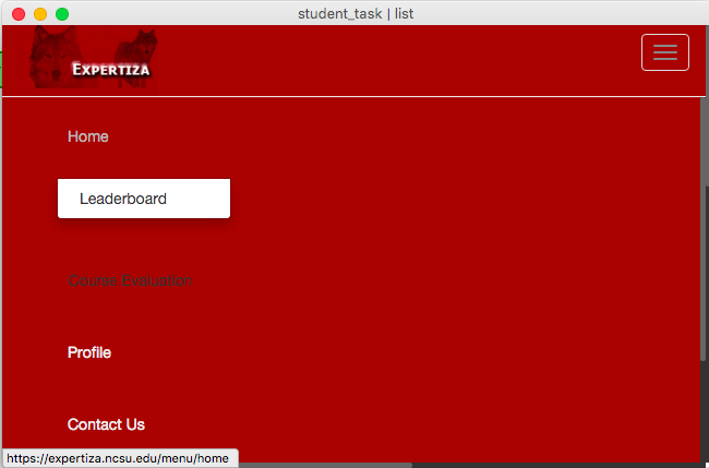
The above mentioned issues can be seen in the screenshot below.<br/><br/> | The above mentioned issues can be seen in the screenshot below.<br/><br/> | ||
| Line 15: | Line 15: | ||
The aforementioned issues will be addressed as explained below: <br/> | The aforementioned issues will be addressed as explained below: <br/> | ||
* Reduce the height of the Menu items. As seen in the screenshot above, there is a lot of space between two menu items. Reducing the space in between will reduce the total screen space consumed by the Menu.<br/> | |||
* Show submenu items on the right side of respective menu item, so that they don't overlap with other menu items (Right now, they are shown below the main menu item).<br/> | |||
* Show the Menu selection button on the left side instead of right side.<br/> | |||
* Start the content below the Menu when Menu is in expanded mode.<br/><br/> | |||
== Implementation == | |||
=== Sub-Menu Overlapping Main-Menu Problem === | |||
On hovering over the menu items on the navigation bar shows the sub-menu. But, the sub-menu position on the screen hides the Main menu. In order to resolve the problem, the sub-menu has been shifted to the right from its actual position such that the main-menu is visible. | |||
app/assets/stylesheets/navbar.scss | |||
.dropdown-menu.pull-left{ | |||
top: 25%; | |||
left: 15%; | |||
} | |||
=== Spaced out Menu-items Problem === | |||
In toggle mode, when the screen width is below 1170px, on clicking the sub-menu button, the menu items on the drop down are too spaced out. As a result, the whole screen view is blocked and the interface looks too spread out. In order to resolve this issue, the space between the menu-items is reduced and the size of the drop down box is also reduced as a result. | |||
* Declared a new class for aligning the logout button | |||
<pre> | |||
app/assets/stylesheets/navbar.scss | |||
.logout-box{ | |||
margin-top: 7px; | |||
left: -2px; | |||
} | |||
</pre> | |||
* Applied the above declared class to the "logout-box" | |||
<pre> | |||
app/views/shared/_navigation.html.erb | |||
<li class="right-most logout-box"> | |||
<%= link_to "Logout", {controller: "auth", action: "logout"}, method: :post %> | |||
</li> | |||
</pre> | |||
* Reduced the padding space between menu-items | |||
<pre> | |||
li.first-level > a { | |||
line-height: 10px; | |||
padding: 0px 10px; | |||
} | |||
</pre> | |||
=== Shifting menu icon to the left on re-sizing === | |||
Upon resizing the window beyond a width below 1170px, the menu changes as an icon bar which on clicking has a drop-down of options to select from with the corresponding sub-menu. This is a toggle button which is by default set on the right. While it does not make much of a difference while using it on a Desktop, it turns to be a problem in tablets and mobile devices wherein it would be more convenient and accessible to have the menu icon bar to the top left section of the header. The code below is a snippet to describe the change corresponding to it. | |||
<button type="button" class="pull-left navbar-toggle" data-toggle="collapse" data-target=".navbar-collapse" > | |||
=== Pushing content down === | |||
== | When the menu button is clicked, earlier the content in the page would stay behind the menu and user could not see or access the content. This issues has been fixed. The content starts below the menu so that it is accessible even when the menu is in expanded mode. | ||
For this, JQuery script is written which introduces an event listener for menu button. When the menu button is clicked, this script changes the position of the "container" by 600 pixels, so that it moves below the menu. When menu button is clicked again, then the original position of the content is restored again. | |||
$(function() { | |||
$('button.navbar-toggle').click(function() { | |||
if ($('.container').css('margin-top') === '-30px') { | |||
$('.container').css('margin-top', '+=600'); | |||
} else { | |||
$('.container').css('margin-top', '-30px'); | |||
} | |||
}); | |||
}); | |||
The content of the page is wrapped under new div with class "container". | |||
<pre> | |||
< | <div class="container" style="position: relative; margin-top: -30px; left: 43px;"> | ||
</pre> | |||
Also, the bootstrap tutorial shows that <nav> tag should be used for the navigation menu instead of div. Also that class "navbar-fixed-top" is changed to "navbar-static-top" as per standard bootstrap rules. | |||
<pre> | |||
<nav role="navigation" class="navbar navbar-default navbar-static-top"> | |||
</nav> | |||
</pre> | |||
== | == Testing == | ||
We are using inbuilt Mozilla browser functionality to check web page in different screen sizes. | |||
With the help of this tool, we will be easily able to test that our changes are working fine for different screen sizes. | |||
<br/> | |||
=== Test Results === | |||
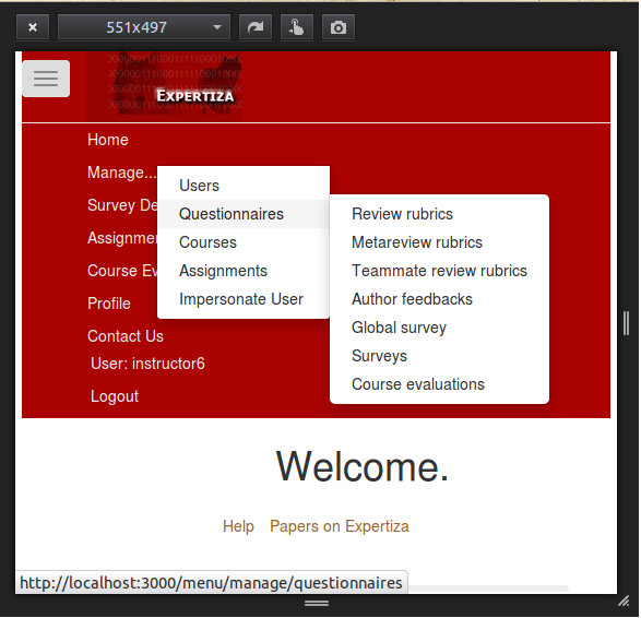
As shown in screenshot below, you can see the changes working on a smaller screen size. | |||
[[File:Screenshot_with_changes.png]] | |||
==References== | == References == | ||
[http://www.w3schools.com/bootstrap/bootstrap_navbar.asp W3Schools Tutorial on Bootstrap] <br/> | |||
[http://www.w3schools.com/css/ W3Schools CSS Tutorial] | |||
Latest revision as of 05:08, 5 December 2015
Purpose
This project aims to fix the problem of the Expertiza Menu layout for smaller devices such as mobiles and tablets. There are many problems currently existing for devices with smaller screen size such as,
- The Menu layout takes almost whole screen space, which is not suitable from user experience point of view.
- The submenu items cannot be selected smoothly.
- User can neither see the content nor scroll it down properly when the menu is open, as it stays behind the menu.
The above mentioned issues can be seen in the screenshot below.
Planned Changes
The aforementioned issues will be addressed as explained below:
- Reduce the height of the Menu items. As seen in the screenshot above, there is a lot of space between two menu items. Reducing the space in between will reduce the total screen space consumed by the Menu.
- Show submenu items on the right side of respective menu item, so that they don't overlap with other menu items (Right now, they are shown below the main menu item).
- Show the Menu selection button on the left side instead of right side.
- Start the content below the Menu when Menu is in expanded mode.
Implementation
Sub-Menu Overlapping Main-Menu Problem
On hovering over the menu items on the navigation bar shows the sub-menu. But, the sub-menu position on the screen hides the Main menu. In order to resolve the problem, the sub-menu has been shifted to the right from its actual position such that the main-menu is visible.
app/assets/stylesheets/navbar.scss
 .dropdown-menu.pull-left{
    top: 25%;
    left: 15%;
  }
Spaced out Menu-items Problem
In toggle mode, when the screen width is below 1170px, on clicking the sub-menu button, the menu items on the drop down are too spaced out. As a result, the whole screen view is blocked and the interface looks too spread out. In order to resolve this issue, the space between the menu-items is reduced and the size of the drop down box is also reduced as a result.
- Declared a new class for aligning the logout button
app/assets/stylesheets/navbar.scss
    .logout-box{
      margin-top: 7px;
      left: -2px;
    }
- Applied the above declared class to the "logout-box"
app/views/shared/_navigation.html.erb
     <li class="right-most logout-box">
              <%= link_to "Logout", {controller: "auth", action: "logout"}, method: :post %>
     </li>
- Reduced the padding space between menu-items
li.first-level > a {
  line-height: 10px;
  padding: 0px 10px;
}
Upon resizing the window beyond a width below 1170px, the menu changes as an icon bar which on clicking has a drop-down of options to select from with the corresponding sub-menu. This is a toggle button which is by default set on the right. While it does not make much of a difference while using it on a Desktop, it turns to be a problem in tablets and mobile devices wherein it would be more convenient and accessible to have the menu icon bar to the top left section of the header. The code below is a snippet to describe the change corresponding to it.
<button type="button" class="pull-left navbar-toggle" data-toggle="collapse" data-target=".navbar-collapse" >
Pushing content down
When the menu button is clicked, earlier the content in the page would stay behind the menu and user could not see or access the content. This issues has been fixed. The content starts below the menu so that it is accessible even when the menu is in expanded mode.
For this, JQuery script is written which introduces an event listener for menu button. When the menu button is clicked, this script changes the position of the "container" by 600 pixels, so that it moves below the menu. When menu button is clicked again, then the original position of the content is restored again.
 $(function() {
   $('button.navbar-toggle').click(function() {
       if ($('.container').css('margin-top') === '-30px') {
               $('.container').css('margin-top', '+=600');
           } else {
                   $('.container').css('margin-top', '-30px');
               }
     });
 });
The content of the page is wrapped under new div with class "container".
<div class="container" style="position: relative; margin-top: -30px; left: 43px;">
Also, the bootstrap tutorial shows that <nav> tag should be used for the navigation menu instead of div. Also that class "navbar-fixed-top" is changed to "navbar-static-top" as per standard bootstrap rules.
<nav role="navigation" class="navbar navbar-default navbar-static-top">
</nav>
Testing
We are using inbuilt Mozilla browser functionality to check web page in different screen sizes.
With the help of this tool, we will be easily able to test that our changes are working fine for different screen sizes.
Test Results
As shown in screenshot below, you can see the changes working on a smaller screen size.

