CSC/ECE 517 Fall 2017/E1789 Semester Project: Difference between revisions
| Line 48: | Line 48: | ||
It will be more reasonable if there is a header in the page. The information of the header will include course name, project name and student number as below: | It will be more reasonable if there is a header in the page. The information of the header will include course name, project name and student number as below: | ||
[[File:n8.png]] | [[File:n8.png]] | ||
==='''3.3Form design in summary page'''=== | ==='''3.3Form design in summary page'''=== | ||
Revision as of 01:21, 15 November 2017
Improvements to review grader
1.Overview
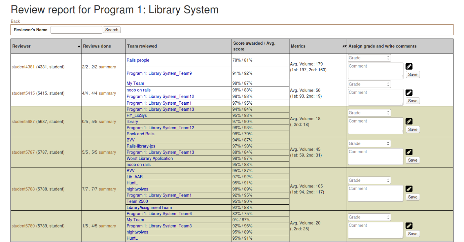
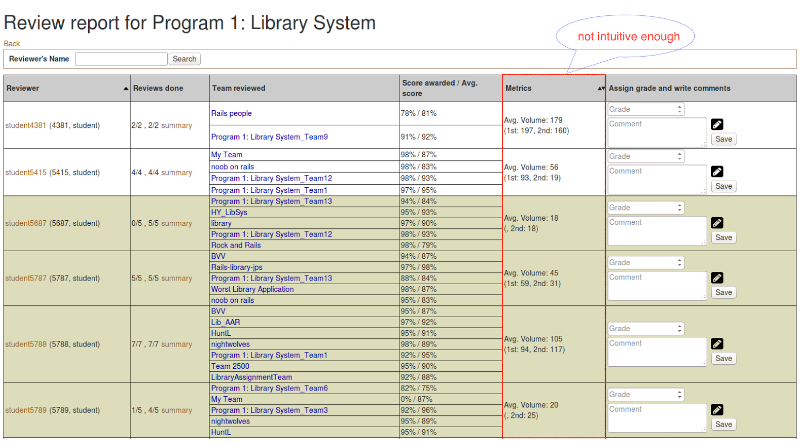
In expertiza, review report page and summary page give the information for instructors to view the overall review result. Also, they are the place where instructors grade the reviews. Review report page can be accessed via Manager -> Assignment, then click the “View review report” button (the one which has a spyglass and two people). The summary can be accessed through Review Page by clicking “summary” button of a particular student.
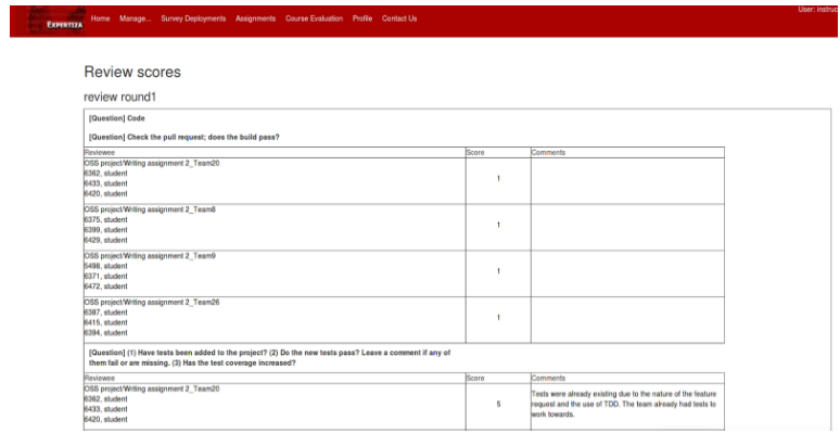
The appearances of the two pages are shown below:
For now, there are several defects need to be fixed to optimize the grade procedure:
- Metrics column is not intuitive enough.
- The layout of “Review Report Form” in “Summary Page” is unreasonable.
- Reviewers don’t need to re-review the submissions which are not updated, so there should be a checking mechanism.
Therefore, our tasks are:
- Visualize Metrics column.
- Reasonably reorganize the “Review Report Form” in “Summary Page”.
- Check updates of submissions for reviewers to help them decide if they need to review aga.
2.Visualize Metrics column
2.1.Summary of problems
Metrics column, which is in “Review Report Form”, displays statistic data of words used in particular student’s reviews. This helps graders to value how the student compares with the average student. For now, it displays numerical data in the literal way which is not intuitive. It would be better to have a bar or column chart showing this. Ultimately, we may be showing several metrics in this column, so the bars or charts should be resizable.
2.2Chart design in the metrics
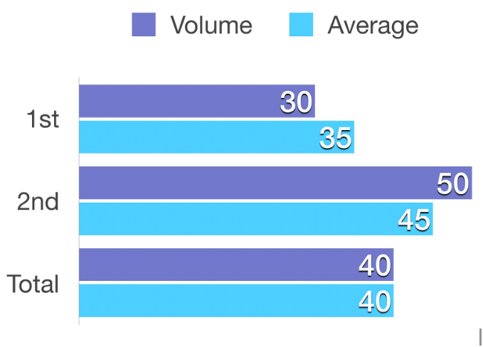
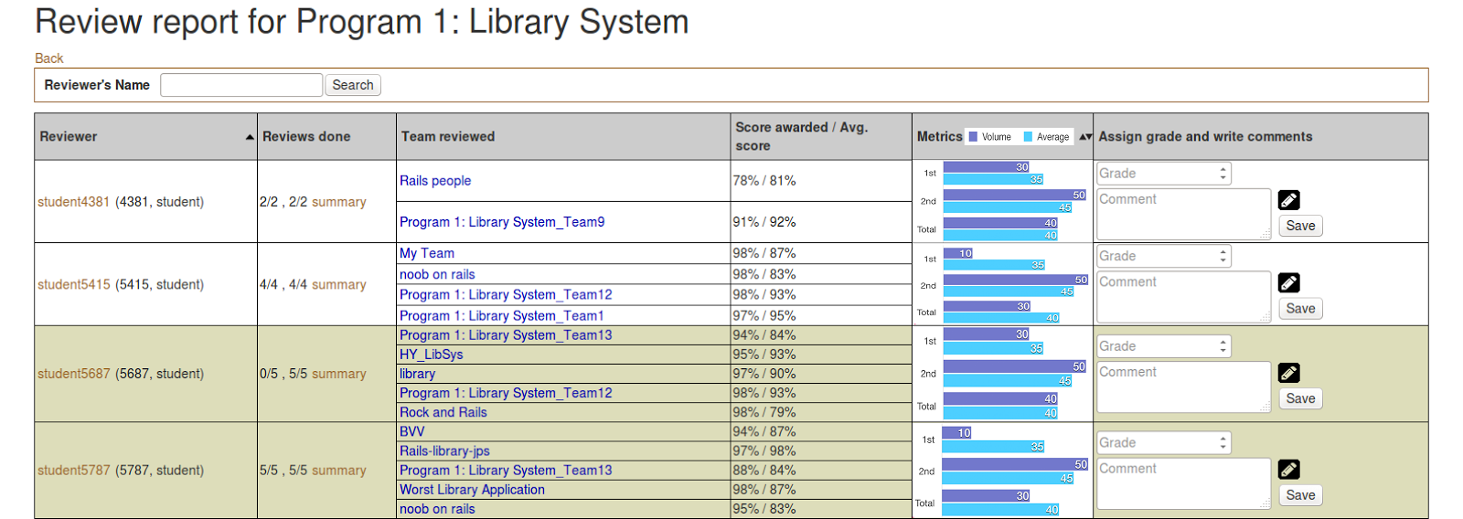
We compare the 1st round and the 2nd round review with their average separately, then compare the overall (Total) with the average. In this way, it will be pretty clear for the grader to checkout how the student performs in the reviews.
3.Reorganize “Review Report Form
3.1Summary of problems
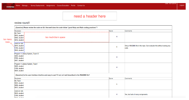
- There is no header saying what course, assignment, or student this relates to.
- The team name and student names are listed on separate rows. With the large amounts of whitespace, this makes the table too sparse vertically. It also takes up too much space as the other columns usually contain more information.
- Text is too close to the cell boundaries.
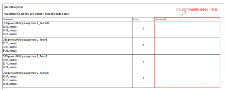
- For checkbox questions, comments are not possible, but still a blank cell is displayed.
- Checkbox questions could be displayed more compactly, better in a visually appealing manner like the review is shown to the author.
3.2Header in summary page
It will be more reasonable if there is a header in the page. The information of the header will include course name, project name and student number as below:

3.3Form design in summary page
We totally redesign the form in order to arrange the space more properly. The form looks as below:
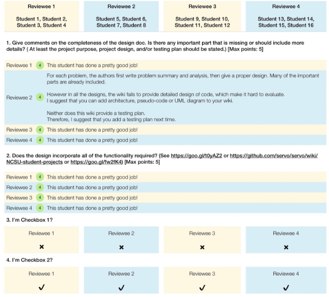 Firstly, we lay the teams and questions into the horizontal and vertical columns respectively, so that we could avoid the problem of listing the team repeatedly for each question in the previous way. At the same time, it solves the problem that the team field takes up too much space.
Secondly, for questions that require score and comment, we show the score at the beginning of the cell, then the text follows. This is consistent with the way that review is shown to the author.
Finally, for the checkbox, it will become easy. The result will show as ✔ or ✘ that replaces the previous manner of using 0 or 1. This also removes the previous comment column.
