CSC/ECE 517 Spring 2015 E1526 MPRI
E1526. Responsive web design for Expertiza
Introduction to Expertiza
Expertiza is a large project developed as a combined effort of students and faculty using the Ruby on Rails framework. The main advantage of using Expertiza, in an educational environment, is for the instructor to introduce peer reviewing among the students. Expertiza allows the instructor to create and customize assignments, create a list of topics the students can sign up for, have students work on teams and then review each other's assignments at the end. Expertiza supports submission of almost any document type, including the URLs and wiki pages.
Expertiza is supported by National Science Foundation under Grant No. 0536558. Additional funding from the NCSU Learning in a Technology-Rich Environment (LITRE) program, the NCSU Faculty Center for Teaching and Learning, the NCSU STEM Initiative, and the Center for Advanced Computing and Communication.
Problem Statement
Despite an amazing set of functionality Expertiza offers, there are numerous parts of it that could use a more stylish look and an improved user experience. The goal of this project is to use both Bootstrap and AngularJS to improve the look of the entire Expertiza including the representations of buttons, tables, and other elements. Certain changes in design will also improve the efficiency of the web app when it comes to the amount of time it takes for a page to be loaded.
List of Tasks
Below are detailed explanations to the tasks listed in the description documentation.
1. Replace Buttons and Links to Bootstrap styled Buttons
Expertiza, being an extensive web application with numerous features, heavily relies on buttons when it comes to interacting with the user. We plan to improve the user experience by replacing the plain html buttons with stylish bootstrap buttons. However, numerous elements in the current version of Expertiza, like 'Back' element, are hyperlinks rather than buttons. To make the design of Expertiza consistent, our goal is to replace this plain-styled text with color coded Bootstrap buttons.
2. Create new theme
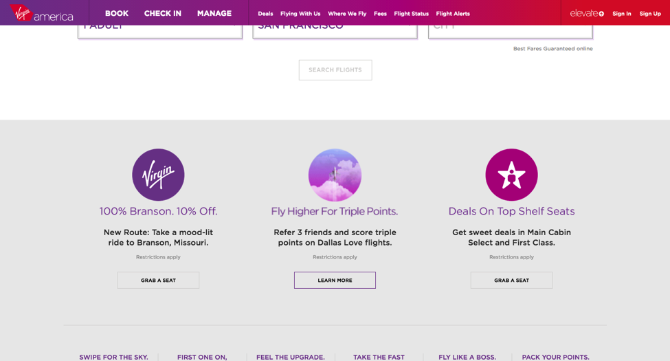
One of the entities responsible for the primitive look of Expertiza, as of now, is the lack of fixed navbar. The new design of Expertiza will include the fixed menu bar on the top of the page. Please refer to the screenshot shown below for an example from Virgin American website. As it can be seen on the screenshot, the user has scrolled down the page, but the menu bar is still visible on the top of the page, making it convenient for the user to navigate throughout the website.
3. Auto hides contents on the dashboard for instructors
Please refer to the later part of this article: Manage-Course page for viewing the current design
Now, when trying to open manage-courses, all records are loaded before rendering them onto the page, which takes too long time to load and is not responsive at all.
Better practice is on Virgin American’s website: https://www.virginamerica.com/book/rt/a1/sfo_bos/20150401_20150402
When the website is representing the calendar, the price for each day is not actually loaded. But the skeleton of the page, which is the calendar in this case, can be displayed first.
So in Expertiza, we can create several buttons for course semesters in the page. After clicking on Fall 2014, the courses for Fall 2014 will come out.
And if the list is still too long and takes a long time load, we can use a ‘show more’ button ,or automatically load more data when the scroll bar reaching the end of the page, to minimize the content we need to load after one single mouse click.
4. Simplify Action Panel
We will need to reduce the number of buttons. For example, the first row are actions for assignments and the second row is for participant. So we can replace them to 5 buttons with responsive design, that is, no redirecting happens after clicking on the buttons.
5. Offer Better UI for Managing Users
Please refer to the later part of this article: Manage-User page
6. Make grades_view Responsive with Better Design
Similar to the previous tasks, we will need to make it responsive.
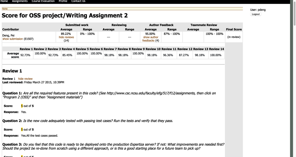
After clicking on ‘Your scores’, all reviews are loaded before rendering the page now. That takes a long time to load and the length of review list is too long.
Design Patterns
As an assignment with a goal of improving the graphic design and responsiveness of Expertiza web application, this project mainly follows design patterns from two design pattern groups: structural and behavioral.
Structural Design Patterns
Flyweight, a design pattern aiming to minimize the memory usage by sharing as much data as possible, is heavily implemented on the css and bootstrap side. Our team leans towards creating classes for styling that can be efficiently reused in a variety of Expertiza sections, rather than separately refining the design of each little section. This will both save us time and keep the code concise, while optimizing the memory needed to store the code.
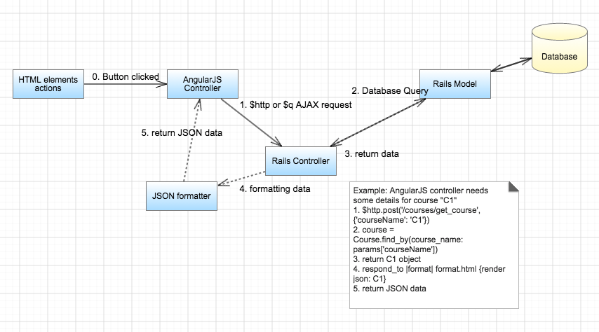
Another structural design pattern that will be seen in this project is Front Controller pattern. While this pattern suggests that there is a single controller that takes all the requests, when we have both Rails and AngularJS coexisting, we can think of Rails framework as being the "single bridge" to the database from AngularJS's stand point. AngularJS, being an outstanding front-end framework, will interact with the user and pass all the request to Rails framework. Rails framework then queries/updates the database and provides AngularJS with the data.
Finally, the third structural design pattern that this project follows is Module pattern. Modules are one of the essential constructs in the skeleton of AngularJS framework and, hence, this project is bound to follow module pattern.
Behavioral Design Patterns
Since the large part of this project is to iterate through the database query and show the data to the user with a reduced delay, this project follows the well known Iterator pattern.
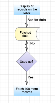
Along the similar lines, Observer pattern is followed to efficiently handle query requests to a large database (the main culprit behind the unpleasantly long delay). Our project intends to tackle this challenge by fetching only a screen-full of results and showing it to the user right away (fast response). While the user is looking at this first chunk of data displayed on the screen, further queries are made to the database in the background and the rest of the matching results are being returned, efficiently populating the page further. This approach greatly improves the user experience since it does not leave the user waiting empty-handed until Rails framework completes the full query of the database.
Pages To Be Modified
For this project, it is difficult to re-design all webpages and make them responsive. After discussing with the contact person, we will be focusing only on these 3 pages:
Login Page
What's wrong with it
1. Now it takes more than 15 seconds to even login to the admin's home page with the sample development database. This is definitely not good enough for a daily used web application.
The cause for the long rendering time is that it will be redirected to 'tree_display/list', which needs to fetch all questionnaires, courses and assignments before page rendering.
2. The webpage looks primitive.
What changes need to be made
1. Actually it is unnecessary to fetch all data at the very beginning; if there is too much data to present, the list will be extremely long and it is quite hard for users to locate a specific course.
So, we will use AngularJS and jQuery to make a asynchronous webpage that delays the database query until all the basic html elements are correctly rendered, or until the user explicitly asks for that part of data.
2. Bootstrap will be applied for better user interfaces.
Manage-Course page
What's wrong with it
As illustrated above, now the displaying list is too long and it takes too long to scroll to the end, which makes locating a specific course quite difficult.
Also, loading time can be reduced.
What changes need to be made
1. Create several buttons for different time intervals, for example, after clicking on the button '2013-2014', only courses for 2013 to 2014 are presenting, and there is no redirection during this process.
2. The database should not be executed before the user clicks on the button. Only parts of databased is fetched when each button is clicked.
3. Bootstrap will be applied for better user interfaces.
Manage-User page
What's wrong with it
1. The list is too long: if there are 20k users in the database, there will be 20k rows in this table in a one page!
2. When clicking on the letter A-Z, redirections happen and the whole page is reloaded.
What changes need to be made
1. Load only a given number of records to the view, such as 100 records, when accessing into this page for the first time.
2. Using AngularJS to eliminate the redirections and page reloading for better UI performance.
