CSC/ECE 517 Fall 2017/E1792 OSS Visualizations for instructors
This wiki page is for the description of changes made under E1792 OSS Visualizations for instructors.
About Expertiza
Expertiza is an open source project based on Ruby on Rails framework. Expertiza allows the instructor to create new assignments and customize new or existing assignments. It also allows the instructor to create a list of topics the students can sign up for. Students can form teams in Expertiza to work on various projects and assignments. Students can also peer review other students' submissions. Instructors can also use Expertiza for interactive views of class performances and reviews.
Introduction
This project aims to improve the visualizations of certain pages related to reviews and feedback in Expertiza in the instructor's view. This would aid the instructors to judge outcomes of reviews and class performance in assignments via graphs and tables, which in turn would ease the process of grading the reviews.
Problem Statement
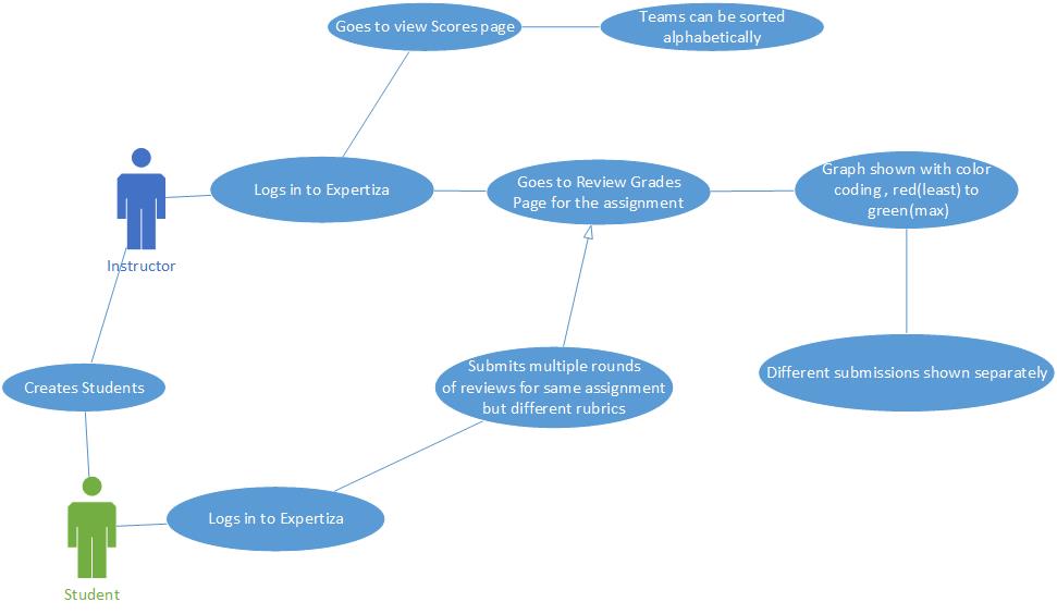
- Issue 1: The scale is blue to green, which does not make sense. And colors will change randomly each time loading the page. It will be better to scale from red to green.
- Issue 2: Two adjacent bar represents the response in round 1 to round k. It makes sense only if the rubrics in all review rounds are all the same. If the instructor implements the vary-rubric-by-round mechanism, this visualization will not make sense.
- Issue 3:The table is presorted by teams in the page View Scores, but you can now also sort alphabetically. The cell view looks way too long, and should be divided into partials.
- Issue 4: An interactive visualization or table that shows how a class performed on selected rubric criteria would be immensely helpful. It would show the instructors what they need to focus more attention on.
UML Diagram
Solutions Implemented
Issue 1
Description:The scale is blue to green, which does not make sense. And colors will change randomly each time loading the page. It will be better to scale from red to green.
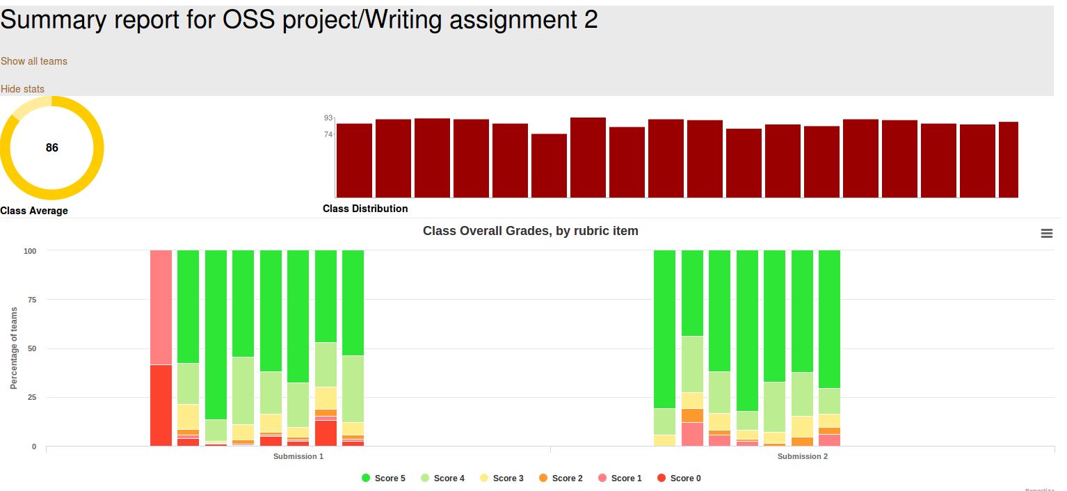
Approach: Here the color coding is blue to green and also it changes randomly which one color in one graph may represent some other score in the next graph. To fix this issue, we have redefined the highchart_colors data structure to contain the colors defined in the grades.scss file (already defined earlier) as suggested by the Professor. This way no matter what scale is being used it will always have appropriate color coding. Also, the color legend is now appropriate to explain correctly the color-code used.
highchart_colors = []
   highchart_colors.push("#2DE636")
   highchart_colors.push("#BCED91")
   highchart_colors.push("#FFEC8B")
   highchart_colors.push("#FD992D")
   highchart_colors.push("#ff8080")
   highchart_colors.push("#FD422D")
Issue 2
Description: Two adjacent bar represents the response in round 1 to round k. It makes sense only if the rubrics in all review rounds are all the same. If the instructor implements the vary-rubric-by-round mechanism, this visualization will not make sense.
Approach: Here the problem was that the data was represented rubric-wise, that is, if there are 5 rubrics, there would be 5 graphs. A graph for a particular rubric would show the performance of a team in that rubric in all rounds of submissions. This is fine when the rubrics are same for all the rounds. But, since rubric 1 of round 1 may not be same as rubric 1 of round 2, therefore this representation seems illogical. In our approach, the graphs are rendered submission-wise, the performance of a team in all rubrics in a particular round are shown in one graph pertaining to that round of submission.
We create an array called chart_data to hold the information for creating the highchart stack charts. Data is now stored in the highchart in form of hash-maps which contain the score as key and score pertaining to different rounds of reviews as value. Earlier, data was stored in the hash map in a way that in the value scores pertaining to different rubrics were getting stored. Our process facilitates the graph/chart formation submission/round-wise instead of rubric-wise (earlier approach). This guarantees the data is represented logically. In the earlier approach, data was represented rubric-wise. A graph for a particular rubric would show the performance of a team in that rubric in all rounds. But, since rubric 1 of round 1 may not be same as rubric 1 of round 2, therefore this representation seems illogical. Now, the graphs are submission-wise, the performance of a team in all rubrics in a particular round are shown in one graph pertaining to that round of submission. This addresses the problem of varying rubric by round. We can now have different number of rubrics in different rounds without affecting the visualizations for instructors.
def get_highchart_data(team_data, assignment, min, max, number_of_review_questions)
   chart_data = {}  # @chart_data is supposed to hold the general information for creating the highchart stack charts
   for i in 1..number_of_review_questions
     chart_data[i] = Hash[(min..max).map {|score| [score, Array.new(assignment.rounds_of_reviews, 0)] }]
   end
   team_data.each do |team|
     team.each do |vm|
       next if vm.round.nil?
       j = 1
       vm.list_of_rows.each do |row|
         row.score_row.each do |score|
           unless score.score_value.nil?
             #chart_data[vm.round][score.score_value][j] += 1
             chart_data[j][score.score_value][vm.round-1] += 1
           end
         end
         j += 1
       end
     end
   end
   chart_data
 end
vm is an object of the model 'VmQuestionResponse' (was already defined earlier). It contains the following information:
 @list_of_rows = []
   @list_of_reviewers = []
   @list_of_reviews = []
   @list_of_team_participants = []
   @max_score = questionnaire.max_question_score
   @questionnaire_type = questionnaire.type
   @questionnaire_display_type = questionnaire.display_type
   @rounds = rounds
   @round = round
   @name  = questionnaire.name
Here we build the 'series' array which is used by the highchart object to render the graph. This array holds the actual data for the chart along with the legend name. By introducing the counter count_rounds corresponding to the counter for rounds, we are able to compress the legends of highchart to a standard form, showing only what is required. Also, we have redefined the highchart_colors data structure to contain the colors defined in the grades.scss file (already defined earlier) as suggested by the Professor.
 def generate_highchart(chart_data, min, max, number_of_review_questions, assignment, team_data)
   # Here we actually build the 'series' array which will be used directly in the highchart Object in the _team_charts view file
   # This array holds the actual data of our chart with legend name
   highchart_series_data = []

   count_rounds=0
   chart_data.each do |round, scores|
     scores.to_a.reverse.to_h.each do |score, rubric_distribution|
       if count_rounds == 0
         highchart_series_data.push(name: "Score #{score}", data: rubric_distribution, stack: "S#{round}")
       else
         highchart_series_data.push(linkedTo: "previous",name: "Rubric #{round} - Score #{score}", data: rubric_distribution, stack: "S#{round}")
       end
     end
     count_rounds = count_rounds + 1
   end
   # Here we dynamically creates the categories which will be used later in the highchart Object
   highchart_categories = []
   for i in 1..@assignment.rounds_of_reviews
     highchart_categories.push("Submission #{i}")
   end
   # Here we dynamically create an array of the colors which the highchart uses to show the stack charts.
   # Currently we create 6 different colors based on the assumption that we always have scores from 0 to 5.
   highchart_colors = []
   highchart_colors.push("#2DE636")
   highchart_colors.push("#BCED91")
   highchart_colors.push("#FFEC8B")
   highchart_colors.push("#FD992D")
   highchart_colors.push("#ff8080")
   highchart_colors.push("#FD422D")
   [highchart_series_data, highchart_categories, highchart_colors]
 end
Issue 3
Description: The table is presorted by teams, but you can now also sort alphabetically. The cell view looks way too long, and should be divided into partials.
Approach: Here we can sort the select query with appropriate column alphabetically, or we can sort the table automatically according to user criteria using dynamic table format. And the long view issue can be solved by using paging.
Issue 4
Description: An interactive visualization or table that shows how a class performed on selected rubric criteria would be immensely helpful. It would show me what I need to focus more attention on.
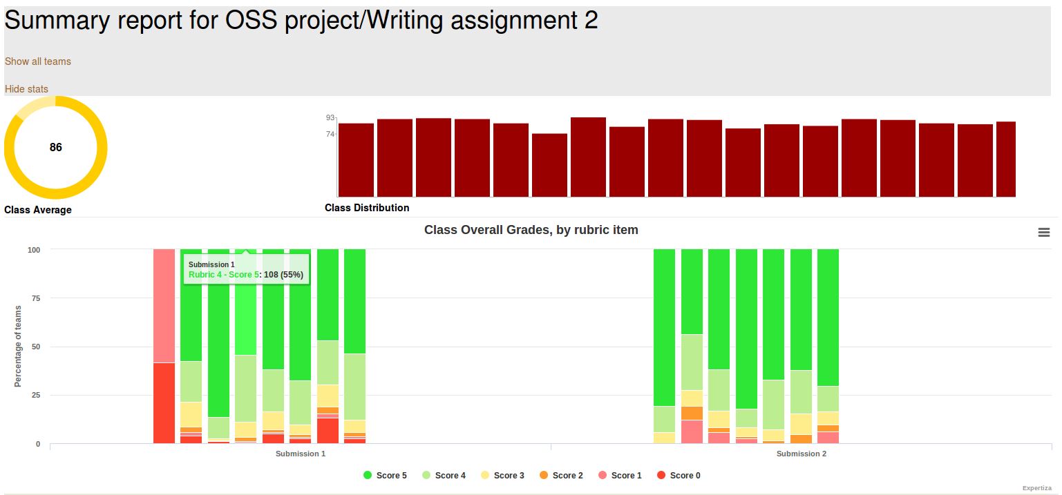
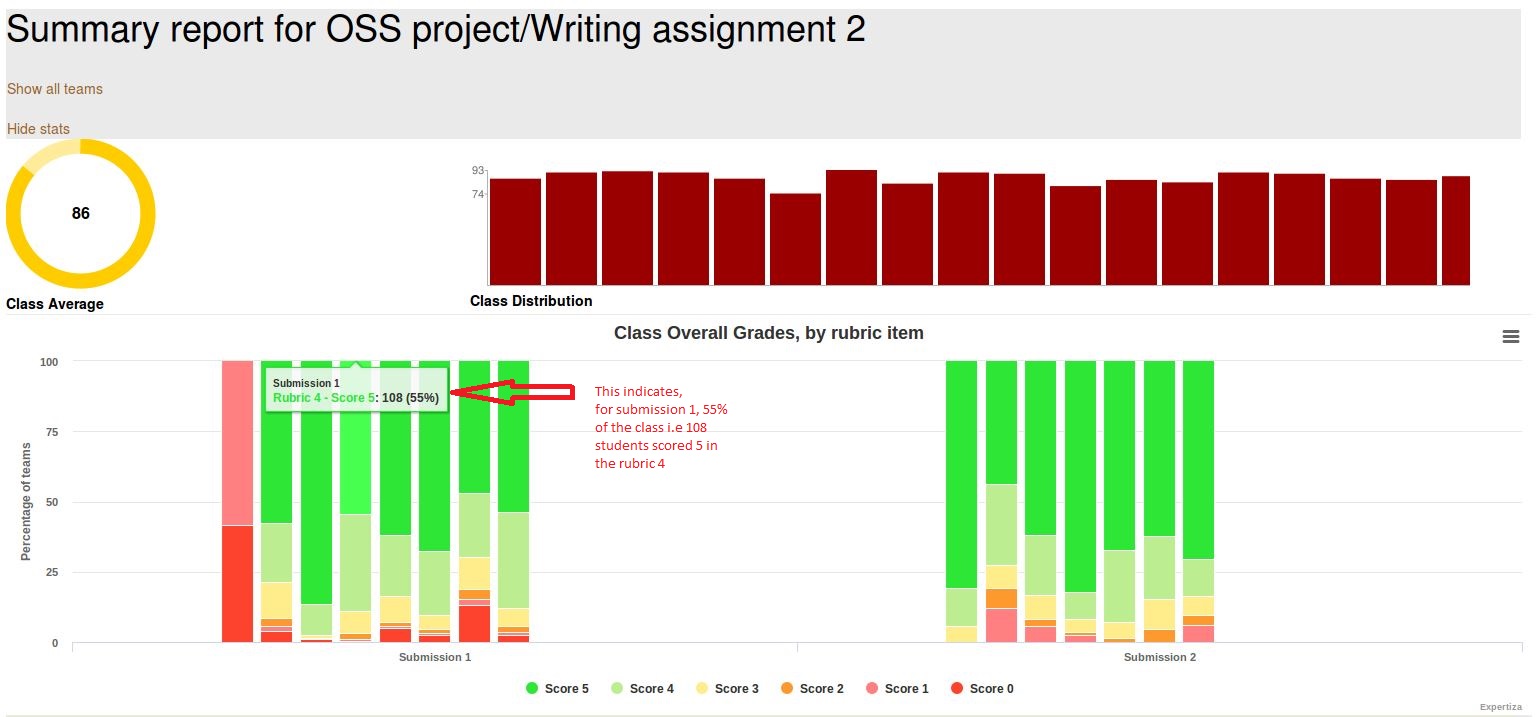
Approach: The issue is about getting the performance of the entire class graded using the 5 rubrics criteria.Scores will be color coded for each of the rubrics in each of the submissions. When hovered over the graph , for each score, the instructor should see the number of students , the percentage of students that has scored that particular point in that rubric in that submission.
The code snippet used to fix Issue 4 is same as that used to fix Issue 2. The graphs that we are rendering by making use of highcharts addresses this Issue.
Test Plan
Issue 1:Check if color coding from red to green for a range of score
- 1) Login as instructor
- 2) Create a dummy assignment and come dummy reviews for the same.Log out.
- 3) Login as a student. Attempt the assignment. Log out.
- 4) Login as another student and repeat step 3.
- 5) Login as either student and attempt the review. Logout.
- 6) Login as instructor. Go to Review grades page and check the table. If color code ranges from red ( for least score) to green ( for highest score), then test passed.
Issue 2:Check if different graph visible for different review submission
- 1) Login as instructor.
- 2) Create an assignment. Select 2 reviews. Also select different rubrics for both reviews.
- 3) Login as a student ("A") and submit the assignment. Repeat this for another student("B").
- 4) Login as student A and perform review. Do this for student B too.
- 5) Now resubmit assignment as student A and B again.
- 6) Resubmit reviews as student A and B again. This time the rubrics will be different from the previous round.
- 7) Now login as instructor and see the visualization of the reviews. You can see the different graphs for different submissions.
Issue 3:Check if the table is sorted with appropriate column alphabetically
- 1) Login as instructor
- 2) Create a dummy assignment with some teams. Logout.
- 3) Login as a student and attempt the assignment and logout.
- 4) Repeat step 3 for all dummy teams.
- 5) Login as instructor.
- 6) Go to View Scores page. Check the grade table.
- 7) Click on a column header and check if data in it is getting sorted alphabetically. If yes, then the test passed.
Issue 4:Check if graph in Issue 3 shows how a class performed on selected rubric criteria
- 1) Login as the instructor
- 2) Click on the button to compute graphs
- 3) Compare the bar graphs with separate scores of students in each assignments.


